
Aurora Gradient CSS Generator: 60 FPS Animated Background
Contents
- Why aurora gradient backgrounds are so popular
- The core principle of building an aurora background with CSS alone
- Core technical mechanics: CSS multiple background layers and the rendering pipeline
- 4-color palette matrix for recommended aurora themes
- 5 common mistakes when applying an aurora background
- A 5-step workflow for building an aurora web page
- 7 Practical Tips for Aurora Backgrounds
- Final Decision Tree: Which Aurora Style Should You Use?
- Aurora CSS Key Terms Cheat Sheet
- Frequently Asked Questions
Dreamy pastel blobs of light that slowly spread and drift across the background — the aurora gradient background — are a big hit right now on Instagram Linktree profiles, Notion portfolios, and tech SaaS landing pages.
Instead of a flat solid color, they add a rich, dimensional feel, and you can pull off smooth 60 FPS motion with just 2KB of pure CSS — no heavy video files, no JavaScript libraries.
Here's the multi-layer background technique behind aurora gradients, how to write high-performance animations with no browser reflow, and working code you can drop into Linktree in one minute.
Key takeaways ① How CSS auroras work: Layer multiple 'radial-gradient's on a parent container, apply an 80px blur, then rotate them with 'keyframes' to get a soft, hazy glow. ② Performance optimization is a must: Instead of 'top/left' (which triggers reflow), use 'transform: rotate()' (GPU compositing) and 'will-change' to keep things smooth on mobile. ③ Zero traffic & ultra light: At about 1/10,000 the size of a video, it plays instantly with no loading delay (CLS) and adapts perfectly to any screen. ④ With our generator, pick 4 pastel colors and a speed setting, then copy the finished CSS code in one click.
Why aurora gradient backgrounds are so popular
Unlike a static photo or an ordinary gradient, an aurora gradient draws the eye in a calm way with organic light that feels alive.
- Profile links / Linktree: Give a simple page with just a few lines of text and buttons a dramatic, emotional mood.
- SaaS landing pages: Create a futuristic, polished tech feel in the hero section.
- Notion web portfolios: Upgrade a text-heavy, monotonous resume into an interactive website.
The core principle of building an aurora background with CSS alone
1. Mixing multiple radial gradients
Place 4 radial gradients on top of a single background layer:
- Color coordinates (background-position): top left (10% 10%), top right (90% 10%), bottom left (10% 90%), bottom right (90% 90%).
- Blur filter (filter: blur(80px)): Erase the outer edges of each circle completely so the 4 colors blend into soft, billowing clouds.
2. Two CSS rules that protect browser performance
- Rule 1: Use transform: rotate(360deg) instead of top/left (avoids CPU reflow, uses a GPU compositing layer).
- Rule 2: Declare will-change: transform to hint at hardware acceleration to the browser.
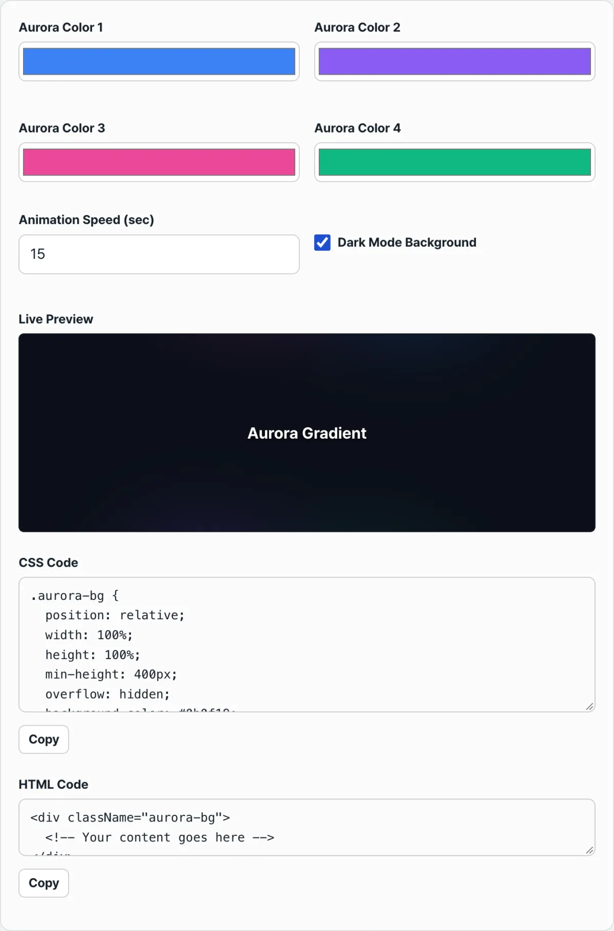
Free · pick your colors and get trendy aurora background CSS code in one second
Core technical mechanics: CSS multiple background layers and the rendering pipeline
Let's break down the CSS structure a browser uses to render a 4-color aurora efficiently on a single pseudo-element.
1. Multiple radial-gradient code on a single pseudo-element
.aurora-bg {
  position: relative;
  width: 100%;
  height: 100vh;
  overflow: hidden;
  background-color: #0b0f19; /* dark base */
}

.aurora-bg::before {
  content: "";
  position: absolute;
  top: -50%;
  left: -50%;
  width: 200%;
  height: 200%;
  background:
    radial-gradient(circle, #3b82f6 0%, transparent 50%),
    radial-gradient(circle, #8b5cf6 0%, transparent 50%),
    radial-gradient(circle, #ec4899 0%, transparent 50%),
    radial-gradient(circle, #10b981 0%, transparent 50%);
  background-position: 10% 10%, 90% 90%, 10% 90%, 90% 10%;
  background-size: 50% 50%;
  background-repeat: no-repeat;
  filter: blur(80px);
  opacity: 0.45;
  animation: aurora-rotate 18s linear infinite;
  will-change: transform;
}

@keyframes aurora-rotate {
  0% { transform: rotate(0deg); }
  100% { transform: rotate(360deg); }
}
2. GPU compositing in the browser's render tree
- Changing a normal DOM property goes through the heavy three-step path: [Layout ➔ Paint ➔ Composite].
- transform: rotate(), by contrast, skips Layout and Paint entirely and performs only the Composite (GPU compositing) step, so it uses almost no mobile battery or CPU power.
4-color palette matrix for recommended aurora themes
| Theme name | Base background color | 4-color aurora palette (HEX) | Best-fit websites |
|---|---|---|---|
| Midnight Aurora | #0B0F19 (deep navy) | #3B82F6, #8B5CF6, #EC4899, #10B981 | Developer portfolios, AI services |
| Cotton Candy Pastel | #F8FAFC (soft white) | #F472B6, #C084FC, #60A5FA, #34D399 | Instagram Linktree, beauty/fashion stores |
| Sunset Romantic | #180828 (dark burgundy) | #F97316, #F43F5E, #A855F7, #6366F1 | Cozy cafes, music playlists, blogs |
| Cyber Green | #051510 (deep forest) | #10B981, #06B6D4, #84CC16, #3B82F6 | Eco brands, fintech, tech blogs |
5 common mistakes when applying an aurora background
- Animating top/left and causing lag: Skipping transform makes the screen stutter on mobile.
- Forgetting overflow: hidden on the parent container: The rotating layer spills off-screen and creates a horizontal scrollbar.
- Setting the blur too low so the circles show: With a blur under 50px, the gradient edges look oddly round.
- Setting the rotation too fast (under 5 seconds): It can cause motion sickness, so a relaxed slow rotation of 15–25 seconds is essential.
- Messy z-index layering: The aurora layer covers your body text and buttons, so links can't be clicked.
A 5-step workflow for building an aurora web page
- Step 1 (Decide the website concept and mode): Set the tone of the site — dark mode or light pastel mode.
- Step 2 (Choose a color palette in the generator): Adjust the 4 color pickers and set the rotation cycle (15–20 seconds).
- Step 3 (Review in the live preview): Check the smooth aurora motion and blur spread on screen.
- Step 4 (Copy the CSS in one click): Copy the generated, clean HTML/CSS code.
- Step 5 (Combine with glassmorphism cards): Layer a translucent blurred card component over the aurora background to finish a polished web page.
7 Practical Tips for Aurora Backgrounds
- Use opacity to keep text contrast readable: On dark mode, opacity 0.4–0.6 and on light mode, opacity 0.3–0.4 is the golden ratio for text legibility.
- Pair it with a blur card UI: Put a card with
backdrop-filter: blur(12px); background: rgba(255,255,255,0.05);on top and you get that Apple feel. - Use CSS variables (--color-1): If you declare your colors as CSS variables, you can switch themes in 1 second when you toggle dark and light mode.
- Set mobile viewport height to 100dvh: Use 100dvh (dynamic viewport height) instead of 100vh so the background doesn't break when the mobile browser address bar animates.
- Apply it to a custom Notion site: When you publish a Notion portfolio to the web, drop this aurora code into your custom CSS to grab visitors' attention.
- Add mouse interaction: If you add a parallax effect that tilts the angle slightly based on the cursor position, the interactive effect is maximized.
- Bookmark this generator: You don't have to hand-write CSS for every new project—pull a palette in 1 second.
Final Decision Tree: Which Aurora Style Should You Use?
- Case A (Instagram Linktree, personal social profile) ➔ White base + pastel pink/purple aurora
- Case B (IT startup landing page, Web3, AI) ➔ Dark navy + blue/violet neon aurora
- Case C (Mood-driven portfolio, photographer's résumé) ➔ Dark burgundy + sunset orange aurora
- Case D (Corporate B2B service) ➔ Calm deep blue monochrome aurora
Aurora CSS Key Terms Cheat Sheet
- Radial Gradient: A radial gradient that spreads outward in a circle from a center point.
- GPU Compositing: An extremely fast rendering technique that composites the screen directly in GPU memory without a layout reflow.
- Layout Reflow: A heavy operation where the position or size of a web element changes and the browser recalculates the whole screen.
- Backdrop Filter: A CSS property that applies real-time blur only to the background layer behind an element.
Frequently Asked Questions
Doesn't it drain the battery on mobile?
Not at all. The CSS from this tool uses the GPU-only transform: rotate() instead of heavy JavaScript loops or top/left, which trigger CPU reflow, so CPU usage stays under 1% and battery drain is minimal.
Can I apply the aurora background to one section instead of the whole site?
Yes. Set position: relative; and overflow: hidden; on the parent container class (for example, .hero-section) and apply this CSS, and it renders perfectly contained within just the section you want.
Can I use it for free on a commercial website or a client project?
Yes, you're free to use the generated CSS code in commercial and personal projects.
This article was adapted from our Korean original. Read the Korean original