
box-shadow cut off: fix overflow clipping on CSS cards
Contents
- Making the shadow bigger won't create space for it
- Finding where it's clipped with DevTools
- Code that keeps rounded images and card shadows together
- In a scrolling area, keep the clipping and make room
- Where to look next, by symptom
- What the generator can and can't verify
- Order of checks after you apply it
- Frequently asked questions
If box-shadow is getting cut off at the edge of a card, start by walking up from the parent of the element that has the shadow and checking its overflow values. An ancestor's overflow: hidden or clip can cut off a shadow that spreads outward. If you also need to keep the image's rounded corners, split the job: put the shadow on the outer element and clip the image in an inner element.
Here's the case where things look fine in the generator but only the bottom shadow disappears once you put it on the page. Below is the order to check in DevTools and code you can apply right away.
Making the shadow bigger won't create space for it
box-shadow is a visual effect drawn outside the element. According to the W3C CSS Backgrounds and Borders spec's description of shadow placement, shadows don't affect layout and don't increase the size of the scrollable area.
So if your card is 120px tall, making its shadow bigger won't push the next card down automatically. You have to make room for the shadow yourself with padding, margin, gap, or similar.
If the value order itself is confusing, start with box-shadow syntax and inset explained. This post focuses on the case where valid code is already applied but part of it gets clipped.
Finding where it's clipped with DevTools
You can narrow down the cause in the browser's element inspector and Styles panel without any generator. Before you touch production code, toggle items off one at a time in the Styles panel.
- Select the card that has the shadow. In Computed styles, check whether box-shadow is none. If it's none, look at your selector or an overriding declaration before hunting for clipping.
- Select its immediate parent and look at the computed values of overflow-x and overflow-y. If either is hidden, clip, auto, or scroll, that element is a candidate for the clipping.
- Temporarily disable the overflow declaration on the candidate, or set both axes to visible. See whether the shadow appears, then put the original value back.
- If nothing changes, repeat with higher ancestors. Don't stop at the card's immediate parent.
- Once you find the element doing the clipping, check whether that clipping is needed for the image, slider, or scroll behavior, then apply one of the structures below.
The W3C CSS Overflow spec explains how hidden and clip cut things off. If one axis is auto and the other is visible, visible can compute to auto, so it's more accurate to read the computed values in DevTools than to trust the one line of CSS you wrote.
Code that keeps rounded images and card shadows together
If you put overflow: hidden on the whole wrapper to keep the image from spilling out of the card, split the box that draws the shadow from the box that clips the image.
<div class="card-shadow">
  <div class="card-clip">
    <img src="/sample.jpg" alt="Public example image">
    <p>Card content</p>
  </div>
</div>
.card-shadow {
border-radius: 12px;
overflow: visible;
box-shadow:
0 4px 6px -1px rgba(0, 0, 0, 0.1),
0 30px 40px -3px rgba(0, 0, 0, 0.05);
}
.card-clip {
border-radius: inherit;
overflow: hidden;
background: #fff;
}
.card-clip img {
display: block;
width: 100%;
height: auto;
}Swap the example image path for a file in your real project. The inner overflow: hidden clips the image and the content, and the outer box draws the shadow. If an ancestor further up is still clipping, this split alone won't fix it, so keep going with the checks from the earlier step.
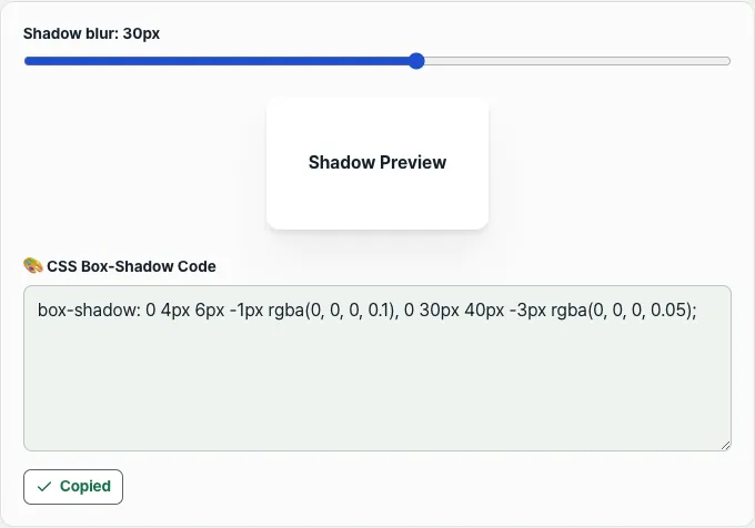
When you're deciding on the shadow's shape, you can check the preview and the code together in the free generator. This tool builds two shadow layers, and the slider changes the second shadow's vertical offset and blur together.
Free · two-layer shadow preview · slider controls and CSS copy
In a scrolling area, keep the clipping and make room
In places that need overflow-x: auto, like a horizontal card list, setting every overflow to visible will change the scroll behavior you had. Start by checking whether you can give the shadow room to spread inside the scroll area.
.card-track {
  display: flex;
  gap: 24px;
  overflow-x: auto;
  padding: 48px 32px 80px;
}

.card-track > .card-shadow {
  flex: 0 0 240px;
}
The padding values here are just an example for checking the shadow code above. Adjust them to fit the shadow's offset, blur, and spread and the design around it. Check the left side of the first card, the right side of the last card, and the bottom at the end of the scroll.
Before you add overflow: hidden to the whole page to hide horizontal overflow, look at which element is actually overflowing. Clipping everything can clip your card shadows too.
Where to look next, by symptom
| What you see | What to check first |
|---|---|
| Shadow cut off in a straight line at the parent's edge | overflow on that parent and its ancestors |
| Shadows overlap because the cards sit too close together | gap, margin, and the shadow's offset |
| Only the first card in a scrolling list is clipped on the left | padding at the start of the scroll area |
| Looks fine in the generator but not at all on the page | computed box-shadow, ancestor clipping, overlapping elements |
Raising z-index alone won't remove an ancestor's clipping. First change overflow and see whether the shadow comes back, and only when you've narrowed it down to another element covering it—not clipping—should you look at stacking order.
What the generator can and can't verify
As of November 13, 2026, this tool's slider range is 5–50. The first shadow is fixed. For the second shadow, the slider value becomes the vertical offset, and that value plus 10 becomes the blur radius. Moving "Blur amount" on screen changes both values together.
At the 30px setting in the screenshot, the second shadow outputs as 0 30px 40px -3px. Grab the code you want with the Copy CSS button, apply it to your real card, then check the parent's clipping and the spacing separately.
This tool doesn't let you edit colors or the number of layers separately, and it doesn't diagnose the overflow on your page automatically. A normal-looking shadow in the preview doesn't mean the layout on your real page is verified.
Order of checks after you apply it
Confirm the shadow is actually applied, find where the ancestor clips, then adjust the structure and spacing while keeping the image clipping and scroll behavior you need. Last, check the card corners and both ends of the scroll on narrow and wide screens.
Free · two-layer shadow preview · slider controls and CSS copy
Frequently asked questions
If a card has overflow: hidden on itself, does that always clip its own shadow?
You need to separate the shadow outside the card from the clipping of the child content. Don't pin the cause on the card's own overflow: hidden alone—also check clipping on the ancestors that contain the card. Splitting the inner image from the outer shadow makes each role easier to verify.
I only set overflow-y: visible, so why is it still clipped?
If the other axis is auto or scroll, visible can compute to auto. Check the computed values of both axes together. If you need horizontal scrolling, first consider making room with inner padding.
Will reducing the blur fix it?
A smaller spread can make it look less clipped, but the parent is still clipping for the same reason. If you want to keep the shadow you intended, check the clipping location and the spacing first.
Will this code give me the same look on every card?
It will look different depending on background color, card size, surrounding spacing, and ancestor styles. Use the generated code as a starting point and check the computed styles and the screen on your real page.
This article was adapted from our Korean original. Read the Korean original