
box-shadow syntax: value order, inset meaning, stacked shadows
Contents
You've probably seen code like box-shadow: 6px 8px 20px 0px rgba(0,0,0,0.25); and wondered what each of the four numbers actually means. It's also common to plug the values in a slightly different order and end up with a shadow that looks off.
These values aren't listed at random. The order is a direct code translation of how the shadow is actually drawn. Once you know what each position controls, you don't have to memorize anything — you can build the shadow you want right away.
Summary ① The box-shadow values follow the order offset-x, offset-y, blur-radius, spread-radius, color, and each one does a different job. ② The inset keyword flips the surface the shadow is drawn on from the outside of the box to the inside, turning a raised look into a pressed-in look. ③ When you list multiple shadows separated by commas, the first one goes on top and the later ones stack underneath, which creates a sense of depth.
Breaking Down the Value Order, One at a Time
The basic box-shadow syntax is offset-x, offset-y, blur-radius, spread-radius, color. You can leave out blur-radius and spread-radius, but the order itself never changes.
offset-x sets how far the shadow moves horizontally. A positive value moves it right, a negative value moves it left. offset-y handles vertical movement, so a positive value pushes the shadow down and a negative value pushes it up.
blur-radius sets how much the edge of the shadow fades out. At 0 you get a shadow with a crisp edge, and as the value grows the edge spreads wider and gets softer.
spread-radius sets how much the shadow shape itself grows or shrinks in every direction before the blur is applied. A positive value makes the shadow swell larger than the original box, and a negative value shrinks it smaller than the box. The final value, color, sets the shadow's color and transparency, which controls how strongly it blends with the background.
How inset Flips the Shadow to the Inside
Without the inset keyword, the shadow is drawn from the outer edge of the box, spreading outward as if it were behind the box. That's why the box looks like it's floating above the background.
Add inset and the surface the shadow is drawn on switches to the inner edge of the box. The shadow no longer spills outside the box — it's drawn from the box's inner border and presses inward.
As a result, even with the same offset and blur values, inset makes the surface look pressed in or sunken instead of raised — the complete opposite. That's why inset is used for input fields and buttons that look pushed down.
Why Stacking Multiple Shadows with Commas Creates Depth
box-shadow lets you list multiple shadows separated by commas. Each shadow is painted in order like an independent layer. The first one you write becomes the topmost layer, and each later shadow sits underneath the previous one. It's the same ordering rule you get when stacking multiple background images.
Most of the dimensional shadows you see in real interfaces aren't a single shadow. They're built by layering a tight, dark shadow together with a wide, faint one. Because you're showing both the short, sharp shadow from a nearby light source and the soft glow from a distant one at the same time, the result feels far more natural than a single layer of shadow.
Now that you know which slot in the syntax each slider value belongs to, it's time to adjust those values while watching them change.
Free · no sign-up · adjust box-shadow values with sliders and a color picker, then copy the CSS code right away
How the Tool Remembers the Value Order for You
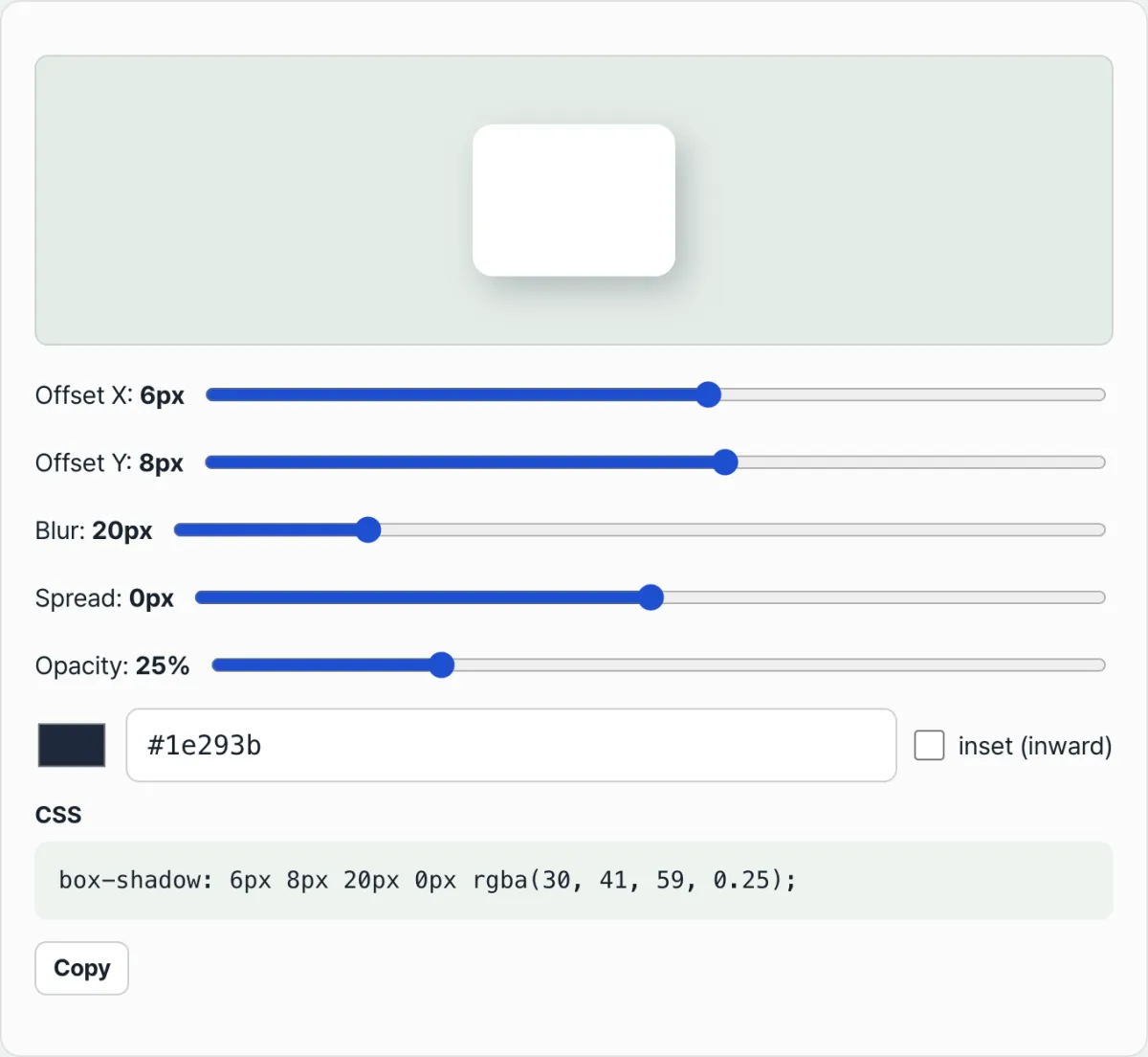
The CSS Box Shadow Generator splits each of the values we just covered into its own slider. Move the Horizontal Offset X, Vertical Offset Y, Blur, and Spread sliders and the shadow on the preview box above updates on the spot.
The current value is shown next to each slider as a number in px, so there's no confusion about which slider lands in which position between offset-x and offset-y. The color is controlled separately with a color picker, a HEX input field, and an opacity slider, and all of it is combined into box-shadow code at the bottom of the screen right away.
You turn inset on and off with a single checkbox. Click it and you can see the preview square switch instantly from a raised look to a pressed look, even with the same offset and blur values.
Using It to Build Multi-Layer Shadows
The tool builds one box-shadow value at a time and shows it as code. As we covered earlier, to stack multiple shadows for depth you need to build one tight shadow and one wide, faint shadow separately.
First, set the sliders to a dark color, low blur, and a spread close to 0 to make the close shadow, then copy the code shown at the bottom. Then, on the same screen, set the sliders to a light color, large blur, and positive spread to make the wide shadow and copy it once more.
Join the two copied values with a comma, and you get a final box-shadow value where the first shadow sits on top and the second sits underneath, following the layer rule we described earlier.
Recap
- box-shadow values must follow the order offset-x, offset-y, blur-radius, spread-radius, color, and blur and spread can be omitted.
- offset-x and offset-y control the shadow's position, blur-radius controls how soft the edge is, and spread-radius controls the size of the shadow shape itself.
- inset switches the surface the shadow is drawn on from outside the box to inside, flipping a raised look into a sunken one.
- When you list multiple shadows with commas, the first one goes on top and later ones stack underneath, following the same order as stacked background images.
- Layering a tight shadow with a wide, faint one creates far more natural depth than a single shadow alone.
Free · no sign-up · adjust box-shadow values with sliders and a color picker, then copy the CSS code right away
Frequently Asked Questions
Can I leave out blur-radius and spread-radius in box-shadow?
Yes. If you omit blur-radius, it's treated as 0 and you get a shadow with a crisp edge. If you also omit spread-radius, it's treated as 0 too, so the shadow ends up the same size as the box. Even when you omit both, you still have to keep the offset-x, offset-y, color order.
What happens if I use negative values for both offset-x and offset-y?
The shadow moves toward the upper left relative to the box. A negative offset-x pushes it left and a negative offset-y pushes it up, so with both negative the shadow appears at the upper left and creates the effect of a light source sitting at the lower right.
With inset, do I have to read the direction the offset sign means the opposite way?
The movement direction the sign means doesn't change. But because the shadow is drawn from the inside surface of the box, the edge that actually looks dark appears on the opposite side. A positive offset-x makes the right edge dark in a normal shadow, while an inset shadow makes the left edge dark instead.
Does changing the order of multiple shadows change the result?
It can. Whichever shadow you list first is always the top layer, so in the area where two shadows overlap, the color and shape of the first shadow show through as-is. The difference becomes especially obvious as you increase the spread value and the shadow areas get larger.
This article was adapted from our Korean original. Read the Korean original