
CSS Button Hover Effects: Shine, 3D Press, and Slide Fill
Contents
- Why buttons need hover effects
- How to build button hover effects in CSS yourself
- Core mechanics: three architecture rules for high-performance CSS buttons
- Comparison Matrix of 9 Modern CSS Button Hover Styles
- 5 Button Hover Styling Mistakes to Avoid at All Costs
- 5-Step Production-Level Micro-Interaction Button Workflow
- 7 Micro-Interaction Detail Tips
- Final Decision Tree: Picking the Right Hover Effect for Your Brand
- Terminology Cheatsheet
- Frequently Asked Questions
When a button on a landing page or signup screen gives no visual response when you hover over it, users can't be sure right away that the element is clickable. A CSS button hover effect is a device that signals "this button is interactive" by changing color, shadow, or the position of a pseudo-element in the :hover state. This post explains which CSS property combinations produce three popular effects — the diagonal shine, the 3D press, and the slide fill.
Summary ① Most button hover effects are built from
::before/::afterpseudo-elements combined with thetransformandbox-shadowproperties. ② The shine effect moves a tilted, semi-transparent gradient bar using theleftvalue, while the 3D press effect shrinks thebox-shadowdepth and thetranslateYoffset together to create the pressed feel. ③ Declareoverflow: hiddenso pseudo-elements don't spill outside the button, and on touch devices limit hover animations with an@media (hover: hover)query.
Why buttons need hover effects
Elements that nudge users toward their next action are often called CTA (call to action) buttons. If a button has no state change at all, users can't immediately tell it's clickable even with the cursor over it.
Visual feedback — a change in color, shadow, or position on hover — tells people the button is interactive. Beyond just swapping colors, combining pseudo-elements with the transform property lets you build a shine that sweeps across the button, a 3D press, a background that fills with a slide, and more.
How to build button hover effects in CSS yourself
How the three main effects work
Button hover effects are implemented through an element's pseudo-elements (::before, ::after) plus the transform and box-shadow properties.
- Diagonal shine (Shine Effect):
Use a
::beforepseudo-element to create a white semi-transparent gradient bar tilted at -25 degrees, then on:hoverpass it fromleft: -100%toleft: 180%. - 3D press (3D Press Effect):
Add depth with
box-shadow: 0 6px 0 #1e40af;, then on:activecombinetransform: translateY(4px);with a smaller shadow so the button looks pressed down. - Slide fill (Slide Fill Effect):
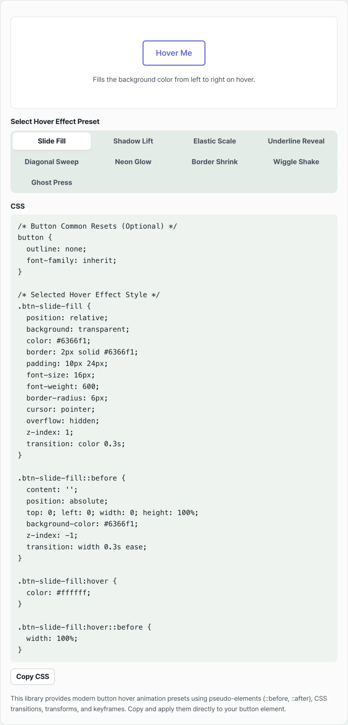
Hide a
::beforeelement atwidth: 0, then widen it towidth: 100%on hover so the background color fills from left to right.
Shine button CSS example
Here's the CSS for a diagonal shine hover button.
.btn-shine {
  position: relative;
  padding: 14px 32px;
  font-size: 16px;
  font-weight: 600;
  color: #ffffff;
  background: linear-gradient(135deg, #3b82f6 0%, #1d4ed8 100%);
  border: none;
  border-radius: 12px;
  overflow: hidden;
  cursor: pointer;
  box-shadow: 0 4px 14px rgba(37, 99, 235, 0.35);
  transition: all 0.3s ease;
}

.btn-shine::before {
  content: '';
  position: absolute;
  top: 0;
  left: -100%;
  width: 60%;
  height: 100%;
  background: linear-gradient(
    90deg,
    transparent,
    rgba(255, 255, 255, 0.4),
    transparent
  );
  transform: skewX(-25deg);
  transition: left 0.75s ease;
}

.btn-shine:hover::before {
  left: 180%;
}

.btn-shine:hover {
  transform: translateY(-2px);
  box-shadow: 0 6px 20px rgba(37, 99, 235, 0.45);
}
Change the color values or the transition duration one at a time in this code and you can dial in the exact feel you want.
Note Instead of hunting through open-source communities for effect code like this and editing the values every time, you can preview 9 hover presets in our free tool below — slide fill, neon glow, light sweep, and more — and copy the CSS on the spot.
Try it yourself in the tool below.
Preview popular button hover animations like shine, pulse, glow, and slide in real time, then copy the optimized CSS stylesheet.
Core mechanics: three architecture rules for high-performance CSS buttons
For a button hover effect to run smoothly at 60fps without dragging down performance, you need to understand and control the browser's rendering pipeline (Layout → Paint → Composite).
1. Geometric transforms on pseudo-elements (::before, ::after)
To add an independent visual layer without disturbing the button's own layout, use pseudo-elements.
With the shine effect, for example, you generate a semi-transparent gradient that traces the path of the light:
background: linear-gradient(90deg, transparent, rgba(255,255,255,0.4), transparent)
Then you move that light bar from outside the left edge to outside the right edge using left or the GPU-accelerated transform: translateX() property, which gives the button a sense of motion and texture.
2. Layer stacking and paint containment
The key is isolating the moving pseudo-element so it doesn't invade other DOM elements around the button.
position: relative; overflow: hidden;: These two properties create a clipping mask on the parent button. No matter how long the pseudo-element's streak of light gets, it won't render outside the button's edges.z-index: 1(text label): So that a slide effect or neon effect covering the background never hides the text, lift the button's text element above it to protect accessibility and readability.
3. The 3D elevation and physical depress algorithm
To give an on-screen element the weight of a real button, the Y-axis travel distance and the amount the shadow shrinks must match exactly.
- Resting (default state):
box-shadow: 0 6px 0 var(--shadow-color); transform: translateY(0); - Hover (mouse over):
box-shadow: 0 8px 0 var(--shadow-color); transform: translateY(-2px);(a slight lift into the air) - Active (clicked state):
box-shadow: 0 2px 0 var(--shadow-color); transform: translateY(4px);(the button drops 4px, matching the shadow's 4px reduction) When this net displacement math lines up, your brain naturally reads it as a real 3D object.
Isolating hover on touch devices (Touch Hover Isolation)
Media queries have evolved to the point where you no longer need JavaScript to detect the device. Here's the standard CSS block for preventing sticky hover bugs on mobile:
@media (hover: hover) and (pointer: fine) {
  /* Only trigger hover on devices with a mouse (fine pointer), such as desktops */
  .btn:hover {
    transform: translateY(-2px);
    box-shadow: 0 6px 15px rgba(0,0,0,0.2);
  }
}
Comparison Matrix of 9 Modern CSS Button Hover Styles
The hover effect that fits your project depends heavily on the project's nature and target devices. Compare each style's characteristics, GPU load, implementation difficulty, mobile touch friendliness, and best use cases at a glance.
| Hover Style | GPU Load | Implementation Difficulty | Mobile Touch Friendliness | Best Use Case |
|---|---|---|---|---|
| Shine Beam (Light Reflection) | Low | Medium | Very good | SaaS hero section CTAs, fintech signup buttons |
| 3D Push/Depth (Physical Press) | Very low | Low | Good (active state) | E-commerce shopping carts, gaming websites |
| Slide Fill (Background Fill) | Low | Medium | Fair (watch for ghosting) | Portfolio sites, minimalist corporate websites |
| Ripple Wave | High | High | Fair | Material Design UI, Android WebView |
| Neon Glow Pulse | Medium | Medium | Low (battery drain) | Cyberpunk design, dark mode apps |
| Gradient Border Sweep | High | Very high | Low | Web3, blockchain, high-end tech platforms |
| Magnetic Jiggle | Medium | High | Poor | Playful agencies, creative studios |
| Inset Bevel (Inner Engraving) | Very low | Low | Good | Admin dashboards, industrial software |
| Minimal Underline | Very low | Very low | Good | In-text links, blog navigation |
5 Button Hover Styling Mistakes to Avoid at All Costs
A poorly implemented hover animation is worse than none at all. Make sure to check these five common mistakes.
- Missing
@media (hover: hover)(sticky hover on mobile touch) This is the most common and most damaging mistake. When a mobile user taps a button, the animation triggers and stays frozen in place, making it feel like the system has locked up. - Animating layout properties (
padding,width,margin) and causing reflow jank Changing size or spacing forces the browser to recalculate the layout of the entire page (layout thrashing). Animations must use onlytransform(scale) andopacity, which skip layout calculations, to protect 60fps. - Missing
overflow: hiddenon rounded buttons When an inner pseudo-element moves inside a button withborder-radius, a square background can bleed past the rounded corners and sharply lower quality. Always declareoverflow: hiddenas well. - Pseudo-elements covering button text and hurting readability (z-index conflicts)
While building an elaborate slide fill, the background element can rise above the text, breaking text contrast or even blocking clicks. Give the pseudo-element
z-index: -1and give the text element an explicit stacking context. - Skipping keyboard accessibility (
:focus-visible) When you focus only on mouse hover, it's easy to forget visual indicators for users who navigate with the Tab key. Always implement a focus ring (:focus-visible) that matches or is clearer than the hover state, and follow web accessibility guidelines.
5-Step Production-Level Micro-Interaction Button Workflow
Here is a standardized five-step workflow for building reliable buttons that can handle millions of visits in production.
- Semantic Markup and Base Typography (Base Setup)
Declare an accessible, semantic
<button>or<a>tag, and apply a generous touch target (padding) and a clear font system. - GPU-Accelerated Transitions and Shadow Base (GPU Pipeline)
Choose only the properties you will animate and declare a rendering-optimized transition such as
transition: transform 0.2s cubic-bezier(0.4, 0, 0.2, 1), box-shadow 0.2s;. - Inject a Pseudo-Element and Prevent Clicks (Pointer-events)
Create a
::beforeor::afterelement to serve as the animated object. Then assignpointer-events: noneandz-index: -1so the pseudo-element never intercepts mouse events. - Wrap Touch-Hover Prevention in a Media Query (Hover Isolation)
Safely isolate mouse-over definitions (for example,
:hover::before { left: 100%; }) inside a@media (hover: hover)block. - Verify Keyboard Focus and Active Press Physics (Active & Focus)
Confirm that the
:focus-visibleoutline is clear when you move to the button with the Tab key. Then run a final test to make sure the Y-axis physical drop (translateY) in the:activestate feels natural when the user presses the spacebar or Enter key (or left-clicks with a mouse).
7 Micro-Interaction Detail Tips
Button quality is decided by subtle details: 1 pixel and 0.1 seconds. Here are the tips top 1% front-end engineers use.
- The magic of
pointer-events: none: When you give a pseudo-element this property, you can completely prevent a situation where overlapping layers confuse the browser about the click location and click events fail to bubble to the parent. - Snappiness is everything! Keep transition times in the 150 ∼ 250ms range: If a hover animation runs longer than 300ms, the system feels slow. The Goldilocks zone, where it feels sharpest to the human eye, is between 150ms and 250ms.
- Shadow shrinkage equals travel distance: If the Y-axis offset of
box-shadowshrinks from 6px to 2px in the:activestate, you must also usetransform: translateY(4px)to move the body down 4px so the physics match perfectly. - Use a subtle scale to invite magnetic engagement: Don't just change the color on hover. Mix in
transform: scale(1.02)so the element feels as if it's being pulled toward the mouse pointer like a magnet. - Declare
will-change: transformbefore complex 3D calculations: If a button combines a light sweep with multiple 3D rotations, usewill-changeto give the browser a rendering optimization hint right before hover and prevent initial jank. - Double-check the WCAG 4.5:1 contrast ratio: The contrast ratio must be at least 4.5:1 (WCAG AA), not only in the default state but also for the background and text colors in the hover state.
- Make active use of automated web tools: Instead of writing dozens of lines of CSS by hand and fighting typos, use the CSS Button Hover Effects tool at the top of this page to copy perfectly tested, cross-browser CSS in just one second and maximize your productivity.
Final Decision Tree: Picking the Right Hover Effect for Your Brand
Use this to quickly settle on the style that fits the project you're working on right now.
- Q: What's the brand tone for the service you're building?
- Is it a B2B, finance, or corporate site that needs to feel professional and trustworthy? ➔ [Shine Beam] or [Subtle Inset Bevel]. (Skip the constant motion and deliver a quiet, polished sense of confidence.)
- Is it a trendy, high-energy startup, SaaS product, or modern web app? ➔ [Slide Fill] or [Smooth Scale Up]. (Motion that feels young, lively, and natural to digital-native users.)
- Is it a game, entertainment, or kids' service where fun and interaction are the point? ➔ [3D Depress] or [Magnetic Jiggle]. (Give the most dramatic, playful feedback to every interaction and keep people on the page longer.)
Terminology Cheatsheet
A quick-reference list of the concepts you need to know when working with web animation and micro-interactions.
- Pseudo-elements (::before, ::after): Visual decorations that don't exist in the HTML markup but are generated virtually through CSS. They're essential for adding animation layers without disrupting layout.
- Shine Beam: An interaction technique that sweeps a slanted bar of light quickly across a button, creating the illusion of shimmering metal or glass.
- 3D Depress: A physics-style effect that uses CSS
box-shadowto build a thick sense of depth, then shrinks the shadow and moves the button down on the Y axis when clicked, so it feels like pressing a physical button. - Sticky Hover: A bug on mobile where a hover effect doesn't clear after a tap and stays frozen on screen like a ghost image.
- hover: hover media query: A modern web standard query that detects whether a device has a pointer that can rest precisely over the screen, like a mouse, and branches the CSS block accordingly.
- overflow: hidden: A layer-isolation property that clips and hides the visual area of child elements or pseudo-elements that extend past the parent's border.
- :focus-visible: A key accessibility property that draws a visual outline only when an element receives focus through something other than a mouse click, such as moving with the Tab key.
- Hardware Acceleration: A technique that hands rendering calculations to the graphics card (GPU) instead of the browser's main thread (CPU), so complex animations run smoothly at 60fps without stutter (this covers
transform,opacity, and similar properties).
Frequently Asked Questions
Q1. On my phone, the hover animation stays stuck after I tap a button. Why does that happen?
A1. A mobile touchscreen has no real concept of a mouse pointer "hovering" in mid-air. For compatibility, mobile browsers treat the first touch as a mouse hover and stop rendering there (Sticky Hover). To fix it, always wrap your CSS hover code in a @media (hover: hover) and (pointer: fine) { ... } query so hover animations don't run at all on phones.
Q2. Is there a specific formula for nailing the pressed feel of a 3D button?
A2. Yes — you have to follow the law of total travel distance, or the brain won't perceive it as natural. Say the resting shadow is box-shadow: 0 6px 0, and when the button is pressed (:active) it shrinks to box-shadow: 0 2px 0. That means the shadow collapsed by 4px. You have to physically move the button body down by those same 4px, so you must declare transform: translateY(4px) to complete the 3D mechanics.
Q3. The slide background built with a pseudo-element (::before) covers the button text and hurts readability. How do I fix it?
A3. Your stacking context got tangled. To fix it, first wrap the text inside the button in a <span> element and give it position: relative; z-index: 1; to pull it up. Second, on the ::before pseudo-element that handles the background fill, you must declare z-index: -1 to force the layer order so it always sits beneath the text layer.
This article was adapted from our Korean original. Read the Korean original