
cubic-bezier Explained: What the 4 CSS Easing Numbers Do
Contents
- What the four numbers in cubic-bezier(x1, y1, x2, y2) point to
- Why the slope of the curve is the perceived speed
- Why linear feels unnatural
- ease, ease-in, ease-out, and ease-in-out are really just these values
- How to check this curve by hand
- How the tool shows curve calculation and motion checks at the same time
- Comparing curves quickly with presets and duration
- The takeaway
- How It Works Under the Hood: The Third-Order Parametric Bézier Equation and the Physics
- CSS Easing Function Spectrum: Comparison Matrix
- 5 Cubic-Bézier Animation Mistakes to Avoid
- A 5-Step Workflow for Designing Intuitive Cubic Bézier Curves
- 7 Animation Curve Tips Motion Designers Keep to Themselves
- Motion Decision Tree in Practice: Which Curve Do I Need?
- Essential Terminology Cheat Sheet for Pros
- Frequently Asked Questions
If you've ever put a name like ease or ease-in-out into transition-timing-function in CSS, you've probably also seen the four-number notation like cubic-bezier(0.42, 0, 0.58, 1) at some point. A lot of people copy and paste those four numbers from somewhere without knowing exactly what they mean.
In fact, ease, linear, and ease-in-out are all just different values on the same mathematical curve. Let's start with the underlying principle: what this curve represents, and why linear in particular feels so stiff.
Summary ① The four numbers in
cubic-bezier(x1, y1, x2, y2)are the coordinates of the two middle control points of a cubic Bezier curve that connects the start point (0,0) and the end point (1,1). ② The x-axis is "how much time has passed," and the y-axis is "how far the animation has progressed." The slope of this curve is the instantaneous speed. ③ Names likeease,linear, andease-in-outare just preset labels attached to combinations of these four numbers — there's no separate calculation method behind them.
What the four numbers in cubic-bezier(x1, y1, x2, y2) point to
The four numbers x1, y1, x2, and y2 inside the cubic-bezier() function are the coordinates of two control points that draw a cubic Bezier curve. The start point (0,0) and end point (1,1) of the curve are already fixed by the CSS spec, so the only values you can actually adjust are the two control points in between.
The horizontal axis (x) of the graph shows how much of the total duration has passed since the animation started, as a ratio from 0 to 1. The vertical axis (y) shows how far the animation has progressed at that moment — that is, what percentage of the way a value like position or size has moved from its start value to its end value.
x is locked between 0 and 1 because time can't run backward, but y can go above 1 or below 0. The section where y goes above 1 creates a bouncing motion that slightly overshoots the target and then comes back.
Why the slope of the curve is the perceived speed
The slope at any given point on this curve shows how fast the animated value is changing at that moment. A steep slope means the value moves a lot in a short time, and a gentle slope means the value barely changes as time passes.
Real objects don't suddenly go from standing still to top speed, and they don't suddenly drop to zero speed right before they stop. That gradual speeding up and slowing down is why this feels natural to our eyes.
The ease family of curves deliberately makes the slope gentle near the start and end to create this acceleration and deceleration. If you build a curve where even the start and end slopes are steep, the motion feels abrupt and jumpy.
Why linear feels unnatural
linear is actually identical to cubic-bezier(0, 0, 1, 1). With both control points sitting in the same spots as the start and end points, the whole curve becomes a perfect straight line connecting (0,0) and (1,1).
A straight line has the same slope everywhere. That means the speed stays constant, without changing at all, from the moment the animation starts to the moment it ends.
The problem is before and after the animation. An element that was sitting still jumps from speed 0 to a constant speed, and at the end it stops abruptly while still moving at that speed. That instant change in speed looks like a jerky, unnatural movement to the eye.
ease, ease-in, ease-out, and ease-in-out are really just these values
All the named easings the browser provides by default are just nicknames attached to a predefined set of cubic-bezier coordinates. There's no separate calculation method — they're just names given to commonly used control point combinations.
| Name | cubic-bezier value | Characteristics |
|---|---|---|
| linear | (0, 0, 1, 1) | Constant speed from start to finish |
| ease | (0.25, 0.1, 0.25, 1) | Starts a little fast and gradually slows down (the default) |
| ease-in | (0.42, 0, 1, 1) | Starts slow, gets faster and faster, and keeps its speed at the end |
| ease-out | (0, 0, 0.58, 1) | Starts fast, gradually slows, and stops |
| ease-in-out | (0.42, 0, 0.58, 1) | Starts slow, speeds up in the middle, then ends slow again |
In ease-in, the end control point is at (1,1) — the same spot as the end point — so it finishes while still accelerating. That's why it's often used for elements that disappear off the screen.
ease-out is the opposite: its start control point is at (0,0), the same spot as the start point, so it builds up speed right away and then slows to a stop at the end. It suits elements that come into view and settle.
How to check this curve by hand
To see by hand what kind of motion these values actually produce, you have to plug t from 0 to 1 into the cubic Bezier formula over and over, calculate points on the curve one by one, and plot them on graph paper.
Drawing the shape of the curve alone isn't enough. You need to apply it in real CSS and look at it to know whether the value gives the sense of speed you want, so you have to repeat the process of tweaking the values and refreshing the browser many times.
Adjust the curve with sliders, preview the actual motion, and copy the transition CSS right away with the Cubic Bezier Easing Generator
How the tool shows curve calculation and motion checks at the same time
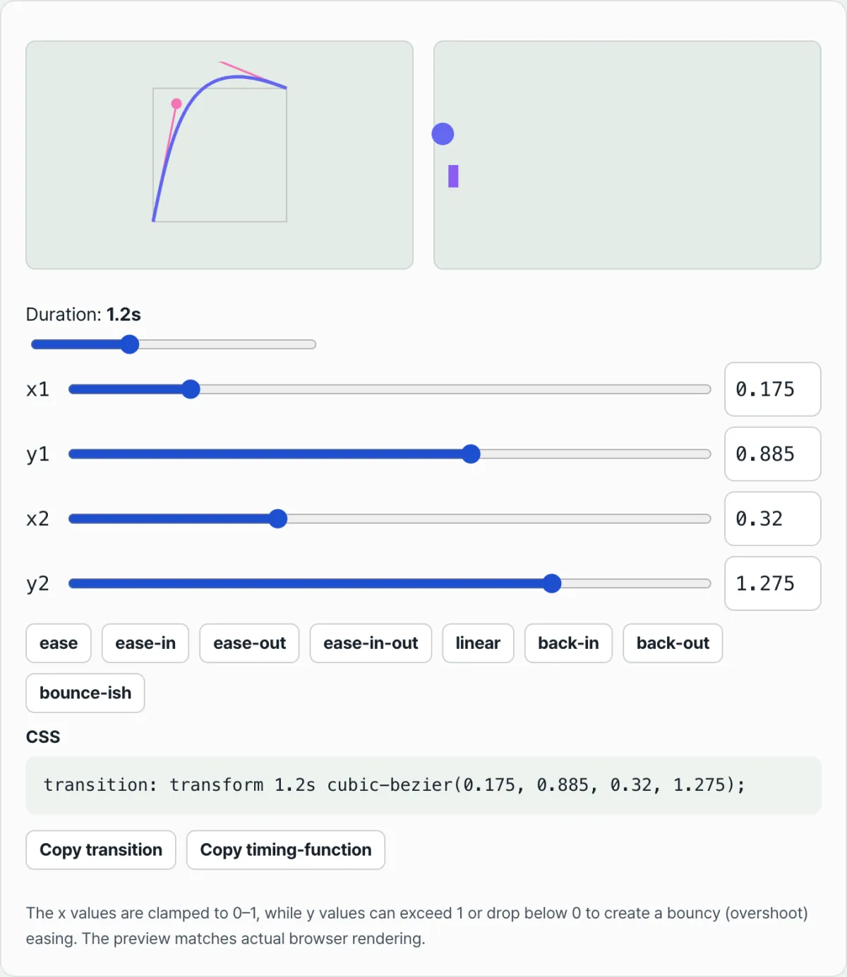
The Cubic Bezier Easing Generator draws the graph described so far as a visible curve. In the left area, a square coordinate plane, the curve, and the positions of the two control points appear as dots, so you can immediately see where the x1, y1, x2, and y2 values sit on the graph.
In the right area, a circle and a bar with the same cubic-bezier value applied to a real CSS transition move on repeat. This preview is actual browser rendering, so you can directly check whether the curve shape you see in the graph matches the sense of speed you feel on screen.
Comparing curves quickly with presets and duration
Press any of the eight preset buttons, from ease to bounce-ish, and the coordinate values described so far fill in the sliders and number inputs exactly as they are. x1 and x2 are limited to values between 0 and 1, but y1 and y2 can go outside that range, so you can build bouncing curves like back-out yourself.
The duration slider lets you compare the same curve at different speeds, and you can copy the finished value right away as a single line of transition or a single line of transition-timing-function.
The takeaway
- The four numbers in
cubic-bezier(x1, y1, x2, y2)are the coordinates of the two control points between the fixed start point (0,0) and end point (1,1). - The slope of the curve is the speed at that moment; the gentler the slope, the slower the value changes, and the steeper it is, the faster.
lineariscubic-bezier(0, 0, 1, 1), a perfect straight line, so the speed changes abruptly at the start and end, which feels unnatural.ease,ease-in,ease-out, andease-in-outaren't separate algorithms — they're just names attached to commonly used coordinate values.- y can go above 1 or below 0, so overshoot curves that pass the target and come back are built on the same principle.
Adjust the curve with sliders, preview the actual motion, and copy the transition CSS right away with the Cubic Bezier Easing Generator
How It Works Under the Hood: The Third-Order Parametric Bézier Equation and the Physics
Let's take apart the math that lets a browser take the four numbers in CSS (x1, y1, x2, y2) and paint a smooth 60fps animation.
1. The Third-Order Parametric Bézier Equation
The curve a browser draws is a cubic Bézier curve, with time t (0 ≤ t ≤ 1) as its parameter. Here's the base formula.
In CSS transitions, the start point P0(0,0) and the end point P3(1,1) are always fixed. Plug those values into the formula and simplify, and you can split time X and progress Y into two separate parametric equations.
X(t) = 3(1−t)2 t x1 + 3(1−t) t2 x2 + t3 Y(t) = 3(1−t)2 t y1 + 3(1−t) t2 y2 + t3
The values you type into CSS are the control points P1(x1, y1) and P2(x2, y2).
2. Time Mapping with Newton-Raphson
What the browser gets from you is an X value — the fraction of total time, meaning "how far through the animation are we right now?" But to find the current progress Y, it first has to find the invisible parameter t. The trouble is that X(t) is a cubic equation in t, so inverting it is painful. That's why modern browser engines (Chrome's V8, Safari's WebKit, and others) use the Newton-Raphson numerical method. Given a specific time X, they quickly approximate the matching t, then feed that t back into Y(t) to produce the property value that actually gets rendered. That whole calculation runs more than 60 times a second.
3. Derivatives, Instantaneous Slope, and the Physics of Speed
How fast an animation feels comes down to the instantaneous slope of the curve — its derivative (dY/dX).
- Slope (dY/dt/dX/dt): the rate of change in Y with respect to the parameter t, divided by the rate of change in X.
- Steep curve = large slope = the value changes a lot in a short time = blazing-fast movement
- Flat curve = small slope = the value barely moves as time passes = deceleration close to a standstill
4. Overshoot Physics: y > 1.0 or y < 0.0
Y control points that leave the normal [0, 1] range simulate bounce and elastic physics.
- If y1 or y2 goes above 1.0, the Y(t) curve punches through the 1.0 line (the final destination) and then falls back down to it. To the user's eye, the object shoots past its target (overshoot), swells up, and bobs back into place.
- Heads up: Y values can leave the range freely, but x1, x2 must stay between 0 and 1. The X axis is time, and time doesn't run backwards in a web browser — Einstein's relativity doesn't apply here. If an X value falls outside that range, the browser marks the whole CSS declaration as invalid.
CSS Easing Function Spectrum: Comparison Matrix
One table that shows how each motion behaves and where it fits.
| Easing Type | Math Coordinates / Preset | Acceleration Profile | Ideal UI Role | Visual Personality | Eye Strain Risk |
|---|---|---|---|---|---|
| Linear | cubic-bezier(0, 0, 1, 1) | Zero acceleration or deceleration from start to finish (constant speed) | Infinite-loop spinners (loading animations), color changes | Stiff, mechanical, robotic | Medium (low with simple repeats) |
| Standard | ease (0.25, 0.1, 0.25, 1) | Gentle start → acceleration → long, soft deceleration | Everyday screen transitions and panel slides in mobile apps | Safe, universal, predictable | Low |
| Ease-In | cubic-bezier(0.42, 0, 1, 1) | Starts from rest → hits top speed at the end | Modals and notifications that exit the screen | Sharp, urgent, decisive | Very high (never use on enter) |
| Ease-Out | cubic-bezier(0, 0, 0.58, 1) | Already at top speed on entry → eases to a stop | Sidebars and popups that enter the screen | Steady, friendly, polished | Very low (the most comfortable) |
| Ease-In-Out | cubic-bezier(0.42, 0, 0.58, 1) | Slow start → mid acceleration → slow stop (symmetric) | Size changes within a screen, hover states | Weighty, unhurried, smooth | Low |
| Custom Expo | cubic-bezier(0.16, 1, 0.3, 1) | Explosive entry speed → extremely soft, long deceleration | Reveal motion for an app's core UI components | Snappy, high-tension, modern | Low |
| Overshoot | cubic-bezier(0.34, 1.56, 0.64, 1) | Swells past 100% → springs back to 100% | Success badges, highlight alerts, like/heart buttons | Playful, juicy | Medium (distracting when overused) |
5 Cubic-Bézier Animation Mistakes to Avoid
- Pushing X control points outside 0–1 (fatal error): If you set an X-axis (time) control point above 1 or below 0, like
cubic-bezier(1.2, 0, -0.2, 1), the entire CSS statement is dropped as a parsing error. Time travel isn't possible! - Using
ease-inon entering UI: Whenease-inruns on an element that appears, the element is at top speed right as it reaches its destination and then slams to a hard stop. That creates a visual collision and puts real stress on users. - Overusing
linearfor UI movement: When sidebars, modals, and dropdowns move in a straight line, they break the physical rules of the real world (inertia, friction), so your brain quietly files the software as "clunky and cheap." - Extreme overshoot (y > 2.0) causing layout clipping: Crank the Y values too high to get bounce and the element flies far outside its container, where
overflow: hiddencuts it off (clipping) — a visible bug. - Long durations (>500ms) paired with a steep curve: Put heavy early acceleration on an animation longer than 0.5 seconds and users feel the input feedback isn't immediate, so they assume the app is sluggish.
A 5-Step Workflow for Designing Intuitive Cubic Bézier Curves
Here's a hands-on 5-step guide to designing mathematically precise motion instead of guessing.
- Step 1: Define the intent of the interaction → Is this element entering the screen (Entering), leaving it (Exiting), simply being emphasized (Emphasizing), or just changing state neutrally?
- Step 2: Pick a baseline preset → For entrance motion, start from Ease-Out. For exit motion, use Ease-In. For hover motion, use Ease-In-Out as your skeleton.
- Step 3: Tune the handles with a visual tool → In the Cubic Bezier Easing Generator on this page, drag the P1(x1, y1) and P2(x2, y2) control-point handles to tune the curve's slope (acceleration).
- Step 4: Test at real UI scale → A curve can look perfect on a small circular graph but feel different on a modal that travels 300px or a button that grows to 1.2x. Check it in the tool at close to its real size.
- Step 5: Micro-tune the duration → Once the curve is set, fine-tune
transition-durationbetween 150∼ 300ms. The steeper the curve, the shorter the duration needs to be to feel comfortable.
7 Animation Curve Tips Motion Designers Keep to Themselves
- Modern entrance motion with Apple-like polish: Use
cubic-bezier(0.16, 1, 0.3, 1)(Expo Ease-Out) to create snappy, premium-feeling entrance animations for dialogs and drawers. - Exit motion that vanishes like a ninja: The
cubic-bezier(0.7, 0, 0.84, 0)curve is the best choice when you want to get an element off the screen quickly and decisively, with no lingering drag. - Playful bounce notifications: Apply
cubic-bezier(0.34, 1.56, 0.64, 1)so badges and tooltips pop in with a bounce, giving users pleasant feedback. - Make exits 30% faster than entrances: If an entrance takes 300ms, set the exit to 200ms or less. Users won't wait around for an element they've already seen to disappear.
- No overshoot on full-screen modals: Adding elasticity (y > 1.0) to a huge overlay that covers the whole screen can make users motion sick. Apply bounce only to small elements.
- Pair it with hardware acceleration (
will-change: transform): No matter how good your curve is, animatingmarginorwidthwill stutter. To get the full effect of a smooth bézier curve, always use it with thetransformproperty. - Make curve-checking with a live web generator a habit: Bookmark the visualization tool on this page and get into the habit of checking the speed by eye before you write code.
Motion Decision Tree in Practice: Which Curve Do I Need?
A guideline for picking the best curve for your situation in 5 seconds.
- Is the element entering the screen from outside? (Entering)
- → Yes: Use an Ease-Out family curve. (Comes in fast, stops slowly)
- Is the element disappearing completely from the screen to outside? (Exiting)
- → Yes: Use an Ease-In family curve. (Starts slowly, then vanishes in a flash)
- Does the color or size change in response to the user's mouse hover?
- → Yes: Use Ease-In-Out or Ease to make the motion symmetrical and smooth.
- Is this an emphasis notification for a goal achieved or something that needs to grab attention?
- → Yes: Apply a springy bounce with an Overshoot (Spring) curve where the Y value exceeds 1.
- Is a data chart loading, or is it an infinitely spinning spinner?
- → Yes: Use Linear to keep a mechanical, error-free constant speed.
Essential Terminology Cheat Sheet for Pros
- Cubic Bézier Curve: A cubic polynomial curve whose shape is determined by four control points (P0, P1, P2, P3). The mathematical model underlying web animation.
- Control Points (P1, P2): Coordinates that act like magnets, pulling the curve's shape (slope) taut between the start and end points. These are the four numbers (x1, y1, x2, y2) we pass to the
cubic-bezier()function. - Parametric Curve: A mathematical approach that expresses position as X(t), Y(t) using a hidden variable t, rather than in the form y=f(x).
- Newton-Raphson Method: A numerical approximation algorithm browser engines use to rapidly back-calculate the parameter t from a given time value X.
- Instantaneous Velocity / Slope: The slope of the curve's tangent line at a specific point. The steeper the slope, the faster the element moves on screen.
- Overshoot / Spring Physics: An elastic effect where the animation's progress (Y-axis) temporarily exceeds 100% (1.0), passing the final destination and coming back.
- Ease-In / Ease-Out: Terms for acceleration (In) and deceleration (Out). Ease-In means motion that keeps speeding up; Ease-Out means motion that keeps slowing down.
- Time Fraction: The ratio of time elapsed so far to the total animation duration (0.0 to 1.0). It makes up the X-axis.
Frequently Asked Questions
Deeper Q&A for developers who want to dig into the principles, beyond the simple usage.
Q1. X coordinates (time) are limited to 0–1, so why can Y coordinates (progress) go above 1 or become negative?
A1. Because the X axis represents "time fraction," an absolute physical law. If an animation lasts 3 seconds, the 1.5-second mark maps exactly to x=0.5. From the browser engine's point of view, time running backward (x < 0) or jumping to a future point beyond the set duration (x > 1) is logically impossible. The Y axis, on the other hand, represents "the amount of change in the element's state (progress)." When an animation grows an element from 0px to 100px, y=1.2 means it briefly inflates all the way to 120px. An object moving past its target is easily explained by the elasticity or inertia of the physical world, and that is exactly the core principle behind dynamic bounce (overshoot).
Q2. What's the scientific reason linear (constant-speed) animation feels so unnatural and stiff to the human eye?
A2. It comes down to the laws of physics in the real world. Our brains grew up seeing only the motion of objects governed by gravity, friction, and inertia. No car in reality teleports from a standstill to 100km/h in 0.001 seconds, and when it stops, the brakes bring it down gradually. Linear motion, by contrast, is motion possible only when mass and inertia are "0." It bursts from zero speed straight to top speed, then stops at the end as if it had frozen solid like a rock. The brain registers this "unrealistic absence of gradual acceleration and deceleration" and unconsciously files the motion away as artificial (robotic), cheap, and glitchy mechanical movement — which is why it feels stiff.
Q3. With time X, how does the browser calculate the current position Y on screen?
A3. This involves a highly sophisticated computation. The CSS engine has to match the currently elapsed time fraction against the parameter t through the X(t) formula.
- The browser checks the currently elapsed time X (for example, 0.3).
- It needs to find the t that satisfies the cubic equation X(t) = 0.3. Since there is no inverse function, it brings in the Newton-Raphson numerical method, repeatedly solving the tangent line equation to approximate t at extremely high speed.
- It plugs the computed parameter t back into the cubic equation Y(t) to get the final progress value (for example, 0.15).
- Repeating this computation nonstop at 60 frames per second (16.6ms) intervals to update the pixel coordinates on screen — that is the reality of the smooth, hardware-accelerated animation you see.
This article was adapted from our Korean original. Read the Korean original