
CSS gradient text with background-clip: a practical guide
Contents
- Why build gradient text with CSS instead of an image
- Build gradient text by hand with CSS
- Watch out for these styling gotchas
- Key properties at a glance
- How it works under the hood: why these problems happen
- Gradient Typography Methods: Comparison Matrix
- 5 Common Gradient Text Styling Mistakes
- A 5-Step Production-Level Workflow That Boosts Real-World Productivity
- 7 Gradient Text Styling Tips
- Final Decision Tree: Which Approach and Settings Should You Choose?
- Key Terms Glossary and One-Line Cheat Sheet (Terminology)
- Frequently Asked Questions
Sometimes you want a soft gradient instead of a flat color on a landing page headline or a highlighted phrase. In the past, people often sliced the phrase into an image file and laid it on the page, but you can apply a gradient to plain text using CSS alone. This post covers how background-clip: text works and the gotchas you'll run into in real projects.
Summary ① Gradient text works like this: you paint a gradient on the element's background, clip that background to the shape of the text (
background-clip: text), then make the text color transparent (-webkit-text-fill-color: transparent) so the gradient behind it shows through. ② For cross-browser support, write the-webkit-prefixed property alongside the standard property, and it's safest to also set a fallbackcolorfor older browsers that don't support these properties. ③ When a user drags to select the text, or in dark mode, check your::selectionstyles and background contrast separately so readability doesn't drop.
Why build gradient text with CSS instead of an image
If you upload your headline as an image, you have to rebuild the image file just to change one character. Text edges can look blurry at different screen pixel densities, and search engines and screen readers can't read the characters inside an image as text.
Using CSS's background-clip: text together with -webkit-text-fill-color: transparent gives you the same gradient effect with plain text and no image. Because it's real text, it stays crisp at any screen size, and search engines and screen readers read the phrase as-is.
Build gradient text by hand with CSS
The order in which clipping happens
A CSS text gradient works in this order: paint a linear or radial gradient across the element's entire background, clip that background to the shape of the text, then empty out the text's own fill so it's transparent.
Put another way, the color you see on screen is only what's left where "the background gradient (angle, color 1 → color 2)" overlaps "the shape of the text." The background itself covers the whole rectangle, but everything outside the letter shapes is clipped away and invisible.
Three properties are involved.
- background: linear-gradient(135deg, #3b82f6, #ec4899); — applies a 135-degree linear gradient to the background.
- -webkit-background-clip: text; (and background-clip: text;) — limits the visible area of the background to the pixels inside the text.
- -webkit-text-fill-color: transparent; — makes the text's default fill color transparent so the background gradient behind it shows through.
Cross-browser code example
Here's an implementation that uses all three properties together.
<h1 class="gradient-heading">
  Build Future-Proof Web Applications
</h1>
.gradient-heading {
font-size: 56px;
font-weight: 800;
line-height: 1.2;
letter-spacing: -1px;
/* 1. Declare the background gradient colors */
background: linear-gradient(135deg, #6366f1 0%, #a855f7 50%, #ec4899 100%);
/* 2. Clip the background to the text area */
-webkit-background-clip: text;
background-clip: text;
/* 3. Make the original text fill transparent */
-webkit-text-fill-color: transparent;
color: transparent; /* fallback for older browsers without background-clip */
/* 4. Hook up the animation (optional) */
background-size: 200% auto;
animation: shine-gradient 4s linear infinite;
}
@keyframes shine-gradient {
0% { background-position: 0% center; }
50% { background-position: 100% center; }
100% { background-position: 0% center; }
}Note Instead of memorizing vendor-prefixed (
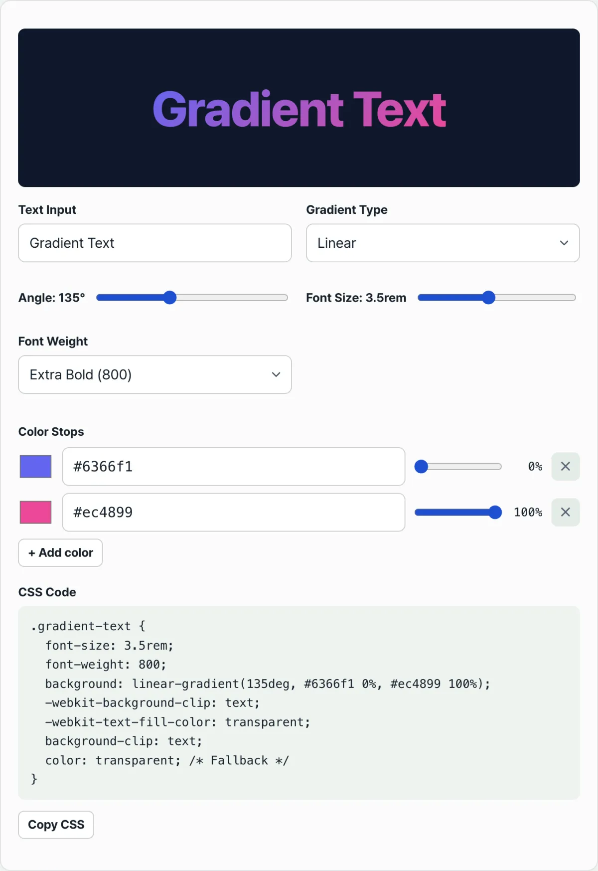
-webkit-) property names and calculating gradient angles and color stop values by hand, you can use the CSS Gradient Text Generator to dial in the angle, colors, and font size in real time and get CSS you can use right away.
See it in action with our tool.
Adjust the gradient color stops and angle visually, then copy CSS you can drop straight into your site's headings.
Watch out for these styling gotchas
Readability when text is selected: When a user drags to select your headline, text that's been clipped with background-clip can look distorted or disappear. It's a good idea to set background-color, color, and -webkit-text-fill-color separately on the ::selection pseudo-element so the selected text stays visible.
Dark mode and contrast ratio: If the middle color of your background gradient is close to the site's background color, the text can blend in and become hard to read. Check the contrast ratio between text and background, and if needed, shift the palette toward higher saturation and brightness.
Key properties at a glance
| Property | Role | |---
How it works under the hood: why these problems happen
Once you understand the technical root cause behind a problem, you can stay calm in any situation and arrive at the right fix.
1. The three-stage clip and fill rendering pipeline
Gradient text isn't about painting color onto ordinary text — it's a technique that masks the element's background into the shape of the text.
- Background painting: The
background: linear-gradient(135deg, #6366f1, #ec4899);property draws a giant gradient canvas across the element's entire border box. - Clipping mask definition:
-webkit-background-clip: text;andbackground-clip: text;restrict the visible background area to the inside of the rasterized text vector glyph shapes. All background outside the letters is cut away. - Glyph fill evacuation:
-webkit-text-fill-color: transparent;removes the solid fill (foreground color) the text has by default and makes it transparent. Only then does the masked gradient background hiding behind it become visible.
2. Dynamic shimmer and shine animation
Beyond a simple static gradient, an advanced animation where light sweeps across the text is born from combining background-size and background-position.
- Setting
background-size: 200% auto;widens the background gradient canvas to twice (200%) the actual text width. - Applying the
@keyframes shimmer { 0% { background-position: 0% 50%; } 100% { background-position: 200% 50%; } }animation slides that widened gradient canvas behind the letters, producing a highlight beam effect that looks like it's glowing.
3. Text selection and contrast protection
When a user drags across gradient text, the browser's default ::selection style kicks in and the background color changes to blue or similar. If the text fill is still transparent at that point, transparent letters sit on a blue background and nothing is visible. So you need defensive code that restores a fixed solid color in the selected state.
Gradient Typography Methods: Comparison Matrix
There's more than one way to put a gradient on text for the web besides CSS. Here's a clear comparison of the pros and cons of each approach.
| Comparison metric | CSS background-clip | SVG <text> + <linearGradient> | HTML5 Canvas createLinearGradient | Static PNG / WebP Image |
|---|---|---|---|---|
| Search engine machine readability (SEO) | Excellent (text is exposed) | Good (crawlable) | Poor (needs separate accessibility tags) | Poor (depends on alt tags) |
| Retina display scalability | Infinite scaling (crisp) | Infinite scaling (crisp) | Pixel matching required (resolution-dependent) | Fixed resolution (breaks when enlarged) |
| CSS keyframe animation | Supported (background-position) | Supported (SVG SMIL or CSS) | Complex (JavaScript RequestAnimationFrame) | Not possible (needs GIF/APNG, large file size) |
| Bundle size overhead | Almost none (< 1KB) | Low (~2KB) | High (includes JS logic) | Very high (hundreds of KB to MB) |
| Browser compatibility and prefixes | -webkit- vendor prefix required | Full standard support | Full standard support | Supported in all browsers |
As the table shows, its overwhelmingly small size, strong SEO ranking, and easy maintenance have made the CSS background-clip approach the industry standard on the modern web.
5 Common Gradient Text Styling Mistakes
Check these critical mistake patterns that ruin a beautiful gradient before you start, and skip the trial and error.
- Using
color: transparenton its own: If you makecolortransparent but leave out-webkit-background-clip: text, the background shows up as an unclipped rectangle while the text turns invisible — a complete mess. - Missing a fallback
colorfor older browsers: In very old browsers or unusual email clients that don't supportbackground-clip: textat all, the background isn't clipped. If the text is transparent at that point, the content becomes invisible. So to be safe, declare a solid fallback likecolor: #3b82f6. - Leaving
::selectionunstyled: If you ignore the way text disappears when a user drags to select a sentence, you do serious damage to usability (UX). - Ignoring broken line wraps in inline
<span>: When you apply a gradient to a sentence that runs across multiple lines, the gradient cuts off unnaturally at each line break. In that case, wrap it withdisplay: inline-blockor add thebox-decoration-break: cloneproperty so it flows naturally. - Violating the WCAG 4.5:1 contrast ratio: A light pastel gradient on a white background makes the text completely unreadable for visually impaired users or people outdoors. Core text should always have enough contrast with the background. The web accessibility contrast ratio (CR) formula is defined as CR = L1 + 0.05/L2 + 0.05 where L1 is the relative luminance of the lighter color and L2 is the relative luminance of the darker color. When you apply gradient text, the CR value between the background and the text must be at least 4.5.
A 5-Step Production-Level Workflow That Boosts Real-World Productivity
- Write semantic markup: Build the skeleton with semantically correct tags like
<h1>and<h2>. - Declare a vivid multi-stop background: Use
background: linear-gradient(...)to define a gradient background with rich color. - Apply the clipping and fill properties: Add
-webkit-background-clip: text;andbackground-clip: text;, then empty out the text with-webkit-text-fill-color: transparent;. - Set a fallback color and area: Add
color: (fallback solid color);and setdisplay: inline-blockorwidth: fit-contentso the background doesn't spread across the whole element. - Check the selection state and dark mode: Give
::selectiona high-contrast color and confirm the text is legible in both light and dark mode.
7 Gradient Text Styling Tips
- Make the most of
box-decoration-break: clone: It's the magic property that keeps the gradient from breaking off abruptly when a long sentence wraps, repeating it beautifully on each line. (The-webkit-prefix is required.) - A perfect match with bold font weights (700 and up): The larger the area where colors shift, the more striking a gradient looks. It delivers a dramatic effect with heavy fonts like Black or ExtraBold rather than thin ones (Light, Regular).
- Shimmer animation with
background-size: 200%: Add a gentle, flowing shine animation on top of a flat gradient to catch the eye. - Control the width of inline elements (
fit-content): Applying a gradient to a block-level element (h1, div) stretches the background into the empty space. Match the width to the content so the gradient sits tightly inside the text. - Ensure contrast across both light and dark mode: If even one gradient stop is too light or too dark, it can get lost in the background color. Pick vivid colors at mid-level brightness.
- The white-text rule for
::selection: In the drag highlight state, a brand color background with pure white text (#ffffff) gives the cleanest, most polished impression. - Use a CSS generator tool: Stop wasting time matching angles and color values by hand — pull safe, proven code in one go from a trusted web tool.
Final Decision Tree: Which Approach and Settings Should You Choose?
Pick the best text gradient method for your goal in one second.
- Typography-focused main heading (SEO matters) ➔ CSS
background-clip: text(most recommended) - Need complex vector masks or textures ➔ SVG
<text>and<linearGradient> - Particle effects or 3D text animation ➔ WebGL Shader Text (Three.js)
- Fixed graphic layout and avoiding web font loading ➔ Static Image (PNG / WebP)
In most production environments, the CSS approach — which guarantees accessibility and search engine visibility — is the best solution.
Key Terms Glossary and One-Line Cheat Sheet (Terminology)
- Gradient Text: A text effect where two or more colors blend and shift naturally instead of a single solid color.
- background-clip: text: A CSS property that clips (masks) an element's background to the outline (vector path) of its text.
- -webkit-text-fill-color: Sets the actual fill color of the text. It must be set to
transparentfor the background to show through. - box-decoration-break: clone: A property that renders the background or border independently on each line when a line break occurs.
- Shimmer Effect: A dynamic effect that shifts the background position (
background-position) so light appears to sweep across the surface of the text. - ::selection pseudo-element: Controls the style applied when a user selects (highlights) text by dragging with a mouse or touch.
- Vendor prefix (-webkit-): A prefix browser makers (WebKit and others) attach to support a new CSS feature on their own before it's standardized.
- WCAG contrast ratio: The brightness difference ratio between text and background under the Web Content Accessibility Guidelines (minimum 4.5:1 recommended).
Frequently Asked Questions
Q1. Why do I still need the -webkit- prefix in modern browsers?
A1. background-clip: text is now in the latest standard, but -webkit-text-fill-color started out as a non-standard property Apple created specifically for the WebKit engine. Because so many existing websites were written with code that includes this prefix, browser makers agreed to alias it for backward compatibility — so even today's Chromium browsers and Firefox still interpret and render the -webkit- version. In practice, the safest approach is to write the prefixed version alongside the standard one.
Q2. How do I make the gradient look good on text that wraps across multiple lines?
A2. Try adding -webkit-box-decoration-break: clone; and box-decoration-break: clone; to the element. Without this property, the gradient is sized against the start and end of the whole paragraph, so each line breaks off in a dull, choppy way. With clone, every line gets its own full gradient range, which makes the text look much brighter.
Q3. When a user drags to select my gradient text, the letters turn invisible! How do I fix that?
A3. It happens because the inner text color of gradient text is transparent. To fix it, you must add code at the bottom of your CSS file that restores the text to a solid color, such as ::selection { -webkit-text-fill-color: #ffffff; background-color: #3b82f6; }.
This article was adapted from our Korean original. Read the Korean original