
CSS Grid fr unit: why it beats % and px in responsive layouts
Contents
When you lock column widths in CSS Grid to % or px, the layout tends to break every time the number of items or the screen width changes. The fr unit means "the share of the leftover space after gaps and fixed widths are subtracted, divided by ratio," so it holds up far better in layouts like card lists or galleries where the count changes often. Add the repeat() syntax and you can compress repeated column definitions into one line — and even build a responsive grid whose column count adjusts to the screen width with nothing but CSS.
Summary ①
frdoesn't divide the total width — it divides the leftover space after gaps and fixed widths into proportional shares. ② Writingrepeat(3, 1fr)saves you from repeating1fr 1fr 1fr, and switching torepeat(auto-fit, minmax(200px, 1fr))adjusts the column count to the screen width with no media queries. ③ If you want to set your column and row counts and the gap, then copy the CSS right away, you can check it with a grid generator.
The problem: why % and px grids break when the screen width changes
You've probably tried width: 33.3% to line three cards up in a row. But the moment you add space (margin) between the cards, the widths add up to more than 100% and the third card gets pushed down to the next row.
To avoid that, you might hand-calculate something like calc(33.33% - 16px) to subtract the gap. But change the column count to four and you have to rewrite every one of those formulas. Fixing widths in px is simpler but worse: the cards don't shrink when the screen narrows, so they spill outside the container and you get horizontal scrolling or clipped layouts.
So both % and px force you to calculate for yourself "how much of the total width, gaps included, is my share." That's the root problem — every time the column count or gap changes, the math has to be redone.
The fix: start by understanding how fr divides the "leftover space"
The fr (fraction) unit in CSS Grid works in a different order. The browser first subtracts the gaps and any px-fixed tracks from the container width, then splits only the leftover space according to the ratio of the fr values. That means you never have to subtract the gap yourself.
The most basic three-column grid looks like this:
.grid {
  display: grid;
  grid-template-columns: repeat(3, 1fr);
  gap: 16px;
}
repeat(3, 1fr) is shorthand for 1fr 1fr 1fr, and it splits the width remaining after the two 16px gaps evenly across three columns (1:1:1). Want five columns? Change the number to repeat(5, 1fr) and the browser redoes the gap math for you.
You can also change the fr ratios to change the width proportions. For example, grid-template-columns: 2fr 1fr 1fr; creates a three-column layout where the first column is twice as wide as the other two. You can mix fixed tracks in as well: grid-template-columns: 240px 1fr; pins a sidebar at 240px and lets the main area take up all the leftover space (1fr).
If you want the column count itself to adapt to the screen width, put auto-fit in place of the repeat count and minmax() in place of the fr value.
.grid {
  display: grid;
  grid-template-columns: repeat(auto-fit, minmax(200px, 1fr));
  gap: 16px;
}
With this, the browser works out on its own how many columns fit across the screen width under the condition that "each column must be at least 200px." Wide screens get more columns, narrow screens get fewer, and the leftover space is distributed evenly across the columns by fr ratio again. You end up with a fully responsive grid without writing a single media query.
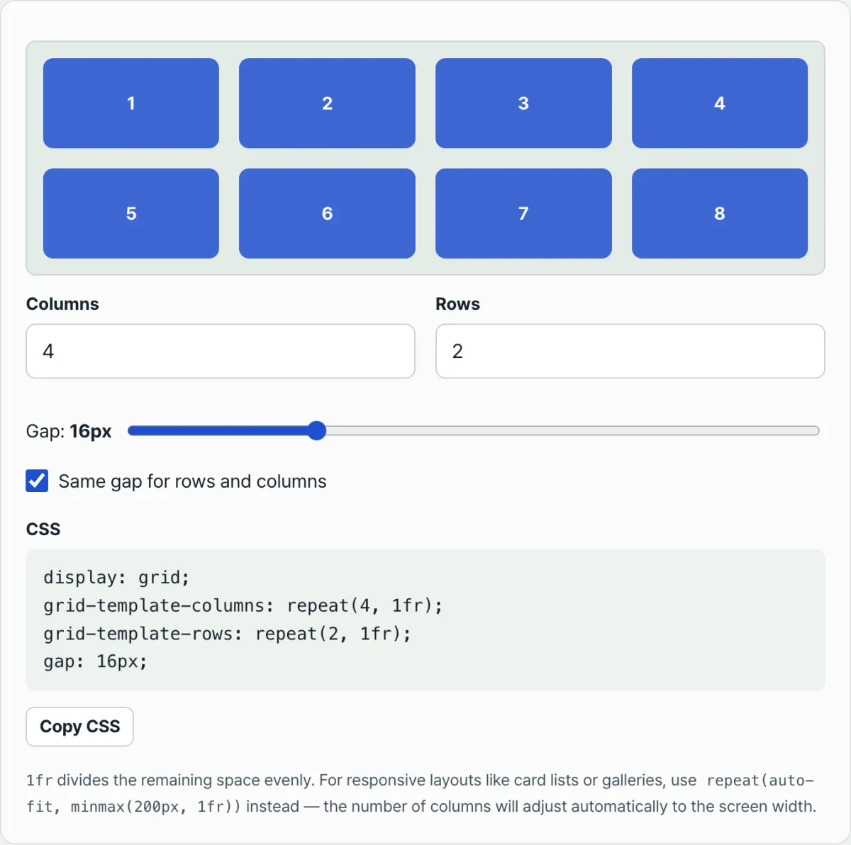
Use our tool to check whether the numbers you worked out match the layout you want.
Free · no sign-up · adjust columns, rows, and gap and copy the CSS instantly
Common sticking points
| Situation | Cause | Fix |
|---|---|---|
It's 1fr, but images and text inside overflow | A grid item's default minimum width (min-width) is auto, so it won't shrink below its content size | Set min-width: 0 on that item |
| The gaps look wrong after I changed the column count | You set column-gap and row-gap differently and mixed them up | First check whether you're using one value for both or separate values |
auto-fit and auto-fill give different results | auto-fill keeps empty tracks occupying width, while auto-fit collapses empty tracks and gives that space to the existing items | Use auto-fit if you want cards to stretch and fill the row |
My 33.33% three-column layout drops to a fourth row | % doesn't account for gaps, so the widths add up to more than 100% | Replace it with repeat(3, 1fr) plus gap |
Wrapping up
The fr unit divides the "leftover space" left after gaps and fixed tracks, not the container's full width, so you never have to recalculate when the column count or gap changes. Add repeat() and minmax() and you can build a grid whose column count adapts to the screen width without media queries. If you'd like to combine values yourself and copy the CSS straight out, open the grid generator and take a look.
Free · no sign-up · adjust columns, rows, and gap and copy the CSS instantly
FAQ
Do I have to use repeat(3, 1fr) instead of grid-template-columns: 1fr 1fr 1fr?
The result is exactly the same. repeat() is just shorthand. Its real benefit is easier maintenance in code with many columns (12, say) or values that change often.
What exactly is the difference between auto-fit and auto-fill?
Both start the same way: they calculate how many tracks meeting the minmax condition fit across the screen width. The difference comes after that. auto-fill keeps empty tracks that no item fills, and they still take up width. auto-fit collapses those empty tracks to zero width and redistributes that space to the existing items by fr ratio. If you have few items and want them to fill the screen, use auto-fit; if you want track widths to stay consistent, use auto-fill.
Can I mix fixed widths and fr on the same line?
Yes. With grid-template-columns: 240px 1fr 1fr;, the first track is fixed at 240px, and the remaining space (total width − 240px − gaps) is split in half between the two 1fr tracks. It's a common combination when you want a fixed-width sidebar and a main area that grows and shrinks responsively.
This article was adapted from our Korean original. Read the Korean original