
CSS Page Curl Effect: Fold a Card Corner with Pure CSS
Contents
- Why the Paper Curl Effect Is a Hassle
- Building a Folded Paper Corner with CSS
- Things to Watch For in Real Projects
- Key Values at a Glance
- Wrap-Up
- Core Technical Mechanics: Why These Problems Happen
- Best Settings for Each Situation, with Comparison and Analysis
- 5 Critical Mistakes People Make, and How to Avoid Them
- 5-Step Interactive Workflow
- 7 Paper Styling Tips
- Final Decision Tree: Which Corner Fold Style Should You Pick?
- Key Terms Glossary and Cheat Sheet
- Frequently Asked Questions
On online magazines, e-book cards, and moody portfolio sites, the design trick that makes a card corner curl up slightly like real paper is the CSS page curl (fold) effect. Instead of matching gradient angles and pixel values by hand one at a time, once you understand how it works you can change a few values and apply it to whatever card you want. This post covers how the folded corner is built and how to pull it off in pure CSS.
Summary ① You can get a folded-paper, three-dimensional look with pure CSS alone (a linear gradient plus a pseudo-element), with no images. ② The background gradient cuts the corner off diagonally, and the ::before pseudo-element layers a folded triangular flap and a shadow on top. ③ Instead of working out the angle, width, and shadow values yourself, you can pick a direction tab, move sliders, and get the code right away.
Why the Paper Curl Effect Is a Hassle
In the past, people stuck a triangular PNG piece on a card corner to make it look folded. But when the background color changed or the card size changed, the image would shift and look wrong. Modern CSS combines linear-gradient corner cut-offs on pseudo-elements (::before, ::after) with box-shadow to get the same effect without images. The catch is that nudging the angle, pixel width, and shadow darkness one at a time and eyeballing it takes a lot of work.
Building a Folded Paper Corner with CSS
How the Fold and Shadow Fit Together
When paper curls up diagonally, what you see at the card's corner comes from two pieces working together. One is the folded triangular flap that lifts up (Folded Flap), and the other is the diagonal cast shadow that falls beneath it (Cast Shadow). For the two to line up exactly without drifting, this relationship has to hold.
Gradient cut-off point (px) = ::before border thickness (border-width, px)
- Fold diagonal angle: For a top-right corner,
linear-gradient(-135deg, ...)creates the transparent-to-opaque boundary along the diagonal. The same direction is sometimes written as225deg, but since -135 + 360 = 225, both values point to exactly the same angle — it's just a different way of writing it. - Fold size: This is the px value in the relationship above. It sets both the point where the background gradient switches from transparent to paper color and the width and height of the ::before pseudo-element. If the two values differ, the edge of the cut corner and the edge of the triangular flap fall out of line and you see a seam.
- Curved shading (box-shadow): A soft shadow cast behind the folded paper surface suggests the paper's thickness.
Implementing It in Code
The example below is a responsive CSS card whose corner folds further on mouse hover.
<div class="curl-card">
  <h3>E-Book Chapter 01</h3>
  <p>디지털 스크린 위에서 펼쳐지는 실물 종이 질감의 아날로그 감성 인터랙션 가이드.</p>
</div>
.curl-card {
position: relative;
width: 320px;
padding: 32px 24px;
background: #ffffff;
color: #1e293b;
border-radius: 4px;
box-shadow: 0 4px 12px rgba(0, 0, 0, 0.08);
/* Mask the top-right corner by cutting it out of the background (size=32px) */
background: linear-gradient(
225deg,
transparent 32px,
#ffffff 32px
);
overflow: hidden;
transition: all 0.3s ease;
}
/* The curled-up triangular paper flap (Folded Corner, width/height = 32px, same as the gradient above) */
.curl-card::before {
content: '';
position: absolute;
top: 0;
right: 0;
width: 0; height: 0;
border-style: solid;
border-width: 0 32px 32px 0;
border-color: transparent #e2e8f0 transparent transparent;
box-shadow: -3px 3px 6px rgba(0, 0, 0, 0.15);
transition: all 0.3s ease;
}
/* On hover the paper folds deeper for an interactive feel (size=48px) */
.curl-card:hover {
background: linear-gradient(
225deg,
transparent 48px,
#ffffff 48px
);
}
.curl-card:hover::before {
border-width: 0 48px 48px 0;
box-shadow: -5px 5px 12px rgba(0, 0, 0, 0.25);
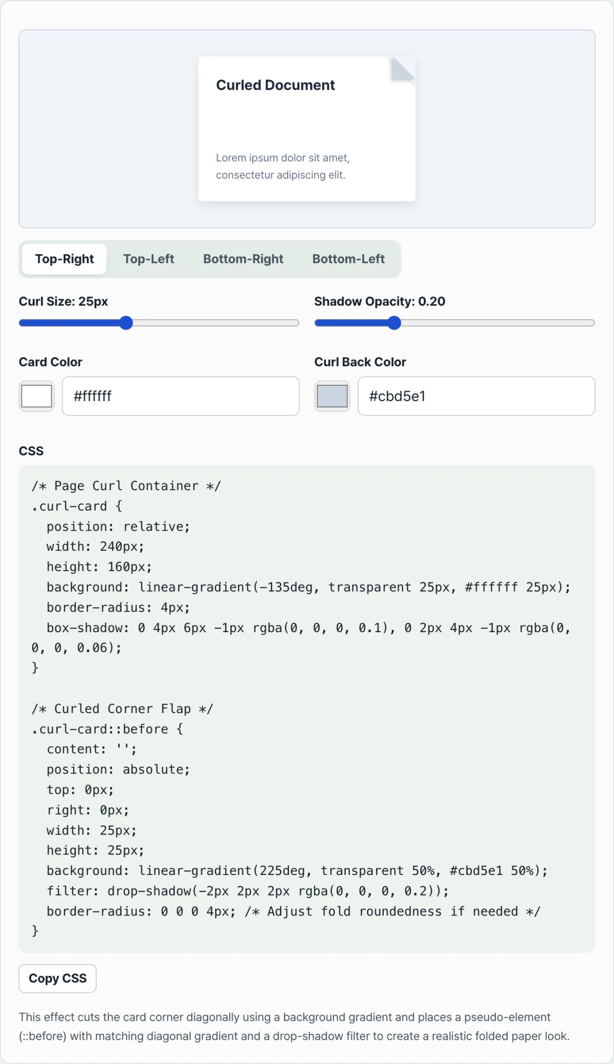
}Note Instead of lining up the gradient angle and border-width pixel values by hand every time to test the fold ratio, you can use the CSS Page Curl Effect Generator. Pick the corner direction with tabs, set the fold size and shadow strength with sliders, and adjust the card color and the folded back color with color pickers, then copy the finished CSS.
Instead of changing values by hand one at a time to see how they look, choose the corner direction with tabs and set the size and shadow strength with sliders — then check the result with our tool.
Adjust the folded corner size, shadow depth, and card color, then copy the CSS for a modern analog paper feel right away.
Things to Watch For in Real Projects
- Conflicts with the border property: If you've cut the corner with background: linear-gradient and then apply border: 1px solid #ddd to the whole card, the border won't follow the diagonal cut and will look broken. If you need a border, box-shadow: inset 0 0 0 1px #ddd is the recommended way to draw the outline inside the card.
- Fixing the flap color in dark mode: In dark mode, when the card surface is dark, set the folded triangular flap (::before) to a slightly lighter tone than the card so the fold stands out clearly.
Key Values at a Glance
| Item | Default state | Hover state |
|---|---|---|
| Gradient cut-off boundary (size) | transparent 32px → #ffffff 32px | transparent 48px → #ffffff 48px |
| Triangular flap border width (size) | 0 32px 32px 0 | 0 48px 48px 0 |
| Shadow | -3px 3px 6px rgba(0,0,0,0.15) | -5px 5px 12px rgba(0,0,0,0.25) |
Wrap-Up
- The page curl effect works with no images — linear-gradient masking plus a ::before pseudo-element is all you need.
- Control the fold size with the gradient boundary value and border-width, and the sense of thickness with box-shadow.
- Using the border property as-is leaves the cut corner looking broken, so swapping in an inset box-shadow is the safer choice.
- Rather than calculating values yourself, you can also adjust sliders and see the result right away.
Adjust the folded corner size, shadow depth, and card color, then copy the CSS for a modern analog paper feel right away.
Core Technical Mechanics: Why These Problems Happen
The physical principles behind combining the CSS border triangle trick with gradient masking:
1. Border Triangle Generation on ::before
The folded paper flap is a right isosceles triangle created using only border width, starting from a zero width and height.
width: 0; height: 0;
border-style: solid;
border-width: 0 32px 32px 0;
border-color: transparent #e2e8f0 transparent transparent;
The code above creates a right isosceles triangle flap exactly 32px in size at the top-right corner.
2. Background Masking Alignment
The corner of the card body that disappears when folded is masked and cut away with a linear gradient. Here, S is the size of the flap in px. linear-gradient(225°, transparent S, CardBackground S)
3. Smooth Morphing Transition
Transitioning the background gradient position and the border-width (or transform: scale()) at the same time on :hover produces a smooth interaction that looks like paper peeling back with a bit of spring.
Best Settings for Each Situation, with Comparison and Analysis
Use this matrix of page fold and curl techniques to pick the best implementation for your project.
| Comparison Item | Pure CSS Gradient + Border Triangle | CSS clip-path: polygon() + Flap | SVG Mesh Warp / Displacement | 3D WebGL / Canvas | Static Image Overlay |
|---|---|---|---|---|---|
| Mobile GPU efficiency | Best (fastest) | High | Moderate | Low (heavy battery drain) | High |
| Flexibility on resize | Excellent | Excellent | Moderate | Low | Very low |
| Bundle size overhead | None (0KB) | None (0KB) | Small (XML) | Very large (hundreds of KB) | Large (image assets) |
| Theme customization | Fully flexible (CSS variables) | Fully flexible | Requires attribute changes | Requires texture swaps | Requires rework |
| Hover animation | Smooth | Limited | Complex to implement | Flashy | Not possible |
5 Critical Mistakes People Make, and How to Avoid Them
- Mismatch between the background gradient cut size (S) and the
::beforeborder-width: If the two values differ, you get a visible gap or overlap at the fold. Always use mathematically identical pixel values. - Applying
border-radiusto the folded corner: A diagonal cut corner and a rounded border clash and create an unnatural shape. Set border-radius to 0 wherever the corner folds. box-shadowpointing the wrong way: Shading in the wrong direction makes the paper look sunken inward instead of raised up. Cast a soft shadow opposite to the fold direction.- Forgetting
overflow: hiddenon the card container: The folded flap or shadow can spill outside the card and render messily, so controlling overflow is essential. - Ignoring backface contrast in dark mode: In dark mode, if the folded backface flap doesn't stand out from the background, the effect disappears. Use a brightness difference to bring back the sense of depth.
5-Step Interactive Workflow
- Step 1: Define the card's base dimensions and internal padding.
- Step 2: Apply the diagonal corner cut. Example:
linear-gradient(225deg, transparent 32px, #ffffff 32px) - Step 3: Use the
::beforepseudo-element to build the right triangle flap. Example:border-width: 0 32px 32px 0 - Step 4: Add a soft diagonal cast shadow to give it depth. Example:
-3px 3px 6px rgba(0,0,0,0.15) - Step 5: Set up a smooth
:hoverstate so the fold gently grows to 48px on mouse over.
7 Paper Styling Tips
- Realistic backface tint: Set the folded backface color slightly darker than the original color (#f1f5f9 against #ffffff) to mimic the shading of real paper.
- Diagonal shine: Add a subtle diagonal light reflection on the fold using a second gradient stop to maximize the texture.
- Keep the fold size reasonable: A resting fold between 24px and 36px, expanding by 1.3× to 1.5× on hover, looks the most natural.
- Snappy elasticity: Use
transition: all 0.25s cubic-bezier(0.4, 0, 0.2, 1)to make the paper feel like it springs back. - Prevent pointer events: Set
pointer-events: noneon the flap pseudo-element so mouse events don't interfere with the card body. - Cross-check dark mode: Test carefully that the folded corner and shadow stay clearly visible against a range of dark mode backgrounds.
- Use a generator: Don't hand-calculate complex values. Use a dedicated CSS web tool that outputs clean code for you.
Final Decision Tree: Which Corner Fold Style Should You Pick?
Choose the fold style that fits your brand identity and the nature of your site.
- Minimal & modern branding ➔ Subtle Static Fold (a small 16–24px static fold with no hover animation)
- E-commerce & portfolios ➔ Interactive Hover Peel (a dynamic fold that curls up from 32px ➔ 48px on mouse over)
- Blogs & articles ➔ Bookmark Ribbon (a ribbon shape that sticks out from the side like a bookmark)
- Dashboards & productivity apps ➔ Sticky Note (a sticky note look with bright yellow tones and a slightly lifted bottom edge)
Key Terms Glossary and Cheat Sheet
- Page Curl: A dimensional visual effect that makes paper look like it's rolling up.
- Corner Fold: A design where a card's corner (usually the top right) is folded into a triangle.
- Border Triangle Flap: A right-triangle pseudo-element built from the width differences of CSS border properties.
- Diagonal gradient (linear-gradient 225deg): A CSS masking technique used to cut the background at a 45-degree angle.
- Skeuomorphism: A design movement that copies real-world textures and forms (paper, grain, and so on) directly into digital interfaces.
- Cast Shadow: The shadow a subject (the flap) throws onto the surface (the card body).
- Backface shading: The natural darkness that falls on the back side of folded paper.
- overflow: hidden: A CSS property that cleanly clips shadows or pseudo-elements that spill outside the card.
Frequently Asked Questions
Q1. Why do the background cut size and border-width have to match mathematically?
A1. If the two values don't match, the background gets cut too little or too much, leaving a transparent slit along the boundary with the flap. Even a 1px difference causes a visible break, so the S value must be exactly the same in both properties.
Q2. How do I keep the folded diagonal corner from breaking when I add border-radius to the card corners?
A2. If you apply border-radius to every corner at once, the cut-off diagonal gets rounded too and the graphic smears. To prevent that, set the radius of the folded top-right corner to 0, like border-radius: 8px 0 8px 8px, so it stays a right angle.
Q3. What's the best way to build a smooth hover expand animation?
A3. To avoid stuttering during the size change, instead of animating background-size or clip-path, transition CSS variables (custom properties) directly, or transition border-width and the transparent stop (in px) using the same unit. That gives the best performance and smoothness.
This article was adapted from our Korean original. Read the Korean original