
CSS pulse heartbeat animation: keyframes and ripple rings
Contents
Why You Need Pulse and Heartbeat Animations
Elements users shouldn't miss — a live broadcast status indicator, a sign-up button, a pulse reading result card — stand out better when they move with some rhythm than when they sit still. In particular, a double-beat motion that mimics a heartbeat, or a pulse ring that sends out waves, is commonly used to visually signal that something is happening right now.
The catch is that building these motions by hand with keyframes means lining up scale values and timing points at every stop, one by one. A pulse ring looks right only when size and opacity change at the same rate, and a heartbeat looks choppy if the ratios across the six stops don't line up. Change one value, refresh the browser, check it by eye, repeat — the time adds up fast.
How to Build a Concentric Pulse Ring and Heartbeat Yourself
The core of the pulse ring effect is to layer a translucent copy of the same shape over the original button using the ::after pseudo-element, then grow that layer's scale while dropping its opacity from 0.8 to 0 as the animation runs. Size and opacity change together in the same rhythm, so it looks like light spreading outward and fading away.
The heartbeat goes one step further and places different expansion ratios at six stops. The 0% starting point is the base size, scale(1), and at 14% it swells slightly into a short first peak. The height of this first peak is set by the formula scaleShort = 1 + (scale - 1) × 0.4, so with an expansion ratio (scale) of 1.2 it only grows to scale(1.08). Then at 28% it comes all the way back to scale(1), creating a short pause between the two beats.
At 42% it snaps outward again to exactly the expansion ratio you chose (for example, scale(1.2)) for the second main peak, and from 70% to 100% it eases back to the original scale(1). One short beat, one big beat — that rhythm feels like a real heartbeat.
Here is the HTML and CSS for both motions, the concentric wave ring and the heartbeat.
<!-- 1. Live status wave pulse ring button -->
<button class="pulse-ring-btn">
  <span class="live-dot"></span> LIVE BROADCAST
</button>

<!-- 2. Heartbeat icon -->
<div class="heartbeat-icon">❤️</div>
/* 1. Concentric wave pulse ring style */
.pulse-ring-btn {
position: relative;
padding: 12px 28px;
font-weight: 700;
color: #ffffff;
background-color: #ef4444;
border: none;
border-radius: 9999px;
cursor: pointer;
}
.pulse-ring-btn::after {
content: '';
position: absolute;
top: 0;
left: 0;
width: 100%;
height: 100%;
background-color: #ef4444;
border-radius: 9999px;
z-index: -1;
animation: pulse-wave 1.8s cubic-bezier(0, 0, 0.2, 1) infinite;
}
@keyframes pulse-wave {
0% {
transform: scale(1);
opacity: 0.8;
}
100% {
transform: scale(1.6);
opacity: 0;
}
}
/* 2. Heartbeat double-peak beat style */
.heartbeat-icon {
display: inline-block;
font-size: 40px;
animation: heartbeat-beat 1.3s ease-in-out infinite;
}
@keyframes heartbeat-beat {
0% { transform: scale(1); }
14% { transform: scale(1.08); }
28% { transform: scale(1); }
42% { transform: scale(1.2); }
70% { transform: scale(1); }
100% { transform: scale(1); }
}Note Instead of calculating keyframe percentages and scale values yourself, typing them in, and checking the result every time, you can use the CSS Pulse & Heartbeat Animation Generator tool to preview wave speed, expansion ratio, and easing in real time and copy the finished CSS right away.
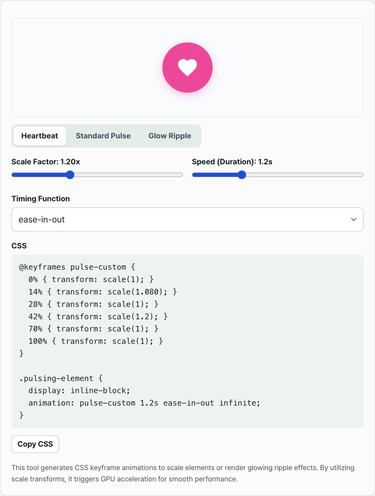
Try it in our tool. Pick one of the heartbeat, basic pulse, or glow ring presets, adjust the expansion ratio, speed, and easing with the sliders, and you'll see the result in the preview right away.
Adjust the pulse speed, scale, and easing in real time, then copy the optimized CSS heartbeat stylesheet.
Heartbeat Double-Beat Timeline at a Glance
The width of the first peak (14%) is set by the formula scaleShort = 1 + (scale - 1) × 0.4 based on the expansion ratio (scale) you choose, and the second peak (42%) uses that scale value as-is. The table below is calculated using the tool's default, scale 1.2.
Progress point
Scale
Meaning
0%
1.00
Base size
14%
1.08 (based on scale 1.2, calculated with the formula)
First peak (short swell)
28%
1.00
Fully back to base size (rest)
42%
1.20 (your chosen scale value, as-is)
Second main peak (hard snap)
70%–100%
Back to 1.00
Eases back to the original size
Tips for Using This in Real Projects
- Write it around transform and opacity. Changing properties like width and height directly in a pulse animation triggers a layout recalculation (reflow) on every frame. Using only transform: scale() and opacity, as in the examples above, gets GPU acceleration and plays back more smoothly.
- Use z-index to set the stacking order. So the ::after wave ring doesn't cover the button text as it spreads, set position: relative on the button and z-index: -1 on the ring element so it sits behind the text.
Summary
A pulse ring is an animation that grows the ::after pseudo-element and lowers its opacity so it looks like a wave spreading out and fading, while a heartbeat places different scale values at six stops — 0, 14, 28, 42, 70, and 100% — to express a double beat.
Both effects run on transform and opacity alone, so they play without any layout recalculation, and adding position: relative with z-index: -1 keeps your text or icon from being hidden behind the wave ring.
Instead of changing values one at a time and checking in the browser, you can use the tool below to adjust with presets and sliders and copy the CSS right away.
Adjust the pulse speed, scale, and easing in real time, then copy the optimized CSS heartbeat stylesheet.
Frequently Asked Questions
Can I use the generated CSS as-is in my project?
Yes. Paste the @keyframes code you copied exactly where it belongs and apply the class to your target element, and it works right away. Note that the examples above use hand-named classes like .pulse-ring-btn and .heartbeat-icon for clarity, while the CSS you actually copy from the tool below is generated with the class name .pulsing-element by default — so just change the class name to fit your project.
Why can't I adjust the expansion ratio for the glow ring effect?
The glow ring (Ripple) preset is built mainly around a box-shadow spreading outward, so it lets you adjust only speed and easing instead of an expansion ratio. That's because it expresses the wave through a spreading shadow rather than by scaling up the element the way the pulse ring does.
How does the heartbeat preset create that double-beat feel?
It places different scale values at six stops — 0%, 14%, 28%, 42%, 70%, and 100% — to build a double-beat keyframe that beats once short and once big. At 14% it bounces up briefly to the height calculated by scaleShort = 1 + (scale - 1) × 0.4, at 28% it returns fully to scale(1), then at 42% it snaps out hard to exactly the scale value you chose, and from 70% to 100% it eases back to the original size.
This article was adapted from our Korean original. Read the Korean original