
CSS Typing Effect: How Typewriter Text and Cursor Blinking Work
Contents
- The typing effect: why does it look like JavaScript?
- How to verify it: build it yourself in code
- Common sticking points
- Recap
- Core technical mechanism: the CSS masking reveal model and step functions
- Comparison Table: Ways to Build a Text Typing Effect
- 5 Common CSS Typing Mistakes
- Pixel-Perfect Typing Effect: A 5-Step Workflow
- 7 Tips for Typing Animations
- Decision Tree: How to Choose a Text Reveal Animation
- Terminology Cheat Sheet
- Frequently Asked Questions
When you see a line of text with a typing effect, it looks like JavaScript is drawing it in one character at a time. The blinking cursor next to it makes it feel even more that way. But this effect is built with nothing but two pure CSS animations.
Summary ① The characters appearing one by one isn't text being added — it's a CSS animation that grows the element's width from 0 to the full character count ②
overflow: hiddenhides the characters outside the width that hasn't grown yet, so the text looks like it's appearing as the width increases ③ The cursor beside it is a separateborder-rightplus a blink animation. It just runs at the same time as the typing animation — the two are different effects
The typing effect: why does it look like JavaScript?
Because the characters appear one after another with a delay, most people assume JavaScript is appending the string one character at a time with something like setInterval. Plenty of libraries really do implement it that way.
But you can create the same illusion with CSS alone. Put the entire text inside the element from the start, then animate the element's width from 0 to the full text width. If you set overflow: hidden on the element, the characters in the part the width hasn't reached yet don't show on screen.
As the width grows little by little, the hidden characters behind it are revealed in order. So in reality you're not adding text — a "cover" is just sliding out of the way. And if that width increase runs smoothly, the reveal looks like it's flowing pixel by pixel instead of character by character.
That's where CSS's steps() timing function becomes the key. With steps(character count, end), the width animation doesn't glide — it jumps in exactly as many hard steps as there are characters. Pair that with a monospace (fixed-width) font, where every character has the same width, and the CSS unit ch, which means the width of one character, and one step matches exactly one character.
How to verify it: build it yourself in code
First, on the element that wraps the text, set overflow: hidden, white-space: nowrap, and font-family: monospace. You need to block line breaks and overflow for the width animation to behave the way you intend.
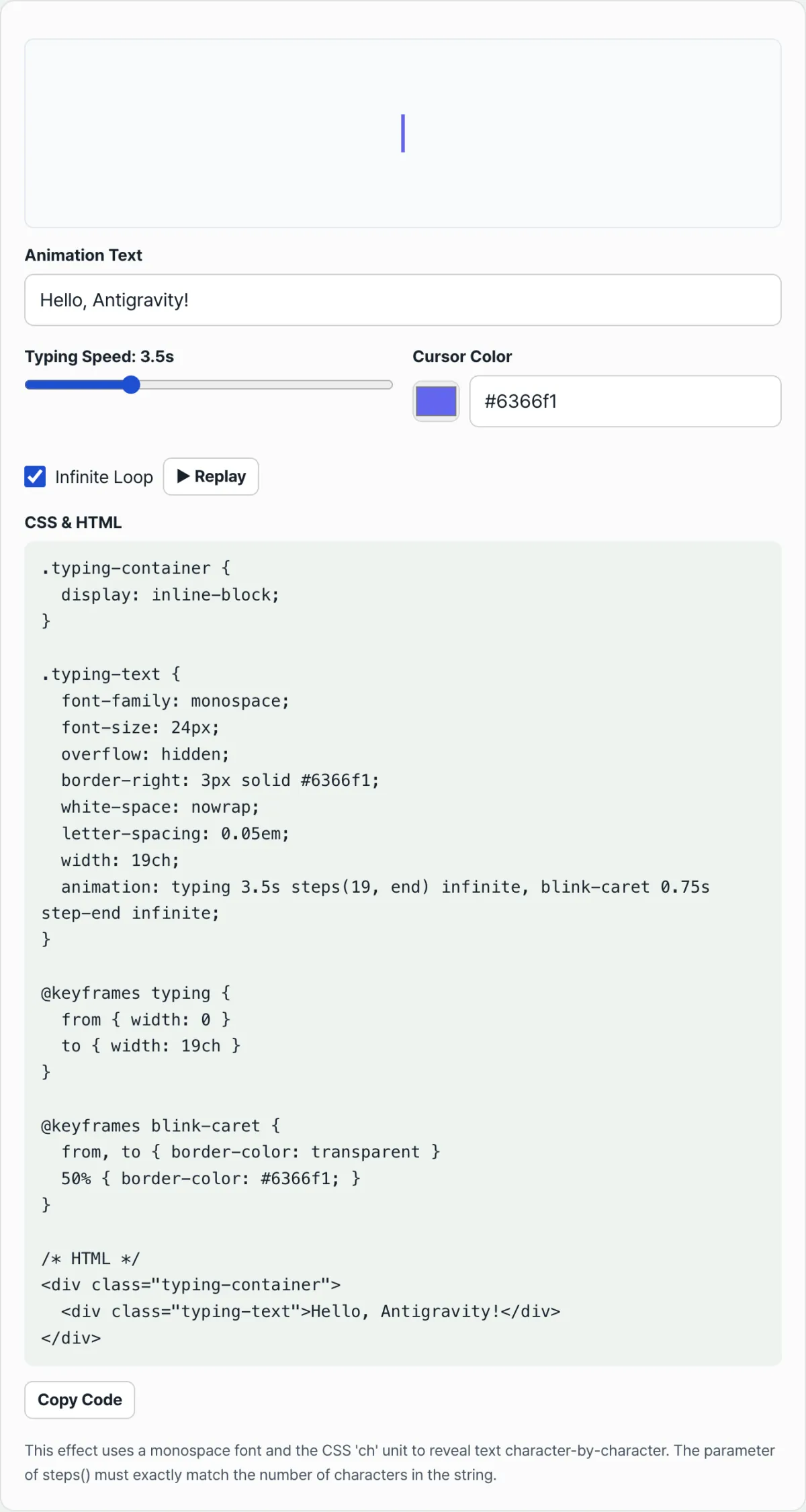
Next, create a keyframes rule that grows the width from 0 to the character count (for example, 20ch for 20 characters), and set duration and steps(character count, end) in the animation property. If that value doesn't match the actual character count, you get a mismatch: either the animation keeps running after all the text is visible, or the animation finishes while the last character still isn't showing.
The cursor is built separately. Draw a vertical line with border-right, then attach a blink-caret animation that toggles border-color between transparent and the cursor color, chaining it on with a comma. You need step-end so the cursor snaps on and off instead of fading gradually.
Check it with our tool. Enter your text, typing speed, and cursor color, and it immediately generates CSS and HTML code calculated on these same principles, with a live preview.
Free · no sign-up · generate CSS right in your browser
Common sticking points
| Situation | Cause |
|---|---|
| Changing the text doesn't replay it from the start | The width animation starts when the element is newly rendered, so you have to remount the element when the text changes for it to replay from the beginning |
| Typing looks unnatural in a normal font | Each character has a different actual width, so it doesn't match the ch width — the text shows up early or leaves extra space at the end |
The steps() number doesn't match the character count | The animation's pace and the characters actually visible fall out of sync, so the last character shows up late or is revealed too early |
| The cursor sits there without blinking | You added border-right but didn't attach a separate blink-caret animation along with it |
Most of the situations in the table come down to a mismatch between "the steps value of the width animation" and "the actual character count." If you always calculate both values in the same place, that mismatch can't happen.
Recap
In a typing effect, characters appearing one by one isn't text being added — it's a CSS animation that grows, in steps() units, the width of an element whose overflow is hidden by overflow: hidden. The cursor blinking beside it is just a border-right with a separate blink animation added on top.
If all you need is one line of text typed once and repeated, these two animations together are enough — no JavaScript required.
Free · no sign-up · generate CSS right in your browser
Core technical mechanism: the CSS masking reveal model and step functions
How does it look like characters are being added one at a time without JavaScript? It's thanks to the CSS Width Masking Reveal Model.
1. The masking illusion (Overflow Masking)
The text isn't actually being added to the DOM dynamically. It exists in the DOM complete from the start. It's just that overflow: hidden on the parent container clips and hides the text outside the current width.
When you gradually grow the width with a @keyframes typing { from { width: 0; } to { width: Nch; } } animation, the hidden characters are revealed one after another.
2. The steps(N, end) step timing function
The steps() function is what makes a width that would otherwise stretch out smoothly instead break into hard "one character" increments.
Expressed as a formula, it looks like this:
At time tk = k/N · T, width jumps to k/N × Nch = kch
Over the total time T, the width makes exactly N discrete jumps in a staircase pattern, and each jump increases the width by exactly 1ch.
3. Why the ch unit and monospace fonts are essential
The CSS unit 1ch means the width of the digit "0" in the current font.
- Monospace font: Every character (A, i, W, and so on) has the same width of 1ch. So the rule "1 step of width increase = 1 character revealed" holds perfectly.
- Proportional font: Widths differ — "i" is about 0.3ch, "W" is about 1.2ch. Because of that, the step increment and the character width fall out of sync and the typing illusion breaks.
4. Cursor blink as a separate animation
The cursor blinking at the end of the text is a completely independent effect, separate from the text animation. It's usually drawn using the right border of the text container (border-right: 3px solid).
Then you attach an animation that switches border-color between transparent and the chosen color, making sure to use step-end so the color snaps on and off like a blade rather than fading.
Comparison Table: Ways to Build a Text Typing Effect
Here's how pure CSS stacks up against JavaScript-based approaches.
| Approach | How it works | JS dependency | Font constraints | Multi-line support | Customization flexibility | SEO text crawling |
|---|---|---|---|---|---|---|
| Pure CSS Width Mask | Reveals text by animating a cover using steps() and the ch unit | 0KB (none) | Monospace required | Hard (single line recommended) | Low | Perfect (in the DOM from the start) |
| JS innerHTML Append | Adds text to the DOM one character at a time with setInterval | High | None (any font works) | Moderate | Very high | Can be an issue (client-side rendering) |
| GSAP SplitText | Splits text into pieces and staggers the delay on each | High (library required) | None (any font works) | Excellent | Very high | Perfect |
| Typed.js Library | A well-known JS library built specifically for typing animations | High (library required) | None (any font works) | Excellent | Highest (backspace support, etc.) | Depends on configuration |
| SVG stroke-dashoffset | An SVG path effect that looks like handwriting being drawn | 0KB – low | (Depends on the SVG path) | Not possible | Limited to path drawing | Text not exposed |
5 Common CSS Typing Mistakes
These are the five mistakes that come up most often when you write a typing animation.
- Using a proportional font: Character widths aren't uniform, so letters look half-cut in the middle of the animation.
- Miscounting the number of steps: People forget that Korean, Japanese, and Chinese characters take up about twice the width of a Latin letter (about 2ch), so the animation cuts off partway through.
- Using smooth easing (ease, linear): If you use a smooth timing function instead of
steps(N, end), you don't get typing — you get a slide-mask effect where the text glides in sideways. - Leaving out
white-space: nowrap: Once the text gets long enough to wrap, the horizontal width-masking view falls apart completely. - Leaving out
animation-fill-mode: forwards: Without this property, the animation snaps back to its initial state (width: 0) as soon as it hits 100%, so the finished text vanishes right in front of you.
Pixel-Perfect Typing Effect: A 5-Step Workflow
- Set up the text container: Give the element wrapping your text
overflow: hidden; white-space: nowrap;so it acts as a cover and prevents line breaks. - Apply a monospace font: Set
font-family: 'Fira Code', 'Courier New', monospace;on the element so every character has the same width. - Count the characters (N) accurately: Count the total number of characters, including spaces. Latin letters and digits count as 1 each; CJK characters such as Korean and Chinese count as 2 each.
- Hook up the typing keyframes to the steps animation: Define
@keyframes typing { from { width: 0 } to { width: Nch } }and applyanimation: typing 2s steps(N, end) forwards;to the element. - Add an independent blinking cursor: Draw the cursor on the same element with
border-right: 2px solid;, define@keyframes blink-caret, and add a blinking animation on a separate assignment usingstep-end.
7 Tips for Typing Animations
- Always set
forwardsmode: If you want the text to stay on screen after typing finishes, never forgetanimation-fill-mode: forwards. - Always use
step-endfor the cursor blink: To get that crisp terminal-cursor blink, usestep-endinstead ofease. - Add an initial delay: Give readers a moment to get ready by adding something like
animation-delay: 1sbefore the typing starts. It feels much more natural. - Handle CJK characters: When you apply this to Korean or Japanese, increase the target
widthtoN2chand set steps toN2. You can also useem, a unit relative to font size, to match the width manually. - Chain multiple lines: To type out several lines, give each line element a progressively longer
animation-delayso the next line starts right as the line above finishes. - Hide the cursor after typing ends: If an endlessly blinking cursor bothers you, set a repeat count like
animation: blink-caret 0.75s step-end 5so the cursor blinks a few times and then disappears. - Use a generator: If writing the CSS by hand and counting characters is a hassle, use the free generator web tool on this page to get code with the character count and steps already calculated for you.
Decision Tree: How to Choose a Text Reveal Animation
Which approach should your project use?
- Q1. Is the font you have to use proportional?
- Yes ➔ GSAP SplitText or a JS-based library (Typed.js)
- No (monospace is fine) ➔ Go to Q2
- Q2. Does the text need to wrap across multiple lines automatically?
- Yes ➔ A JS-based library
- No (single line or manual line breaks) ➔ Go to Q3
- Q3. Do you need a pen-on-paper handwriting effect?
- Yes ➔ SVG stroke-dashoffset handwriting animation
- No ➔ Pure CSS steps()-based typing effect (best performance, zero dependencies)
Terminology Cheat Sheet
- Typewriter Effect: A visual effect where text appears one character at a time, like a mechanical typewriter or a terminal window.
- Step function (steps()): A CSS animation timing function that cuts between frames instantly a set number of times instead of smoothly interpolating in-between frames.
- ch unit (Character Unit): A CSS font-relative length unit. It equals the width of the "0" digit in the current font.
- Monospace Font: A font designed so every character has the same horizontal width (e.g., Courier, Fira Code).
- Overflow Masking: A technique that uses
overflow: hiddento hide anything outside a specific area. - Cursor Blink: The effect where a thin rectangular or line-shaped cursor at the end of the typed text appears and disappears at regular intervals.
- Width Animation: A CSS transition or animation where the width grows from
width: 0to a target size. - CJK double-byte characters: Chinese, Japanese, and Korean characters, which take up roughly twice the space of Latin letters even in a monospace setting.
Frequently Asked Questions
Q1. Why is a monospace font a must-have for a typing effect, not just a nice-to-have?
A1. The steps(N) function splits the specified target width (Nch) into exactly N equal-length intervals. If each character's actual width differs, some characters are narrower than one step, so part of the next character shows too, while wider characters aren't fully revealed yet. For the formula of 1 step = 1 character revealed to hold, every character has to be exactly 1ch wide.
Q2. How do you handle CJK characters, like Korean, that take up 2ch of width?
A2. There are two approaches. First, double both the target width and the steps value. For example, for 10 Korean characters, use width: 20ch; steps(20). Second, use the em unit (the font size itself) instead of ch and tune the ratio by hand. Lately, to fully support proportional fonts and Korean, a common trend is to mix in a JS approach that appends characters one at a time instead of relying on pure CSS.
Q3. Why shouldn't you use smooth easing for the cursor blink animation?
A3. A real computer terminal or typewriter cursor only exists in On/Off states, like a digital signal. If you use ease or linear to smoothly change opacity from 0 to 1, it looks less like a cursor and more like a broken fluorescent light or a breathing LED, which seriously hurts immersion. Using step-end, where the color switches abruptly, is the key detail that keeps the terminal realism alive.
This article was adapted from our Korean original. Read the Korean original