
CSS typing text effect with steps() and ch units, explained
Contents
- Why You Need a CSS Typing Animation
- Building a Typing Effect in Pure CSS
- What to Check Before You Apply It
- Wrapping Up
- Core Technical Mechanics: How CSS Typing Works
- Text Typing Implementation Comparison Matrix
- 5 Critical Mistakes When Building a Typing Animation
- A 5-Step Production-Level CSS Typing Workflow
- 7 Tips for Typing Text Effects
- Decision Tree for Choosing a Typing Implementation
- Terminology Cheatsheet
- Frequently Asked Questions
A profile intro on a developer portfolio, the reply bubble in an AI chatbot conversation, a landing page headline — whenever text appears one character at a time, like someone typing live on a keyboard, that's a CSS typing text animation. In the past you built it with JavaScript timers like setInterval() or requestAnimationFrame(), slicing a string character by character and pushing it into the DOM. But combine the steps() easing function, the ch character unit, and a cursor blink animation drawn with border-right, and you can get the same effect in pure CSS. This post walks through how the steps() step function works, how to write the code yourself, and how to use a tool that does the math for you.
Summary ① Combining steps(N, end) with the ch unit lets you build a typing animation in pure CSS. ② Instead of counting characters by hand to work out the steps value and width, you can let a tool calculate them for you. ③ Check up front whether you're using a monospace font, and watch out for how you handle multilingual characters such as Korean.
Why You Need a CSS Typing Animation
Building a typing animation in JavaScript means writing a timer and, on every frame, cutting the string down one character and pushing it into the DOM. The code gets long, and you have to worry about performance separately. With pure CSS you can skip all that timer logic and get the same effect from the steps() easing function and a width animation alone — but you still have to work out steps(N) and width(Nch) to match the exact character count of your sentence.
Building a Typing Effect in Pure CSS
The steps(N) Step Function and the ch Unit
A CSS typing animation works by growing the width of the box that holds the sentence from 0 to the total character count N, in discrete steps. Expressed as an actual CSS timing function, it looks like this.
steps(N, end) is an easing function that divides the animation's duration into N equal intervals, and at the end of each k-th interval (overall progress k/N) it jumps the width to k × 1ch.
Here are the key properties involved.
- Character unit (1ch): The CSS ch unit is the horizontal width of the "0" glyph in the current font. Apply a monospace font and every single character has exactly the same width: 1ch.
- Stepped easing steps(N, end): Instead of a smooth curve, this splits the easing into N equal steps, producing the mechanical, stop-and-go motion of a typewriter where the text advances one character at a time.
- white-space: nowrap & overflow: hidden: These stop the sentence from wrapping to the next line and hide the portion on the right that hasn't been "typed" yet.
CSS Code That Includes the Blinking Cursor
Below is a pure CSS implementation where a typewriter cursor blinks as it writes out a single sentence.
<div class="typing-container">
  <h1 class="typing-text">Hello, World! I am a Full-Stack Engineer.</h1>
</div>
.typing-container {
display: inline-block;
background-color: #0f172a;
padding: 24px;
border-radius: 12px;
}
.typing-text {
font-family: 'Fira Code', 'Courier New', monospace;
font-size: 28px;
font-weight: 600;
color: #38bdf8;
white-space: nowrap;
overflow: hidden;
border-right: 3px solid #38bdf8; /* blinking typewriter cursor */
/* Based on 41 characters ("Hello, World! I am a Full-Stack Engineer."): 41-step animation */
width: 41ch;
animation:
typing 3.5s steps(41, end) forwards,
blink-cursor 0.75s step-end infinite;
}
/* Text width expansion timeline */
@keyframes typing {
from { width: 0; }
to { width: 41ch; }
}
/* Cursor blink timeline */
@keyframes blink-cursor {
from, to { border-color: transparent; }
50% { border-color: #38bdf8; }
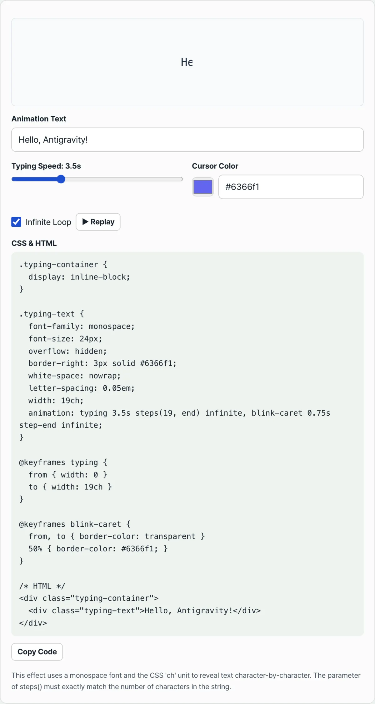
}Note You don't have to count the total characters in your sentence by hand and work out the steps(N) value and Nch width yourself. There's also a tool where you type in your text, adjust the font size and typing speed, and get the calculated values back as ready-to-copy CSS.
If you'd rather see the result for your own wording instead of doing the math yourself, try it with our tool.
Set your typing text, speed, and cursor shape in real time, then copy a stylesheet where the character-count formula is already calculated for you.
What to Check Before You Apply It
| Checkpoint | Explanation |
|---|---|
| Use a monospace font | With a proportional font (Inter, Roboto, Arial, and so on) every character has a different width, so as steps() advances, letters look half-sliced and distorted. Specify a monospace font such as Fira Code, Monaco, or Courier New. |
| Multilingual (CJK) handling | Korean, Japanese, and Chinese characters take up roughly 2ch of width, unlike a single Latin character. When animating Korean text, you can adjust the width ratio, or use a JavaScript dynamic typing library as a supplement. |
| overflow and white-space | You need overflow: hidden and white-space: nowrap together to keep untyped characters from showing early and to stop the sentence from wrapping. |
Wrapping Up
A CSS typing animation can be done without any JavaScript timers by combining the steps(N, end) easing function, the ch unit, and a cursor blink animation built with border-right. Every time your wording or character count changes, you have to recalculate the steps value and width — so a tool that computes them from your sentence will cut down on mistakes. Before you apply it, it's worth checking whether you're using a monospace font and how you'll handle multilingual characters such as Korean.
Set your typing text, speed, and cursor shape in real time, then copy a stylesheet where the character-count formula is already calculated for you.
Core Technical Mechanics: How CSS Typing Works
The steps(N, end) Staircase Interpolation Model
Unlike typical CSS animations that interpolate smoothly between values with linear or ease, steps(N) breaks a continuous change into N discrete steps.
- It divides the total animation duration into equal intervals.
- At each interval boundary = rac{k}{N} cdot T$, the animated property (width) jumps instantly to the next step value: $(t_k) = rac{k}{N} imes W_{ ext{final}} = k cdot 1 ext{ch}$$
- The end keyword means this jump happens when each interval ends. In other words, after a set amount of time, a character pops out all at once, completing the mechanical typewriter motion.
A Deep Dive into the ch CSS Unit (Character Unit)
1ch is the advance width of the digit "0" (U+0030) glyph in the font currently applied.
- Monospace font required: In a monospace font, every character has exactly the same width as the digit 0. So an N-character sentence is always Nch wide.
- Watch out for proportional fonts: In a proportional font, each character has a different width — for example, "W" is 1.3ch and "i" is 0.3ch. That breaks the one-step-per-character mapping, and letters can look half cut off.
The Formula for Handling CJK Character Widths
Even with a monospace font, CJK characters such as Hangul, Hanja, and Kana take up about twice the width of Latin letters and digits (halfwidth) because they are fullwidth.
- Width formula for mixed text: { ext{steps}} = N_{ ext{Latin}} + 2 imes N_{ ext{CJK}}$
- Final element width: $ ext{width} = N_{ ext{steps}} cdot 1 ext{ch}$
Dual-Animation Architecture
A polished typing effect comes from combining two independent animations.
- typing: The main animation that expands the text container width from 0 to Nch.
- blink-cursor: The cursor blink animation that alternates the border-right color between transparent and a set color. It uses step-end so the cursor turns on and off instantly, with no gradient. Declare both at once in the animation property, separated by a comma (,).
Text Typing Implementation Comparison Matrix
A comparison table of the pros and cons of each approach, to help you pick the best tech stack for your situation.
| Criteria | Pure CSS (steps + ch) | JS setInterval (DOM injection) | React useEffect (state management) | Libraries such as GSAP / Typed.js |
|---|---|---|---|---|
| JS bundle overhead | 0 (Zero) | Low | Medium (triggers re-renders) | High (library load) |
| SEO and crawling | Excellent (original text stays in the DOM) | Weak (empty tags before rendering) | Weak (hydration delay) | Excellent / Weak (depends on setup) |
| Rendering performance | Best (GPU compositor work) | Medium (constant reflow) | Low (virtual DOM work) | Medium (JS animation frame) |
| CJK language support | Manual calculation required (2x width) | Automatic | Automatic | Automatic |
| Playback/control flexibility | Low (needs a reflow trick) | Moderate | High | Best (many options) |
5 Critical Mistakes When Building a Typing Animation
- Using a proportional font: With fonts like Inter, Pretendard, or Noto Sans, character widths vary. That throws off the ch-based step calculation, and the text looks cut off.
- Miscounting CJK characters: In a monospace setting, a Hangul character takes up 2ch. If you count it as 1ch and set the width and steps to half, the sentence never finishes revealing.
- Forgetting animation-fill-mode: forwards: forwards keeps the final state after the animation ends. Leave it out, and as soon as typing finishes, the text resets to its original state (width 0) and disappears.
- Forgetting white-space: nowrap: As the width expands, there is not enough space, so the sentence is forced onto the next line.
- Using linear easing: If you use the default ease or linear instead of steps(N, end), characters do not pop into view. They slide in like a window blind opening, which breaks immersion.
A 5-Step Production-Level CSS Typing Workflow
- Analyze and count the text: Count the Latin letters/digits and the CJK characters in your target string to get the exact steps value ({ ext{Latin}} + 2 imes N_{ ext{CJK}}$) and the total width in ch.
- Set the required CSS: Apply a monospace font to the element, use overflow: hidden to cover the area that has not been typed yet, and use white-space: nowrap to prevent line breaks.
- Define the keyframes: Write @keyframes typing to grow the width from 0 to Nch, and @keyframes blink-cursor to blink the right border color.
- Bind the animations: Apply them to the element together as animation: typing 2s steps(N, end) forwards, blink-cursor 0.5s step-end infinite;
- Handle responsiveness and accessibility: Adjust the font size so the text does not overflow the screen on mobile, and add a media query that turns off the animation based on the system setting.
7 Tips for Typing Text Effects
- Use the best developer fonts: Try D2Coding, where Hangul width is exactly twice the Latin width, or dedicated monospace fonts such as Fira Code and JetBrains Mono.
- Add a dramatic delay: Add animation-delay: 0.5s to create a very short pause right after the page loads. That grabs the user's attention much more strongly.
- Play once and hold the final state: If the typing is not meant to loop, combine animation-iteration-count: 1 (the default) with forwards to lock in the completed state.
- Chain multiple lines: To type several lines in sequence, stagger the animation-delay for each line by the time it takes the previous line to finish, so they flow naturally.
- Force a restart with JavaScript (reflow trick): To retrigger a CSS animation when nothing in the DOM render has changed, remove the class, call void element.offsetWidth to force a reflow, then add the class back.
- Add an accessibility (a11y) media query: For users who experience dizziness, add @media (prefers-reduced-motion: reduce) so the full text appears immediately with no animation.
- Use an automatic calculator: Do not count steps and width by hand for mixed Korean/English text. Use the CSS Typing Text Effect Generator above and copy/paste to avoid mistakes.
Decision Tree for Choosing a Typing Implementation
- Single static text (such as a landing page headline) ➔ Pure CSS (steps + ch): Handle it cleanly with no JS overhead.
- Dynamic text based on user input (such as a chat UI) ➔ JavaScript state-based (React, etc.): A good fit for environments that need to handle variable character counts and restart often.
- Complex multi-string swaps (type A, erase it, then type B) ➔ Libraries (Typed.js, GSAP): Essential for complex timeline control such as backspace effects and variable speed.
Terminology Cheatsheet
- Typing Text Effect: A UI animation where characters appear one at a time, like a mechanical typewriter or a terminal console.
- Step Function (steps(N, end)): A CSS timing function that changes a value in N discrete jumps instead of a smooth transition.
- ch Unit (Character Unit): A relative CSS length unit based on the width of the character '0' in the rendered font, which counts as 1ch.
- Monospace Font: A programming font designed so every character has the same horizontal width, whether it's a 'W' or an 'i'.
- Overflow Hidden (overflow: hidden): A CSS property that clips anything extending past a set width so it isn't visible on screen.
- Cursor Blink: The blinking mark at the end of the text, usually implemented by animating the opacity of the element's right border (border-right).
- CJK Fullwidth Characters: East Asian characters such as Korean, Chinese, and Japanese that take up twice the space (2ch) of a Latin letter in a monospace environment.
- Animation Fill Mode (animation-fill-mode: forwards): A property that keeps an element in the final state it reached at the 100% keyframe after the animation ends.
Frequently Asked Questions
Q1. How do I accurately calculate steps and ch width for a sentence that mixes Korean, English, and spaces?
A1. In a monospace font, English letters, numbers, spaces, and ordinary symbols each count as 1ch. Korean characters (including separate consonants and vowels), Chinese characters, and fullwidth symbols count as 2ch. For example, for 'Hello 안녕', the most accurate calculation is 5 English letters + 1 space + 2 Korean characters (2×2=4) = 10 steps and 10ch in total.
Q2. How do I replay a CSS typing animation with JavaScript?
A2. Just removing the element's class and adding it back won't restart the animation, because the browser batches the changes. Call el.classList.remove('typing'), then place a single line, void el.offsetWidth;, right after it to force the browser to recalculate layout (reflow), and then call el.classList.add('typing'). Only then does the browser treat it as a new animation and play it from the start.
Q3. Why does the text keep disappearing after the animation ends (blinking out)?
A3. By default, a CSS animation returns to the original CSS state (the initial style, not the keyframe) when the animation duration ends. When the animation that grows the width from 0 to Nch finishes, the element snaps back to its declared default width (0). You can prevent this by explicitly adding the animation-fill-mode: forwards property so the element holds the state from the 100% point (Nch).
This article was adapted from our Korean original. Read the Korean original