
flex-grow vs flex-shrink: how leftover space splits 1:2
Contents
- flex-basis: the "base size" set before an item grows or shrinks
- flex-grow: taking a proportional share of the leftover space
- flex-shrink: shrinking proportionally when space runs short
- What you can see with this tool: direction and wrapping change the calculation axis
- justify-content and flex-grow handle leftover space differently
- Summary
- Frequently Asked Questions
Set flex-grow: 1 on one flex item and flex-grow: 2 on another, and the leftover space splits 1:2 with surprising precision. That's not a coincidence. The browser is following a fixed formula.
The tricky part is that flex-basis, flex-grow, and flex-shrink sound alike but kick in at different moments. This post walks through exactly what each value calculates, plugging in real numbers as we go.
Summary ① flex-basis is the "base size" an item wants before grow and shrink calculations begin. ② flex-grow only kicks in when the container has leftover space. It divides that space according to the grow values and adds it to the items. ③ flex-shrink is the opposite: it only kicks in when space runs short. It removes the shortfall from each item in proportion to its shrink value (and base size).
flex-basis: the "base size" set before an item grows or shrinks
flex-basis is the size an item wants before flex-grow or flex-shrink starts calculating. You can set it directly in px or %, or leave the default auto, which makes the item use its width (or height), or its content size if neither is set.
A detail people often miss: the axis flex-basis refers to is not fixed. If flex-direction is row-based, flex-basis means width. If it's column-based, it means height. The same flex-basis: 100px stretches a different dimension depending on direction.
In practice, flex-basis: 0 is especially common. The shorthand flex: 1 actually expands to flex-grow: 1; flex-shrink: 1; flex-basis: 0%. In that case, the item's original size is treated as 0, and the final size is determined entirely by the grow calculation.
flex-grow: taking a proportional share of the leftover space
flex-grow only works when there is leftover space in the container. First, you subtract the sum of all items' flex-basis values and the gaps from the container size. The remainder is the "leftover space." Then you divide that space according to each item's flex-grow value and add it on top of the item's base size.
Let's calculate with flex-basis: 0. If the container is 900px wide, the gap is 0, and both items have flex-basis: 0, the leftover space is the full 900px. With grow values of 1 and 2, the total growth units are 3, so each unit gets 300px (900 ÷ 3). The result is 300px for the grow: 1 item and 600px for the grow: 2 item. The final size ratio is exactly 1:2.
If flex-basis isn't 0, things change. In the same container, if both items have flex-basis: 100px, their base sizes add up to 200px, leaving 700px of leftover space. Split 1:2, that adds 233px and 467px, for final sizes of 333px and 567px. As a ratio, that's about 1:1.7 — no longer a clean 1:2.
In other words, flex-grow's ratio applies precisely to the leftover space, not the total size. Only when flex-basis is 0 does that ratio match the final size ratio exactly.
flex-shrink: shrinking proportionally when space runs short
flex-shrink only kicks in in the opposite situation: when the items' combined base sizes are larger than the container and overflow. The overflow amount is taken out of each item in proportion to its flex-shrink value multiplied by its flex-basis.
For example, a 300px-wide container with three items at flex-basis: 150px each adds up to 450px, overflowing by 150px. If the shrink values are 1, 1, and 2 and all bases are 150px, the reduction splits exactly 1:1:2, so each item shrinks by 37.5px, 37.5px, and 75px.
When bases differ, the math gets a little more involved. In practice, the browser compares shrink value × flex-basis, so even with the same shrink value, an item that started larger shrinks more. flex-shrink reflects both the "rate of shrinking" and the item's original size.
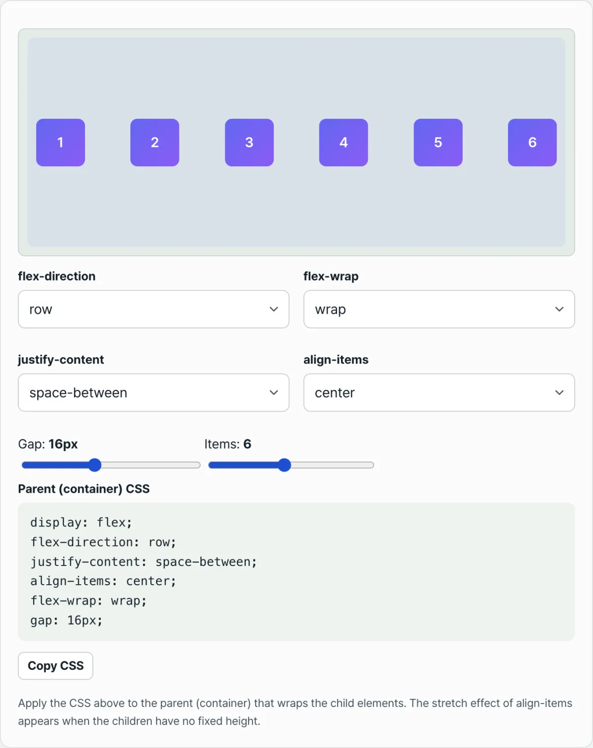
A flexbox generator: adjust flex-direction, justify-content, align-items, flex-wrap, and gap to see a live preview and copy-ready parent CSS.
What you can see with this tool: direction and wrapping change the calculation axis
Flexbox Generator isn't a tool for entering flex-grow, flex-shrink, and flex-basis directly. Instead, you adjust parent (container) properties such as flex-direction, flex-wrap, justify-content, align-items, and gap, and see for yourself under what conditions the calculations above actually happen.
Switch flex-direction from row to column and the "the axis changes" explanation becomes immediately clear. In row, items stretch horizontally and leftover space is calculated along the horizontal axis. Switch to column, and the same items stack vertically and leftover space is calculated along the vertical axis.
flex-wrap also determines whether shrink calculations actually happen. Set wrap to nowrap and add more items. Because of the default flex-shrink: 1, the preview boxes do shrink — until they hit their set minimum width, at which point they stop shrinking and the container overflows with horizontal scrolling. Set it to wrap, and instead of shrinking, items move to the next line, so no shrink calculation happens at all.
justify-content and flex-grow handle leftover space differently
This tool's justify-content options (flex-start, center, flex-end, space-between, space-around, space-evenly) are easy to confuse with flex-grow. Both deal with "leftover space," but they handle it differently.
justify-content doesn't change item size at all. It only places leftover space between items or at the edges. flex-grow, by contrast, absorbs that leftover space into the items themselves. Switch justify-content to space-between and you'll see the preview boxes keep the same size while the empty space moves between them.
The CSS this tool generates covers the parent container only. Set direction, wrapping, and alignment first, copy the CSS, then add flex-grow, flex-shrink, and flex-basis to each child element yourself. The calculations above then apply on top of that.
Summary
- flex-basis is the base size before grow and shrink calculations. Depending on flex-direction, it refers to either width or height.
- flex-grow only kicks in when there's leftover space. It divides that space according to the grow values and adds it to the items. When basis is 0, the final size ratio matches the grow ratio.
- flex-shrink only kicks in when space runs short. It subtracts the shortfall from each item in proportion to shrink value × basis.
- When flex-wrap is set to wrap, items move to the next line instead of shrinking, so shrink calculations may not happen at all.
- justify-content leaves item sizes unchanged and places leftover space "between" items. It handles space differently from flex-grow, which makes the items themselves bigger.
A flexbox generator: adjust flex-direction, justify-content, align-items, flex-wrap, and gap to see a live preview and copy-ready parent CSS.
Frequently Asked Questions
Can I use decimals instead of whole numbers in flex-grow?
Yes. As long as it's not negative, flex-grow accepts any number and uses it as-is in the ratio calculation. Put 0.5 and 1.5 side by side and the sum of the growth factors is 2, so the leftover space splits in a 1:3 ratio. The math works the same even when the numbers don't come out to clean whole numbers.
If I set flex-basis to auto, what value is actually used?
First, if that item has a width (in a row direction) or height (in a column direction) set, that value becomes the base size. If there's no such value either, the content's actual size — as much space as the text and images take up — is used as the base size. auto doesn't mean "there is no value"; it's closer to "the size comes from somewhere else."
What happens if I set flex-shrink to 0?
That item won't shrink below its own flex-basis, even when the container gets narrower. The other items shrink more instead, or if there's still not enough room, content overflows the container or horizontal scrolling appears. It's mainly used for items that should never shrink.
If I use justify-content: space-between, do I still need flex-grow?
They serve different purposes. space-between leaves item sizes alone and pushes the leftover space into the gaps between items. If you want the items themselves to look bigger — that is, you want the boxes to grow rather than the empty gaps — you still need flex-grow. The two properties just place the same leftover space in different spots.
This article was adapted from our Korean original. Read the Korean original