
CSS gradient text shows as a square? Use background-clip: text
Contents
You probably tried to put a gradient on your text by setting background: linear-gradient(...) and ended up with a solid rectangle painted behind the text instead of colored letters. That's not a typo or a browser bug — background fills the entire rectangular box of the element by design. Add one property, background-clip: text, and the background stays only where the letters are, with everything else cut away to transparency.
Summary ①
background(background-image) fills the entire rectangular box of the element by default ②background-clip: textclips that background to the shape of the text, so only that part shows ③ You also have to make the text color transparent, or the clipped background stays hidden behind the letter color
Why it paints a rectangle: what's actually happening
In CSS, background paints the whole rectangular area (the box) that the element takes up. Text is drawn as a separate layer on top of that background, so if you put a gradient in background, the default behavior is for the gradient to cover the entire box while the letters sit on top in their original color (usually black).
In other words, the background and the text are two different layers. To keep the background only where the letters are, you have to tell the browser explicitly: "clip this background to the shape of the text." The property that does that is background-clip, and when you give it the value text, the background is clipped to the inside of the letter outlines instead of the full box.
Filling only the letter shapes: how to check it and fix it
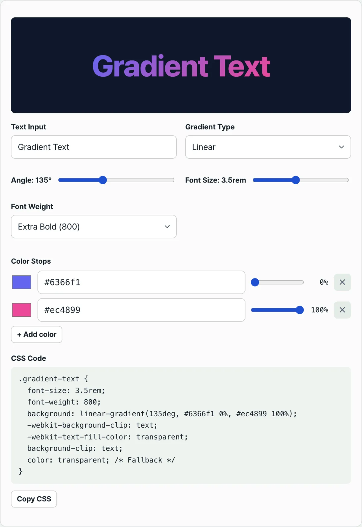
If you want to try it yourself, the order matters. First, set the gradient you want on the text element with background or background-image. With two or more colors, write it as linear-gradient(angle, color1 position%, color2 position%).
Next, add background-clip: text. WebKit-based browsers, Safari included, still don't recognize it without the prefix, so you need to write -webkit-background-clip: text as well. That one line clips the background to the inside of the letter outlines instead of the rectangular box.
Finally, make the text color transparent. Add both color: transparent and -webkit-text-fill-color: transparent, and the original black letter color disappears, letting the clipped gradient show through in its place. These properties have to move as a set — that's what completes gradient text.
Check it with our free tool. Instead of recalculating the code by hand every time you change the angle or a color stop, adjust the sliders, see the result in the live preview, and copy the finished CSS.
Free · No sign-up · Adjust with sliders and copy the CSS
Where people usually get stuck
| Situation | Cause |
|---|---|
I added background-clip: text but it still looks like a rectangle | The -webkit-background-clip: text prefix is missing, so clipping doesn't apply in Safari and similar browsers |
| The text is completely invisible, like a blank space | You added color: transparent but left out background-clip: text, so the background still fills the whole box and only the letters became transparent |
| The gradient direction isn't going the way I want | The linear-gradient angle is measured clockwise starting from the top (0deg), which is easy to get wrong by feel |
| Some older browsers show a solid color instead of the gradient | In browsers that don't support background-clip: text, the color value falls back and applies as-is |
As the table shows, most problems come down to whether you set the clipping property and the text color handling as a set. Get the order and the prefix right, and after that you only need to change the color values.
The short version
background fills the entire rectangular box of the element by default, so a gradient covers the whole box and the letters stay on top in their original color. background-clip: text clips that background to the inside of the letter outlines, and only once you make the text color transparent does the clipped background become visible.
Instead of changing the angle and color stop values by hand and imagining the result each time, adjust them while watching the live preview and then take the finished CSS as-is.
Free · No sign-up · Adjust with sliders and copy the CSS
Frequently asked questions
Does background-clip: text work in every browser?
The latest versions of Chrome, Edge, and Firefox support it without a prefix. Safari, though, still needs -webkit-background-clip: text and -webkit-text-fill-color: transparent written together to work correctly, so it's safest to include both forms.
Can I fill the text with an image instead of a gradient?
Yes. You can set an image with url() in background instead of a gradient, and background-clip: text works the same way, so you can make a photo or pattern show only in the shape of the letters.
The text is completely invisible and only transparent space shows: what should I check?
Check whether you added color: transparent but left out background-clip: text. Without the clipping property, the background stays over the whole box while only the letter color is transparent, so it can look like the letter-shaped holes are punched through the gradient.
This article was adapted from our Korean original. Read the Korean original