
Multi-Layer Box Shadow: Build a 6-Layer CSS Shadow
Contents
Modern web UIs use stacked shadows rather than a single one on cards, buttons, and dashboard components. A single box-shadow value gives you a hard, somewhat stiff edge. Layer several shadows with commas, each with a progressively larger offset and blur, and you get a much softer sense of depth. This post covers the principles behind multi-layer box shadows and the CSS code to build them yourself.
Summary ① A single shadow layer looks hard at the edges, so you stack several layers with progressively larger offsets and blur values, separated by commas. ② A common approach is to double the offset and blur radius at each layer while keeping opacity low. ③ Instead of calculating each value by hand, you can move sliders in the Layered Box Shadow Generator and copy the CSS right away.
Why a Single Shadow Layer Falls Short
Dropping in just one shadow, like box-shadow: 0 10px 20px rgba(0,0,0,0.2), produces a sharp edge that looks a little artificial. If you instead keep opacity low and stack 4 to 6 shadow layers, each with a progressively larger offset and blur radius, joined by commas (,), the shadow spreads far more naturally and reads as real depth.
How to Build a Multi-Layer Shadow Yourself
The Principle: Offsets and Blur That Grow Step by Step
As the layer number goes up, the offset and blur radius double, and opacity either stays fixed at a low value or fades gradually. For example, if you start the offset at 1px and double it to 2px, 4px, 8px, 16px, and 32px, the blur radius grows along with it at twice that: 2px, 4px, 8px, 16px, 32px, and 64px. The six-layer example below shows this approach in action.
- Contact shadow: 0 1px 2px rgba(15,23,42,0.04) — the sharpest, finest edge at the very bottom, where the card meets the surface.
- Close shadow: 0 2px 4px rgba(15,23,42,0.04) — a short-range shade that spreads slightly.
- Mid shadow: 0 4px 8px rgba(15,23,42,0.04) — the middle stage of the shading.
- Diffuse shadow: 0 8px 16px rgba(15,23,42,0.04) — a wider spread of light falloff.
- Ambient shadow: 0 16px 32px rgba(15,23,42,0.04) — a faint, soft offset.
- Residual shadow: 0 32px 64px rgba(15,23,42,0.04) — a large blur that makes the card feel suspended.
Example CSS Code
Here is a CSS example that shows the difference between a single-layer shadow and a multi-layer one:
<div class="shadow-card-multi">
  <div class="card-tag">SMOOTH ELEVATION</div>
  <h3>Soft Multi-Layer Shadow</h3>
  <p>A card with depth built from six stacked shadow layers.</p>
</div>
.shadow-card-multi {
width: 340px;
padding: 32px;
background: #ffffff;
color: #0f172a;
border-radius: 16px;
border: 1px solid rgba(226, 232, 240, 0.8);
transition: all 0.3s cubic-bezier(0.16, 1, 0.3, 1);
/* Six-layer multi-layer box-shadow declaration */
box-shadow:
0 1px 2px rgba(15, 23, 42, 0.04),
0 2px 4px rgba(15, 23, 42, 0.04),
0 4px 8px rgba(15, 23, 42, 0.04),
0 8px 16px rgba(15, 23, 42, 0.04),
0 16px 32px rgba(15, 23, 42, 0.04),
0 32px 64px rgba(15, 23, 42, 0.04);
}
/* Interaction: elevation rises further on hover */
.shadow-card-multi:hover {
transform: translateY(-6px);
box-shadow:
0 2px 4px rgba(15, 23, 42, 0.06),
0 4px 8px rgba(15, 23, 42, 0.06),
0 8px 16px rgba(15, 23, 42, 0.06),
0 16px 32px rgba(15, 23, 42, 0.06),
0 32px 64px rgba(15, 23, 42, 0.06),
0 64px 128px rgba(15, 23, 42, 0.06);
}Note Instead of working out each comma-separated offset and opacity value by hand, you can use the Layered Box Shadow Generator to adjust the layer count, blur spread, offset height, and shadow color in real time, then copy the finished CSS code straight out.
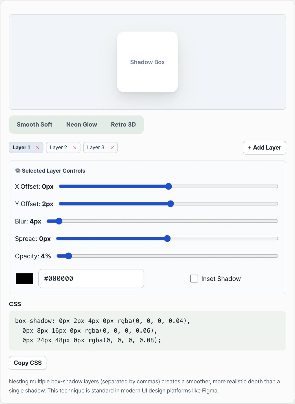
If calculating the values yourself is a hassle, try the sliders in the Layered Box Shadow Generator below and see the result live.
Adjust the number of shadow layers, blur spread, and offset height in real time, then copy clean CSS shadow code.
Shadow Design Tips for Real Projects
- Use a tinted color instead of black: A pure black (#000000) shadow can look muddy on a white card. Base the shadow on your background's primary hue (for example, #0f172a or #1e1b4b) and adjust the alpha channel to keep the design consistent.
- In dark mode, use borders instead of shadows: On a dark background (#0f172a), black shadows barely show up. A common approach in dark mode is to use fewer box-shadows and reveal card edges with a thin border such as border: 1px solid rgba(255, 255, 255, 0.1).
Wrapping Up
A single shadow layer looks hard at the edges, but stacking several layers with progressively larger offsets and blur values, separated by commas, creates soft depth. Rather than calculating every layer by hand, start from a preset and adjust it with sliders to find the shadow you want faster. The finished CSS can be pasted as-is into the box-shadow property.
Adjust the number of shadow layers, blur spread, and offset height in real time, then copy clean CSS shadow code.
Frequently Asked Questions
How many layers can I add?
As many as you want, with no limit. The only restriction is that once you're down to one layer, you can't delete it.
Can I use the generated CSS right away?
Yes. It's copied in the form box-shadow: ... , so you can paste it directly into a CSS file or a style attribute.
If I change values after picking a preset, does the preset change?
No. A preset is only a starting point. You can adjust the sliders freely afterward to create the shadow you want.
This article was adapted from our Korean original. Read the Korean original