
CSS Stripe Pattern Background: repeating-linear-gradient Guide
Contents
When you want a striped pattern instead of a flat solid color behind a promo card or banner on a landing page, adding a separate pattern image file can slow down loading and the image can break at different screen sizes. With CSS's repeating-linear-gradient property, you can build a striped background in code alone — no image file — and adjust the angle and thickness freely. This post covers how to make diagonal stripes with CSS yourself, plus how to get the same result using nothing but sliders.
Summary ① Building a striped background with CSS's repeating-linear-gradient property instead of an image file means no file weight, and the pattern repeats at any screen size. ② The shape of the pattern is set by the angle (θ), the stripe thickness (w), and the points where the two colors switch. ③ With the CSS Stripe Pattern Generator, you can dial the angle, thickness, and colors on sliders, skip the manual math, and copy the code.
Why use CSS instead of a pattern image
When you want stripes on a promo banner or a highlight section, it's common to prepare a separate PNG or SVG image. But an image file adds loading time in proportion to its size, and when the screen width changes the pattern may stretch or look cut off.
CSS's repeating-linear-gradient property makes those problems go away. Declare the colors, angle, and thickness in code, and the browser draws the pattern repeating endlessly to fit the screen. No separate image file, and it holds up on responsive layouts.
How to make diagonal stripes with repeating-linear-gradient
How angle and thickness define the pattern
A CSS stripe pattern works by declaring the boundary positions of two colors (C1, C2) in order, then repeating that span endlessly. Put simply, it looks like this.
repeating-linear-gradient(θ, C1 0px, C1 w px, C2 w px, C2 2w px)
Here's what each value means.
- Rotation angle (θ, e.g. 45deg): Sets the direction the stripes flow. Give it 45deg and they run diagonally.
- Stripe thickness (w, e.g. 10px to 20px): C1 covers 0px to w px, and C2 immediately follows from w px to 2w px. Declaring it this way gives you a crisp band edge instead of a blurry blend.
Pure CSS stripe implementation code
Here's an example of a CSS stripe pattern where the stripes move on their own, no hover needed.
<div class="stripe-bg-container">
  <div class="stripe-content">
    <h2>SPECIAL PROMOTION</h2>
    <p>감각적인 순수 CSS 사선 줄무늬 패턴 배경 가이드</p>
  </div>
</div>
.stripe-bg-container {
width: 100%;
padding: 60px 24px;
background-color: #0f172a;
/* Declare a 45-degree, two-color diagonal stripe background */
background-image: repeating-linear-gradient(
45deg,
#1e293b,
#1e293b 15px,
#0f172a 15px,
#0f172a 30px
);
border-radius: 16px;
border: 1px solid rgba(255, 255, 255, 0.1);
box-shadow: 0 12px 32px rgba(0, 0, 0, 0.25);
animation: move-stripes 20s linear infinite;
}
/* Animation that flows the stripes smoothly */
@keyframes move-stripes {
0% {
background-position: 0 0;
}
100% {
background-position: 42.43px 0;
}
}
.stripe-content {
text-align: center;
color: #ffffff;
}Note You don't have to hand-calculate and type the pixel thickness values and color stop syntax every time. Adjust the angle, thickness, and two colors with sliders and a color picker, and you get CSS code you can use right away.
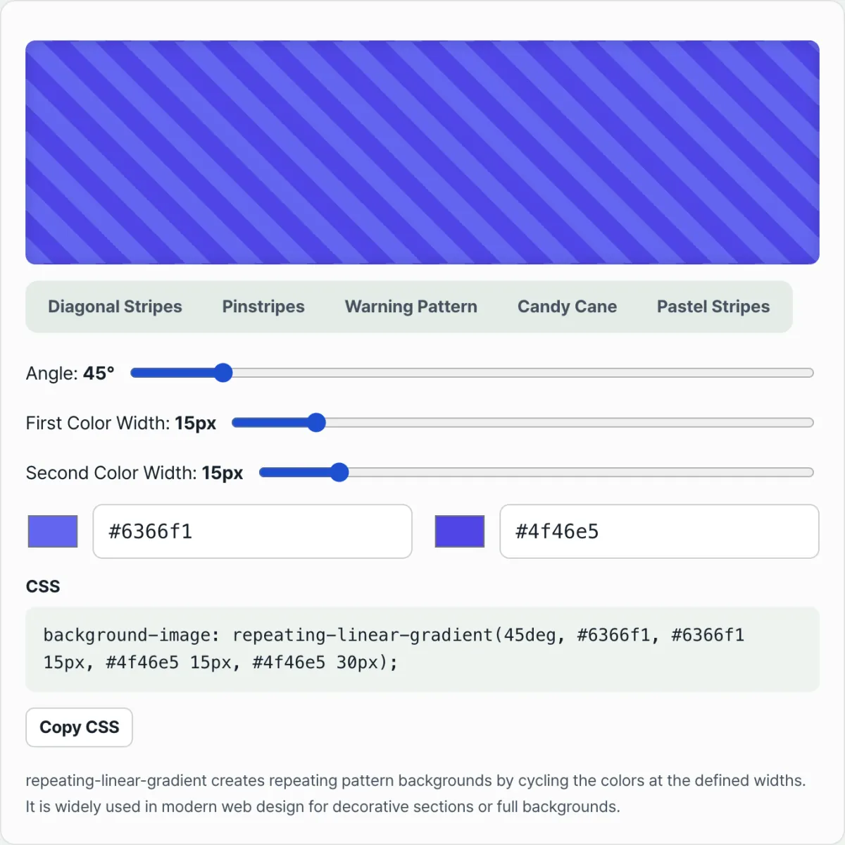
If you want to experiment by changing the angle, thickness, and colors one at a time, try it right in our tool.
Adjust the stripe angle, band width, and two-color pairing visually, then grab the CSS code for your website background right away.
The values behind the pattern at a glance
| Parameter | Meaning | Example value |
|---|---|---|
| Angle (θ) | Direction the stripes flow | 45deg |
| Thickness (w) | Width one color takes up | 10px ~ 20px |
| Color stops | C1 covers 0 to w px, C2 covers w to 2w px | 2 colors |
What to check when refining the pattern in real projects
When you put the pattern on an actual screen, two checks will help.
Tuning the contrast between the two colors
If the contrast between the two stripe colors is too strong (say, pure white and pure black), eyes tire quickly and body text sitting on top gets hard to read. A pair of similar colors with a gentler tonal difference, like slate deep blue (#0f172a) and dark blue (#1e293b), makes it easier to place body text and background together.
Matching the travel distance when you animate
When you add motion to the striped background, the background-position travel value has to land exactly on the width of one stripe cycle. That math changes with the angle, though. If the pattern lines up straight on the horizontal or vertical axis, like 0deg or 90deg, you can use any whole multiple of one cycle's width (for a 30px cycle, 60px or 90px). With a diagonal pattern like 45deg, if you move background-position along the horizontal (x) axis only, the travel distance has to be "cycle ÷ cos(45°)" for the pattern to line up exactly. In the code example above the cycle is 30px, so 30 ÷ cos(45°) ≈ 42.43px, then 84.85px — use multiples of 42.43px and the 20-second animation loops with no seam at the restart point.
Wrapping up
With CSS's repeating-linear-gradient property, you can build a striped background from just an angle, a thickness, and colors — no image file. You can crunch the numbers yourself and drop them into code, but if you want to eyeball several combinations before choosing, a slider-based tool is faster. Paste the finished code straight into a background-image value and it applies immediately.
Adjust the stripe angle, band width, and two-color pairing visually, then grab the CSS code for your website background right away.
Frequently asked questions
Which property do I use the generated CSS on?
Paste it straight in as the value of the background-image property. The pattern background is applied with pure CSS only, no separate image file.
Can I save it as an image file?
The tool only generates CSS code. It's a fit when you want to apply the background as code rather than as an image file.
Does it look right in every browser?
repeating-linear-gradient is a standard CSS feature with broad support in most modern browsers.
This article was adapted from our Korean original. Read the Korean original