
Media Query Breakpoints: Why Mobile and Desktop Layouts Differ
Contents
You've probably had this happen: you open the same website on your phone and on your computer, and the menu position, font size, and entire screen layout look completely different. The site wasn't built twice for different devices. Someone set up rules in CSS ahead of time so the page changes itself based on screen width. Those rules are called media query breakpoints, and once you understand how they work, you can write your own.
Summary ① CSS is written in advance to apply different styles once the screen width passes a certain threshold value (a breakpoint) ② That threshold is written directly in the code as a min-width or max-width condition inside an @media rule ③ Once you pick a direction (Mobile-First/Desktop-First) and the threshold width for each range, you can write the media query template following a set pattern
Why the layout changes completely with screen width
On a phone, the menu is collapsed into a single icon at the top and the body text runs long and vertical. Open the same site on a computer, and the menu often spreads out horizontally across the top with a sidebar next to the body. The server isn't checking your device and sending back a totally different page. A single CSS file already contains conditions that say, "if the screen gets narrower (or wider) than this width, switch to this style."
In CSS, these conditions are called @media rules, and the threshold width that divides them is commonly called a breakpoint. The moment you cross a breakpoint, styles like menu placement, font size, and column count all change at once.
So if you slowly drag your browser window narrower, you'll see a point where the layout snaps to something else. That point is the breakpoint value the site set in advance.
How to check: building media query breakpoints yourself
There's no fixed standard for breakpoints. Each site writes its own numbers directly into the CSS code. Open your browser's developer tools, go to the Elements tab, and find the @media entries in the Styles panel. You'll see exactly how many px that site uses as its threshold for switching styles.
When you build your own, start by picking a direction. Desktop-First means your base styles are desktop styles, and you override them with mobile styles using max-width conditions as the screen narrows. Mobile-First means your base styles are mobile styles, and you expand them with min-width conditions as the screen widens. Pick one.
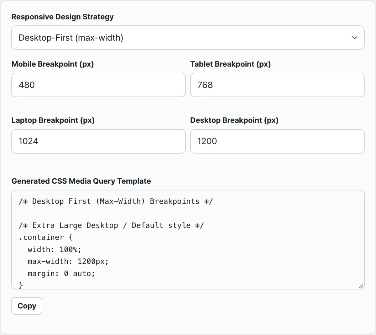
Once you've chosen a direction, set threshold widths for four ranges — mobile, tablet, laptop, and desktop (commonly around 480/768/1024/1200px) — and stack @media (min-width: valuepx) or @media (max-width: valuepx) blocks for each range in order. As you add more ranges, keeping track of the block count and nesting order by hand gets tedious.
Check it with our tool. Just pick a direction and the threshold widths for the four ranges, and it generates the whole set of nested @media blocks in the set pattern at once.
Free · No sign-up · Generate CSS breakpoints right in your browser
Common snags
| Situation | Cause and how to check |
|---|---|
| Layout looks awkwardly broken only on laptop screens | The range between tablet and desktop is empty — add another threshold for laptop widths |
| Mixing min-width and max-width in one project | When both directions are mixed, conditions overlap and priority gets tangled — stick to one direction |
| Developer tools width feels different from the real device width | Displayed width can vary with browser window size or screen scaling settings, so check on a real device too |
| Splitting thresholds too finely | More ranges mean harder code maintenance — usually 3–4 steps is enough |
The takeaway
The same site looks different on a phone and a PC because media query breakpoints are predefined in the CSS to change styles based on screen width. You can check those values yourself in developer tools, and once you pick a direction and threshold widths for each range, you can build your own using the same principle.
Instead of lining up the nesting order by hand every time, enter four threshold values and see the CSS in the set pattern right away — it cuts down on mistakes.
Free · No sign-up · Generate CSS breakpoints right in your browser
FAQ
Do breakpoints have to be 480/768/1024/1200px?
No. Those are just commonly used reference values. In practice, it's more accurate to check where your own content starts looking awkward and use those widths as your thresholds.
Should I use Mobile-First or Desktop-First?
There's no single right answer. If you're building the content starting from mobile screens, Mobile-First with min-width expansion keeps your code changes smaller. If you're adding mobile support to an existing desktop site, Desktop-First with max-width narrowing does.
How many breakpoint steps is reasonable?
Three steps — mobile, tablet, desktop — or four if you add laptop covers most layouts well enough. Adding more steps means more @media blocks to manage, which makes maintenance harder.
This article was adapted from our Korean original. Read the Korean original