
iOS vs Android Tab Bars: Why They Differ and How to Build One
Contents
You've probably noticed that the same service's bottom tab bar looks slightly different on iPhone and Android. On iPhone, only the icon color changes. On Android, a rounded background often appears behind the selected tab. That's not a designer's personal preference — the two platforms recommend different ways of showing the active tab in their official guidelines.
Summary ① iPhone (iOS) usually signals the active tab with icon and label color changes alone ② Android (Material Design) makes a capsule-shaped background behind the active tab the standard ③ The difference comes down to a few lines of CSS, so you can pick the style you want and pull the code directly
Why tab bars look different on iPhone and Android
On iPhone, the selected tab in the bottom bar usually just gets a darker icon and label color, with no decoration behind it. Open the same service on an Android phone and you'll see a rounded capsule background behind the selected tab.
The reason is that Apple and Google recommend different ways of showing the active tab in their own design guidelines. Apple's interface guidelines have long kept a restrained approach that shows selection through color change alone, while Google's Material Design treats a pill-shaped background behind the selected item as the standard.
Neither approach is wrong — each follows the visual language its platform's users are used to. But if you ship one service to both platforms as a web app or hybrid app, it's worth deciding up front which style you'll standardize on.
Creating the tab bar style you want: how to check it and apply it
You can build it yourself in CSS. For an iPhone feel, change only the color values in the active state and skip any separate background on the tab button. Matching the icon and label to the same color alone gives a restrained look.
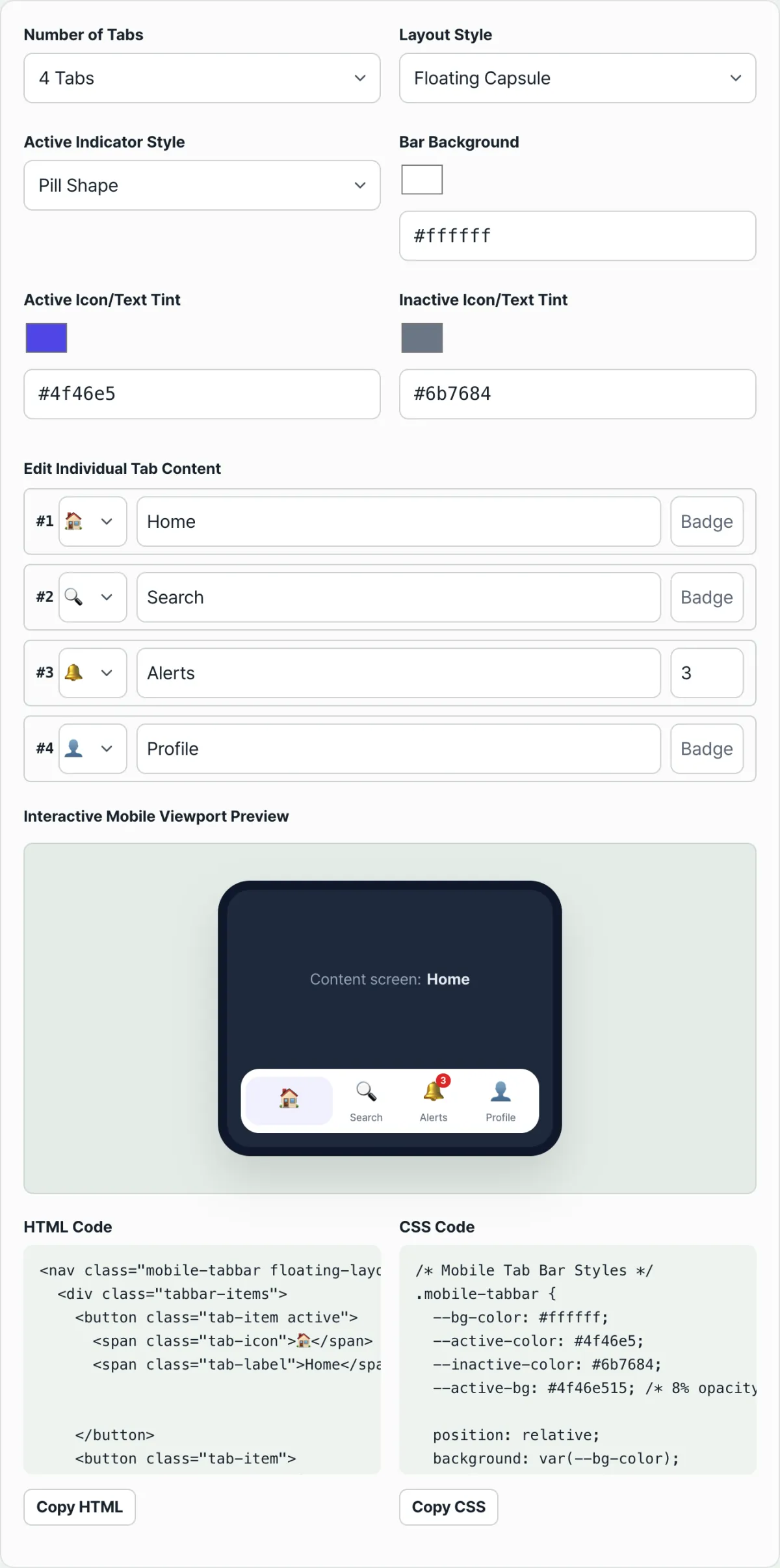
For an Android Material feel, add a background with a large border-radius to the active tab only. The background color usually comes from blending the active color at low opacity into a light tone, and you need generous left and right padding for the capsule shape to look natural.
The catch is that hand-tuning these values means readjusting icon size, badge position, and per-layout spacing one by one. Even changing a single color means recalculating the background opacity, which eats up time.
Check it with our tool. Change the number of tabs, the layout, and the active tab style (capsule, dot, or top line) with a click, and the result draws live inside a phone mockup. Then copy the finished HTML and CSS as is.
Free · No signup · Copy the HTML and CSS right in your browser
Common sticking points
| Situation | Why the problem happens |
|---|---|
| Trying to fit 6 or more tabs | Most guidelines recommend 3–5 — go beyond that and labels overlap or tabs get too narrow |
| Wanting an iPhone feel but using a capsule background | A pill background is how Android Material shows the active tab, so it actually looks Android |
| Badge numbers buried in the icon | Badges need to overlap the icon's corner and stick out so notifications catch the eye |
| Active and inactive colors too close in tone | Selected and unselected tabs become indistinguishable, so users lose track of which screen they're on |
As the table shows, most problems come from mixing guidelines from different platforms. Pick one way of showing the active tab and keep the tab count within the recommended range, and most of them go away.
Wrap-up
iPhone and Android tab bars look different because Apple and Google recommend different ways of showing the active tab. Color change is the default convention on iPhone, and a capsule background is the default on Android.
Once you know the difference, decide which style to standardize on first, then pick your tab count and active tab style and generate the code.
Free · No signup · Copy the HTML and CSS right in your browser
FAQ
Which style is the right one, iPhone or Android?
There's no single right answer. If you only ship a native app within one operating system, following that platform's guidelines is what users expect. But if you ship to both platforms as a web app or hybrid app, many teams standardize on one style for brand consistency.
How many tabs should I use?
3–5 is the usual range. Add more and tabs get too narrow, labels get cut off, or icons end up crowded together — so it's better to move rarely used menus into another screen.
How do I apply the finished code to a real service?
Paste the copied HTML and CSS straight into your project, then replace just the emoji icons with the icon files you actually use. Background color and active/inactive colors are split into CSS variables, so changing only your brand colors keeps the rest of the styling intact.
This article was adapted from our Korean original. Read the Korean original