
Glassmorphism Card CSS: Blur and Opacity Values That Work
Contents
The translucent, glass-like card UI you see on the Apple iOS lock screen, on modern fintech dashboards, and in crypto wallet apps is called glassmorphism. You can build it with pure CSS by combining backdrop-filter: blur() with a semi-transparent background color and a border highlight. But you end up tweaking the blur value and opacity one step at a time and refreshing the browser until the glass looks right.
Summary ① A glassmorphism card is built from a combination of four CSS properties: background blur, a semi-transparent background color, a border highlight, and a shadow. ② Instead of editing values in code one at a time, you can adjust sliders for a live preview and copy the finished CSS right away. ③ For broad support down to older Safari and iOS, it's safer to include the
-webkit-backdrop-filterprefix alongsidebackdrop-filter.
Why matching the glass look by hand is such a hassle
If backdrop-filter: blur() is too small, the blur is too weak; if it's too large, the shapes behind it disappear completely. The right value changes every time depending on the background image and the card size. You also have to line up the background color's transparency (alpha value), the border width, and how far the shadow spreads, so you end up editing code and refreshing over and over.
Building a glassmorphism card directly in CSS
A glassmorphism card is built from a combination of these four CSS properties.
- Background blur: Set a value like
backdrop-filter: blur(16px)and only the background behind the card gets blurred. - Semi-transparent background color: Instead of a fully opaque color, layer a low-opacity white like
background: rgba(255, 255, 255, 0.12)so light from the background shows through. - Border highlight: Use
border: 1px solid rgba(255, 255, 255, 0.25)to add a thin, bright edge around the card so it looks like light reflecting off the cut edge of glass. - Dimensional shadow: Use
box-shadow: 0 8px 32px 0 rgba(0, 0, 0, 0.25)so the card looks like it's floating slightly above the background.
Here's an example of a dashboard card with those four properties applied.
<div class="glass-card">
  <div class="glass-icon">💎</div>
  <h3>Glassmorphism Card</h3>
  <p>An aesthetic layered stylesheet interaction with a translucent frosted-glass feel.</p>
  <button class="glass-btn">Learn more</button>
</div>
.glass-card {
width: 340px;
padding: 36px 28px;
background: rgba(255, 255, 255, 0.12);
/* Vendor prefix fallback for backdrop blur rendering */
-webkit-backdrop-filter: blur(16px);
backdrop-filter: blur(16px);
border-radius: 20px;
border: 1px solid rgba(255, 255, 255, 0.25);
box-shadow: 0 8px 32px 0 rgba(0, 0, 0, 0.25);
color: #ffffff;
transition: all 0.3s ease;
}
.glass-card:hover {
background: rgba(255, 255, 255, 0.18);
border-color: rgba(255, 255, 255, 0.4);
transform: translateY(-4px);
box-shadow: 0 12px 40px 0 rgba(0, 0, 0, 0.35);
}
.glass-btn {
width: 100%;
margin-top: 20px;
padding: 12px;
background: rgba(255, 255, 255, 0.25);
-webkit-backdrop-filter: blur(8px);
backdrop-filter: blur(8px);
border: 1px solid rgba(255, 255, 255, 0.4);
border-radius: 10px;
color: #ffffff;
font-weight: 600;
cursor: pointer;
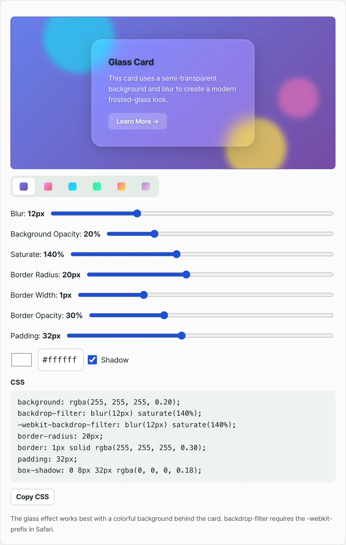
}Note Instead of changing the background, blur, opacity, border, and shadow one by one in code, you can adjust them with sliders in the Glassmorphism Card Generator, watch the live preview, and copy the finished CSS right away.
See it in action with our tool.
Dial in the frosted-glass blur strength, transparency, and border highlight you want in real time, then copy an optimized glassmorphism CSS stylesheet.
Where things usually get stuck in real projects
| Situation | Cause and fix |
|---|---|
| No blur in older Safari or iOS | If you declare only backdrop-filter without the -webkit-backdrop-filter prefix, the effect can be dropped in older Safari. Include both properties to safely cover a wider range of versions. |
| The card is just blurry and doesn't feel like glass | backdrop-filter blurs what's behind the card, so the effect only shows up when there's something vivid back there, like a gradient or an image. |
| Text on the semi-transparent background is hard to read | Text contrast shifts with the background color, so pair white text with a dark background and dark text with a light background. |
Wrap-up
A glassmorphism card is built from a combination of four CSS properties: background blur, a semi-transparent background color, a border highlight, and a shadow. Rather than plugging values into code and refreshing to check them, you can adjust sliders with a live preview and find the glass look you want faster. To support a wide range down to older Safari and iOS, get in the habit of including the -webkit- prefix as well.
Dial in the frosted-glass blur strength, transparency, and border highlight you want in real time, then copy an optimized glassmorphism CSS stylesheet.
Frequently asked questions
Which browsers do the generated CSS work well in?
It works in current versions of Chrome, Edge, Safari, and Firefox that support backdrop-filter. The -webkit-backdrop-filter prefix is generated too, for Safari.
My card only looks blurry and doesn't feel like glass.
backdrop-filter blurs what's behind the card, so the glass feel only comes through when there's a vivid background with color or an image behind it.
Can I use the generated CSS as-is in a real project?
Yes. You can freely use the CSS you copy in your project with no license attribution required.
This article was adapted from our Korean original. Read the Korean original