
Duotone effect: how a photo ends up with just two colors
Contents
Spotify album covers and conference posters often show a single photo rendered in just two colors, no matter what the original colors were. This isn't a special filter. It's the result of a fixed two-step process: strip the photo's color information, keep only the brightness, then paint color back onto that brightness. Once you know the principle, you can make a two-color image from any photo the same way.
Summary ① Duotone starts by stripping a photo's color information and keeping only brightness (tonal) information ② That brightness value is treated on a 0 (darkest) to 255 (brightest) scale, then repainted with a gradient that runs between a dark color and a light color ③ Whatever colors the original photo had, the result always shows only tones between the two colors you picked
Why a Photo Shows Only Two Colors: How Duotone Works
Duotone takes its name from a printing technique that overprinted two inks on black-and-white photos. Digital works the same way. The first step is a black-and-white conversion that removes the photo's color information (hue and saturation) and keeps only brightness.
In the black-and-white photo, each pixel holds a single brightness value from 0 (fully black) to 255 (fully white). Up to this point it's no different from any grayscale image.
The second step repaints those brightness values as colors. The darkest pixels get the dark color you chose, the brightest pixels get the light color you chose, and brightness in between gets a mix of the two colors proportional to brightness. Whether the original was red or blue, the same brightness produces the same result color.
How to Check It: The Math That Paints Two Colors onto Brightness
You can reproduce this process without any tool. First, in a photo editor, drop saturation to 0 or apply a black-and-white filter to keep only brightness information. Now each pixel has just one grayscale value.
Then pick two colors: one for the dark areas (shadow color) and one for the light areas (highlight color). The "Gradient Map" feature in programs like Photoshop does exactly this job. Register a gradient with the two colors at each end of the 0–255 grayscale range, and it automatically replaces each pixel's brightness value with the color at the same position on the gradient.
The formula is simple. If t (0–1) is the brightness ratio, each R, G, and B channel of the result is: dark color value + (light color value − dark color value) × t. The lower the brightness, the closer to the dark color; the higher the brightness, the closer to the light color.
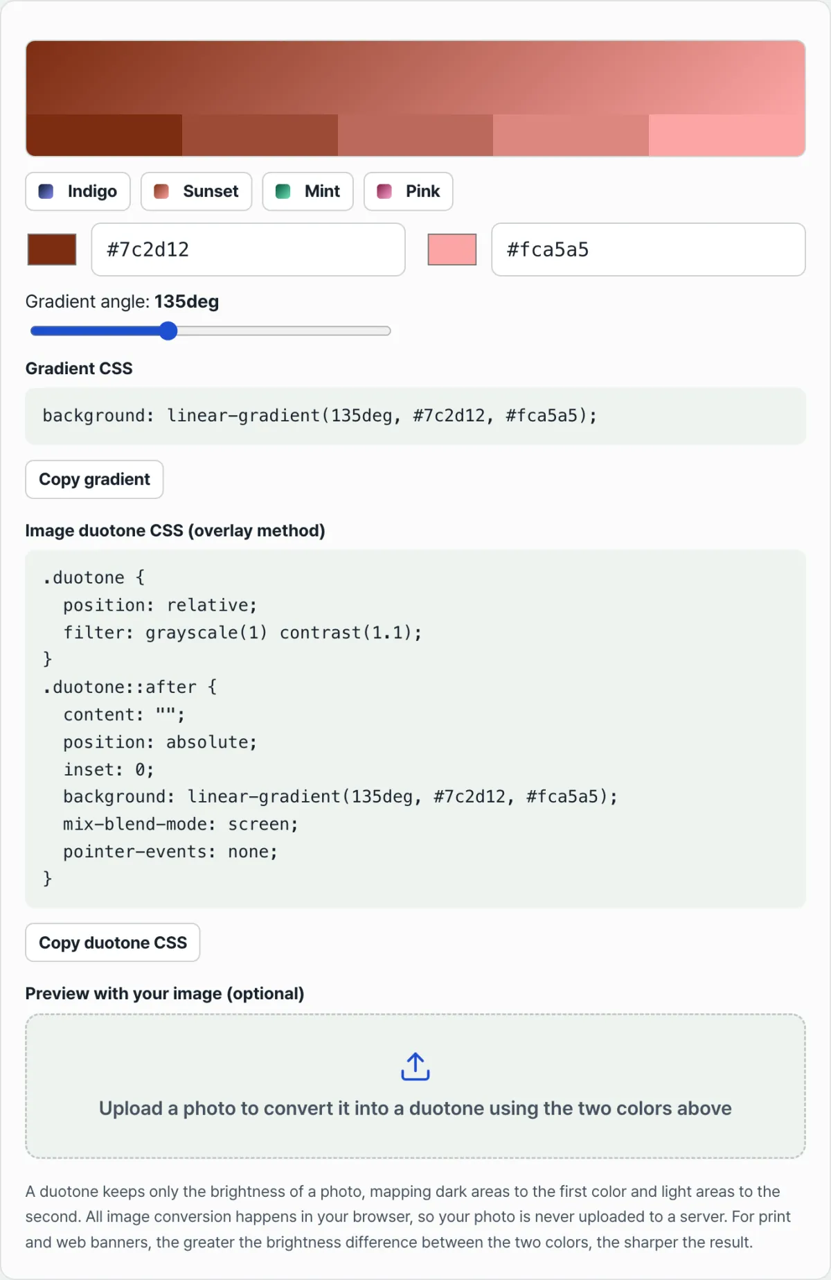
Try it with our tool. You don't have to run this math or apply a gradient map by hand. Pick two colors and you'll see the same result right away.
Free · No sign-up · Convert to duotone right in your browser
Common Sticking Points
| Situation | Why it happens |
|---|---|
| The two colors are close in brightness | The gradient span narrows, so contrast comes out muddy |
| Color is overlaid without a black-and-white conversion | The original color information remains, so it looks like simple color grading instead of duotone |
| You only use a CSS overlay | It may look right on screen, but the pixel values (RGB) in the saved file stay the same as the original |
| The original photo is low-contrast | A narrow brightness range squeezes the gradient between the two colors into a small span |
Stacking a CSS grayscale filter and a color overlay looks like duotone on screen, but it doesn't change the pixel values in the saved file. If you need an image file, you have to calculate brightness per pixel and repaint the color.
In Short
Duotone is a two-step process: strip the photo's color information and keep only brightness, then apply a gradient with a dark color and a light color at each end of the 0–255 brightness range. Whatever the original colors were, equal brightness gets painted the same color, so the result always shows only the two tones you chose.
The bigger the brightness difference between your two colors, the crisper the contrast. A small difference gives a washed-out result. Start by checking the brightness gap between your two colors and tune it to the look you want.
Free · No sign-up · Convert to duotone right in your browser
FAQ
Can I make a duotone image without Photoshop?
Yes. Duotone is a general principle built on two steps — black-and-white conversion and color replacement based on brightness — so any tool that supports those two steps can produce the same result in your browser, no install needed.
How is duotone different from a color filter overlaid on a photo?
A color filter lays one translucent color over the original, so some of the original color remains. Duotone wipes the original color completely, keeps only brightness values, then repaints with two colors — so whatever the original colors were, the result always shows only tones between the two colors you picked.
Which color pairs give a crisp result?
The bigger the brightness difference between the two colors, the crisper the contrast. Pair a dark color like deep navy or near-black with a light pastel for the bright end, and the photo's tonal structure comes through clearly. If the two colors are similar in brightness, the whole image flattens into a single tone.
This article was adapted from our Korean original. Read the Korean original