
CSS Diagonal Stripes: One Line of CSS, No Image Files
Contents
- Diagonal stripe backgrounds: why do they look like image files?
- How to check it: build it yourself in CSS
- Common sticking points
- Wrapping up
- Technical Mechanism: The Geometry and Mathematical Truth of Browser Rendering
- Implementation Techniques Matrix for Procedural Background Patterns
- 5 Critical Repeating Stripe CSS Mistakes and How to Prevent Them
- A Razor-Sharp 5-Step CSS Stripe Workflow
- 7 Procedural Pattern Design Tips
- Stripe Pattern Decision Tree by Design Context
- Key Terms and Cheatsheet
- Frequently Asked Questions
When you want to move the yellow-and-black diagonal stripes from a road work sign or a warehouse floor onto a website banner, most people start by hunting for a stripe image file. But this kind of pattern can be reproduced exactly with one line of CSS, using nothing but repeating-linear-gradient. Once you know how it works, you never have to rebuild the image just because you want a different color or angle.
Summary ① Diagonal stripe backgrounds are usually made with the CSS
repeating-linear-gradientfunction, not an image file ② Assign the same color to two stops so the color stops repeat at a fixed interval, and you get stripes ③ Know just three numbers — angle, colors, and width — and you can reproduce any pattern you want with one line of CSS, no image needed
Diagonal stripe backgrounds: why do they look like image files?
Yellow-and-black diagonal stripes show up all the time on construction site signs, road barriers, and hazard warning banners. When people try to reproduce these banners on the web, a good number of them open Photoshop, make a stripe image, and tile it with background-image.
The visible result looks similar, but as the screen gets larger the image scales up and can go blurry, or the seams where the stripes meet can look misaligned. Changing a color also means rebuilding the image file and uploading it again.
In reality, browsers already have a built-in feature for drawing repeating patterns like this. The CSS repeating-linear-gradient function does that job, drawing stripes in a vector way with no image file involved.
How to check it: build it yourself in CSS
repeating-linear-gradient is a function that takes an angle and color stops, then draws that span over and over to the edge of the element. The basic form is repeating-linear-gradient(angle, color1 start, color1 end, color2 start, color2 end).
For example, if you write background-image: repeating-linear-gradient(45deg, #facc15 0px, #facc15 20px, #1e293b 20px, #1e293b 40px);, yellow fills 0–20px and dark navy fills 20–40px, and that 40px span repeats to the edge of the element. The key is assigning the same color to two stops — that's what keeps the colors from blending smoothly and gives you stripes with crisp edges.
The angle follows the normal CSS gradient rules. 0deg points up, and the angle rotates clockwise as it increases, so 90deg gives vertical stripes and 45deg or 135deg gives diagonal stripes.
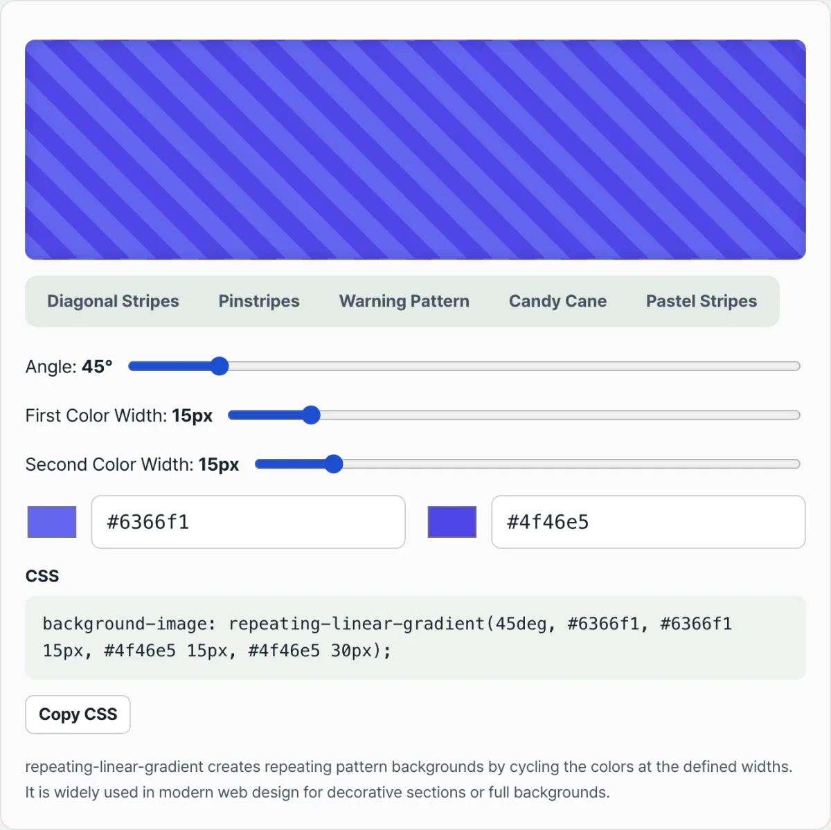
Try it with our tool. Instead of editing angle, width, and color values in code one at a time and eyeballing the result, you can drag sliders, see a live preview, and copy the finished CSS.
Free · no sign-up · generate CSS stripe code right in your browser
Common sticking points
| Situation | Cause |
|---|---|
| I set the angle to 90 degrees and got horizontal stripes instead of vertical ones | CSS gradient angles are measured clockwise from the top (0deg), so 90deg means pointing right, not vertical stripes |
| The stripe edges are blurry instead of crisp | You only specified each color stop once, so the two colors blend like a gradient — you have to repeat the same color at two stops to get a hard split |
| It's a 45-degree diagonal but the stripes look thicker than the px value I set | The width in px is measured along the gradient axis, so the farther the angle gets from 0 or 90 degrees, the thicker the stripes appear on screen |
| White text on the light stripes is unreadable | The background alternates light and dark, so the text needs a shadow or a semi-transparent background to stay readable over every section |
As the table shows, when stripes come out differently than expected, it's almost always because of confusion over the angle reference or the number of color stops. Remember those two rules and you can build the pattern you want right away.
Wrapping up
repeating-linear-gradient is a CSS function that repeats an angle and color stops to draw an endless stripe pattern. Assign the same color to two stops and you get stripes with crisp edges, and the angle increases clockwise from 0deg at the top.
Know those rules and you can reproduce diagonal stripes like a construction site banner with one line of code — no image file — and you never have to rebuild an image to change the color or angle.
Free · no sign-up · generate CSS stripe code right in your browser
Technical Mechanism: The Geometry and Mathematical Truth of Browser Rendering
To control CSS gradients perfectly, you need to understand the low-level rendering math a browser uses to paint pixels on the screen. Here are the three core geometric principles that govern stripe patterns.
1. The Hard Color Stop Duplication Vector Geometry
CSS linear-gradient and repeating-linear-gradient essentially create smooth transitions by linearly interpolating the pixel space between two color stops.
The rendering equation for a continuous gradient looks like this:
gradient(colorA 0px, colorB 20px) → Continuous linear interpolation over [0, 20]px.
In that case, over the span from 0px to 20px, the RGB values shift gradually, pixel by pixel, from colorA's RGB values to colorB's.
But what we want is not a smooth transition. We want a hard step stripe with a razor-sharp edge. To get that, you declare the stops so they overlap at exactly the same point, reducing the transition space (Δ x) where colors can blend to zero. Mathematically, this is a software-enforced infinite slope of the Heaviside step function—a forced discontinuity. repeating-linear-gradient(45°, C1 0px W1, C2 W1 (W1 + W2)) Breaking down the formula: the first color (C1) runs from the starting point at 0px to W1, and the second color (C2) starts at the exact same coordinate, W1, and runs to W1 + W2. The transition length between the two colors is mathematically W1 − W1 = 0px, so the browser's rendering engine skips pixel color blending and immediately draws a crisp, hard edge on the screen.
2. The Diagonal Axis Projection Trigonometry
Why do stripes look so much thicker when you set a 45-degree diagonal angle? It's because the browser's rendering engine doesn't draw pixels along the horizontal or vertical axis of the monitor. It calculates absolute lengths along an imaginary gradient ray axis rotated to the declared angle.
Let T be the actual thickness of a stripe defined along the gradient axis. On the horizontal and vertical pixel grid of a monitor, the horizontal visible thickness perceived by the human eye, Wscreen, is determined by the following cosine projection formula: Wscreen = T/cos(θ) So for the most common 45-degree diagonal, the trig works out like this: Wscreen = T/cos(45°) = T · √2 ≈ 1.414 · T In short, if you travel 20px along a 45-degree gradient line, the hypotenuse expands dramatically relative to the horizontal and vertical screen grid, so the stripe appears stretched to roughly 28.28px—a distortion and expansion effect. If a designer asks for a stripe that reads as 20px horizontally in a design tool (Figma, Photoshop, etc.), never forget that the actual parameter a front-end developer must put in the CSS is 20 / √2 ≈ 14.14px—scaled down.
3. CSS Gradient Clockwise Axis Geometry
When developers use the angle system in CSS gradients, most confusion comes from a difference in the reference direction. Common graphic design tools and the polar coordinate system in classical math use the horizontal right axis as 0 degrees and add angles counterclockwise. CSS follows a compass heading system instead.
- 0° = Top (runs vertically from bottom to top)
- 90° = Right (runs left to right, creating vertical stripes)
- 180° = Bottom (runs top to bottom)
- 270° = Left (runs right to left)
Angles always rotate clockwise. Beginners often assume that entering
90degmeans "the line lies at 90 degrees, so I'll get a horizontal line." But the gradient wave travels to the right, so the boundary that cuts the wave is a vertical line. Keep that counterintuitive truth in mind.
Implementation Techniques Matrix for Procedural Background Patterns
This is a comprehensive matrix that compares implementation techniques for rendering procedural background patterns on the web across three dimensions: pros and cons, network performance overhead, and rendering characteristics. (CSS repeating-linear-gradient vs SVG <pattern> tiling vs HTML5 Canvas 2D procedural pattern vs tileable PNG/WebP bitmap vs CSS multiple radial/linear stack)
| Implementation Technique | HTTP Asset Overhead (network load) | Infinite Scalability on Retina/8K | Dynamic Variable Reskinning | GPU Rendering Performance | Theme Flexibility |
|---|---|---|---|---|---|
CSS repeating-linear-gradient | 0KB (pure browser rendering engine built-in function evaluation) | Perfect (vector-based, so it never breaks when scaled up) | Perfect (real-time binding of CSS custom properties --var) | Best (direct access to hardware-accelerated texture compositing) | Excellent (infinite variations by changing numbers in the code alone) |
SVG <pattern> tiling | 0.5KB ~ 2KB (slight DOM parsing overhead when injected inline into the DOM) | Perfect (vector shapes) | Partial (CSS variables can be scoped to fill and stroke attributes) | Good (goes through the browser's SVG rendering engine) | Good (can build complex, irregular patterns such as curves and geometric shapes) |
| HTML5 Canvas 2D Procedural Pattern | 0KB + parse and load latency for the JS logic bundle | Requires your own pixel-correction logic (window.devicePixelRatio multiplication by hand) | Requires forced redraws via requestAnimationFrame through JS event listeners | Moderate (JavaScript main-thread involvement and bridge overhead) | Unlimited, but the engineering cost is far too high for simple stripes |
| Tileable PNG/WebP Bitmap Image | 5KB ~ 500KB (triggers external asset network downloads, causing FOUT/CLS) | Impossible (severe stair-stepping and blur degradation when zoomed) | Impossible (to change a color you must re-render the image file and re-upload it to the server) | Excellent (the GPU just copies an already-computed bitmap) | Worst (requires managing and branching a separate image asset for every color set, including dark mode) |
| CSS Multiple Radial/Linear Stack | 0KB (only negligible string-parsing load) | Perfect (vector compositing of multiple layers) | Perfect (per-layer control of opacity and variable mixing) | Moderate (five or more stacked layers can spike paint load on low-end mobile devices) | Excellent (can compose intersecting fabric patterns such as gingham and checks) |
As the comparison table above shows, the absolute champion technique — the simplest one, with overwhelmingly better performance and the easiest maintenance — is always plain repeating-linear-gradient. It is the strongest front-end weapon there is: it never triggers a single byte of external network requests, yet it renders crisply at the highest resolution of modern devices.
5 Critical Repeating Stripe CSS Mistakes and How to Prevent Them
These are five typical disasters and anti-patterns that countless front-end developers and designers run into at work after copying and pasting code. Avoid them and you reach expert level.
- Leaving the "muddy blur" caused by single color-stop declarations:
If you declare each color only once (
repeating-linear-gradient(red 10px, blue 20px)), the browser's interpolation engine does you the unnecessary favor of blending red into blue. The result is a dull, hazy blur covering the screen. If you want crisp stripes, you must define closed ranges twice each, like#facc15 0px 20px, #1e293b 20px 40px, so there is no gap left for colors to mix in. - Rendering "morbidly obese stripes" by forgetting the √2 diagonal expansion factor: When you use a 45-degree diagonal angle and skip the trigonometric length correction, the visual thickness projected on screen becomes mathematically exactly about 1.414 times thicker. If a design mockup was handed to you based on the thickness you perceive on screen, burn this habit into your bones: multiply by 1/√2, that is ≈ 0.707, and enter the reduced CSS pixel value.
- Confusing 90 degrees in the CSS gradient angle system (mistaking horizontal for vertical):
The CSS coordinate angle system runs clockwise, and
0degpoints toward the top of the screen. So90degmeans the gradient's direction of travel points to the right. When light scans from left to right, the bands and edges it produces are naturally "vertical," not "horizontal." Get this compass-like directionality backwards and you will leave a long trail of fix commits. - Overusing ultra-tiny pixel repeats that trigger moiré interference patterns:
If you scroll a viewport over a background where the line thickness is set as tight as
1pxor1.5px, the physical subpixel rendering limits of the monitor and the optical illusion of the human eye combine, and a dizzying, rippling moiré interference breaks out. This causes severe dizziness and photosensitive fatigue in users, so from a web accessibility standpoint it is safer to guarantee a repeat period of at least 4px. - Leaving visual noise that destroys text readability:
If you just lay text elements transparently over stripes where dark and very bright colors alternate in strong contrast, then whatever font color you pick will clash with the stripe colors and half of each letter will vanish like camouflage. To meet accessibility standards, you must either apply a strong text shadow over the banner (
text-shadow: 0px 2px 10px rgba(0,0,0,0.9)) or place a safe zone behind the text: a translucent frosted glass plate with CSSbackdrop-filter: blur(12px)applied.
A Razor-Sharp 5-Step CSS Stripe Workflow
This is a no-mistakes workflow for pumping out precise, production-grade vector backgrounds in a minute, without leaning on amateur guesswork.
- Step 1: Lock In a Theme Palette That Fits the Context (Determine Theme Colors):
Pick two colors that match the design context and the psychology behind it. For a high-stakes warning or construction banner that needs to grab attention right away, go with the extreme contrast of amber warning (
#facc15) and slate navy (#1e293b). For an elegant, soft cosmetics brand site, use a low-saturation tone-on-tone pair of pastel mint (#a7f3d0) and pure white (#ffffff). - Step 2: Back-Calculate Perceived Thickness Using the Diagonal Triangle Ratio (Calculate Perceived Stripe Thickness): Say you've decided the on-screen horizontal stripe thickness you actually want the user's eye to see (Wdesired) is 30px. Plug that into T = Wdesired × cos(θ) for a 45-degree diagonal. 30 × cos(45°) = 30 × 0.707 ≈ 21.21px — that's the hidden real thickness you hand the browser, worked out on an engineering calculator.
- Step 3: Assemble Paired Hard Color Stops With Zero Gaps (Construct Paired Hard Color Stops):
Using the computed 21.21px, build the duplicated-declaration structure with no gap of even 0.1 pixels.
background-image: repeating-linear-gradient(45deg, #facc15 0px, #facc15 21.21px, #1e293b 21.21px, #1e293b 42.42px);With this code, one full repeat cycle of the two colors is held to exactly 42.42px. - Step 4: Optimize the Base Background and Component Layering (Layer Over Base Styles):
Apply the finished pattern code not just to a plain
body, but to standalone componentdivs — buttons, hero banners, warning tickets. Then push the polish further by addingborder-radius: 12pxorbox-shadow: 0 10px 25px rgba(0,0,0,0.1)to build a clean, dimensional layered structure. - Step 5: Test Accessibility and Shore Up Text Legibility (Test Accessibility & Add Text-Shadow):
Test hard on multiple devices to make sure text sitting on the pattern doesn't get swallowed by the visual wave of the stripes. If legibility falls short, don't hesitate — add
.banner-text { text-shadow: 0 4px 6px rgba(0,0,0,0.8); }or add a backdrop blur panel to save the user experience.
7 Procedural Pattern Design Tips
For the first time, here are the advanced pattern engineering techniques that the top 1% of CSS wizards quietly use on the job.
- Memorize the 1 / √2 Diagonal Thickness Back-Correction Constant Until It's Reflex: To match 45-degree stripes pixel-perfect, 1:1, with the design mockup, burn this math reflex into your bones — always multiply the thickness you want by 0.707. This is non-negotiable, absolute truth.
- Maximize Elegance With Low-Contrast Tone-on-Tone Pairings: A hard yellow-and-black combo for warnings is useful, but something surprising happens when you use a pair of light grays like
#f8fafcand#f1f5f9, where the HSL saturation and lightness difference is only about 2–3%. Laid down as a full-page texture background, it doesn't stab at the eyes, yet it produces the fine texture of luxury suiting fabric. It's the ultimate cheat code. - Expand Into Multidimensional Plaid With
background-blend-mode: Stack a horizontal repeating gradient layer and a vertical repeating gradient layer on the same element with a comma (,), then applybackground-blend-mode: multiply;oroverlay. In a few lines of code, a Scottish gingham check fabric texture gets woven right in the browser. - The Never-Ending Barber Pole Conveyor Animation Trick:
Use CSS keyframes to slide the background endlessly by exactly one pattern cycle.
@keyframes move-conveyor { 0% { background-position: 0 0; } 100% { background-position: 42.42px 0; } }Apply that short animation to the pattern (animation: move-conveyor 1s linear infinite;) and those flat standing stripes transform, as if by magic, into a living, breathing factory conveyor belt or progress bar looping forever. - Runtime Dynamic Rendering With CSS Custom Properties:
Don't hard-code HEX color values into the file. Abstract them fully as variables, like
repeating-linear-gradient(45deg, var(--stripe-color-primary) 0px, ...). Then, when a dark mode/light mode toggle flips or a component's logical event state changes (success, failure, warning), have JavaScript swap just the root CSS variable values. The rendering engine reacts instantly and runs unlimited theme changes at 60fps. - Avoid Ultra-Thin Stripes Under 3px and Build a Subpixel Antialiasing Defense: Very thin stripe designs cause severe subpixel rendering interpolation conflicts between high-DPI and low-DPI monitors, and the whole screen collapses into a jittering Moiré shimmer — a visual nightmare. For safe, crisp cross-browser design, make it policy to enforce a floor of 4px or 5px.
- Mechanize Production Code Output With a Generator Web Tool (CSS Generator Tool): When a human developer hand-writes long, repetitive color-stop declarations and irrational-number triangle-ratio decimals, the odds of a typo breaking the render are way too high. Drag the sliders on the dedicated web tool at the top of this post — the CSS Stripe Pattern Generator — and the algorithm inside controls the trig ratios and interpolation gaps perfectly, spitting out flawless production CSS in 0.1 seconds. Drop it into your real work and get out the door earlier.
Stripe Pattern Decision Tree by Design Context
An engineering and aesthetic fork-in-the-road guide that helps you instantly pick the pattern style that best fits your UI context and the personality of the component.
- ➔ Is this area a system-critical error modal, or a banner announcing that infrastructure is under construction or maintenance?
- YES ➔ [High-Visibility Hazard mode]: Go with extreme-contrast pairings, like a strong amber yellow against pitch black, or emergency fire-engine red against warning white. Use a 45-degree tilt with heavy, oversized stripes 20px–40px thick or more, so the stripe pattern yanks the viewer's eye straight to the critical zone of the screen and prevents accidents.
- ➔ Is it not a hazard warning, but the background of a luxury brand landing page or a modern minimalist website?
- YES ➔ [Subtle Luxury Pinstripe mode]: Go with a two-tone light gray/cool gray pairing that is so faint and so low in opacity you can barely tell it apart by eye. Either use pinstripes worked down to an extremely thin 1–2px, or leave the gaps as wide as 100px or more for an expansive, unhurried pattern layout that gives the brand an extreme sense of luxury, sophistication, and refined elegance.
- ➔ Is this a retro pop-art mood, a bright dessert shop, or a playful, bouncy gamification event banner?
- YES ➔ [Retro Candy Stripe mode]: Go with candy colors that are high in saturation and light in value, like baby pink, pastel mint, and lemon yellow. For the angle, choose a stable, classic 90-degree vertical layout rather than a diagonal, and split it into even 15px bars to create the storybook feel and cheerfulness of vintage circus tent canvas or the wax paper around a sweet candy shell.
- ➔ Is the current screen a progress bar for a large file upload, or a loading component for a long wait?
- YES ➔ [Moving Barber Pole Infinite Loop mode]: Go with a trust-inspiring blue two-tone (deep blue/sky blue). Combine a crisp 15px thickness at a 45-degree angle with an infinitely moving CSS keyframes linear animation engine (
linear infinite) that slides the background, so you deliver reassuring visual feedback that the system behind the scenes is still hard at work shuttling data.
- YES ➔ [Moving Barber Pole Infinite Loop mode]: Go with a trust-inspiring blue two-tone (deep blue/sky blue). Combine a crisp 15px thickness at a 45-degree angle with an infinitely moving CSS keyframes linear animation engine (
Key Terms and Cheatsheet
Seven core CSS procedural rendering terms you need to master to hold your own in expert technical docs and frontend community discussions.
- repeating-linear-gradient: A high-speed built-in graphics rendering function at the heart of the CSS3 spec that takes a single directional vector declaration plus an array of color stops and tiles the completed pattern unit infinitely out to the visible edge of whatever container it's given.
- Hard Color Stop: An advanced markup technique that forces the transition pixel span between two or more different colors down to 0px and declares it twice, which defeats the browser's smooth gradient interpolation algorithm and artificially forges a knife-sharp, discontinuous step edge.
- Discontinuity: In a graphics rendering pipeline, the absolute boundary break where, with no intermediate buffer pixel (no alpha-blended gray zone), the color jumps from one pixel coordinate in space to a completely different pixel color. It is the alpha and omega of a sharp stripe.
- Trigonometric Projection: The geometric pixel-length expansion that inevitably results when a virtual line segment running along a hypotenuse direction such as 45 degrees is forced onto the horizontal 2D display grid that human eyes look at. At 45 degrees, it produces a distortion that blows the original thickness up by a factor of ≈ 1.414.
- Moiré Effect: A nasty visual frequency noise that occurs when two or more periodic, regular geometric pixel patterns collide and overlap in space (the monitor hardware's pixel grid vs. software-rendered stripes). It shows up as a sizzling heat-haze shimmer when extremely thin stripes scroll quickly.
- Tone-on-Tone: An elegant technique that avoids complementary colors 180 degrees apart on the color wheel and extreme contrast, and instead colors only within the same base hue family, flicking small switches in lightness or saturation on and off. It's outstanding for backgrounds that stay understated while bringing a luxurious fabric texture to the whole surface.
- Clockwise Angle System: The rendering coordinate rule unique to the CSS W3C spec, which runs completely counter to the polar coordinates of general mathematics (counterclockwise) and the angle conventions of other 3D design tools. The
degunit only turns clockwise, and you must never confuse the fact that the reference point0degpoints dead north, straight up at the top.
Frequently Asked Questions
Q1. Why do I have to declare the same color stop twice (0–20, 20–40) to get crisp stripes? Can't I declare it just once?
A1. The gradient rendering engine built into browsers defaults to linear interpolation — the smoothest, most natural blend between colors — and that behavior is hardcoded deep in the core. If you declare red at 0px and blue at 10px just once, the engine fills the whole 1px–9px middle zone with a mathematical blend of the two colors (a purple range) and paints a smooth gradient instead. We want none of that blending. To block it, you have to deny the engine the physical space to blend in. Tell it, "Start at 0 and run 100% pure red all the way to 10px, then at that same 10px coordinate start 100% pure blue immediately, without resting for even 0.1px." That doubled declaration (a hard stop) leaves no gap, so the engine has nowhere to blend and gives you the sharp, knife-edge vector boundary you wanted.
Q2. When I code the 45-degree diagonal stripes from a design mockup exactly as drawn, why do they render much thicker than the horizontal stripe width I intended? How do I correct for that mathematically?
A2. The computer display you look at is built from a square orthogonal pixel grid, with horizontal and vertical rows crossing at right angles. If you draw a band of light with a true thickness T at a 45-degree diagonal, then cut that band horizontally along the monitor's pixel rows, you expose the hypotenuse cross-section of a right isosceles triangle. Because the trigonometric ratio 1 : 1 : √2 holds exactly at 45 degrees, the horizontal cross-section is longer than the real thickness — the horizontal thickness you perceive swells by about 1.414 times. To undo this geometric distortion and keep the thin T from the design mockup at a true 1:1 on the horizontal axis, front-end developers have to multiply the pixel value they put in the CSS by an inverse correction factor of 1 / √2 (about 0.707) ahead of time. Then, when the browser expands it by × 1.414, you get back exactly the thickness you intended on screen, with 0% error.
Q3. How do I animate a static stripe pattern so it moves continuously, like a factory conveyor belt or a construction barricade? Which CSS property do I manipulate?
A3. To move a background texture pattern rather than an image file, you don't move the whole DOM element. You slide the pattern's starting-point mapping coordinate itself, using the CSS keyframes engine. The secret is knowing the exact length of one cycle — the point where the pattern lines up with itself again. (Example: yellow 21.21px + black 21.21px = one complete 42.42px cycle.)
Push background-position along the horizontal x-axis by exactly that repeating length, and the optical illusion is complete.
@keyframes slide-texture { from { background-position: 0 0; } to { background-position: 42.42px 0; } }
Define a simple two-frame animation rule like that, then bind it to the background component with an endless timing loop (infinite linear). The browser's GPU then runs the texture at a full hardware-accelerated 60fps, so you get the barber-pole effect of a belt sliding along forever — without the clumsy work of swapping heavy raster tile files on the server in real time.
This article was adapted from our Korean original. Read the Korean original