
text-shadow: How to Make 3D Letters With Two Layers
Contents
- Why a single shadow always looks flat
- How to check: stack two shadows pointing in opposite directions
- Where people get stuck
- Recap
- Core technical mechanism: optical illusion and multi-layer stacking
- Comparing 3D text techniques in CSS typography
- 5 Critical text-shadow Mistakes That Ruin 3D Text
- A Practical 5-Step Workflow for Making 3D Embossed Text
- 7 Tips for 3D Text
- Text Shadow Style Decision Tree by Design Intent
- 3D Text Design Terminology Cheat Sheet
- Frequently Asked Questions
You drop a single text-shadow onto a banner headline or logo letters, and all you get is a blurry smudge behind the text — no sense that the letters pop out. Making the color darker or the blur bigger doesn't help either. That's because this effect can't come from one shadow. It comes from stacking two shadows that point in different directions.
Summary ① A single shadow only shows a blur behind the text. It can't create the sense of something popping out. ② text-shadow accepts multiple values separated by commas. Shadows you list first are drawn on top, and shadows you list later are drawn underneath. ③ Stack a light, faint shadow on one side and a dark shadow on the opposite side, and you get the look of a single light source shining on the text.
Why a single shadow always looks flat
One text-shadow value just clones the shape of the letters, fills it with the color you specify, pushes it in a given direction, and blurs it. No matter how dark or how large you make the color, that mechanism doesn't change.
Real objects look raised because two cues appear at the same time under one light source. The edge facing away from the light gets a shadow, and the edge facing the light gets a bright highlight.
A single CSS shadow value only expresses one of those two cues — the dark one. With no bright contrast on the other side, your brain reads it as a blurry smudge on the background, not as letters standing out.
How to check: stack two shadows pointing in opposite directions
Like box-shadow, text-shadow accepts multiple values separated by commas. The shadow you write first becomes the top layer, closest to the text. Each shadow you write after that sits further below.
To get depth, the two layers need to point in opposite directions. Say the light comes from the upper left. Then you use a light, faint shadow toward the upper left as the highlight, and a dark shadow toward the lower right as the shade.
Join the two values with a comma and you get something like text-shadow: -1px -1px 0 rgba(255,255,255,0.6), 2px 2px 3px rgba(0,0,0,0.35);. The upper left reads bright and the lower right reads dark, which gives the look of a single light source shining from above.
If you want a thicker raised look, like on a logo or banner headline, you can also stack more shadows in the dark direction, increasing the offset a little each time. Chain shadows pushed in the same direction — 1px 1px, 2px 2px, 3px 3px — and you get a solid extrusion running down from the bottom of the letters.
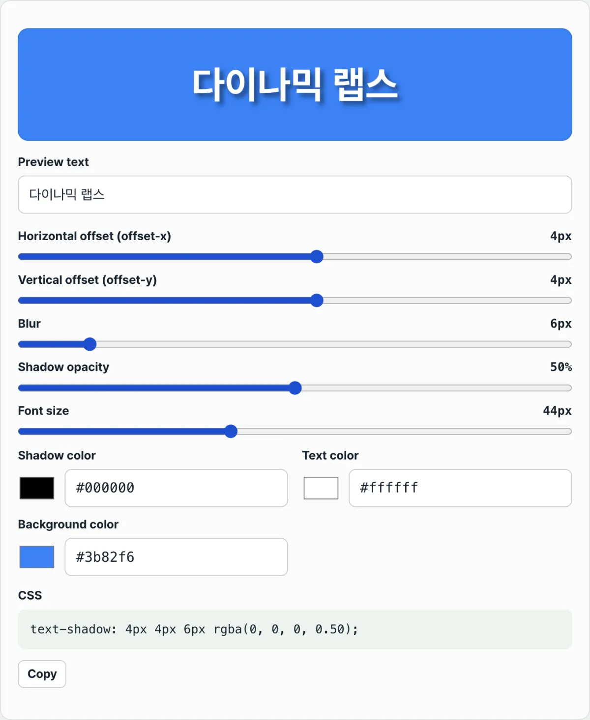
Check it in our tool. Set the sliders toward the highlight direction, build one value, and copy it. Then set the sliders toward the shadow direction, build another value, and copy that. Comparing the two side by side makes it quick to find the contrast you want.
Free · no sign-up · build a text-shadow value with the offset, blur, and color sliders, then copy the CSS
Where people get stuck
| Situation | Cause |
|---|---|
| The text still looks flat even with a darker, larger shadow | There's only one dark shadow, so there's no bright contrast on the other side |
| Two shadows in opposite directions still look weak | The bright shadow color is too close to the background, so the contrast doesn't stand out |
| Several layers look the same no matter what order you put them in | If the offsets and colors are similar, layer order barely shows to the eye |
| After joining values, only the first shadow seems to apply | A semicolon may have slipped in instead of a comma, cutting off the later values as a separate property |
Recap
- A single shadow only shows a blur behind the text. It can't create the sense that the letters pop out.
- Depth comes from two contrasts at once: a dark shadow on the side away from the light, and a bright highlight on the side facing the light. Only then does your brain read the text as raised.
- text-shadow accepts multiple values separated by commas. Shadows you list first are drawn on top, and shadows you list later are drawn underneath.
- Build one bright shadow and one dark shadow pointing in opposite directions, join them with a comma, and you can make 3D letters that look lit by a single light source.
Free · no sign-up · build a text-shadow value with the offset, blur, and color sliders, then copy the CSS
Core technical mechanism: optical illusion and multi-layer stacking
The 3D letter effect built with text-shadow isn't just coloring. It's the result of how human visual perception works combined with the layer stacking rules of the CSS rendering engine.
The two-cue model of human depth perception (Dual-Shadow Optical Depth Cue Model)
When our visual cortex perceives 3D depth on a 2D plane, it relies on two cues that appear together under a single light source. Cue 1 (Shadow): dark shadow offset on the side opposite the light source Cue 2 (Highlight): bright highlight offset on the side facing the light source If only one of these cues is present, the brain interprets it as a flat smudge rather than a raised or recessed surface. So to create a convincing 3D illusion, you have to render both the bright face that catches the light and the dark face that is shaded from it.
Anatomy of the four text-shadow parameters
The text-shadow property has four core parameters, and how they combine determines the texture of the depth. text-shadow: Xoffset (horizontal) Yoffset (vertical) Rblur (spread) Color (shadow color) The horizontal and vertical offsets trace the path of the light, the blur radius sets how soft the material feels, and the color tunes the overall tone.
Layer order rules for comma-separated multiple values
When you join multiple text-shadow values with commas (,) in CSS, you create multiple layers.
- The shadow declared first = rendered on top (closest to the text)
- The shadow declared last = rendered at the bottom (closest to the background) You can use this stacking order to build a thick extrusion or to fine-tune how light scatters.
Extruded 3D block letter shadow stacking
To build thick block letters, lock the blur at 0, push the offset out one pixel at a time, and stack each step with a progressively darker color. text-shadow: ∑k=1N kpx kpx 0 darken(baseColor, k × 5%) Stacking shadows this way renders a clean 3D extrusion running from the body of the letters into the background.
Comparing 3D text techniques in CSS typography
Here's a clear comparison of the strengths and weaknesses of the different ways to render 3D text on the web.
| Technique | SEO-friendly selectable text | GPU rendering performance | Responsive scalability | Versatility for glow/emboss | Implementation complexity |
|---|---|---|---|---|---|
| CSS Multi-Layer text-shadow | Full support (real text) | Excellent (simple rendering) | Very strong (em/rem friendly) | Most flexible (anything goes) | Low (join with commas) |
| CSS text-stroke + Stacked | Full support | Excellent | Moderate (limited thickness control) | Low (confined to the outline) | Low |
| SVG feDropShadow filter | Supported (inside the tag) | Moderate (scales with complexity) | Good | Excellent (precise filtering) | Medium (needs SVG syntax) |
| Canvas 2D TextPath Shadows | Not supported (becomes an image) | Low (pixel operation overhead) | Moderate (manual resolution handling) | Excellent | High (JS required) |
| WebGL 3D Text Geometry | Not supported (mesh-based) | Very high (hardware) | Moderate (needs resizing logic) | All-purpose 3D (includes lighting) | Very high (Three.js and so on) |
The standard CSS text-shadow approach gives you the best value for 3D depth without hurting search engine optimization (SEO) or performance.
5 Critical text-shadow Mistakes That Ruin 3D Text
Avoid these five common mistakes when you're trying to create great 3D lettering.
- Using only a single-direction shadow: If you add only a dark shadow without a highlight cue from the light source, your brain reads it as a blurred stain, not a 3D form. Always pair it with a light shadow in the opposite direction.
- Using semicolons between multiple values: When layering multiple shadows, if you use a semicolon (;) instead of a comma (,), the CSS syntax breaks: only the first shadow renders and the rest are ignored.
- Making the blur radius too large (10px or more): If you want a thick extruded 3D effect and set the blur radius to 10px or more, the edges get smeared and turn into an unreadable muddy mess. To keep the shape, keep blur to 0–1px.
- Using a shadow color that's too bright on a white background: When contrast with the background disappears, the depth cues that let you perceive 3D are lost. Consider the background color, lower the shadow's opacity appropriately, and make it darker.
- Forgetting the element's bounding box: text-shadow only extends the visual shape of the letters; it does not increase the actual space the HTML element occupies (its bounding box). If the shadow is too large, it can overlap nearby elements or text and make the layout messy.
A Practical 5-Step Workflow for Making 3D Embossed Text
Here's a five-step guide to creating the most stable and handsome 3D text.
- Decide the light direction: Set where the light comes from. The most natural direction is top-left.
- Define a light highlight layer: Create a light-colored shadow on the side facing the light. (Example: "-1px -1px 0 rgba(255,255,255,0.5)")
- Define a dark shade layer: Create the main dark shadow on the opposite side from the light. (Example: "2px 2px 3px rgba(0,0,0,0.4)")
- Combine with commas in a single property: Join the two values with a comma into one text-shadow declaration. (Example: "text-shadow: -1px -1px 0 rgba(255,255,255,0.5), 2px 2px 3px rgba(0,0,0,0.4);")
- Add an optional stepped extrusion: For thicker 3D depth, stack N more layers that increase the offset by 1px at a time toward the dark side.
7 Tips for 3D Text
These are seven text-depth engineering techniques used by experienced front-end craftspeople.
- A duet of light and shadow: For a realistic 3D relief effect, always pair a light highlight and a dark shadow pointing in opposite directions.
- The secret to crisp extruded letters: When stacking multiple stepped shadow layers to make a thick 3D title, set the blur radius to 0 so clean pixel-sharp edges survive.
- The magic of the rgba() alpha channel: Instead of solid HEX colors, use rgba() and set opacity between 30% and 60% to blend naturally with background textures without hurting readability.
- Think in reverse and carve inward: Reverse the directions—dark shadow above, light highlight below—and you get a refined engraved/inset neumorphism effect that makes the text look pressed into the background.
- Give 3D text breathing room with letter spacing: For thick extrusion, set "letter-spacing: 2px~4px" or so to keep shadows from overlapping and turning letters into a blob.
- Switch themes with CSS variables: Separate shadow colors into CSS custom properties such as "--shadow-color" and "--highlight-color". Then a light/dark theme switch needs only a one-line code change to keep the 3D effect perfect.
- Make full use of a generator tool: Use our free CSS Text Shadow Generator on this page to preview offsets and layer stacks in real time, auto-generate the best code, and copy it.
Text Shadow Style Decision Tree by Design Intent
If you're not sure which style to choose, follow the decision tree below.
- Is it a polished UI component or card title? ➔ Flat Drop Shadow (single layer, large blur radius, soft lift)
- Is it text on a metallic or raised button? ➔ Embossed Relief (dual highlight + shadow layers, short offset)
- Is it a high-impact title for a game banner or comic-book style? ➔ Extruded Block Letter (multi-layer stack built by pushing offsets out with 0 blur)
- Is it a sleek dashboard built for dark mode? ➔ Engraved Inset (reverse shadow + highlight, inset neumorphic panel effect)
- Is it a cyberpunk or nightclub flyer concept? ➔ Neon Glow (0 offset, strong blur radius, vivid fluorescent multi-layer spread)
3D Text Design Terminology Cheat Sheet
- text-shadow: The core CSS typography property that duplicates the letterform and pushes it to create a shadow.
- Offset (offset-x, offset-y): The distance values that determine how far the shadow moves from the original letters along the horizontal (X) and vertical (Y) axes.
- Blur radius (blur-radius): The spread value that determines how softly the shadow's edge is diffused.
- Highlight: A light-colored shadow layer used to show the edge that catches the light and glows brightly.
- Shadow: The natural dark shadow area that appears on the side opposite the light.
- Extruded 3D: A 3D effect that stacks multiple shadow layers to make it look like a thick cross-section column extends below the letters.
- Engraved Inset: An effect that reverses the direction of light and shadow so the text looks deeply carved into the surface.
- Neumorphism: A UI design trend that uses only the contrast between light and shadow to make elements look raised or recessed.
- Comma-separated Multi-value: A CSS syntax rule for creating multiple layers by listing several sets of values separated by commas within one property.
Frequently Asked Questions
Here are the three questions developers and designers ask most often when implementing 3D text.
Q1. Why does a single shadow layer look like a flat smudge instead of 3D?
The human visual system perceives depth through the simultaneous contrast between lit surfaces (highlights) and dark surfaces (shadows) created when light hits objects in the real world. With only a dark shadow, the brain loses half the 3D cues, so it interprets the result as a flat 2D image with a blurry pattern or stain behind the letters, not something raised.
Q2. How do I create a carved effect where the text looks deeply engraved into the surface?
Do the exact opposite of the raised emboss effect and reverse the light direction. On the top (the side facing the light), place a dark shadow to suggest the recessed inner face, and on the bottom (the side opposite the light), place a bright highlight along the edge. Flip light and shadow vertically like this, and the brain creates the visual illusion that the letters are carved into the surface.
Q3. Why can't I use semicolons (;) between values when stacking multiple shadows?
In CSS syntax, a semicolon (;) is a terminator that tells the engine a property declaration has ended completely. A comma (,), by contrast, is a list separator that says multiple values continue within one property. If you put a semicolon in the middle, only the first value is treated as valid code; the values after it are treated as an unknown invalid property name and are all dropped from rendering.
This article was adapted from our Korean original. Read the Korean original