
CSS shine effect: how a diagonal light sweep works
Contents
- The Light Streak on a Card: Why It Gets Confusing Without the Principle
- How to Check It: The Principle Behind a Gradient Band Moving Diagonally
- Common Sticking Points
- Wrapping Up
- Core Technical Mechanism: The Optics of Light and Vectors
- Comparing Sweep Implementation Techniques by Situation
- 5 Critical Mistakes People Commonly Make
- The 5-Step Ultra-Fast Smooth Diagonal Sweep Workflow
- 7 Highlight Effect Tips
- Decision Tree: Choosing the Light Beam Angle and Trigger by Situation
- Terminology Cheatsheet
- Deep FAQs
- Frequently Asked Questions
You've probably seen it on websites: a streak of light that glides diagonally across a card or button, giving it a premium feel. It looks complicated, but it's built with nothing more than CSS gradients and a pseudo-element — no images, no JavaScript libraries. Once you know how it works, you can build it yourself and change the angle, speed, and color however you like.
Summary ① The shine isn't a photo — it's a narrow white gradient band animating across the card ② The band looks diagonal not because of its movement direction, but because of the gradient's own angle value ③ You need a pseudo-element much larger than the card, clipped with overflow: hidden, so the band crosses every corner without gaps
The Light Streak on a Card: Why It Gets Confusing Without the Principle
If you try to copy the look from the outside, you'll usually reach for animating background-position or rotating the element itself. That approach makes the band cut off unnaturally at the card's edges, and if you change the angle even slightly, you have to re-align the coordinates from scratch.
The real shine effect doesn't move an element diagonally. It's an element that moves only left and right, containing a gradient band that's already tilted diagonally. Miss that distinction, and it's hard to see why changing the angle from 45 degrees to 30 degrees makes the band appear to leak outside the card.
How to Check It: The Principle Behind a Gradient Band Moving Diagonally
The shine effect is a few pieces working together. Break them down one at a time and you'll also understand why the result changes when you adjust the angle or speed.
Build the Narrow Gradient Band First
Add another invisible pseudo-element (::after) inside the card, and give it a linear-gradient background that runs transparent–white–transparent. If you set the color stops tightly, like 30%–50%–70%, you get a narrow bright band in the middle instead of a fully lit element.
The Angle Value Sets the Tilt
When you give the gradient an angle of, say, 45 degrees, the band itself tilts from top left to bottom right. An angle near 0 degrees is close to vertical stripes, near 90 degrees is close to horizontal stripes, and the tilt is determined by the angle value alone — not by the direction of movement.
Make It Bigger Than the Card and Move It Left to Right
Make the pseudo-element much larger than the card (about 300% wide and 200% tall) and animate its left position from outside the card's left edge (-150%) to outside the right edge (150%). If the element were the same size as the card, the band couldn't fully cover some of the four corners while moving, leaving triangular gaps.
Making it larger than the card is what lets the tilted band cross the entire card with no gaps for the whole duration of the move.
Wrap It with overflow: hidden
Finally, set position: relative and overflow: hidden on the card itself. Without overflow: hidden, the oversized pseudo-element sticks out past the card and becomes visible. Without position: relative, the pseudo-element moves relative to the whole page instead of the card.
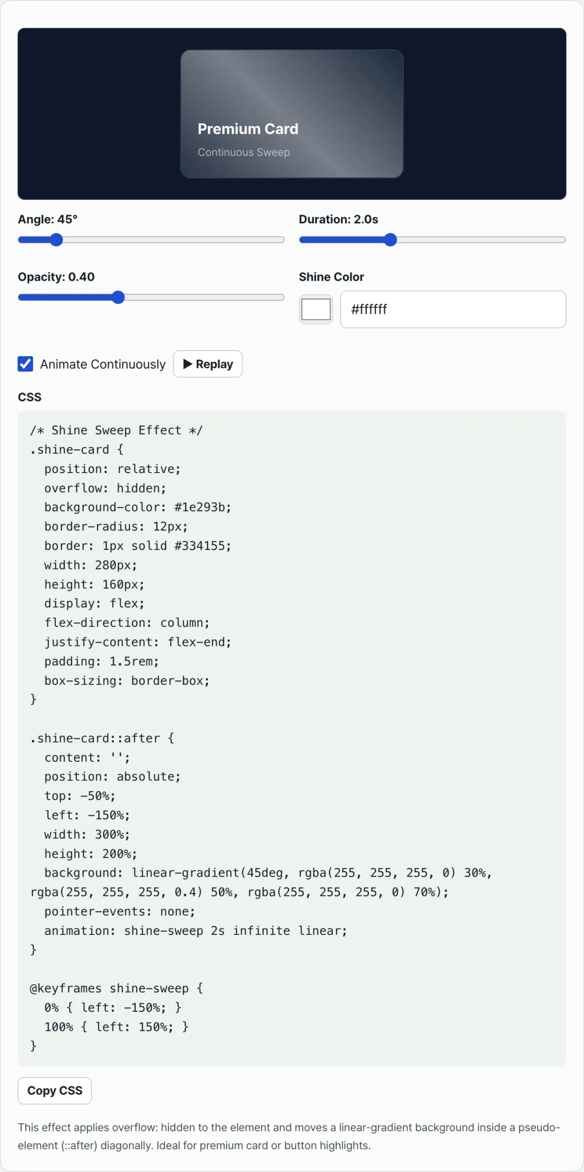
Check it with our tool. Adjust the angle, speed, sharpness, and color with the sliders, watch the band travel across the card in real time, and copy the finished CSS code as-is.
Free · no sign-up · preview it with sliders and copy the CSS right away
Common Sticking Points
| Situation | Cause |
|---|---|
| The light streak sticks out past the card's edges | overflow: hidden is missing on the card (parent) element |
| Triangular gaps appear in the corners while it moves | The pseudo-element is about the same size as the card, or smaller than 300%/200% |
| The shine moves relative to the whole screen, not the card | position: relative is missing on the parent element |
| No shine appears on hover | It's set up as a hover-only transition but mixed with a continuous animation (@keyframes) |
Most problems in this table are solved just by checking the pseudo-element's size and position, and whether the parent has overflow: hidden.
Wrapping Up
The shine that sweeps across a card or button isn't real light. It's a pseudo-element holding a narrow gradient band, animating left and right over an area wider than the card. The band looks diagonal because of the gradient's angle value, not because of the movement direction.
Change the angle, speed, and opacity one at a time and watch how the result shifts, and you can put together the exact CSS code for the look you want.
Free · no sign-up · preview it with sliders and copy the CSS right away
Core Technical Mechanism: The Optics of Light and Vectors
Decoupling Geometric Tilt vs Kinematic Motion
A CSS pseudo-element (::after) moves strictly horizontally along the X axis (from transform: translateX(-100%) to translateX(100%)). The reason the light appears to sweep diagonally is not that the element moves diagonally, but that the internal pixel vectors of the linear-gradient(45deg, ...) rendered inside the element are tilted diagonally. It's an optical illusion created by combining horizontal motion with internal tilt.
Trigonometric Dimensioning for a Diagonal Beam
On a card of width W and height H, the minimum travel distance (span) for the band to enter at angle θ and exit completely is calculated as: Travel Distance = W + H · tan(θ) When θ = 45°, the travel distance becomes W + H. If θ = 60°, the distance jumps to W + 1.73H. This is the mathematical reason the pseudo-element has to be set very large, such as 300% × 200%, to prevent corner clipping.
Optical Sharpness of Narrow Color Stops
To create a soft, refined specular light streak, you need to constrain the color stops tightly like this: linear-gradient(45°, transparent 35%, rgba(255,255,255,0.4) 50%, transparent 65%) Limiting the active gradient bandwidth to within 30% produces a sharp, crisp gloss without the whiteout effect that washes out your text.
Comparing Sweep Implementation Techniques by Situation
A clear comparison of the strengths and weaknesses of five main ways to build a shine effect.
| Technique | GPU hardware compositing | Resilience to geometric resizing | Bundle size (Bytes) | Subpixel antialiasing smoothness | Code complexity |
|---|---|---|---|---|---|
| Pure CSS ::after Gradient (recommended) | High (when using transform) | Best (works on a ratio basis) | Very small (< 200B) | Best | Low |
| CSS Skew Rect (transform: skewX) | High | Moderate (watch for edge overflow) | Small | Moderate (possible stair-stepping on edges) | Medium |
| CSS mask-image Sweep | Medium (limited on some devices) | High | Small | High | Medium |
| SVG LinearGradient animation | Medium | High | Medium | Best | High |
| WebGL Fragment Shader | Best | Best | Very large (requires Three.js, etc.) | Best | Very high |
5 Critical Mistakes People Commonly Make
These are the anti-patterns you must avoid to build a flawless shine sweep.
- Trying to rotate the pseudo-element itself (transform: rotate(45deg)): Rotating the element directly makes the bounding box overflow calculation with its parent extremely complicated and causes serious spacing problems.
- Forgetting overflow: hidden on the parent card: If you leave this off the parent, a huge pseudo-element two to three times the size of the card flies in from off-screen and users see it happening.
- Animating with the left property: Controlling position with left and top forces the browser to recalculate layout and paint every frame, which drags rendering performance to the floor. Always use transform: translateX().
- Setting gradient opacity too strong, 0.8 or higher: When the light passes over, it completely covers the card's key text and UI, seriously hurting usability.
- Omitting pointer-events: none: The ::after element sits on top of buttons and intercepts the user's click events, causing the critical bug where buttons don't respond.
The 5-Step Ultra-Fast Smooth Diagonal Sweep Workflow
- Initialize the container card: Apply position: relative; overflow: hidden; to the parent card element to constrain your canvas.
- Create a huge pseudo-element (::after): Use position: absolute; top: -50%; left: -50%; width: 200%; height: 200%; to float an oversized layer that dwarfs the card's dimensions.
- Define a multi-stop gradient: Write a sharp, crisp 45-degree white linear-gradient to create the optical band.
- Bind GPU-accelerated keyframes: Create @keyframes shineSweep and connect an animation that runs from transform: translateX(-150%) to transform: translateX(150%).
- Run a performance rendering audit: Open the Rendering and Performance tabs in Chrome DevTools and check that no Paint flashing occurs.
7 Highlight Effect Tips
- Run on the 60fps GPU compositor: To avoid rendering bottlenecks, all movement must go through transform: translateX(), which the browser compositor accelerates in hardware.
- Keep the opacity luxurious: For that premium specular look, keep the center opacity gently between 0.15 and 0.35.
- Let clicks pass through: Always declare pointer-events: none; on the ::after pseudo-element so nothing blocks the user's clicks.
- Apply a natural easing curve: Instead of linear, a curve like cubic-bezier(0.4, 0, 0.2, 1) makes the light glide and accelerate across the surface for a natural optical feel.
- Adjust the angle for extra-wide hero banners: On very wide desktop banners, tilting to 30 degrees instead of 45 fits the field of view more naturally.
- Add a periodic pause: Constant flashing tires the eyes. (For example, keyframe timing that runs the animation for 1 second, then waits 3 seconds with empty frames.)
- Use a generator tool: Skip the complex math and use a dedicated web tool that gives you production-ready CSS straight out of an intuitive UI.
Decision Tree: Choosing the Light Beam Angle and Trigger by Situation
The right approach depends on how important the card is and how much of the screen it takes up.
- Top-priority hero banner (needs sustained attention) ➔ Periodic Auto Sweep / apply a gentle angle (30 degrees)
- Shop product thumbnail card (encourages browsing) ➔ Hover Trigger / apply the standard angle (45 degrees) and a fast speed
- Notification badges and limited-edition special buttons (create urgency) ➔ Continuous Fast Shimmer / apply a steep angle (60 degrees) and a narrow band width
Terminology Cheatsheet
- Shine Sweep: An animation effect where a beam of light appears to sweep across an element's surface.
- Diagonal Light Beam: The visual illusion of a tilt, created by angling a linear-gradient.
- Color Stops: The percentage (%) breakpoints where colors change inside a gradient.
- Oversized Pseudo-element: A ::before/::after area made 2x to 3x larger so it fully extends past the parent container.
- overflow: hidden: The essential property that clips the huge pseudo-element sticking out of the parent and hides it visually.
- Compositor Acceleration: A technique that moves pixels directly in GPU memory to hit 60fps without loading the CPU.
- skewX: A way to create a diagonal by skewing the element, but it has edge anti-aliasing problems, so it's not recommended over rotating the gradient.
- Pointer Events Control: Setting pointer-events: none so the pseudo-element doesn't block mouse interaction.
Deep FAQs
Q1. Why is it better to move the element horizontally and just tilt the gradient diagonally, rather than moving the element diagonally?
Rotating the pseudo-element directly and moving it along a diagonal path (left and top together) makes calculating the start and end coordinates very tricky. On the other hand, if you tilt the band with a gradient and only move the element horizontally (along the X axis) from left to right, you can build a perfect diagonal light beam with just 2 keyframes (translateX(-150%) to 150%), which is far easier to maintain.
Q2. Why make the pseudo-element (::after) so drastically large, like 300% or 200%?
When the light beam tilts past 45 degrees, the hypotenuse it crosses through the card becomes much longer than the card's width or height. If the element is the same size as the card, empty triangular gaps appear where the light doesn't reach as it crosses the corners. So you need to oversize the element enough to match the mathematical trigonometric ratio, letting the beam start off-screen and exit perfectly.
Q3. How do I convert my existing left/top animation to transform: translateX?
Inside your CSS @keyframes, delete left: -100% ➔ left: 100% and just put transform: translateX(-100%) ➔ transform: translateX(100%) in its place. With this change, the browser no longer repaints the screen every frame — it pushes a texture it already loaded into GPU memory using hardware, so battery drain drops sharply and you get extremely smooth 60fps.
Frequently Asked Questions
Does changing the angle value change the direction of the light beam?
Yes. The larger the gradient's angle value, the steeper the band tilts. Near 0 degrees it looks like vertical stripes, near 90 degrees like horizontal stripes, and around 45 degrees it naturally feels like the light flows from the top left to the bottom right.
Can I make it shine only on hover?
Yes. Instead of a continuous animation (@keyframes), use a transition on the pseudo-element's position (left) in the hover state. It stays hidden outside the card normally, then passes through once when the mouse hovers over it.
My shine is too faint or not visible at all. Why?
The gradient's opacity value is too low, or the light color is too similar to the card's background color. White tones work well on dark background cards, and a contrasting color works well on light background cards, so the effect stands out much better.
This article was adapted from our Korean original. Read the Korean original