
CSS shine effect: how to make a diagonal light sweep
Contents
- Why the diagonal shine effect is so hard to tune
- How to build a diagonal shine effect with plain CSS
- The values behind a shine effect
- Recap
- The Core Technical Mechanism: Oversizing and the GPU Compositor Secret
- Specular Shine Implementation Methods Compared by Situation (Matrix)
- 5 Common Mistakes When Applying a Shine Effect
- A 5-Step Workflow for Building a Production-Ready Diagonal Shine Card
- 7 Shine Styling Tips
- Decision Tree for Applying Shine Dynamics
- Core Terminology Cheatsheet
- Frequently Asked Questions
You can build the diagonal shine that glides across premium pricing cards and highlight buttons with plain CSS. The catch is that you have to nudge the pseudo-element's gradient angle, brightness (opacity), and travel speed one number at a time and check each change in the browser, so dialing in the look you want takes a while. This post covers how a diagonal light streak works and the actual CSS behind it, plus a faster way to tune the values and grab the finished code.
Summary ① A shine effect is a translucent white gradient band tilted with an angle value, then moved from left to right on a pseudo-element (::before, ::after). ② Without overflow: hidden on the parent element, the light streak spills outside the card. ③ Instead of changing the angle, speed, and brightness in code one at a time, you can drag sliders in our tool and copy the finished CSS.
Why the diagonal shine effect is so hard to tune
The diagonal light sweep you see on premium pricing cards, discount banners, and checkout CTA buttons used to be built by stacking a video or GIF layer. Today you can do it with plain CSS: create a translucent gradient band on a pseudo-element (::before) and move it from left to right.
The hard part is that the values are tangled together. Change one — the gradient angle the streak runs along, its brightness (opacity), its speed — and the balance with the others shifts. Every time your card design changes, you end up refreshing the browser and eyeballing combination after combination.
How to build a diagonal shine effect with plain CSS
The skeleton of the effect is a single pseudo-element hidden inside the card. Park it outside the card's left edge (left: -150%), then move it to the right edge (left: 150%) on hover or on a timed interval, and the light appears to sweep diagonally.
- Tilting the streak: Set the linear-gradient angle to around 45deg instead of 0deg so the band itself runs diagonally. Close to 0deg gives vertical stripes, close to 90deg gives horizontal stripes, and around 45deg you get a natural diagonal beam. In other words, the tilt comes from the gradient angle, not from the direction of travel.
- A transparent gradient band: Use linear-gradient(45deg, transparent 0%, rgba(255,255,255,0.4) 50%, transparent 100%) to make the center bright and both ends transparent.
- Oversize the pseudo-element: Make it much bigger than the card (300% wide, 200% tall) so the diagonal band covers every corner for the whole trip.
- overflow: hidden is mandatory: Without it on the parent container, the light streak sticks out past the card's frame.
Below are two versions of the CSS: a card that shines once on hover, and a button that repeats on its own.
<div class="shine-card">
  <div class="badge">PRO PLAN</div>
  <h3>Unlimited cloud plan</h3>
  <p>Sign up today and get 50% off your first month plus premium storage.</p>

  <button class="shine-btn">Get started</button>
</div>
/* 1. Shine card styles */
.shine-card {
position: relative;
width: 320px;
padding: 32px;
background: linear-gradient(135deg, #1e1b4b 0%, #312e81 100%);
color: #ffffff;
border-radius: 16px;
overflow: hidden; /* required: keeps the streak from spilling out */
box-shadow: 0 10px 25px rgba(49, 46, 129, 0.4);
}
/* Create the pseudo layer for the diagonal streak */
.shine-card::before {
content: '';
position: absolute;
top: -50%;
left: -150%;
width: 300%;
height: 200%;
background: linear-gradient(
45deg,
transparent,
rgba(255, 255, 255, 0.25),
transparent
);
transition: left 0.75s ease-in-out;
}
/* On hover, the streak sweeps across the whole card */
.shine-card:hover::before {
left: 150%;
}
/* 2. Button with a self-running, infinite shine */
.shine-btn {
position: relative;
width: 100%;
padding: 14px;
font-weight: 700;
color: #0f172a;
background: linear-gradient(135deg, #38bdf8 0%, #818cf8 100%);
border: none;
border-radius: 10px;
overflow: hidden;
cursor: pointer;
}
.shine-btn::after {
content: '';
position: absolute;
top: -50%;
left: -150%;
width: 300%;
height: 200%;
background: linear-gradient(
45deg,
transparent,
rgba(255, 255, 255, 0.5),
transparent
);
animation: auto-shine 3.5s infinite ease-in-out;
}
@keyframes auto-shine {
0%, 60% { left: -150%; }
100% { left: 150%; }
}The second snippet uses @keyframes to hold the light still from 0% to 60% and let it pass only once during the rest of the cycle. Without that pause, the light repeats without a break and can get in the way of reading the text. Also, using transform: translateX() instead of left for the movement gets you GPU acceleration, so the animation plays more smoothly.
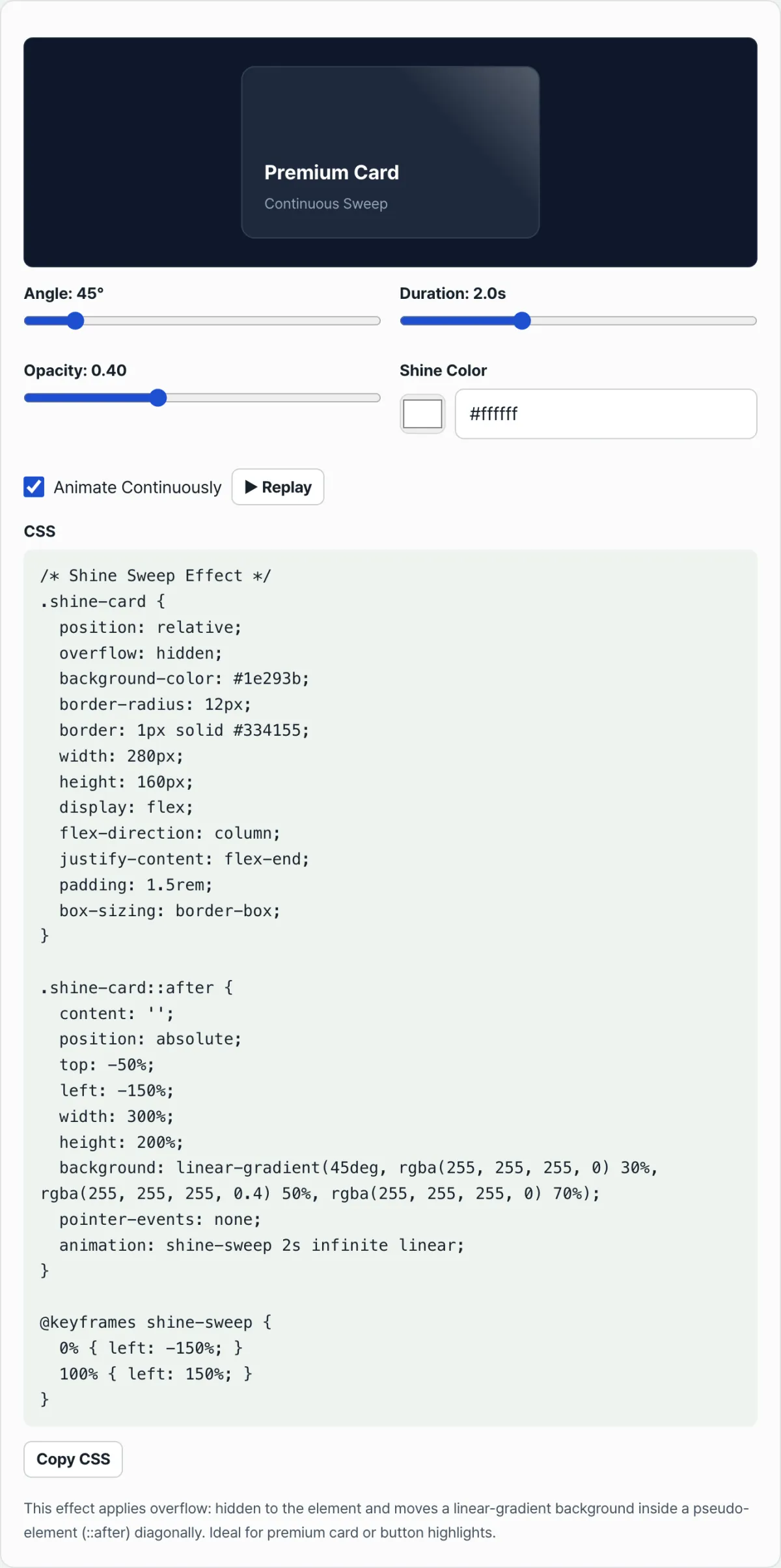
Instead of changing these values in code one at a time, adjust the angle, speed, and brightness with sliders, see the result live, and copy the finished CSS — try it in our tool.
Preview your diagonal light sweep angle, speed, and brightness in real time, then grab the optimized shine animation CSS right away.
The values behind a shine effect
| Property | What it does | Typical values |
|---|---|---|
| Gradient angle | How much the streak tilts. Near 0deg is close to vertical, near 90deg is close to horizontal | 0deg ~ 360deg (default 45deg) |
| Pseudo-element size | Set bigger than the card so no corner is left empty while it moves | width 300%, height 200% |
| Brightness (opacity) | How bright the center of the light is | rgba(255,255,255,0.25~0.5) |
| overflow | Clips the streak so it can't leave the card | hidden (required) |
| Animation style | One pass on hover, or an infinite loop | transition or @keyframes |
Recap
- A shine effect is a translucent gradient band tilted with an angle value, moved from left to right on a pseudo-element.
- Without overflow: hidden on the parent element, the light streak sticks out past the card.
- If the light repeats without a break, it gets in the way of reading the text, so add a pause in your @keyframes.
- Using transform: translateX() instead of left plays more smoothly thanks to GPU acceleration.
- Instead of matching value combinations in code one at a time, adjust them with sliders in the tool and copy the resulting CSS.
Preview your diagonal light sweep angle, speed, and brightness in real time, then grab the optimized shine animation CSS right away.
The Core Technical Mechanism: Oversizing and the GPU Compositor Secret
1. The Trigonometry of Oversizing (Why 300% x 200% Oversizing Is Essential)
For a diagonal light streak set to 45 degrees to cross a W x H rectangular card completely, the diagonal travel distance (Span) the light has to cover is calculated like this:
If you size the pseudo-element (::before) at 100% x 100%, the same as the card, the 45-degree beam gets clipped at the card's corners as it travels (Corner Cutoff). So if you expand the width and height to 300% x 200% and run the start position from left: -150% to left: +150%, you guarantee perfect edge-to-edge light coverage at any aspect ratio.
2. The Linear Gradient Formula for Specular Reflection
A linear gradient that reads as a three-dimensional reflection can't just use plain white. It needs careful placement of transparency levels and color stops.
This structure puts a bright core (0.4 opacity) in the center with soft scattered light (0.05 opacity) on either side, which produces a natural metallic sheen.
3. GPU Compositor Acceleration and Layout Thrashing
Animation performance depends heavily on which properties you animate. If you change left or margin-left, the browser recomputes the layout (reflow) stage every frame, which overloads the main thread. Use transform: translateX() and will-change: transform instead, and the work gets offloaded to the GPU compositor, giving you a smooth 60 frames per second sweep without CPU involvement.
Specular Shine Implementation Methods Compared by Situation (Matrix)
There's more than one way to build a light streak and a reflection. Pick the technique that fits your project's scale and performance requirements.
| Implementation Method | GPU Load | High-DPI Retina Sharpness | DOM Complexity | Theme Color Adaptability | Mobile Battery Impact |
|---|---|---|---|---|---|
| Pure CSS Gradient Sweep | Very low (best) | Perfect (vector resolution) | Simple (1 pseudo-element) | Excellent (CSS variable compatible) | Minimal (almost no impact) |
| CSS transform: skewX() | Low | Perfect | Slightly complex (nested DOM required) | Moderate (angle control limited) | Low |
| SVG <filter> Specular | High | Moderate (depends on render settings) | Very complex | Very low | High (watch for heat) |
| HTML5 Canvas 2D Scene | Moderate to high | Pixel matching required | JavaScript dependent | High (controlled by code) | Moderate |
| WebGL Fragment Shader | Very high | Perfect | WebGL context setup | Unlimited | Very high |
For micro-interactions on real production websites, the pure CSS Gradient sweep wins by a landslide, since it costs the least in performance and battery drain.
5 Common Mistakes When Applying a Shine Effect
When you rush to add a flashy effect, it's easy to make mistakes that damage UX and performance.
- Missing clipping wrapper: You don't set overflow: hidden and position: relative on the card container, so the diagonal light streak spills into the page margins or other UI elements.
- Wrong sizing: You set the pseudo-element to width: 100%, which leaves the corners looking black and empty as the light crosses the card. (Always use 300% x 200% oversizing.)
- Too much brightness: You push the center streak opacity to 0.7 or higher, so the card title and body text underneath become unreadable as the light passes over them.
- Fast, constant infinite looping: You set the animation cycle to 1 second or less and loop it forever, which grabs the user's attention and badly hurts readability.
- Blocking touch events: You forget pointer-events: none on the pseudo-element, so the transparent layer on top intercepts clicks and hover events meant for the buttons below, and the buttons stop responding.
A 5-Step Workflow for Building a Production-Ready Diagonal Shine Card
- Set the container reference point: Apply position: relative, overflow: hidden, and border-radius to the parent element wrapping the card to create a clipping context for masking.
- Create the oversized geometric pseudo-element: Give the card's ::before or ::after width: 300%; height: 200%; top: -50%; left: -150%; to prepare the large light layer.
- Paint the specular reflection gradient: Apply a centered 45-degree transparent-to-white-to-transparent (transparent -> rgba -> transparent) linear gradient to get a metallic reflective texture.
- Build the hover sweep animation: On :hover, use transition: left 0.75s ease-in-out or @keyframes shineLoop so the light glides across smoothly.
- Test accessibility and contrast: Confirm that pointer-events: none is working so clicks aren't blocked, and check on mobile that readability holds up while the light passes over the text.
7 Shine Styling Tips
- Use transform: translateX(): Animating transform with will-change: transform instead of the left property gives you pure GPU acceleration and eliminates dropped frames, even on mobile.
- Fully control pointer events: Always add pointer-events: none so the invisible pseudo-element doesn't block interactions on the card.
- Pair it with high-contrast backgrounds: A shine effect looks the most premium against rich, dark card backgrounds such as deep indigo (#1e1b4b), emerald (#064e3b), or obsidian (#0f172a), where the brightness contrast peaks.
- Add a double-core stripe: Putting two narrow, strong opacity bands at 48% and 52% instead of a single light band gives you a refined gloss that mimics real metal reflecting light.
- Stagger the repeat cycle: If the shine plays automatically, stretch the @keyframes animation to 4–6 seconds and give it a pause of 70% or more where no light moves, keeping it subtle instead of annoying.
- Adjust the angle to the ratio: If the card's aspect ratio is a wide banner, lay the angle down to 30–35 degrees. If the card is close to square, 45 degrees looks the most natural.
- Use a CSS generator tool: Instead of hand-editing code in your editor, it's far more efficient to dial in the look with sliders in a dedicated web tool, check it in real time, and then pull out the production code.
Decision Tree for Applying Shine Dynamics
How much attention you need to pull from users should determine the timing and intensity of the light.
- Step 1: Top-level highlight banner (promotions, limited-time offers) ➔ Periodic Ambient Pulse: Let a soft sweep pass automatically every 5–6 seconds to draw the eye.
- Step 2: Interactive micro elements (premium plan cards, CTA buttons) ➔ Hover Triggered Sweep: Keep it hidden by default, then have it sweep across at a fast 0.5 seconds the moment the user hovers, giving instant feedback for the interaction.
- Step 3: States that need constant feedback (loading skeletons) ➔ Continuous Fast Shimmer: Like a skeleton loading bar, let it sweep past quickly and repeatedly at 1–2 second intervals while data loads, so users know the system hasn't frozen.
Core Terminology Cheatsheet
- Shine Effect: A visual micro-interaction where a band of light appears to cross over an object's surface.
- Specular Highlight: The brightest area of mirror-like reflection where light hits. It adds a premium, metallic feel.
- Gradient Angle: The angle at which the linear gradient is tilted (usually around 45deg).
- Oversized Geometry: A pseudo-element size greater than 100% (for example, 300%x200%) that prevents the corners from getting cut off during diagonal movement.
- Clipping Context (
overflow: hidden): An essential CSS property for cutting off visual elements that spill outside the parent element. - Skew (
skewX): A property that distorts and tilts an element, though in shine effects you can replace it by adjusting the gradient angle alone. - Pointer Event Control (
pointer-events: none): A property that ignores mouse and touch events entirely and lets them pass through, so clicks on buttons underneath aren't blocked. - Compositor Acceleration: A browser rendering optimization that hands calculations to the GPU instead of the CPU to produce smooth 60fps animation.
Frequently Asked Questions
Q1. Why should the pseudo-element be oversized at 300% x 200% instead of 100%?
A1. When the light band is tilted diagonally (say, 45 degrees), it moves from left to right in a rotated state. At 100% size, it passes through the center of the card, but the top and bottom corners (especially along the diagonal) get a shorter band of light and are never covered, leaving dark dead zones. You need a width of 300% or more so the light covers the whole surface from start to finish.
Q2. Why does transform: translateX() perform better than changing the left property?
A2. The CSS left property affects the page layout (position and space), so the browser has to redo a reflow calculation every frame, which puts a heavy load on the CPU. transform, on the other hand, doesn't affect layout; the GPU just moves the image during the final compositing step, so the animation is far smoother.
Q3. An invisible pseudo-element is blocking clicks on my button. How do I prevent that?
A3. When a pseudo-element (::before or ::after) covers the top layer of a card, it intercepts all mouse and touch events even though you can't see it. To prevent this, you must add pointer-events: none; to the pseudo-element's CSS so the user's clicks reach the button underneath.
This article was adapted from our Korean original. Read the Korean original