
Neon Text CSS: Stack text-shadow Layers and Add Flicker
Contents
- Why neon text effects are hard to tune by hand
- The multi-layer text-shadow structure, and checking it with our tool
- Layer structure and real-world use at a glance
- Core Technical Mechanics: Optical Physics Modeling of Gas Discharge Tubes
- Neon Glow Implementation Techniques: Comparison Matrix
- 5 Critical Mistakes in CSS Neon Text Styling
- A 5-Step Workflow for Building a Convincing Neon Sign Glow
- 7 Neon Styling Tips
- Decision Tree for Neon Color and Flicker Dynamics by Mood
- Key Terminology Glossary and One-Line Cheat Sheet for Pros
- Frequently Asked Questions
When you want glowing text like a neon sign on a web page, stacking several layers of CSS text-shadow gets you there in pure CSS, with no images or Canvas scripts. The catch is that tweaking blur radius and colors by feel makes it hard to know how many layers you need or how to split the radii. This post covers how the multi-layer text-shadow structure works and how to build the flicker animation.
Summary ① A neon glow comes from stacking several
text-shadowlayers with different radii into a three-stage structure: core, spread, and aura. ② Splitting the radii as white core (4–7px), colored spread (10–20px), then outer aura (40–80px) gives a natural glow. ③ Rather than calculating each value, it's faster to adjust color, radius, and flicker in the Neon Text CSS Generator and copy the finished code.
Why neon text effects are hard to tune by hand
In the past, getting a neon sign look meant layering image files or Canvas scripts. CSS3 text-shadow lets you declare several comma-separated shadows at once, so overlapping three or four layers with different radii is enough to produce the core-spread-aura glow that neon tubes have. The problem is that tuning the layer count, radii, and color combinations by hand easily turns into repeated trial and error.
The multi-layer text-shadow structure, and checking it with our tool
A neon sign emits bright light inside a glass tube, with a purple or pink aura spreading around it. You recreate that by stacking three or four shadow layers of different radii on text-shadow. The full neon glow is the sum of several text-shadow layers with different radii (r) and colors, added in order.
Here's what each layer does.
- Center core tube (radius 4px–7px): Declare a very bright white (#ffffff) light at a narrow radius to create the glowing center of the neon tube.
- First main colored spread (radius 10px–20px): Spreads the tube's own purple, pink, or green color softly outward.
- Second outer wide aura (radius 40px–80px): A large, deep aura that makes the whole background wall feel soaked in light.
Here's an example of neon sign CSS with a flicker animation added.
<div class="neon-container">
  <h1 class="neon-text">OPEN 24 HOURS</h1>
</div>
.neon-container {
background-color: #030712;
padding: 60px 20px;
text-align: center;
}
.neon-text {
font-family: 'Monaco', 'Courier New', monospace;
font-size: 48px;
font-weight: 700;
color: #fff;
/* Stacked multi-source text-shadow layers (core 1 + spread 1 + aura 2 = 4) */
text-shadow:
0 0 6px #fff,
0 0 16px #f43f5e,
0 0 45px #f43f5e,
0 0 75px #f43f5e;
/* Hooked up to the neon flicker animation */
animation: neon-flicker 1.8s infinite alternate ease-in-out;
}
/* A convincing effect of the neon tube flickering from unstable voltage */
@keyframes neon-flicker {
0%, 18%, 22%, 25%, 53%, 57%, 100% {
text-shadow:
0 0 6px #fff,
0 0 16px #f43f5e,
0 0 45px #f43f5e,
0 0 75px #f43f5e;
}
20%, 24%, 55% {
text-shadow: none; /* The light cuts out for an instant */
}
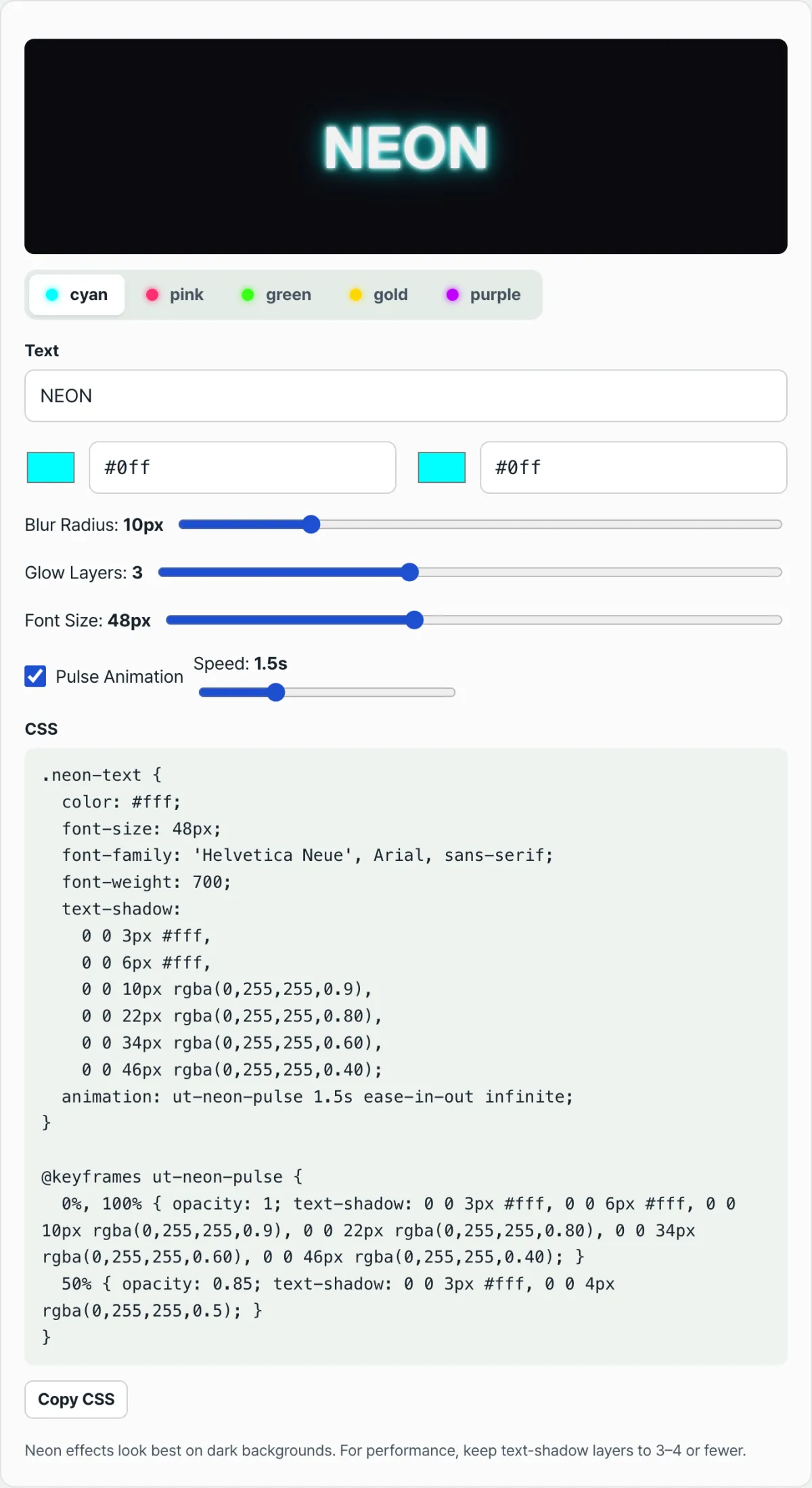
}Note Instead of hand-tuning commas and pixel radii, you can use the Neon Text CSS Generator to set the text, glow color, glow radius, and flicker speed with sliders, then copy the finished CSS right away.
If you'd rather see the result right away instead of calculating each value, check it with our tool.
Adjust the neon color, aura radius, and flicker speed in real time, then copy the optimized neon sign CSS stylesheet.
Layer structure and real-world use at a glance
| Layer | Blur Radius | Color | Role | | ---
Core Technical Mechanics: Optical Physics Modeling of Gas Discharge Tubes
To build neon text that looks like real light is spilling off the monitor using nothing but CSS, you can't just pile on shadows. You have to understand exactly how a gas discharge tube emits and scatters light in the physical world, then translate that behavior into code.
The Optical Physics and Light Emission Principles of Gas Discharge Tubes
A real-world neon sign works by sealing an inert gas like neon or argon inside a vacuum glass tube and running high voltage across electrodes at both ends to ionize the gas atoms. The energy released when electrons drop from an excited state back to the ground state is the intense light we see. In the process, the tube forms an extremely bright plasma core at its center, and that core light passes through the colored glass and radiates outward. The escaping light then scatters off particles in the surrounding air or bounces off a dark wall behind it, creating a faint aura. So to mimic this as closely as possible in CSS, you need a strategy that splits the behavior of light into four independent shadow layers and stacks them.
The 4-Tier text-shadow Stack Architecture (Optical Layer Design)
This four-layer structure is a direct formula for the physical phenomenon where the blur radius grows exponentially from the center outward and the harsh white of the emitter gradually dissolves into the neon's own saturated hue.
Layer 1 (White-Hot Core): 0 0 4∼ 7px #ffffff (simulates plasma core) Layer 2 (Inner Tube Color): 0 0 10∼ 20px var(--neon-color) (pure saturated tint) Layer 3 (Ambient Glow): 0 0 40∼ 50px var(--neon-color) (radiant halo) Layer 4 (Outer Wall Flood): 0 0 70∼ 100px var(--neon-color) (environmental reflection)
Translated into code, the brightest plasma core (Layer 1) locks in the visual shape of the neon, the pure saturated tint (Layer 2) sets the color inside the tube, and the radiant halo spilling outward (Layer 3) plus the environmental reflection (Layer 4) blend the light smoothly into the background.
How Realistic Voltage Flicker Works
The beat-up neon signs you see in movies or in games set in back alleys never glow steadily. The cause is irregular discharge delays from an old ballast that can't supply voltage evenly. To pull this off with CSS animation, you have to rule out easing functions that produce linear or smooth curves.
Instead, you build a keyframe set broken into highly irregular, discrete steps. If you treat the full animation cycle as 100%, it should stay fully lit from 0% to 19%, kill every glow layer instantly at 20% (text-shadow: none), and snap back on at 21% — a jagged, sawtooth break. That abrupt on/off stutter, like an electrical arc jumping, creates visual tension in the brain and sells a much more believable worn-out tube.
Interaction with Typographic Geometry
A real neon sign is made by a craftsman heating glass tubing and bending it by hand into the shape of the letters. Because the tubing is physical, a stroke can't suddenly get thinner or thicker, and it can't taper to a sharp point. So if you apply a neon text effect to a serif or calligraphy font, you get visual cognitive dissonance. You need a geometric sans-serif or monospaced typeface with thin, uniform strokes that matches the geometry of glass tubing perfectly. Fonts like Neon Tubes, Monaco, and Montserrat (at its thinnest weight) line up with the mechanics of a physical glass tube and maximize the realism of the effect.
Neon Glow Implementation Techniques: Comparison Matrix
There are several technical alternatives for producing text-based glow effects on the web. Depending on what your project needs — live editing, performance limits, device compatibility — I compared multi-layer CSS against the other approaches from several angles.
| Implementation Approach | Live Text Editing and Dynamic Data Binding | GPU Hardware Acceleration and Rendering Performance | Rendering Sharpness Across Screen Resolutions | Battery Efficiency on Mobile Devices | Physical Realism of the Final Glow |
|---|---|---|---|---|---|
| Multi-layer CSS (text-shadow) | Excellent (works with a CMS, text edits apply instantly) | Excellent (leans on GPU acceleration in modern browsers) | Perfect (vector-based, stays crisp when zoomed) | Excellent (native browser optimization keeps battery drain minimal) | Very realistic (great fidelity with a 4-layer optical stack) |
| SVG <feGaussianBlur> filter | Good (text nodes inside the SVG can be edited) | Average (complex SVG filter math is heavy on older devices) | Perfect (pure vector rendering) | Average (power draw scales with computation) | Extremely realistic (blend modes plus filter combos allow precise control) |
| Canvas 2D Glowing Path | Average (every text change requires a script-driven canvas repaint) | Low (constant CPU/GPU work ties up the thread) | Average (needs separate scaling for high-DPI displays) | Low (constant frame drops once animation is involved) | Average (code complexity explodes when simulating multiple light sources) |
| WebGL Bloom Shader | Low (text must be baked to a texture and pushed through a shader pipeline) | Very low (the heaviest graphics workload on the web) | Excellent (great quality with anti-aliasing) | Worst (causes device heat and severe battery drain on mobile browsers) | Best (full physically based light scattering and rendering) |
| Static transparent PNG / WebP image | Impossible (every text change depends entirely on a designer redoing the asset) | Best (plain bitmap rendering, no heavy computation) | Low (pixelation and quality loss when force-scaled in responsive layouts) | Best (no extra computation) | Limited (great for static looks, but no flicker animation) |
As the matrix makes clear, the multi-layer CSS text-shadow technique is the ultimate web-standard method — it hits the sweet spot between text editability, browser rendering performance, and design realism in a dynamic web environment where data changes in real time.
5 Critical Mistakes in CSS Neon Text Styling
Great design and a terrible result are one small step apart. Here are the 5 critical mistakes frontend developers and UI designers most often make when building neon effects — plus the guardrails that prevent each one up front.
- Missing the White-Hot Core: This is the big one — setting the innermost first
text-shadowlayer to a signature color like blue or red instead of#ffffff(pure white). By the nature of light, the hottest, highest-energy center has to burn out to white (clipping). Without that core, the neon sign stops reading as a light source giving off light. It just looks blurry and flat, like ink bleeding into water around the text. Always declare the first layer in white with a narrow radius. - Luminous Glow on a Bright Canvas: A neon sign effect is a visual effect that leans on the contrast between light and its surroundings. Put a neon glow on a white or light gray background and the contrast ratio collapses, so the glow gets canceled out entirely. This badly breaks web accessibility standards (WCAG) and is a leading cause of unreadable text. To paint light, you first need perfect darkness underneath.
- Overly Thick or Bold Typography: Apply a large blur to a heavy face like Impact or a Black weight and the wide interior of the thick letters tangles with the outer shadow area, smearing everything into one giant blob. Light needs gaps to pass through and spread, so the key is to use a relatively thin typeface with plenty of negative space and leave those physical gaps open for the glow.
- Massive Blur Radius Overload: This is when you ignore web performance and slap blur radii of 150px or more across dozens of text nodes all at once. A blur is a heavy operation — the browser's rendering engine samples neighboring pixels one pixel at a time. Do it over and over and the GPU in a mobile browser hits its limit, giving you serious frame drops and stuttering on scroll. If you need a wide glow, it's smarter to fake it with a
radial-gradienton the background than with a shadow on the text itself. - Ignoring Accessibility Fallbacks: This one comes from falling so in love with the visual effect that you ignore OS-level high-contrast mode, which people with low vision or other visual impairments often rely on. In a high-contrast setting, heavy blur turns the letters into an obstacle you can't even make out the shape of. Real pros declare fallback CSS for the
@media (prefers-contrast: more)media query: remove the shadows and restore the letters' native sharpness.
A 5-Step Workflow for Building a Convincing Neon Sign Glow
Here's a systematic 5-step workflow you can use on a real project right away to build the most realistic, best-looking neon glow sign. Assemble the code in this order and the odds of failure drop to near zero.
- Step 1 (Set the Deep Background — Prep the Canvas): The first step in working with light is to prepare the most perfect darkness. Rather than flat
#000000black, set the page or section background to a deep obsidian dark tone (#030712to#0f172a) that adds space and depth, giving you an abyssal canvas that maximizes the glow. - Step 2 (Choose Tube-Shaped Typography): Pick a typeface that can mimic the thickness of a physical neon discharge tube. Apply a thin, tube-like sans-serif or monospace face with even stroke weight and terminals that end round or cut clean at a right angle. Set the font size to at least 3rem or larger so the shadow has physical room to spread.
- Step 3 (Build the 4-Layer Optical Shadow Stack): Use commas in the
text-shadowproperty to stack the optical layers one on top of another. Up front, keep the brightest pure white core (#ffffff) small and tight at a 4–7px radius. Behind it, declare the color's first tube spread (10–20px), a second ambient aura (40–50px), and finally a third wide reflected glow (80px or more), in that order, to build the full depth of the light emission. - Step 4 (Add a Flickering Unstable-Voltage Animation): Instead of a smooth, breathing pulse, write unstable-voltage keyframes (
@keyframes) that twitch like an old alleyway sign. At specific percentage stops (for example 22% and 53%), make the glow stack cut out tononefor a harsh break, then attach it to the text element with theanimationproperty. - Step 5 (Audit Contrast and Test Responsive Rendering): Check that the blur radius scales down and up appropriately with font size as the viewport changes across mobile, tablet, and desktop. Then do a final audit with accessibility tooling to confirm the text at the center of the glow has enough WCAG contrast against the background to read clearly regardless of a visitor's eyesight.
7 Neon Styling Tips
Seven advanced tips and techniques from senior developers and art directors that go beyond simple text shadows and take the craft into the realm of art.
- Use CSS custom properties wisely: Don't repeat dozens of lines of code just to switch themes. Define CSS variables on your top-level selector, like
--neon-color: #f43f5e; --neon-core: #ffffff;, and reference them in the shadow properties. Then you can swap color themes such as cyberpunk pink, electric cyan, alien green, and retro amber across the entire website instantly by changing a single value, using JavaScript or media queries. - Combine neon text with a glowing border: Neon text floating alone in empty space feels less convincing than when a rectangular frame around it glows too. Give the container element a border and declare
box-shadow: 0 0 15px var(--neon-color), inset 0 0 15px var(--neon-color)for both the outside and inside. This perfectly mimics a neon box sign made by bending glass tubes. - Maximize reflected-light synergy with a dark concrete texture background: Instead of a perfectly smooth, solid black background, try a background image with a very dark brick or rough concrete texture pattern applied subtly. The large
text-shadowaura of the neon seems to spread across the bumpy texture, creating dramatic ambient lighting that looks like a scene from a movie. - Staggered animation delays by letter: For a long sign like "OPEN 24 HOURS," having all 13 characters blink in perfect sync looks unnatural and fake. Wrap each letter or word in its own
<span>tag and give each one a slightly differentanimation-delay, such as 0.1s, 0.3s, and 0.7s. This gives the sign a more irregular, worn, realistic feel, as if a faulty wire is making parts of it fire at random. - Fuse ambient light with mix-blend-mode: If a complex image or video is layered over a dark background, try adding
mix-blend-mode: screenorcolor-dodgeto the neon text layer. The neon light is optically calculated and mixed with the background's pixel values. This creates a natural, dramatic blend with the environment, as if real light were reflecting off objects in the background. - Always enforce a minimum font size: For the four stacked light layers to stay clearly separated and create depth, the base font size must be at least 32px (about 2rem). If you shrink the text too much for mobile, the blur radii get tangled and overlap in a cramped space. What you get is not crisp, clean neon but a muddy, messy smear.
- Use a neon CSS generator to keep complexity under control: Tweaking the numbers for the four-layer nested shadow, keyframe setup, and hex color calculations by hand in your editor, then refreshing to check the result, is the worst kind of inefficiency. Use the "Neon Text CSS Generator" web tool provided at the top of this article. Adjust the radius and color visually with sliders, then copy the code for the perfect live-rendered result with one click and add it to your project.
Decision Tree for Neon Color and Flicker Dynamics by Mood
This practical guide will help you choose the neon color palette and flicker pattern (dynamics) that best fit the overall art direction and mood of your web service or project.
- Project mood: Cyberpunk arcade and Web 3.0 portfolio
- Core color palette: A high-contrast neon combination of electric cyan (
#00ffff) bright enough to sting your eyes and intense magenta pink (#ff00ff). - Flicker dynamics: Very frequent, unstable voltage flicker. Use fast, sharp, frequent blinking animations, as if the ballast has failed and the sign could blow at any moment, to maximize the sense of motion and an unstable futuristic mood.
- Core color palette: A high-contrast neon combination of electric cyan (
- Project mood: Noir-style cocktail bar landing page
- Core color palette: Deep, heavy amber orange (
#f59e0b) or a dark, murky deep red like blood (#dc2626). - Flicker dynamics: It stays quietly on most of the time, but every few minutes it cuts out heavily and briefly, as if with a buzz, then comes back on. This heavy, secretive voltage sag creates a sense of weight and mystery.
- Core color palette: Deep, heavy amber orange (
- Project mood: Minimalist modern accent for a high-end tech brand
- Core color palette: Clear, untinted cool white (
#e0f2fe) or a very pale, translucent ice blue. - Flicker dynamics: Avoid blinking and unstable animation entirely. Keep a constant brightness permanently, with no wavering. This gives page text elements the perfection of cutting-edge technology and a clean, forward-looking polish.
- Core color palette: Clear, untinted cool white (
Key Terminology Glossary and One-Line Cheat Sheet for Pros
A collection of terms you must know when working with neon effects and CSS typography glow, and that your team should use consistently when communicating.
- Neon Text: A broad term for effects that give typography the visual illusion of emitting light on its own and lighting up the space on a dark screen.
- Text Shadow (text-shadow): In CSS, you declare multiple text shadows separated by commas. This is the one property the whole technique depends on, controlling not just simple depth but also glow, scattering, and spread of light at the same time.
- Plasma Core: The innermost thin layer of light at the center of a physical gas discharge. It is the hottest, highest-energy part, which the human eye perceives as white (clipping).
- Chroma Diffusion: The first shadow glow that immediately wraps around the white core and emits the tube's own clear native color (pink, blue, etc.) at its highest saturation.
- Ambient Aura: The collection of faint reflected-light layers with the largest radius. They spread widely and softly into surrounding walls and the ambient air, tinting the entire canvas.
- Voltage Flicker: An animation technique that mimics the rough, fragmented, momentary flickering caused by an aging ballast or voltage imbalance in a neon sign.
- Gas Discharge Tube: The physical glass tube that makes up an actual neon sign. High-voltage electricity passes through it, turning the gas into plasma to produce light.
- Obsidian Dark Theme: A background environment in the deep black range with a very dark, deep-sea blue cast, rather than plain achromatic black (#000). It makes neon brightness stand out as elegantly as possible.
Frequently Asked Questions
Clear answers to the deeper questions developers and designers ask most often when building multi-layer neon text in real projects.
Q1. To get a real neon sign look, can't I just make the innermost shadow a heavy version of the neon color? Why do you insist the white core layer is mandatory?
A1. Because of how strong light actually behaves in nature and in physics. The light inside a real neon tube has a center — a plasma core — where the energy is most extremely concentrated. The intensity there is so high that it blows past the brightness limit a camera sensor or the human retina can register as a specific color, so it clips to pure white. If you leave out this white core (radius 4–7px) and start filling from the first layer with pink or blue, the whole text just spreads out as a blurry flat color and the light's depth and dimension disappear entirely. What you end up with isn't a glowing transparent discharge tube — it's just ink spilled on paper and smeared in a tacky way. Only when the blinding white core sits there like a skeleton does the brain and eye clearly register the "explosive starting point" of the emission, and that's what keeps the extreme realism alive.
Q2. I built a flicker animation that mimics unstable neon sign voltage. How do I optimize it so it still feels realistic without giving users dizziness or risking seizures?
A2. A simple blink with a steady, pendulum-like frequency — say, on/off repeating forever on an exact 0.5-second cycle — tires the eyes badly and, in severe cases, can trigger photosensitive epilepsy. Think of a real broken neon sign you see on the street. It doesn't blink nonstop. It stays lit and normal for more than 90% of the time, and only flickers in very fragmented, unpredictable bursts for under 10%. So inside the @keyframes animation block, you want to kill the light (none) only in extremely narrow windows like 20%, 21%, and 50%, while leaving it fully on from 0–19% and 22–49%. In other words, deliberately design a very irregular, discrete timing map. That asymmetric rest period is what sharply lowers eye strain while maximizing realism.
Q3. What background color combination and extra layout techniques best maximize the aesthetics of a CSS neon luminescence effect?
A3. Pure black (#000000) gives you the maximum contrast ratio, but the light cuts off hard and you lose the sense of space. My top recommendation is a dark base like deep charcoal (#0f172a) or obsidian black (#030712) — a dark background with just 1–2% of a blue or purple tint mixed in. Visually it gives you a deeper, more cosmic sense of infinite space. As an extra advanced technique, place a huge radial-gradient directly behind the background element where the neon text sits, spread wide in the same neon color as the text but very faint. That way you mimic not just the light from the tube but the entire wall behind it catching and softly reflecting the glow, which blows up the overall luminance and mood of the glow.
This article was adapted from our Korean original. Read the Korean original