
CSS Loading Spinner: Infinite Rotation Without Images
Contents
Why CSS spinners run without an image: what's actually going on
A loading spinner on screen isn't a moving image file. It's a single still shape that keeps rotating. The shape itself never changes. Only the angle in transform: rotate() keeps going from 0 degrees to 360 degrees, and that's the illusion that makes it look like it's spinning.
The most common ring spinner is built from one circle's border, with only the top side given a strong color. Leave the other three sides pale or transparent, and each time the dark part travels around the circle, it feels like progress is happening.
The CSS keyframes and animation properties handle making that rotation repeat. Define the start and end angles, and the browser calculates everything in between and draws it smoothly — so you don't need a stack of frame images.
Building an infinitely spinning spinner: how to check and fix it
When you build one yourself, start with a square. Set the width and height to the same value, then give it border-radius: 50% and it becomes a perfect circle.
For the border, use border to outline the whole thing in a pale color, then set border-top-color separately to a strong color. That gives you a shape where only one spot at the top of the circle is different.
Next, define the rotation angle with keyframes. Write transform: rotate(360deg) at the end point, and the browser fills in everything from 0 degrees to 360 degrees on its own.
Finally, put that keyframe name in the animation property along with a duration, linear for a steady speed, and infinite. Then it won't stop after one turn — it starts over and repeats. Circle shape, a border color difference, rotating keyframes, infinite repeat — with just those four things you can build any ring spinner yourself.
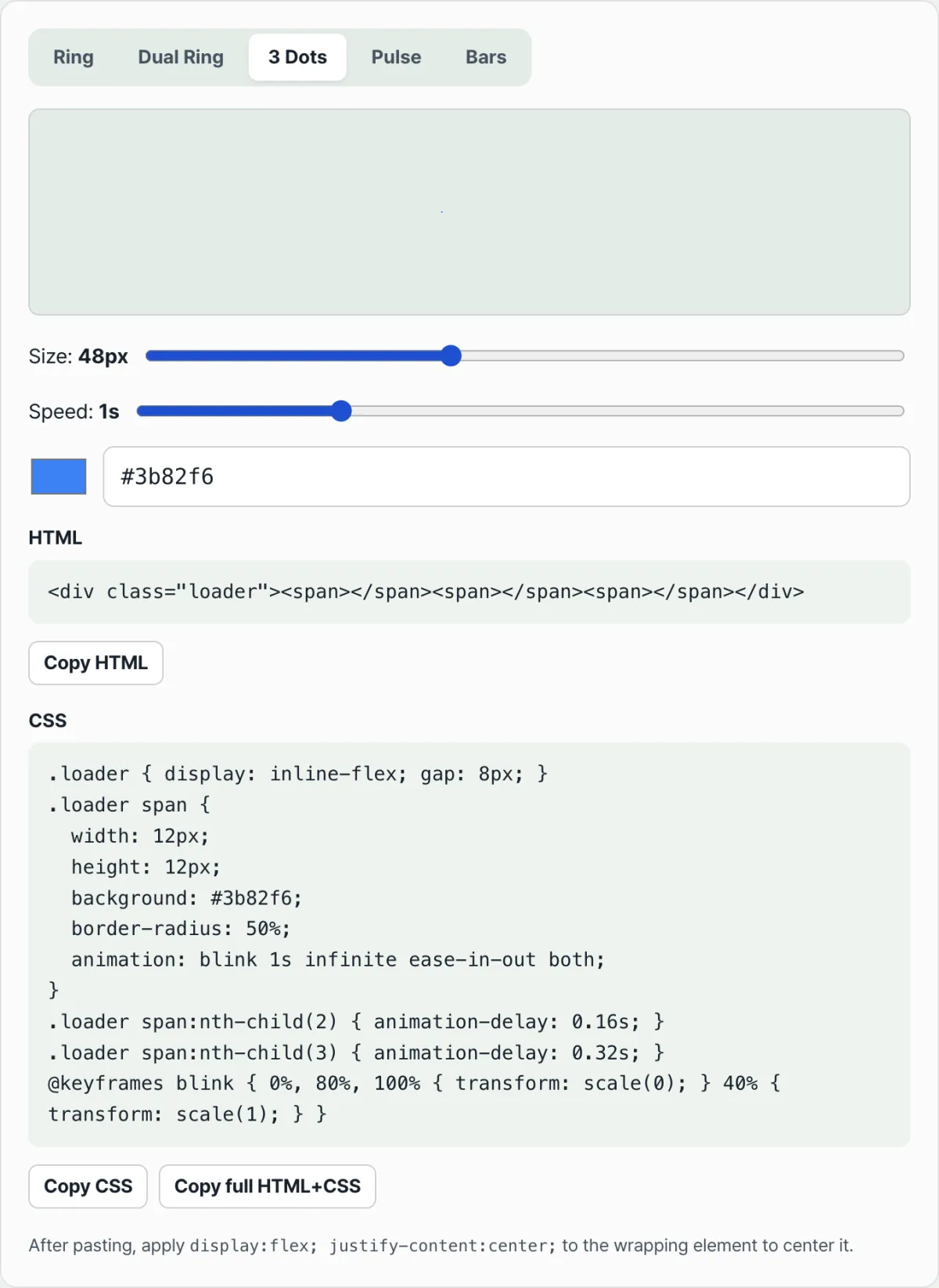
Check it with our tool. Instead of hand-tuning border colors and angle values every time, you can pick a style and adjust color, size, and speed with sliders, then copy the finished HTML and CSS right away.
Free · no signup · copy your spinner CSS right in the browser
Where people usually get stuck
Symptom
Cause
The spinner turns once and stops
infinite is missing from the animation property
The circle looks like one solid color
All four border sides have the same color, so there's no difference between the strong and pale parts
It won't center after pasting
The wrapper element is missing display: flex and justify-content: center
With three dots or bars, everything moves at once
Each element needs a different animation-delay value to look like it's moving in sequence
As the table sums up, most cases of a spinner stopping or looking awkward come down to whether one animation property is missing, or whether the colors are actually distinguishable.
Wrapping up
A loading spinner isn't an image or a video. It's an illusion built from a color difference on a circle's border, rotating keyframes, and infinite repetition. Once you know that, you only need to change a few values whenever you want a new spinner with a different color or speed.
Instead of calculating and matching values by hand, you can also pick a style, adjust it with sliders, and get finished code you can use right away.
Free · no signup · copy your spinner CSS right in the browser
Frequently asked questions
What's the difference between making a loading spinner as a GIF or video and making one with CSS?
GIFs and videos make you download a separate file, which can slow down loading itself. A CSS spinner runs on a few lines of code with no image file, so it doesn't add weight to the page.
How do I change the spinner's rotation speed?
Lower the duration value in seconds on the animation property to spin faster, or raise it to spin slower. Somewhere between 0.6 seconds and 1.5 seconds usually looks natural.
Do the three-dot and bar styles work on the same principle as the ring spinner?
Instead of rotation, they use keyframes that change each dot's or bar's size and opacity in sequence. You give each element a slightly different animation-delay value so they don't move all at once and instead look like they're moving one after another.
This article was adapted from our Korean original. Read the Korean original