
CSS Glitch Text Effect: clip-path Layers and Keyframe Timing
Contents
On cyberpunk-style game sites and sci-fi branding pages, you've probably seen text that snaps out of place for a split second — the glitch text effect. You can build it with nothing but CSS pseudo-elements (::before, ::after), clip-path, and @keyframes — no images or canvas scripts required. This post covers how the effect works and how to apply it without making the screen a mess.
Summary ① The glitch effect works by stacking the same text three times — the original, a red layer, and a cyan layer — then clipping each layer with clip-path so only part of it shows vertically, and nudging each one slightly left or right. ② Giving the ::before and ::after pseudo-elements text-shadow in different colors is the key to the RGB chromatic aberration look. ③ Because the effect flashes quickly, it's best to pair it with a prefers-reduced-motion media query.
Why build it with CSS instead of a GIF or canvas
In the past, you needed a heavy GIF image or a canvas script to pull off this kind of screen distortion. Modern browsers can do the same thing with just CSS pseudo-elements, clip-path, and @keyframes, so the animation plays without any extra image files or script execution.
The core idea is to stack three copies of the same text (original, red layer, cyan layer), clip each color layer with clip-path so only a vertical slice shows, and shift each one left or right by a random offset. In other words, what you see on screen at any moment is the result of two things combined: a "visible range" (the top and bottom cut lines of clip-path) and a "horizontal offset" (transform) — both of which change over time.
The main visual pieces are:
- RGB chromatic aberration: Give ::before a reddish text-shadow (text-shadow: -2px 0 #ff0055;) and ::after a cyan one (text-shadow: 2px 0 #00ffff;) to mimic lens distortion.
- clip-path: inset() clipping: Use clip-path: inset(top% 0 bottom% 0) to show only a specific vertical band of the text and hide the rest.
- Random pulse timeline: Split the keyframe percentages into 20–25% steps between 0% and 100% so the slices jump to a different position at each step, making it look like a corrupted signal.
How to build it yourself in CSS
To write the code yourself, start by adding a data-text attribute to your markup. Using attr(data-text) automatically fills the pseudo-elements with the same text.
<div class="glitch-wrapper">
  <h2 class="glitch-text" data-text="CYBERPUNK 2026">CYBERPUNK 2026</h2>
</div>


Next, give ::before and ::after text-shadow and clip-path in different colors, and hook each one up to a @keyframes animation with a different duration.

css
.glitch-text {
  position: relative;
  font-size: 48px;
  font-weight: 900;
  color: #ffffff;
  letter-spacing: 3px;
  text-transform: uppercase;
}

/* Red glitch pseudo layer */
.glitch-text::before {
  content: attr(data-text);
  position: absolute;
  top: 0;
  left: -2px;
  width: 100%;
  height: 100%;
  color: #ffffff;
  text-shadow: -2px 0 #ff0055;
  background: #0f172a;
  overflow: hidden;
  clip-path: inset(0 0 0 0);
  animation: glitch-anim-1 2s infinite linear alternate-reverse;
}

/* Cyan glitch pseudo layer */
.glitch-text::after {
  content: attr(data-text);
  position: absolute;
  top: 0;
  left: 2px;
  width: 100%;
  height: 100%;
  color: #ffffff;
  text-shadow: 2px 0 #00ffff;
  background: #0f172a;
  overflow: hidden;
  clip-path: inset(0 0 0 0);
  animation: glitch-anim-2 2.5s infinite linear alternate-reverse;
}

/* Keyframes for clipping layer 1 */
@keyframes glitch-anim-1 {
  0% { clip-path: inset(20% 0 60% 0); transform: translate(-4px, 0); }
  20% { clip-path: inset(80% 0 5% 0); transform: translate(4px, 0); }
  40% { clip-path: inset(40% 0 45% 0); transform: translate(-2px, 0); }
  60% { clip-path: inset(10% 0 75% 0); transform: translate(3px, 0); }
  80% { clip-path: inset(65% 0 15% 0); transform: translate(-3px, 0); }
  100% { clip-path: inset(30% 0 50% 0); transform: translate(2px, 0); }
}

/* Keyframes for clipping layer 2 */
@keyframes glitch-anim-2 {
  0% { clip-path: inset(15% 0 70% 0); transform: translate(3px, 0); }
  25% { clip-path: inset(55% 0 20% 0); transform: translate(-3px, 0); }
  50% { clip-path: inset(75% 0 10% 0); transform: translate(4px, 0); }
  75% { clip-path: inset(5% 0 85% 0); transform: translate(-4px, 0); }
  100% { clip-path: inset(35% 0 40% 0); transform: translate(1px, 0); }
}


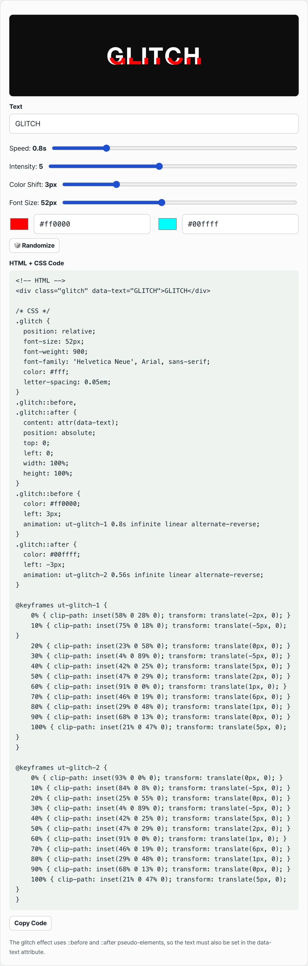
You can use this code as-is, but if you want to tune the keyframe percentages and clip-path values to get the look you're after, you'll need to change the numbers one at a time and preview it several times. If you want to see results instantly every time you change the text, colors, or noise speed, you can preview it live with the tool below.Adjust the text, speed, intensity, color shift, and font size in real time, then copy the ready-to-use HTML+CSS code.
Things to keep in mind
| Aspect | Notes |
|---|---|
| Intensity | Rather than running it at 100% all the time, limiting when it shows — for example, only on mouse hover (:hover) — keeps the screen less distracting. |
| Text sync | Changing only the data-text attribute updates the text in the ::before/::after layers too, so there's no separate script to edit. |
| Accessibility | Because the screen flashes quickly, use a prefers-reduced-motion media query to turn off or tone down the animation for users sensitive to flashing light. |
Recap
- The glitch effect comes from layering three copies — original, red layer, cyan layer — and offsetting them with clip-path and transform.
- The difference in text-shadow color between ::before and ::after is what creates the RGB chromatic aberration.
- Change just the data-text attribute, and the text updates across every layer.
- Rather than showing it all the time, apply it only in limited moments like hover or the start of a load, and keep prefers-reduced-motion in mind.
Adjust the text, speed, intensity, color shift, and font size in real time, then copy the ready-to-use HTML+CSS code.
Frequently asked questions
Where do I paste the generated code?
Put the HTML wherever you want the text to appear, and the CSS in your stylesheet or a style tag. The div's class and its data-text attribute need to contain the same text, or the effect won't work properly.
If I change the text, does the animation change too?
The animation pattern itself is calculated from a seed value and has nothing to do with the text content. If you just want a different pattern, use the tool's pattern change button.
Does this tool send the text I enter to a server?
No. The text and settings you enter are all processed inside your browser and are never sent anywhere.
This article was adapted from our Korean original. Read the Korean original