
CSS Glitch Text Effect: How the Shake and Color Split Works
Contents
- The text jitters and looks broken: is that a corrupted file?
- How to build this effect yourself with CSS
- Where people get stuck
- Recap
- Technical mechanism
- Comparison table: Glitch Animation Approaches Matrix
- 5 glitch text implementation mistakes
- 5-step robust glitch text styling workflow
- 7 glitch typography tips
- Decision tree: tuning glitch intensity
- Terminology (cheat sheet)
- Frequently Asked Questions
- Deep Dive: The Aesthetics and History of the Glitch Effect, and How It Evolved in Web Design
You've probably seen a heading on a game site or event page jitter and buzz, with red and cyan letters drifting out of line. It looks like the screen is broken, but it isn't a video or a GIF. It's CSS: the same text stacked in different colors and shaken fast. Once you know how it works, you can build the effect yourself without a heavy video file.
Summary ① A glitch effect is not video or a GIF. It's a CSS animation that stacks the same text in differently colored layers and shakes them. ② You put the same characters into the pseudo-elements (::before, ::after) and offset their color and position by a few pixels. ③ clip-path cuts random horizontal strips so only a different slice shows at each moment, which creates the illusion of a broken screen.
The text jitters and looks broken: is that a corrupted file?
Short answer: nothing is corrupted. It's intentional design. The creator deliberately layered the text to mimic a failing CRT or a screen that lost its signal.
On screen it looks like one layer, but three copies of the text are stacked. There's one real, visible layer of characters, with a slightly offset red copy and a cyan copy layered on top of it.
When all three line up exactly, you just see plain white text. But when the animation cuts a different slice each moment and shifts the position, it looks like a signal dropping out and buzzing.
How to build this effect yourself with CSS
You need three copies of the text: one visible layer, plus two more in different colors made with the pseudo-elements ::before and ::after.
For the pseudo-elements, use content: attr(data-text) so the value of the tag's data-text attribute is rendered as the characters. That way all three layers share the same text without you typing it twice.
Nudge each of the two layers a few pixels left or right and give them different colors, like red and cyan, and the text already looks misaligned even when it's standing still. Then use keyframes to change the clip-path value randomly on every frame, and only a different horizontal strip shows each moment — that completes the dropped-signal feel.
The hard part is those keyframe values. You have to decide by hand where to cut and how far to move at each step, and to get a natural random feel you have to change the numbers over and over and check the result by eye.
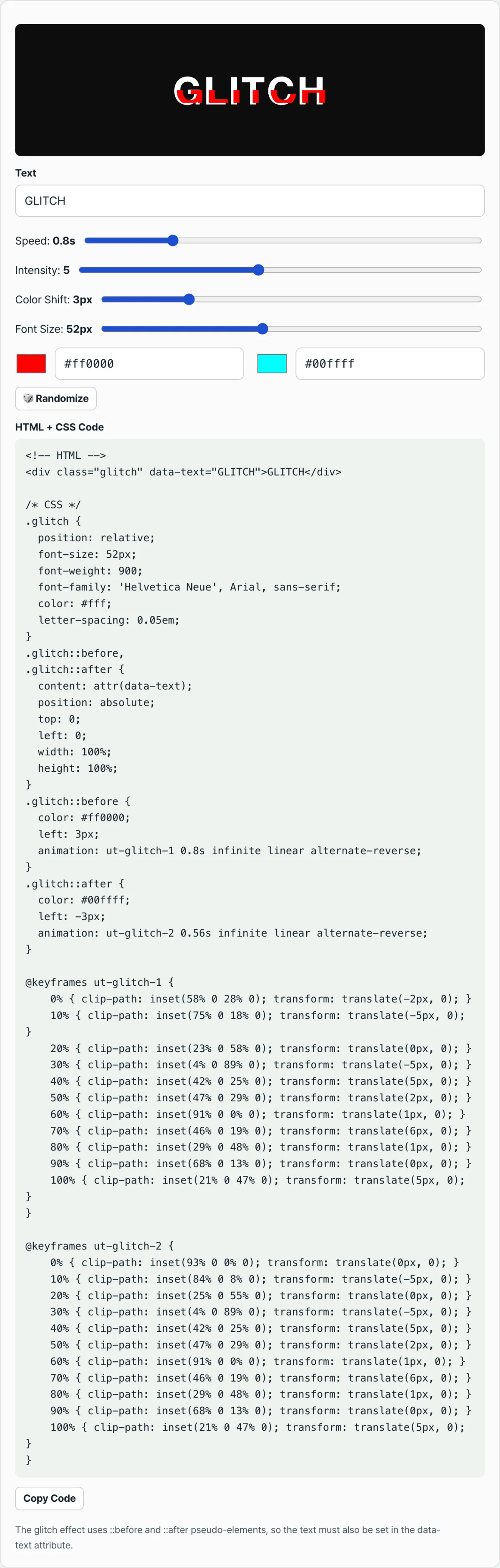
Check it with our (free) tool. Just set the text and adjust the speed, intensity, and color shift sliders. The keyframe values are calculated for you, and you can copy the finished HTML+CSS code as is.
Free · no sign-up · copy the code right in your browser
Where people get stuck
| Symptom | Cause |
|---|---|
| I copied the code and changed the text, but nothing changed | You changed only the inner text and left the data-text attribute alone, so the colored layers still show the old characters |
| The jitter is so fast it hurts my eyes | The lower the speed value (in seconds), the shorter each animation cycle, so it repeats faster |
| The colors don't read as separate layers, it just looks blurry | The color shift (px) value is too small, so the offset between the two layers barely shows |
| The effect looks awkward after I switched to a thin font | Thin fonts make the edges of the cut slices look fuzzy; heavier fonts suit the effect better |
As the table shows, most of these problems start when the data-text attribute and the visible text hold different values. Keep the two in sync and most of them go away.
Recap
The glitch text that buzzes and shows color fringing isn't a damaged video. It's a CSS trick: stack the same text in differently colored layers, slice it with clip-path, and shake it.
Instead of setting keyframe values one by one by hand, adjust speed, intensity, and color shift with sliders and check the preview instantly. You'll find the look you want much faster.
Free · no sign-up · copy the code right in your browser
Technical mechanism
DOM layer duplication and pseudo-elements
The glitch you see on screen isn't a single text layer. It's a three-layer structure: two differently colored copies stacked above and below the original text, all shaking.
At rest these three layers sit exactly on top of each other and read as white text. Once the animation starts, Layer 2 and Layer 3 drift slightly left and right.
Synchronized Text Binding (attr(data-text))
Editing all three layers every time the text changes is inefficient. The CSS content: attr(data-text) function reads the element's custom data attribute directly and inserts it as the pseudo-element's content. With this mechanism, the browser syncs the value straight from the DOM node, so you don't have to write the same text twice in the stylesheet.
Slicing Mathematics with clip-path: inset()
The core of the glitch is cutting the text into thin horizontal slices. The CSS clip-path: inset(top% right% bottom% left%) function crops the element into a rectangle.
- Frame 1: clip-path: inset(10% 0 85% 0); transform: translate(-3px, -1px); (cuts 10% off the top and 85% off the bottom to leave a thin 5%-thick strip, then moves it up and left.)
- Frame 2: clip-path: inset(60% 0 20% 0); transform: translate(3px, 1px); (cuts a 20%-thick band near the bottom, then moves it down and right.) Changing the cut position and thickness randomly on every frame produces the intense, screen-tearing effect.
Chromatic Aberration & Color Theory
Red/Magenta and Cyan/Blue are used because of additive RGB mixing, the way light combines. The effect mathematically simulates chromatic aberration — the color fringing that appears when a screen fails and the RGB subpixels fall out of focus — and reproduces the pixel displacement convincingly.
Comparison table: Glitch Animation Approaches Matrix
| Approach | Implementation Weight (KB) | Typographic Crispness | Text Editability | GPU Performance Load | Accessibility Control |
|---|---|---|---|---|---|
| Pure CSS clip-path + attr() | Very light (1~2KB) | Sharpest (stays vector) | Perfect (edit the HTML) | Moderate (needs optimization) | High (screen reader friendly) |
| CSS text-shadow Rapid Jitter | Light (<1KB) | Somewhat blurry | Perfect (edit the HTML) | Low | High |
| Canvas 2D Bitmap Glitch | Heavy (needs a JS library) | Bitmap degradation possible | Edited through JavaScript | High | Low (canvas text can't be read) |
| WebGL Fragment Shader | Heaviest (shader code) | Most elaborate and detailed | Complex (needs texture mapping) | Very high (GPU accelerated) | Very low |
| Pre-rendered Lottie / Video | Video file size (hundreds of KB ~ MB) | Depends on render quality | Impossible (you have to edit the source project) | Low (decoding cost) | Low (needs alt text) |
5 glitch text implementation mistakes
Here are the 5 critical mistakes people make most often when building glitch text.
- Text desynchronization: The most common mistake. You edit the text inside the HTML but forget to update the tag's
data-textattribute value, so the background layer and the foreground layer end up showing different letters. - Using thin or lightweight fonts: If you use a font with thin strokes, the slices turn visually transparent or disappear entirely when you cut the text with
clip-path. Use a heavy bold font instead. - Setting the animation cycle too fast: If you set the animation cycle below 0.1 seconds (<0.1s), the screen flickers so fast that it causes eye strain, dizziness, and an eye-searing strobe effect.
- Forgetting position: relative: If you don't give the parent container a
position: relativeproperty, the::beforeand::afterpseudo-elements withposition: absoluteescape to the Body root, and the text collapses completely. - Infinite continuous keyframes off-screen: If you leave the glitch animation running in places that aren't visible on screen, it puts a constant load on the rendering engine and seriously degrades scroll performance across the whole site.
5-step robust glitch text styling workflow
A 5-step workflow for building stable, solid glitch text.
- Write semantic HTML: Use a semantic tag and keep the
data-textattribute in sync, like<h1 class="glitch" data-text="CYBERPUNK">CYBERPUNK</h1>. - Pick a heavy geometric typeface: Choose a heavy sans-serif or geometric typeface with a font weight of 700 or more (≥ 700) to maximize the visual punch of each slice.
- Style the base layer and positioning: Set
position: relativeon the parent container and clearly define the text size, color, and Z-index stacking order. - Split the layers into pseudo-elements: Create
::before(Red) and::after(Cyan) pseudo-elements, bind the text withcontent: attr(data-text), and get ready to cut withclip-path: inset(). - Add accessible keyframe animation: Attach staggered keyframe animations, but wrap them in an
@media (prefers-reduced-motion: no-preference)media query to build in guardrails for users who get dizzy.
7 glitch typography tips
Seven advanced glitch typography techniques the pros use.
- Keep pixel displacement subtle: Keep horizontal color displacement narrow, between 2px and 5px (2px∼ 5px), so you get sharp chromatic aberration without hurting readability.
- Use a dark slate background: Cyan and magenta neon pop hardest against a dark slate background (#0b0f19).
- Trigger on interaction: Let it sit still or do a subtle breathing motion most of the time, then explode into the full glitch animation only on hover.
- Leave breathing room in letter-spacing: Give it
letter-spacing: 2px~4pxso the sliced glyphs have room to breathe and don't overlap as they shift. - Add a TV scanline overlay: Lay a very thin, semi-transparent horizontal line pattern (scanline) over the text as a CSS background, and the retro CRT monitor texture is complete.
- Build dynamic themes with CSS variables: With variables like
--glitch-color-1and--glitch-color-2, you can change the glitch colors dynamically with JavaScript as the situation calls for it. - Use a generator: Instead of manually working out complicated clip-path percentages and writing dozens of lines of keyframes, use this web tool to generate clean, optimized CSS automatically with the CSS Glitch Text Generator.
Decision tree: tuning glitch intensity
A decision tree for dialing glitch intensity to fit your project's character and performance budget.
- Subtle Ambient
- Best for: High-end portfolios, brand sites with a quiet mood.
- Settings: Long cycle of 3–5 seconds, 1–2px displacement, minimal clip-path variation.
- Hover Triggered
- Best for: Buttons, navigation menus, featured products on commerce sites.
- Settings: A fast, brief 0.3-second burst on hover only, then back to normal.
- Cyberpunk Hero Title
- Best for: Game landing pages, Web3/crypto projects, music festival main screens.
- Settings: Maximum chromatic aberration, heavy font, constant and aggressive slicing frames.
- Emergency Warning
- Best for: 404 error pages, system maintenance notices.
- Settings: Extremely short flicker under 0.1 seconds, violent jittering that shakes the text up and down. Watch your performance limits.
Terminology (cheat sheet)
- Glitch effect: Artwork that intentionally recreates the visual look of a screen buzzing or breaking up due to a digital signal error or device failure.
- Pseudo-elements (::before, ::after): A technique for adding layers by inserting virtual elements before and after an element with CSS alone, without any HTML markup.
- data-text attribute: A custom HTML data attribute you define yourself. It's used to pull the value into CSS and keep the text in sync.
- attr() function: A CSS function that reads an HTML element's attribute value directly and applies it to a style property (usually
content). - Clip path (clip-path: inset): A masking technique that shows only a specific area of an element and hides the rest, which creates the fragmented text cross-sections in a glitch.
- Chromatic aberration: The way colors smear or misalign because of a lens defect. In glitch art it's used as an effect where red and cyan appear to overlap.
- Scanline: The fine horizontal line pattern left when the beam scans across the screen of an old CRT monitor. It adds a retro feel.
- Jittering: When an unstable signal makes the subject tremble irregularly and rapidly up, down, left, and right.
Frequently Asked Questions
FAQ 1. Why do I have to keep the HTML text and the data-text attribute value in sync?
The browser reads the value in the data-text attribute through CSS's attr() function and renders it as the actual characters in the ::before and ::after layers. If you change the visible HTML text but don't update data-text, two of the three layers will show the old text while the third shows the current text. The result is a nasty visual bug: letters get clipped and old and new characters mangle together into a mess. That's why the two values must always match.
FAQ 2. Why is a heavy font weight essential for clean glitch slices?
A glitch effect built on clip-path works by slicing thin horizontal strips out of the letters. If you take a letter drawn with thin strokes (a Light font) and slice it again horizontally, the overlapping area is so small that it nearly disappears on screen or goes completely invisible. With a heavy weight like Bold or Black, each slice keeps the shape of a big solid rectangle, so you can fully visualize the fragmented, flying-apart motion that makes a glitch feel dynamic.
FAQ 3. How do I optimize CPU usage for glitch animations on mobile devices?
Keyframes that repeat polygon masking with clip-path dozens of times per second put a huge load on a mobile CPU. To fix that, first add will-change: clip-path, transform; to the element carrying the glitch class, so the browser can prepare GPU acceleration ahead of time. Second, keep the animation from running on elements outside the user's viewport: use the Intersection Observer API to turn the class on only when the element scrolls into view, or limit the trigger to :hover interaction only. Restricting when the animation runs makes a decisive difference in performance.
Deep Dive: The Aesthetics and History of the Glitch Effect, and How It Evolved in Web Design
The term glitch started getting wide use in 1962, during the U.S. space program, when John Glenn used it to describe unexpected voltage fluctuations or signal errors. In early digital media and CRT televisions, the distorted screens caused by radio interference or corrupted data on a storage medium were long seen as technical failures or errors. But from the 1990s on, digital media artists began embracing that unpredictable visual fragmentation and error as a new kind of aesthetic. That's how glitch art was born. In a digital world chasing perfection, an accidental error actually appeals to people because it evokes the human limits of the machine and a kind of analog nostalgia.
In web design today, the glitch effect is a powerful visual tool for setting a specific mood — cyberpunk, techno, underground, hacker culture, retro wave. In the past, pulling off this effect in a browser meant using enormous video files or heavy GIF animations. That came with a serious downside: it noticeably slowed page load and hurt the user experience (UX).
Then CSS3 changed everything. With pseudo-elements like ::before and ::after, you can reuse DOM nodes efficiently, and with the powerful masking tool that is clip-path, you can control an element's shape directly at the level of the browser's rendering engine. Now a few kilobytes (KB) of CSS is enough to produce a smooth, dynamic 60-frame-per-second (FPS) glitch text effect. It's a genuine front-end innovation: all the visual flash with none of the performance cost.
Performance Profiling for CSS Glitch Animations
When a browser renders a CSS animation, the process runs through a four-stage pipeline: Style, Layout, Paint, and Composite. The ideal animation skips the earlier stages and runs only Composite. The transform and opacity properties are handled at that Composite stage, and they get GPU acceleration for extremely smooth animation.
The clip-path property, though, is the heart of the glitch effect, and depending on the browser it can trigger the Layout or Paint stage. The browser has to recalculate the clipped region for every one of dozens of keyframes, so on lower-powered mobile devices serious frame drops (jank) are very likely. Front-end engineers use a few optimization techniques to get around this limit.
- Force hardware acceleration: apply transform: translateZ(0) or will-change: transform, clip-path to push the browser into promoting the element to its own composite layer.
- Limit animation complexity: keep the number of steps inside the 100% keyframe cycle to a minimum. Instead of changing clip-path every 1%, change it every 5% or 10% to cut the browser's computing load.
- Suppress layout recalculation: use position: absolute so the element with the glitch effect is fully removed from the document flow and nearby layout isn't affected in a chain reaction.
Accessibility and Inclusive Design
In modern front-end development that follows web standards, visual flash can never be an excuse to break accessibility. Glitch text effects flicker and flash heavily by nature, so for users with a vestibular disorder or photosensitive syndrome they can cause real physical discomfort or even trigger a seizure. The W3C's Web Content Accessibility Guidelines (WCAG 2.1) prohibit more than three flashes per second.
The elegant fix is the prefers-reduced-motion media query. For users who have turned on the "reduce motion" option at the operating system level, your CSS should stop the glitch animation and deliver nothing but readable text.
css /* Media query guard for accessibility / @media (prefers-reduced-motion: reduce) { .glitch::before, .glitch::after { animation: none !important; transform: none !important; clip-path: none !important; opacity: 0; / Hide the duplicated layers so only the clean original text shows */ } }
Also, don't forget one accessibility basic: place aria-hidden="true" properly so screen reader users don't hear the content: attr(data-text) text from ::before and ::after read twice.
This article was adapted from our Korean original. Read the Korean original