
CSS Gradient Color Stops: Why Colors Shift Sharply
Contents
- What Is a Color Stop?
- Stop Position Is the Speed of Color Change
- Why Joining High-Contrast Colors Turns the Middle Muddy
- Checking Each Value by Hand
- How the CSS Gradient Generator Shows Stop Changes in Real Time
- Why You Don't Have to Enter Stops in Order
- Wrap-Up
- The Core Technical Mechanism: Why Do Gradients Turn Muddy?
- The Complete CSS Gradient Interpolation Color Space Comparison Matrix
- 5 Real-World Gradient Color Stop Pitfalls and Mistakes
- A 5-Step Workflow for Lively, Professional Gradients
- 7 Gradient Tips
- Decision Tree: Which Gradient Fits My Project?
- Key Terms Glossary and Cheat Sheet
- Frequently Asked Questions
When you build a gradient from two colors with similar tones, like blue and purple, it usually blends smoothly. But move one color stop, or join two colors with a big brightness gap, and things change. At some point the border cuts off sharply, or you see a muddy band in the middle that doesn't look like either color.
This isn't a broken gradient. It's color stops doing exactly what they're supposed to do — filling the space between two colors linearly. Let's start from the basics: why stop positions set the "speed" at which color changes, and why that color looks muddy when the speed is packed into a narrow range.
Summary ① A color stop is a coordinate that says "this color is 100% at this position," and the space between stops is filled by mixing the two colors linearly. ② When stops are close together, the color changes are packed into that narrow gap, so the shift looks abrupt. When they're far apart, it looks gradual. ③ If you join two colors with a big difference in brightness or hue without any stops in between, the midpoint between them can land on a muddy color that resembles neither one, and it shows up as a visible smear.
What Is a Color Stop?
CSS gradient functions like linear-gradient() and radial-gradient() take a list of colors separated by commas, and you can put a percentage after each color. That percentage is the color stop. A stop only does one thing: it sets a single coordinate where "this color appears at exactly 100%."
The browser fills in everything between stops. For any point between two stops, it works out what percentage of the way along that span the point sits, then mixes the color before and the color after by that ratio — linearly. That's what people actually mean when they say a gradient "interpolates colors."
Stop Position Is the Speed of Color Change
The gap between stops directly determines how fast the color changes. If two stops sit close together, say at 0% and 15%, the entire transition from the first color to the second happens inside that narrow 15% span. To your eye, the color seems to snap from one to the other.
Do the reverse — put the same two colors at 0% and 90% — and the identical amount of change gets spread across a wide range, so it looks much smoother. Not a single color changed; you only moved the stops. That's why the result feels completely different.
The same holds with three or more stops. A span where two stops sit close together changes fast, and the span to the next stop further out looks almost unchanged. Same color palette, different position numbers, entirely different gradient.
Why Joining High-Contrast Colors Turns the Middle Muddy
By default, a gradient mixes the value of each color channel linearly to produce the in-between color. The problem comes when you join two colors with very different brightness and hue — bright yellow and deep navy, for example — with no stops in between. The per-channel arithmetic average can land on an in-between grayish-brown tone that resembles neither color.
When that in-between tone is crammed into a narrow span, the gradient doesn't look smooth; it looks like a dirty smear or stripe got stuck in the middle. People often call this "gradient banding," but the cause is different from true banding, which comes from 8-bit color data loss. The smear you see here isn't file corruption — it's simply the result of connecting two stops in a straight line.
Checking Each Value by Hand
To check this relationship without a tool, you have to write the CSS yourself. You fill in color codes and position numbers in the linear-gradient(angle, color1 position1%, color2 position2%, …) syntax, save the file, then refresh the browser and look at the result.
Changing a single stop position changes the outcome, so you end up tweaking numbers a little at a time and repeating the save-and-refresh cycle. If you want to dial in two or three colors at two or three positions at once, you have to repeat the whole process for every combination of values.
A free gradient generator that turns the colors and stop positions you pick into a live preview and the exact CSS code.
How the CSS Gradient Generator Shows Stop Changes in Real Time
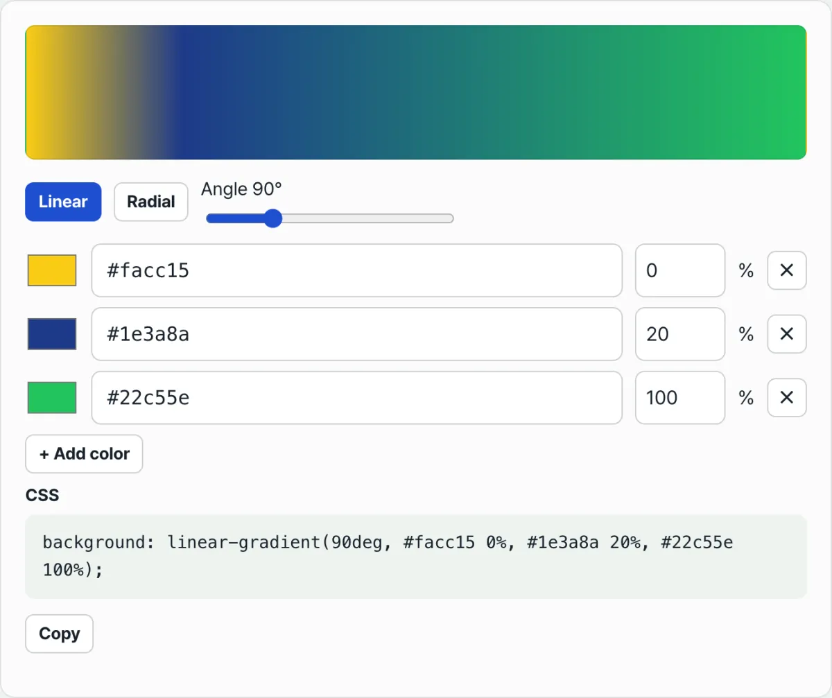
The CSS Gradient Generator puts a live background preview at the top and applies the CSS background built from your current settings to it. Since it renders exactly what the browser draws, the color you see in the preview is the same color you get on your actual site.
Each color stop appears as one row, with a color picker, a hex code input, and a position input from 0 to 100. Click "+ Add color" to add as many stops as you need. Change a position number and you can feel out that "speed of change" right away. The CSS panel below shows the finished linear-gradient()/radial-gradient() syntax, ready to grab with the copy button.
Why You Don't Have to Enter Stops in Order
The order you add stops to the inputs and the order they appear in the gradient can differ. Regardless of the order shown on screen, the CSS Gradient Generator re-sorts the stops by their saved position (%) and then builds the final CSS.
So if you want to insert a stop in the middle, just add it at the bottom of the list and change its position number to the value you want. No need to delete existing rows and recreate them just to keep things in order.
Wrap-Up
- A color stop is a coordinate meaning "this color is 100% at this position," and the span between stops is filled by mixing the two colors linearly.
- The closer two stops are, the faster the color change in that span; the farther apart, the more gradual it looks — stop position is the speed of change.
- Joining two colors with a big brightness or hue gap with no stops in between can drop the per-channel arithmetic average into a muddy in-between tone that looks like a smear.
- That smear's cause differs from true 8-bit banding caused by file corruption — it's the result of stop interpolation itself.
- Every time you change a stop value, the CSS Gradient Generator redraws the actual CSS background instantly, so you can compare how position and color combinations look as you go.
A free gradient generator that turns the colors and stop positions you pick into a live preview and the exact CSS code.
The Core Technical Mechanism: Why Do Gradients Turn Muddy?
A gradient's color interpolation is the result of math the browser's rendering engine performs. If you don't know how that math works, you'll spend the rest of your life fighting muddy gradients.
1. The Physics of Linear Color Stop Interpolation
A gradient mathematically mixes two color values according to the distance (ratio) between the start point and the end point. Let's say color stop C1 sits at p1% and C2 sits at p2%. The local progress t at a given pixel position x (where x ∈ [p1, p2]) is defined as: t = x − p1/p2 − p1 Using this progress t, the legacy sRGB color space does a simple linear interpolation on each of the R, G, and B channels separately. [ R(t) = (1-t)R_1 + tR_2 ] [ G(t) = (1-t)G_1 + tG_2 ] [ B(t) = (1-t)B_1 + tB_2 ]
2. The Secret Behind the sRGB "Gray Dead Zone"
Why do two bright, vivid colors mix into a muddy gray in the middle? It's the tragedy that happens when you mix two colors in a complementary relationship inside sRGB. For example, imagine mixing blue (hue 240°) and yellow (hue 60°) with a simple R, G, B average. In the three-dimensional RGB cube, the shortest straight line connecting blue and yellow unfortunately runs straight through the middle of the cube — which is achromatic (R=G=B). Instead of curving smoothly around the outer rim of the color wheel, it cuts across the gray central axis where saturation falls to zero, so at the 50% mark you get a muddy gray that has lost both lightness and saturation.
3. CSS Color Module Level 4: The Modern Color Space Fix
Fortunately, the latest CSS spec solves this cleanly. You can now declare an interpolation color space such as in oklch or in oklab right inside the linear-gradient() function.
/* Legacy: sRGB interpolation with a muddy center */
background: linear-gradient(to right, cyan, orange);

/* Modern: interpolate along a cylindrical perceptually uniform space (stays vivid) */
background: linear-gradient(in oklch to right, cyan, orange);

/* LAB space interpolation for wide-gamut P3 displays */
background: linear-gradient(in oklab to right, #00f, #ff0);
OKLCH has a cylindrical structure. So instead of blindly cutting across three-dimensional space, it holds lightness steady and interpolates along the circular path of chroma and hue. The gray dead zone disappears completely, and you get a transition that looks optically natural and rich.
4. Using Interpolation Hints
There's a "hint" feature that lets you push or pull the midpoint (usually 50%) between two color stops to wherever you want it.
/* Pull the 50% mix point of red and blue to the 30% position */
background: linear-gradient(red, 30%, blue);
With this hint you can shift a gradient's center of gravity however you like without declaring extra colors — very useful for light-glare effects on buttons or headers.
The Complete CSS Gradient Interpolation Color Space Comparison Matrix
In the past your only option was sRGB, but now you have to choose a color space to fit the situation. Use the table below to see how each interpolation mode differs, along with its strengths and weaknesses.
| Interpolation Color Space | Perceptual Uniformity | Gray Dead Zone Removal | Wide Gamut (P3) Support | Key Traits and Browser Support |
|---|---|---|---|---|
| Legacy (default) | Very low | ❌ Occurs (muddy center) | ❌ sRGB limit | Most widely used, but produces fatal blotches when interpolating complementary colors (all browsers) |
in srgb-linear | Low | ❌ Occurs partially | ❌ sRGB limit | Gives linear brightness changes with gamma correction removed, but still turns muddy |
in hsl / hwb | Medium | ⚠️ Uneven brightness | ❌ sRGB limit | Mixes around the color wheel so hue is kept, but lightness jumps sharply (Chrome 111+) |
in oklab | Very high | 🟢 Removed well | 🟢 P3 support | Brightness stays constant; the most natural mix (Chrome 111+) |
in oklch | Highest | 🟢 Removed completely | 🟢 P3 support | Keeps colors the richest and most vibrant; our #1 practical recommendation |
※ Browser support: CSS Color Level 4 interpolation spaces are supported in Chrome 111+, Safari 16.2+, and Firefox 113+. For backward compatibility, always declare a basic sRGB gradient first as a fallback.
5 Real-World Gradient Color Stop Pitfalls and Mistakes
These are the five most common gradient design mistakes in real projects, and what each one costs you.
- Blending complementary colors directly in sRGB: Connecting colors from opposite sides of the color wheel — blue and yellow, or red and green — with no stop in between will always dump you into the gray dead zone swamp. You have to add a stop that passes through another color (purple or orange, for example), even if it feels forced.
- Misunderstanding the sorting algorithm (twisted stops): If an earlier color's percentage is larger than the next one's, as in
red 70%, blue 30%, the browser's auto-sorting rule ignores the first value and forces it tored 30%, blue 30%. If you don't know about this auto-sort rule, your design gets completely crushed. - Leaving banding alone in dark mode: Stretch a dark gradient over a very large area (a full-screen background, say) and an 8-bit monitor's limits produce dozens of contour-like steps. Trusting bare CSS without dithering or a noise texture overlay is an amateur mistake.
- Missing vendor fallbacks for modern syntax: Write only
background: linear-gradient(in oklch, ...)and on older browsers or a corporate network stuck on Chrome 110 or lower, the background disappears entirely and goes transparent. Always declare the legacy syntax on the line right above. - Hardcoded pixel-based stops that ignore responsiveness: If you specify stop distances in
pxinstead of % (red 100px, blue 300px), the gradient's proportions get mangled beyond recognition on mobile devices.
A 5-Step Workflow for Lively, Professional Gradients
- Step 1: Pick Your Main Hues — Choose the start and end colors that match your brand identity. Whenever possible, pick both colors in HSL or LCH coordinates instead of RGB.
- Step 2: Measure the Angle Distance — If the hue angle difference between the two colors goes past 120°, raise a warning flag. Add a vibrant midpoint hue as a stop so it can bridge the gap.
- Step 3: Tune Stop Percentages (Velocity) — Decide how much area each color gets and how fast the transition moves. If you want one color to hold for a while and then shift quickly, stretch the earlier percentage and use an interpolation hint to adjust the tension.
- Step 4: Declare Modern
in oklchInterpolation & Build a Fallback — Write an OKLCH color space gradient for rich transitions, then declare a plain sRGB gradient above it as a safe fallback so you're covered across browsers. - Step 5: Check It in a Dark Room and on OLED Displays — Turn your monitor brightness down below 30%, or open the screen on an actual OLED phone. If you spot color banding, immediately add a faint white/black noise image at 2–3% opacity to
background-imageto force dithering.
7 Gradient Tips
- Dodge the Valley of Death (3-Stop Rule): When you go from blue to pink, sRGB turns the middle purple but also muddy. Force your way around the gray dead zone by spelling out a middle stop, like
linear-gradient(blue, purple 50%, pink). - Zero DOM Splits with Hard Stops: Declare the same stop position twice, like
color1 50%, color2 50%, and you get a crisp straight split instead of a soft gradient. It's the cheat code for building diagonal and grid patterns without adding pointlessdivs. - Push a Gradient with an Interpolation Hint: You don't need three colors. Drop a bare percentage between two colors (
color1, 75%, color2) and the 50% mix point slides out to the 75% mark, creating a distinctive tension. - Richer Next-Gen Color Rendering: To take advantage of the wide gamut on newer devices like P3 displays in the Apple ecosystem, don't hesitate to use
in oklch. The color you get back is surprisingly vivid. - Noise Dithering That Kills Color Banding: A CSS gradient is a perfect math formula, so it shows the 8-bit limit with nothing to hide it. Append a tiny 2%-opacity noise texture as an SVG data URI (base64) to your background image property with a comma, and the visual dithering makes banding lines vanish like magic.
- Off-Angle for a Sense of Motion: Instead of obvious angles like
45degor90deg, try a slightly tilted one like135deg,160deg, or-10degto create a modern, dynamic flow in your UI. - Use the CSS Gradient Generator: Hand-writing all these complicated stop values and fallback code is a waste of time. Use the CSS Gradient Generator linked at the top and bottom of this post to see your gradient as you build it and get perfect cross-browser CSS right away.
Decision Tree: Which Gradient Fits My Project?
- Situation A (you need strong complementary contrast and a bold hero banner)
➔ Decision: interpolate with
in oklch(a 3-stop sRGB fallback for older browsers is required) - Situation B (simple, minimal monochrome or tone-on-tone background)
➔ Decision: a basic legacy sRGB
linear-gradient()(it blends smoothly enough, so the newest syntax isn't necessary) - Situation C (a subtle charcoal-to-black gradient for dark mode)
➔ Decision:
in oklabinterpolation + a subtle noise SVG overlay (defending against OLED banding comes first) - Situation D (you need a geometric pattern or a diagonal split background) ➔ Decision: hard color stops (declare the same % back to back) (saves the cost of rendering DOM elements)
Key Terms Glossary and Cheat Sheet
- Color Stop: The reference coordinate (a percentage or length unit) on the gradient track where a given color renders at exactly 100% opacity.
- Color Interpolation: The math the rendering engine runs to blend the colors between two stops.
- sRGB Gray Dead Zone: The critical failure zone in the sRGB color space where blending two complementary colors in a straight line tanks both lightness and chroma, so the result looks like a muddy gray or brown.
- OKLCH / OKLab: Modern color spaces built on a model of human perceptual vision. They let you interpolate while keeping lightness and chroma independent, which shuts the gray dead zone down at the source.
- Interpolation Hint: A lone percentage value you declare between two stops to artificially push or pull where the 50% mix point lands, without adding another color.
- Color Banding: The effect where a monitor's limited bit depth breaks a subtle gradient transition into distinct, contour-like bands.
- Dithering: A graphics technique that scatters tiny noise pixels on purpose to soften the blend and ease color banding through an optical illusion.
- Hard Color Stop: A CSS technique where you set two colors' stop positions to the same value (for example, 50%, 50%), which skips interpolation and produces a sharp, knife-edged boundary.
Frequently Asked Questions
Q1. Why does the middle of my gradient keep turning a muddy brown? How does OKLCH fix that?
A1. Older browsers blended colors by taking an arithmetic average along a straight x, y, z line through the sRGB space. When that line cuts through the center of the color wheel — the zero-chroma neutral area — the color dies and you get the "gray dead zone." in oklch interpolation doesn't blunder straight through 3D space. It slides around a rounded cylinder instead. That's why it keeps its chroma and lightness all the way through and holds onto the color's true punch.
Q2. What exactly is an interpolation hint, and when do I use one?
A2. It's when you write nothing but a percentage sign between two colors, like linear-gradient(black, 30%, white). Normally, the point where black and white meet 50:50 lands honestly in the middle (50%). Give it a hint at 30%, though, and the two colors are already half-mixed by the 30% mark of the total space. In other words, it's useful for building an "acceleration" (tension) curve — brightening fast up front, then gradually after — without adding any colors.
Q3. Can I make a sharp two-tone background split diagonally with a single element?
A3. Yes, with the hard color stop technique. background: linear-gradient(135deg, #ff0000 0%, #ff0000 50%, #0000ff 50%, #0000ff 100%); Match the first color's end point (50%) exactly to the second color's start point (50%). You've left the browser zero room to blend the two colors, so you get a pixel-sharp solid two-tone background immediately, with no extra tags.
This article was adapted from our Korean original. Read the Korean original