
SVG Curved Text: Center Text on a Circle and Fix Letter Spacing
Contents
- Why Rotating Each Letter Falls Short
- How to Build It Yourself with a Circular Path and textPath
- Common Sticking Points
- Key Takeaways
- Under the Hood: The Physics of SVG Paths and Alignment
- The Best Settings for Each Situation, Plus a Comparison
- 5 Critical Mistakes to Avoid When Making Curved Text
- A 5-Step SVG Typography Workflow With No Distortion
- 7 Curved Typography Tips
- Final Decision Tree: Which Curve Shape Should You Choose?
- Key Terms Glossary and One-Line Cheat Sheet
- Frequently Asked Questions
Circular logo labels, emblem badges, typography posters — bending straight text along a circle or a wave is called curved text. Rotating each letter one at a time with CSS transform: rotate() tends to drift out of alignment as the character count grows, so in practice most people use the web-standard SVG textPath element instead. This post covers the coordinate rules for a circular path and the actual code for aligning text on top of it.
Summary ① Draw a circular curve with an SVG path, then place your text on it with textPath. ② Use
startOffset="50%"together withtext-anchor="middle"to center the text on the curve. ③ Letter spacing shifts with the curvature, and the direction you draw the path can flip the text — check both.
Why Rotating Each Letter Falls Short
If you want that circular logo or stamp look, the first thing most people try is placing letters one by one with transform: rotate(). The problem is that errors in the angle math pile up as the character count grows, so some stretch of the curve ends up with letters overlapping or spread too far apart. And every time the radius or the text length changes, you have to recalculate the angle for every letter — which makes it a pain to maintain.
SVG textPath, which browsers already support, solves this. Instead of computing an angle for each letter, you define the curve (the path) once and the text lays itself along that path automatically.
How to Build It Yourself with a Circular Path and textPath
You make a circular curve by giving an SVG path element a d value that draws a circle. If the center is cx, cy and the radius is r, the rule the d attribute follows looks like this. The line below is the rule written with letters instead of numbers, so it won't render if you paste it into an SVG as-is — you have to replace cx, cy and r with real numbers.
d="M (cx-r),cy a r,r 0 1,1 (2r),0 a r,r 0 1,1 (-2r),0" (cx, cy and r are placeholders you must swap for real coordinate and radius numbers)
This rule means: start at a point one radius to the left of the center (M), then chain two half-circles together (two a commands) to close a full circle. You can see the result with actual numbers plugged in for cx, cy and r in the full code below.
To put text on that path, you need to set two things together.
- Link the path and the text: declare the path as
<path id="textCirclePath" ... />and reference that id with<textPath href="#textCirclePath">to map the text onto it. - Center it: to center the text on the curve, set
text-anchor="middle"andstartOffset="50%"together.
Here's the full SVG markup for text bent along a circular path with an 80px radius.
<svg width="240" height="240" viewBox="0 0 240 240">
  <defs>
    <!-- circular path: center 120, 120 / radius 80 -->
    <path id="textCirclePath"
          d="M 120, 120 m -80, 0 a 80,80 0 1,1 160,0 a 80,80 0 1,1 -160,0" fill="none" />
  </defs>

  <text font-size="16" font-weight="600" fill="#1e293b" letter-spacing="2">
    <textPath href="#textCirclePath" startOffset="50%" text-anchor="middle">
      PREMIUM QUALITY PRODUCTS • SINCE 2026 •
    </textPath>
  </text>
</svg>
Note Recalculating those
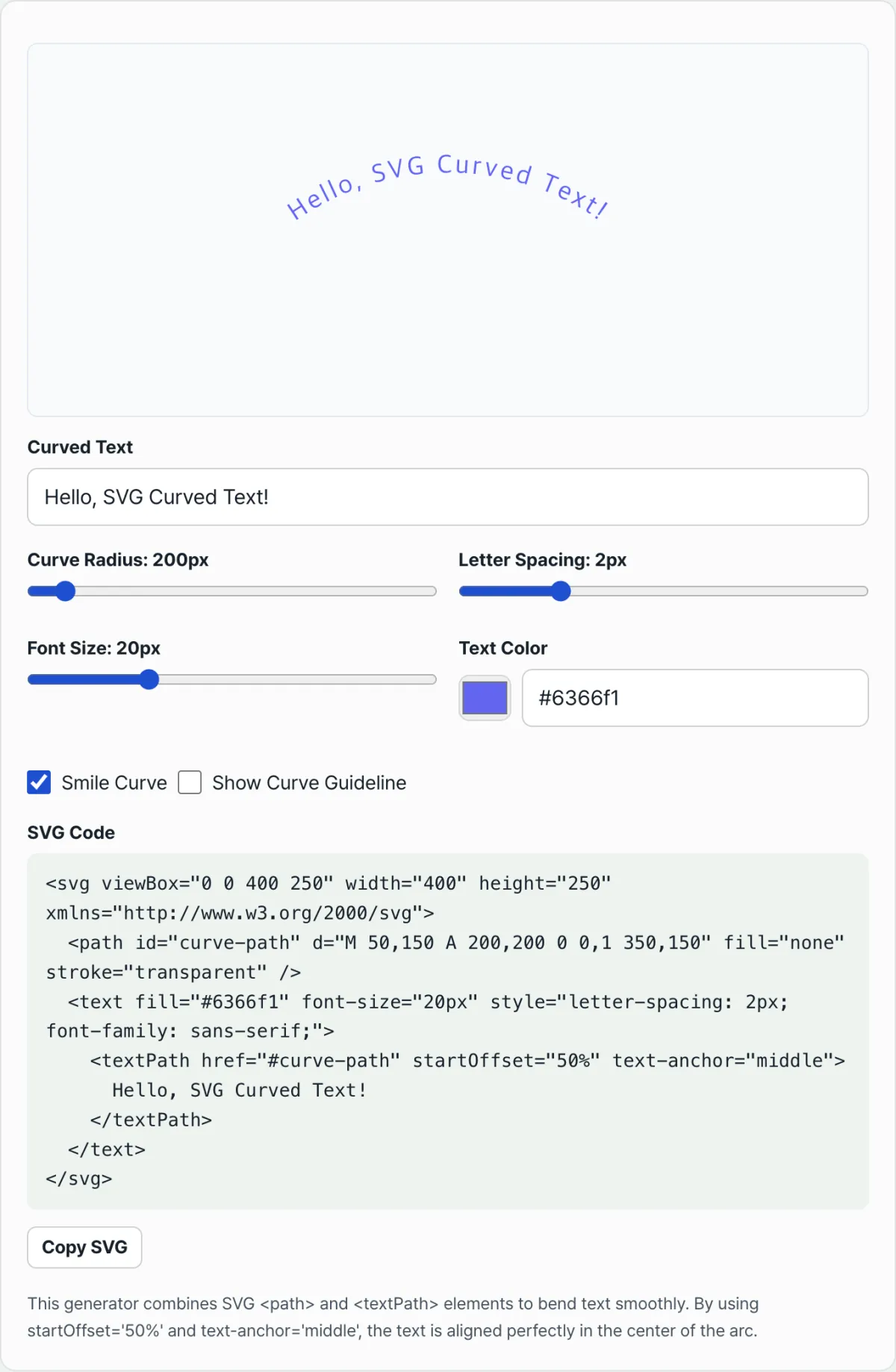
dcoordinates by hand every time the text length or radius changes, then checking the result in the browser, takes a lot of repetition. With the Curved Text Generator you can adjust the text, radius, letter spacing and bend direction with sliders, see the preview update instantly, and copy the finished SVG code as-is.
If you'd rather skip the coordinate math, check it with our tool.
Enter your text, the circle path radius, and letter spacing to instantly generate SVG typography that bends along a circle or a wavy curve.
When you adjust the wording, radius and letter spacing on this screen, the SVG code updates in real time with the d attribute and textPath attributes described above.
Common Sticking Points
| Symptom | Cause | Fix |
|---|---|---|
| Letters overlap when bending inward | On a concave curve, the actual gap between letters gets smaller | Increase letter-spacing bit by bit until they stop overlapping (the right value varies with font size, radius and text length, so there's no fixed number) |
| Text appears upside down | Depending on the direction you drew the path (clockwise vs counterclockwise), the text faces inward | Flip the sweep-flag value on the arc command to reverse the direction |
| Text doesn't land in the middle of the curve | Missing text-anchor or startOffset value | Set text-anchor="middle" and startOffset="50%" together |
All three often show up at the same time once you combine a particular radius with a particular text length, so fixing one can throw another off again.
Key Takeaways
- SVG textPath lays text along a curve more reliably than rotating each letter.
- The
dattribute of a circular path is made of M (start point) and a (two half-circles). - You need
text-anchor="middle"andstartOffset="50%"together to center text on the curve. - On a concave curve, increase letter-spacing; if the text flips, invert the sweep-flag.
- Instead of calculating coordinates by hand, you can tune the values in the tool and see the result right away.
Enter your text, the circle path radius, and letter spacing to instantly generate SVG typography that bends along a circle or a wavy curve.
Under the Hood: The Physics of SVG Paths and Alignment
Once you understand the underlying technical reasons these problems happen, you can work out the right fix in any situation without getting stuck.
Anatomy of the SVG Elliptical Arc Command ('A' or 'a')
The attributes used to draw a circular path are:
a rx ry x-axis-rotation large-arc-flag sweep-flag dx dy
- rx, ry: The horizontal and vertical radii of the ellipse. For a perfect circle, both values are the same.
- large-arc-flag (0 or 1): Decides whether to draw the short arc under 180 degrees (0) or the long arc of 180 degrees or more (1) between the two points.
- sweep-flag (0 or 1): Decides whether the angle is drawn in the positive direction (clockwise, 1) or the negative direction (counterclockwise, 0). If this flag flips, the text renders completely upside down!
The Physics of SVG <textPath> Alignment
These three key attributes give you full control over curved text.
- href="#pathId": Binds the text string to the mathematical vector path.
- startOffset="50%": Places the text anchor (reference point) at exactly 50% of the total path length — the midpoint.
- text-anchor="middle": Aligns the center of the text string itself to that 50% anchor. You need both attributes together for perfect centering.
Compression on Convex vs Concave Curves
- Convex curve (top of a circle): The tops of the letters fan outward and the letter spacing naturally widens.
- Concave curve (bottom of a circle): The tops of the letters squeeze inward, compressing them and raising the risk of collisions. To prevent that, on a bottom curve you should always give letter-spacing a comfortable 2px~4px or so.
The Best Settings for Each Situation, Plus a Comparison
Here's a clear side-by-side look at the strengths and weaknesses of the different techniques for building curved text.
| Technique | Responsive scaling | Live text editing | SEO indexing | Cross-browser | Typographic precision |
|---|---|---|---|---|---|
| SVG <textPath> | Perfect (ViewBox) | Real-time support | Indexable | All modern browsers | Very high (vector rendering) |
| CSS transform: rotate() | Very difficult | Close to impossible | Risk of fragmented text | Excellent | Low (manual calculation error) |
| CSS offset-path | Possible, with limits | Real-time support | Indexable | Not supported in some older browsers | Medium (motion-focused) |
| Canvas rendering | Pixelates when resized | Requires re-calling the script | Impossible (hidden inside the canvas) | Excellent | High |
| Static image (PNG/WebP) | Can be made responsive | Impossible (needs a rebuild) | Depends on alt text | Almost any environment | Depends on the design tool |
As the table shows, if you want perfect responsive rendering, SEO, and maintainability all at once, an SVG <textPath> approach wins by a wide margin.
5 Critical Mistakes to Avoid When Making Curved Text
These are the mistakes people make over and over without realizing it. Check for them up front and you can cut your trial and error to zero.
- Missing text-anchor="middle": If you only set startOffset="50%", the text's starting point lands at the 50% mark and shifts far to the right. You have to use both attributes together.
- Drawing the path counterclockwise: Draw the path in reverse and your text flips upside down toward the floor. To make it face up, you have to draw clockwise (sweep-flag=1).
- Ignoring letter-spacing on a concave bottom curve: On a curve that bends downward, the tops of the letters get squeezed together and collide. Without extra letter-spacing, the text becomes unreadable.
- Applying display: none to a path inside <defs>: If you try to hide the path visually with display: none, <textPath> rendering itself breaks in some browsers, including Safari. Use fill="none" on the path instead.
- Using a fixed font-size without a responsive ViewBox: Set the font size in fixed pixels and your design collapses on smaller screens. Use a relative size that follows the SVG's viewBox ratio.
A 5-Step SVG Typography Workflow With No Distortion
This is the standard process for building curved text in production without things going wrong.
- Step 1 (Find the center point and curvature): Decide on the center coordinates (cx, cy) and the radius r of the circle you want.
- Step 2 (Build the SVG circular path): Combine two semicircle arc commands to write a perfect circular path. (M (cx-r),cy a r,r 0 1,1 2r,0 a r,r 0 1,1 -2r,0)
- Step 3 (Bind the text): Give the path you wrote a unique ID and connect the text with <textPath href="#pathId">.
- Step 4 (Center it): Add startOffset="50%" and text-anchor="middle" to the <textPath> element to balance the design.
- Step 5 (Adjust spacing and check on devices): Fine-tune the spacing with letter-spacing, then do a final check that the typography stays crisp on desktop and mobile viewports.
7 Curved Typography Tips
These are the key expert tips that come out of years of hands-on work and an analysis of the technical standards.
- Use 0.1em–0.2em letter-spacing for uppercase badges: All-caps text inside a round badge needs slightly wider spacing. The curve reads much better and legibility goes way up.
- Use two paths with flipped sweep-flags for top-and-bottom arcs: To make text read right-side up above and below a logo, combine two separate paths — one going clockwise on top, one going counterclockwise on the bottom.
- Keep vector paths inside <defs>: Put the <path> element that guides your text inside a <defs> tag so it stays out of view but still referenceable, and your structure stays clean.
- Lock the ratio with viewBox="0 0 300 300": Instead of a fixed width, use a viewBox so the text inside the SVG scales up and down perfectly in proportion to the container.
- Add an infinite spin with CSS @keyframes: If you want to bring a stamp logo to life, apply a transform: rotate(360deg) animation to the parent <svg> element for a dynamic UI.
- Test typographic contrast: Put a heavy geometric sans (Bold Geometric Sans) up against a slab serif (Slab Serif) and see which typeface distorts less on a curve.
- Save time with a generator tool: Rather than calculating complex coordinate formulas by hand, use a dedicated web tool to generate the SVG markup instantly and then fine-tune it.
Final Decision Tree: Which Curve Shape Should You Choose?
Here's a guideline for picking the best design shape for your goal.
- Scenario A (simple and stable smile shape) ➔ Top Arc: The most readable choice when you're placing a tagline above a logo.
- Scenario B (a solid shape that supports the bottom) ➔ Bottom Arc: Useful for a founding year or a short certification mark, and adding letter-spacing is a must.
- Scenario C (classic certification badge or stamp) ➔ Dual Circular Badge: The brand name and tagline wrap fully around the logo symbol, which builds trust.
- Scenario D (creative, dynamic branding) ➔ Wave Path: Use it when you want a free, loose mood, with the text flowing like a wave.
Key Terms Glossary and One-Line Cheat Sheet
A quick reference of the must-know terms for when you're doing the actual work.
- textPath: The core SVG element that binds characters to a specified vector line (path) so the text flows along it.
- SVG arc command ('a'): An SVG command that draws a curve using mathematical parameters (radius, axis rotation, flags, and so on).
- sweep-flag (drawing-direction flag): The attribute that decides whether an arc is drawn clockwise or counterclockwise, which is what controls whether your letters end up flipped.
- Convex vs. Concave: A rounded shape that bulges outward (convex) versus one that curves inward (concave). This directly affects how letter-spacing renders.
- letter-spacing: The gap between letters. It's essential to adjust this on concave curves to keep letters from overlapping.
Frequently Asked Questions
We've picked the deeper questions that working professionals and users ask most often and put together clear answers.
Q1. I made curved text, so why do the letters keep coming out upside down?
A1. It comes down to the direction the SVG path is drawn. If you draw the path from left to right (counterclockwise), the text renders facing inward. To fix it, flip the sweep-flag value in the arc command so the path is drawn clockwise, and the text will stand upright in the normal direction.
Q2. Why do the letters overlap and blur together when I put text on the bottom curve of a circle (the concave part)?
A2. It works the same way as a fan folding inward. The bottom of the font (the baseline) follows the wide outer arc, but the tops of the letters point toward the narrow inner arc, so the upper parts of the letters collide with each other. This is normal geometric compression, so on a concave curve you have to give the letter-spacing value plenty of room to artificially spread out the collisions.
Q3. How do I make the curved text SVG responsive so it doesn't break on mobile?
A3. Don't hard-code explicit pixel values for width or height on the SVG tag. Instead, keep only the viewBox="0 0 width height" attribute so the aspect ratio is defined. Then apply svg { width: 100%; height: auto; } in CSS, and even on smaller screens the text's curvature and vector resolution stay perfectly intact while it scales down smoothly.
This article was adapted from our Korean original. Read the Korean original