
Why clip-path Shapes Distort: Aspect Ratio Fix Explained
Contents
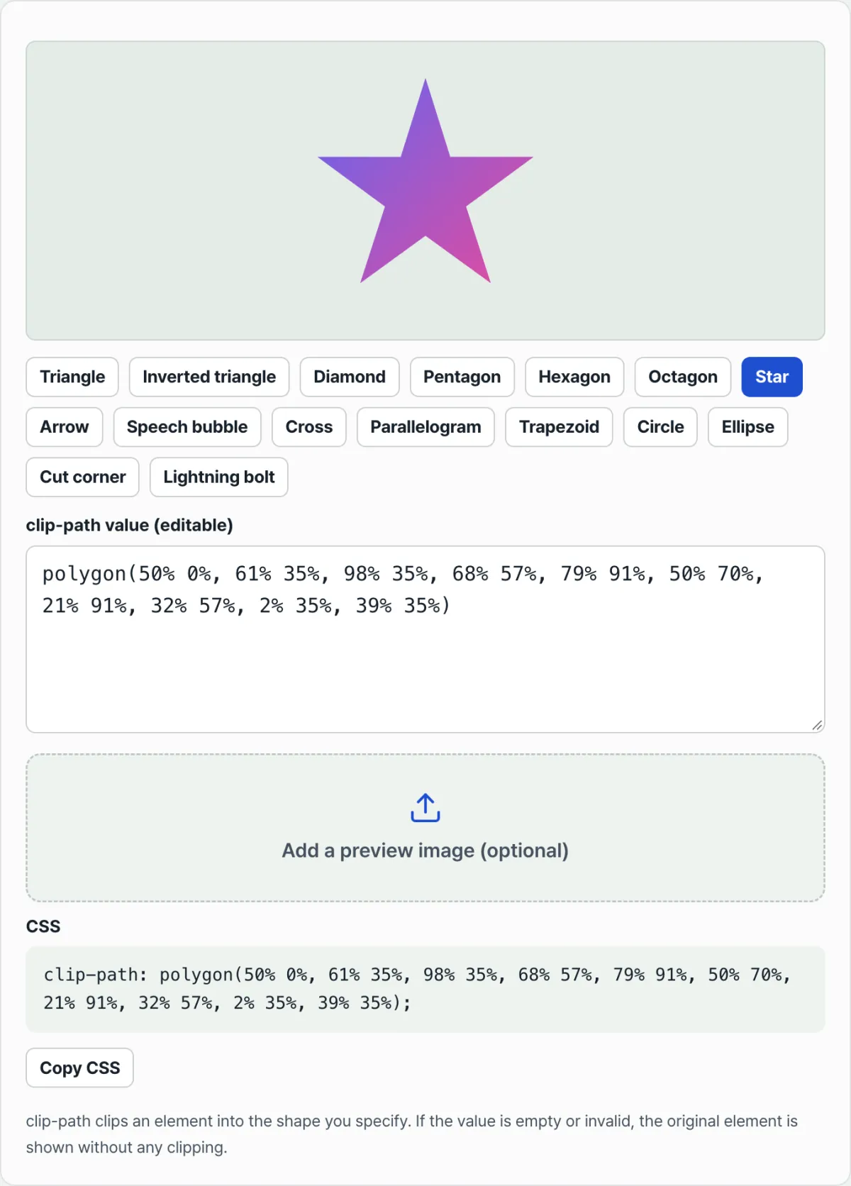
If you picked a star shape in the clip-path generator, copied it, and pasted it onto a banner or card on your actual page, you've probably seen it look different from the tool — stretched sideways or squashed vertically. This isn't CSS misbehaving. It happens because the percentage (%) coordinates in clip-path are not always calculated against a square. Check the element's width-to-height ratio and you can spot both the cause and the fix just by reading the code.
Summary ① In
clip-path, % is multiplied separately against the element's width and its height (based on the reference box). ② If the element isn't square, the samepolygon()values stretch or squash differently. ③ The fix is to lock the element to a square, or recalculate the coordinates for the real ratio.
The problem: why the shape in the tool and the shape on screen don't match
When you pick a shape like a star or diamond in a preview tool, it's usually displayed on a square box (1:1 aspect ratio). Copy those values as-is and paste them onto a wide banner or a large card element on a real page, and the star shows up squashed vertically or with its points blunted.
If you didn't touch a single coordinate value and only the shape changed, the clip-path code isn't wrong. It's that the aspect ratio of the element you applied it to differs from the preview.
The cause: percentage coordinates are multiplied against width and height separately
The % values inside clip-path's polygon(), circle(), and ellipse() aren't calculated from the image's actual pixels. They're calculated against the element's "reference box" — by default, the border-box. Horizontal (x) percentages are multiplied against the element's width, and vertical (y) percentages against its height, separately.
On a square (say 180×180px), 1% on both axes is the same length (1.8px), so the shape's proportions hold. But apply the same values to a wide element (say 800×200px, a 4:1 ratio) and 1% horizontally is 8px while 1% vertically is 2px. The result is a shape that looks squashed in the vertical direction only.
This isn't a bug that behaves differently across browsers. Shape functions like polygon() and circle() are defined that way from the start. To make shapes scale responsively when the element size changes, they use relative percentages (%) instead of absolute lengths — and the price you pay is that when width and height differ, each axis gets a different scale factor.
How to check: with code alone, no tools needed
You can find the cause using only your browser's developer tools.
- Select the oddly shaped element in dev tools and check the actual rendered width and height pixel values in the Computed tab.
- If the ratio between the two values isn't 1:1, that's your cause.
- In the Styles panel, temporarily add
aspect-ratio: 1/1to the element to make its width and height square. If the shape comes back the way you intended, the ratio really was the problem.
Once you've confirmed the cause, there are two fixes. Either lock the element itself to a square (aspect-ratio: 1/1 + object-fit: cover), or manually recalculate the vertical (y) coordinates for the real ratio, pre-stretching the shape by the amount it gets squashed.
Calculating those coordinates by hand, one at a time, then tweaking values and eyeballing the result, is a lot of work. This is where a tool that lets you compare presets and values in a live square preview — and edit them directly — speeds things up.
Free · No sign-up · Images are processed only in your browser (nothing sent to a server)
Common stumbling blocks
| Symptom | Cause |
|---|---|
| A star on a non-square banner looks squashed vertically | The reference box isn't 1:1, so y% is multiplied by a smaller factor than x% |
| You changed the coordinates but the shape didn't change at all | A polygon() syntax error makes the browser ignore the entire clip-path, so the original shows through |
| On an uploaded photo, the shape's edges look misaligned with the image | object-fit framing and reference-box calculation overlap, so the visible cut lands somewhere different |
| The shape looks clipped but the file size is unchanged | clip-path is only a screen mask — it doesn't actually crop the original image file |
Recap
- The % in
clip-pathis multiplied against width and height separately. - Apply the same values to a non-square element and the shape stretches or squashes.
- There are two fixes — lock the element to a square, or recalculate the coordinates for the real ratio.
clip-pathonly masks what's visible on screen; the original file doesn't change.
Free · No sign-up · Images are processed only in your browser (nothing sent to a server)
FAQ
Why does clip-path use % coordinates instead of px?
Percentages scale up or down automatically with the size of the reference box, so a shape keeps the same relative position inside the element as the element resizes responsively. You can mix in absolute lengths like px inside polygon(), but then those specific points stay fixed while the element changes size, which tends to break the shape in responsive layouts.
How do I use a star shape as-is on a banner that isn't square?
The simplest way is to put aspect-ratio: 1/1 on the element to force a square ratio and fill the background image with object-fit: cover. If the element really has to keep its original ratio, you need to nudge the vertical (y) coordinates inward or outward around the 50% line by the actual aspect ratio to compensate visually.
I edited the clip-path values but the shape didn't change at all. Why?
If even one parenthesis, comma, or % sign in polygon(), circle(), or similar breaks the syntax, the browser ignores the whole clip-path and shows the original element uncropped. If the shape stays the same right after you change a value, it's almost always a typo in your input — not a lack of browser support.
If I apply clip-path to an image, does the actual file get cropped into that shape?
No. clip-path is CSS masking that hides parts of what's shown on screen. The original image file's pixels and file size stay exactly the same: the browser still downloads the whole image and then simply hides everything outside the specified shape on screen. To actually cut the file into that shape, you need a separate image editing or cropping step.
This article was adapted from our Korean original. Read the Korean original