
CSS Keyframes Animation Timeline Formula and 60fps Guide
Contents
- Why It's a Hassle to Tune CSS Animations by Hand
- How to Write Keyframes Animations Yourself Without a Tool
- Properties to Check for 60fps Animations
- Recap
- Browser Rendering Optimization You Need to Know for 60fps Animations
- Under the Hood: The Rendering Pipeline and Cubic Bézier Math
- CSS Animation Tech Stack Comparison
- 5 CSS Animation Performance Mistakes That Kill 60fps
- A 5-Step Workflow for Buttery-Smooth 60fps CSS Animation
- 7 Advanced Animation Tips
- Decision Tree: Which Animation Technique Fits My Project?
- Terminology Cheatsheet
- Deep FAQs
- Frequently Asked Questions
To add entrance effects or repeating emphasis motion to a web page, you have to combine CSS @keyframes and the animation property yourself. When you're tuning cubic-bezier easing values, iteration counts, and durations by hand, it's hard to see how the motion will actually look, so trial and error can take a while. This article explains how CSS animations interpolate values and how to write common fade-in and pulse effects yourself.
Summary ① CSS animations are created by interpolating property values such as transform and opacity between a start value and an end value based on timeline progress (0%–100%). ② Common motions such as fade-in and pulse can be written directly with just an @keyframes rule and the animation shorthand property. ③ To hold 60fps, design animations around transform and opacity, and also account for users who reduce motion with the prefers-reduced-motion media query.
Why It's a Hassle to Tune CSS Animations by Hand
Combining @keyframes and the animation property isn't hard in itself, but to get motion that looks good, you need to adjust duration, delay, easing function, iteration count, and other values at the same time. Every time you change one value, you have to refresh the browser and replay the animation, so you end up going back and forth between the code and the screen until it feels right.
Values that define a curve with four numbers, like cubic-bezier easing, are especially hard to predict from the numbers alone. That's why you need a way to preview several motions, such as fade, bounce, and slide, and copy the code right away.
How to Write Keyframes Animations Yourself Without a Tool
How Interpolation Calculates Values
CSS animations calculate and fill in property values such as transform and opacity between a start value and an end value based on timeline progress (0%–100%). The calculation looks like this.
Current value = start value + (end value − start value) × easing function(progress)
Here, progress is a value where the moment the animation starts is 0 and the moment it ends is 1. The easing function doesn't use that progress as-is; it converts it to follow an acceleration or deceleration curve. For example, ease-in-out reshapes progress so the motion is slow at the start and end and fast in the middle.
The Six Parts of the animation Shorthand
The animation shorthand packs the following six values into one line.
- animation-name: the name of the @keyframes rule to connect
- animation-duration: the total time for one playback (for example, 0.6s, 1.2s)
- animation-timing-function: the easing function that sets how speed changes over time (for example, ease-in-out, cubic-bezier)
- animation-delay: how long to wait before the animation starts (for example, 0s, 0.3s)
- animation-iteration-count: the number of repetitions (1, 3, infinite)
- animation-fill-mode: whether to keep the state before the start and after the end (forwards, backwards, both)
Common Fade-In and Pulse Keyframes Examples
Here's how to write a fade-in where an element rises from below as it appears, and a pulse animation that grows and shrinks like a heartbeat.
/* Fade-in animation that appears from below */
.fade-in-up {
  animation: fadeInUp 0.8s cubic-bezier(0.16, 1, 0.3, 1) forwards;
}

@keyframes fadeInUp {
  0% {
    opacity: 0;
    transform: translateY(30px);
  }
  100% {
    opacity: 1;
    transform: translateY(0);
  }
}

/* Pulse animation that grows and shrinks */
.pulse-effect {
  animation: pulse 1.5s ease-in-out infinite;
}

@keyframes pulse {
  0%, 100% {
    transform: scale(1);
  }
  50% {
    transform: scale(1.08);
  }
}
You can type this code yourself and tweak the duration and cubic-bezier values one at a time, but if you want to preview several motions such as fade, bounce, slide, and shake, adjust the values, and copy the finished code right away, using a tool is faster.
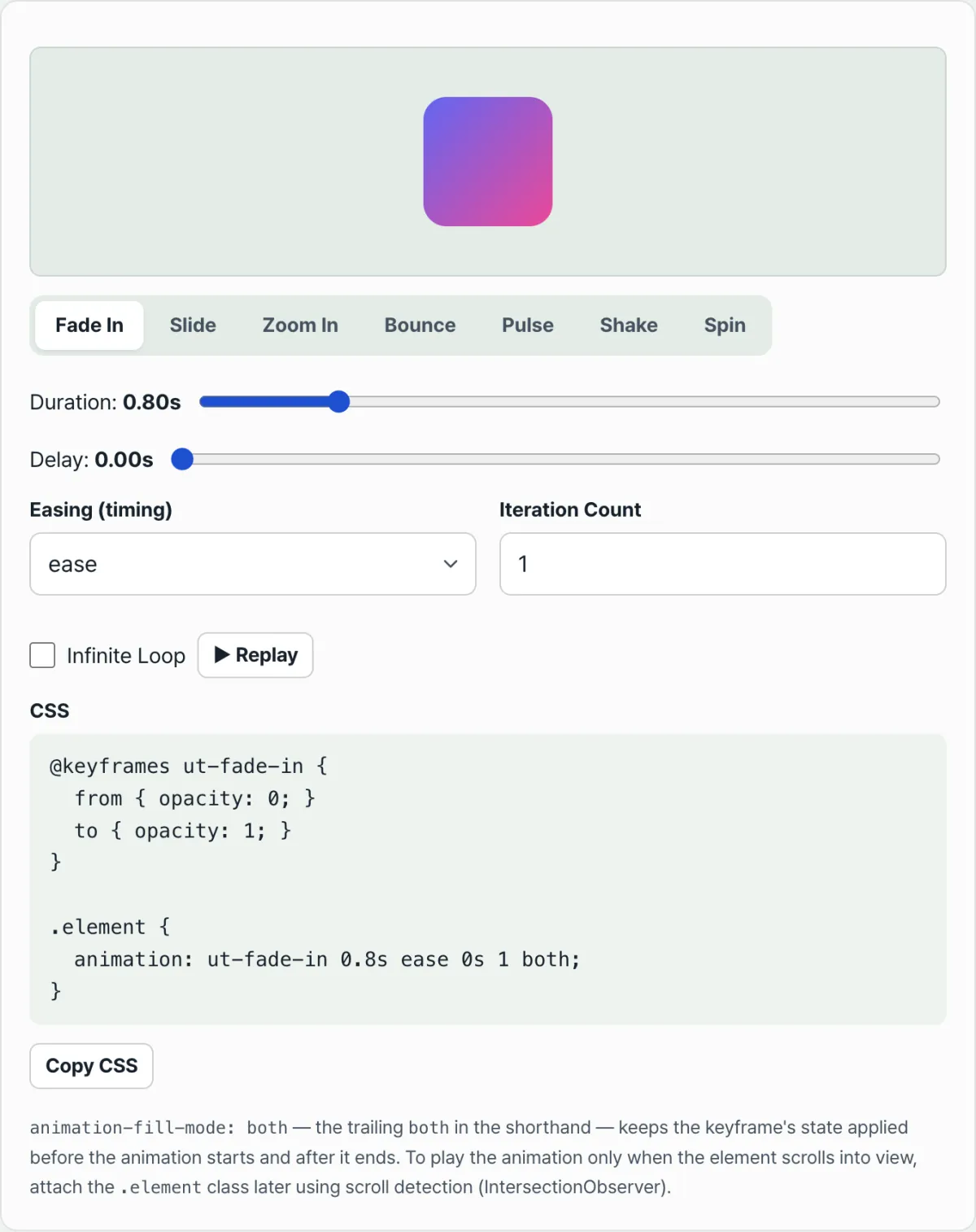
Adjust the speed and repeat count of fade, bounce, slide, and other motion animations, then grab the finished CSS keyframes source code right away.
Properties to Check for 60fps Animations
| Property type | Example properties | Frame impact |
|---|---|---|
| Composited layer handling (recommended) | transform, opacity | Handled on the GPU compositing layer, so it plays smoothly without reflow |
| Layout trigger (avoid) | width, height, margin, top, left | Every value change causes reflow, which can easily drop frames |
If you use layout-affecting properties such as width, height, margin, and top as animation targets, reflow can happen on every frame and cause dropped frames. Changing only transform (scale, translate, rotate) and opacity, which are GPU-accelerated, is better for maintaining 60fps.
Note For users who feel dizzy from motion, it's a good idea to detect the OS's "Reduce motion" setting with the @media (prefers-reduced-motion: reduce) media query and, when that setting is on, shorten the animation duration to close to 0s.
Recap
- CSS animations are created by using an easing function to interpolate between a start value and an end value based on timeline progress.
- The animation shorthand consists of six values: name, duration, timing-function, delay, iteration-count, and fill-mode.
- You can write common motions such as fade-in and pulse yourself by following the @keyframes example code.
- To maintain 60fps, design around transform and opacity, and also account for prefers-reduced-motion.
Adjust the speed and repeat count of fade, bounce, slide, and other motion animations, then grab the finished CSS keyframes source code right away.
Browser Rendering Optimization You Need to Know for 60fps Animations
If you use layout-affecting properties such as width, height, margin, and top as animation targets, reflow can happen on every frame and cause dropped frames. Changing only transform (scale, translate, rotate) and opacity, which are GPU-accelerated, is better for maintaining 60fps.
Under the Hood: The Rendering Pipeline and Cubic Bézier Math
To really understand CSS animations, you need to know how the browser's rendering engine works and what physics and math drive the motion interpolation.
The Browser Rendering Pipeline and the Compositor Layer
When the browser draws a screen, it follows this order (the pipeline):
- Layout (reflow): If you animate properties like
width,height,top,left, ormargin, the browser has to recalculate how much space the element takes up on every frame. That's heavy CPU work, and it's the main cause of dropped frames (jank). - Paint (repaint): Changing properties like
color,background, orbox-shadowskips layout, but the browser still has to repaint the pixels, so it costs compute time. - Composite: Only
transformandopacityskip both layout and paint. They get composited immediately by the browser's GPU compositor thread with hardware acceleration. You can optimize further by giving the browser a hint withwill-change: transform.
How Cubic-Bézier Curves Work
CSS's cubic-bezier(x1, y1, x2, y2) is a parametric 3rd-order Bézier curve with a fixed start point and end point. The four control points are defined as P0(0,0), P1(x1, y1), P2(x2, y2), P3(1,1). For the time parameter t ∈ [0, 1], the curve equation is:
This formula decides how much the property changes (Y axis) as the timeline progresses (X axis). Here's an interesting physical quirk: it shows up when a control point's Y coordinate (y1 or y2) is set above 1.0 or below 0.0. You get an elastic overshoot bounce that flies past the target value and comes back.
How animation-fill-mode Works
This is the key property that decides what state an element stays in before the animation starts and after it ends.
- none: The default. Styles apply only while the animation is running, and the element snaps back to its original state when it ends.
- forwards: Keeps the computed style from the end of the animation (the 100% keyframe).
- backwards: While the element waits out the
animation-delay, it applies the start style (the 0% keyframe) ahead of time. - both: Applies the effects of forwards and backwards at the same time. This is the most widely used option for entrance animations.
CSS Animation Tech Stack Comparison
The right animation tool depends on your project's size and how much interaction it needs.
| Category | CSS @keyframes | CSS transition | WAAPI (Web Animations API) | GSAP library | Framer Motion |
|---|---|---|---|---|---|
| Key characteristic | Plays a predefined keyframe sequence | Interpolates a single property on state change (hover, etc.) | Native animation control driven by JS | Powerful timelines and complex motion | Declarative motion built for React |
| 60fps hardware acceleration | Full support (transform/opacity only) | Full support | Full support | Optimized internally | Optimized internally |
| Bundle size | 0 KB (pure CSS) | 0 KB (pure CSS) | 0 KB (built into the browser) | About 20–30 KB | About 30–40 KB |
| Dynamic interactive control | Limited (hard to restart on state change) | Excellent (responds instantly to state changes) | Excellent (play and pause control) | Top tier (full ScrollTrigger support, etc.) | Top tier (syncs with React state) |
| Timelines and chaining | Manual, by calculating delays (hard) | Nearly impossible | Promise-based sequencing works | Very easy with the Timeline feature | Very easy with Variants |
| Best use case | Loading spinners, infinite pulses, simple entrance effects | Button hover effects, accordion menus | When motion is generated dynamically from state | Flashy landing pages, scroll storytelling | React-based declarative UI/UX apps |
5 CSS Animation Performance Mistakes That Kill 60fps
- Animating layout properties (top, left, width, height): This forces the browser to recalculate the position and size of the whole DOM tree, causing layout thrashing. Always replace them with
transform: translate()andscale(). - Using will-change: all everywhere: For every element with will-change, the browser allocates a separate compositor layer and GPU VRAM. Apply it to everything and you can exhaust memory until the browser crashes, so the rule is to remove the property once the animation ends.
- Skipping the prefers-reduced-motion accessibility fallback: Flashy 3D motion or heavy scroll animations make some users dizzy. Leaving out the media query is a serious web accessibility violation.
- Flicker from a missing animation-fill-mode: forwards: If you build a fade-in animation and don't set fill-mode, the element appears and then snaps right back to opacity 0 when the animation ends.
- Leaving infinite animations running on off-screen elements: If an element you can't see (say, the top section after you scroll down) keeps spinning or blinking, you're wasting CPU/GPU resources. Use
content-visibility: autoor IntersectionObserver to pause animations once they leave the screen.
A 5-Step Workflow for Buttery-Smooth 60fps CSS Animation
- Pick the target DOM element and trigger: Choose the element the animation applies to, and define clearly whether it runs on page load (entrance effect), on hover, or when scrolled into view.
- Design keyframes with transform and opacity only: Turn your visual design requirements into something the browser handles well. Instead of growing the height, use
transform: scaleY(); for movement, usetranslate()to guarantee GPU rendering. - Tune cubic-bezier curves for physical realism: Move past plain linear or ease, and apply Bézier curves that express the texture and weight of an object. Whether it's a bouncing ball or soft fabric, fine-tune the control point curvature accordingly.
- Apply animation-fill-mode and hardware acceleration hints: Use
forwardsso the element settles naturally in its final state, and addwill-change: transformright before complex motion to get the browser ready. - Verify in the Chrome DevTools Performance panel: Open the Performance tab in DevTools and run a profile to confirm you're holding a steady 60fps (a render frame of about 16.6ms or less) with no layout (purple) or paint (green) work.
7 Advanced Animation Tips
- Use the golden-ratio easing curve for polished entrances:
cubic-bezier(0.16, 1, 0.3, 1)(also known as easeOutExpo) starts extremely fast and light, then settles with a satisfying snap at the end — perfect for modern UI motion. - Keep micro-interactions within 200–300ms: If feedback motion like a button click or modal opening runs longer than 300ms, users feel the system is slow. Motion should be noticeable, but short and quick.
- Stagger list items with CSS variables: Give list items an inline
style="--i: 1",style="--i: 2", and so on, then setanimation-delay: calc(var(--i) * 0.1s)in CSS. You get a cascading, waterfall-style animation with no JavaScript. - Make accessibility a priority (prefers-reduced-motion) — it's mandatory: Wrap every flashy animation block in <pre>
@media (prefers-reduced-motion: reduce) { *, *::before, *::after { animation-duration: 0.01ms !important; transition-duration: 0.01ms !important; } }</pre> to put that safety net in place. - Move the rotation/scale origin with transform-origin: Scale animations grow from the center (center) by default. If you want a modal to feel like it pops out of a specific button, shift the origin, for example
transform-origin: top right, for a much more dynamic sense of space. - Pause infinite animations intelligently: When a user switches to another tab or scrolls past your animation, use
animation-play-state: pausedto stop burning rendering resources. It's a small but important optimization. - Don't hand-code it — use a visualizer: Bézier curves and intermediate keyframe values are hard to simulate in your head. Lean on the visual generator on this page to extract clean code.
Decision Tree: Which Animation Technique Fits My Project?
If you're unsure which tool to pick for your project's requirements, follow this flow.
Question 1: Does it need to react to scroll position, or do several motions need to play in sequence?
- YES ➔ Bring in a powerful third-party library like GSAP or Framer Motion.
- NO ➔ Move on to Question 2.
Question 2: Does the state change dynamically based on immediate user interaction, like a mouse hover, and can it be canceled?
- YES ➔ Use a CSS
transition. If the mouse leaves partway through, it interpolates back smoothly in reverse. - NO ➔ Move on to Question 3.
- YES ➔ Use a CSS
Question 3: Is the motion tied dynamically to a DOM element's render lifecycle (state changes)? (e.g., React component mount/unmount)
- YES ➔ Get help from the Web Animations API (WAAPI), React-Spring, or Framer Motion.
- NO ➔ Plain CSS
@keyframeswith theanimationshorthand is your best choice.
Terminology Cheatsheet
- Keyframe (@keyframes): A CSS rule that defines a specific point in the animation's timeline (0%–100%) and the state of the element at that point.
- Cubic Bézier (cubic-bezier): A mathematical easing function curve built on four control points that determines how fast a property changes over the timeline.
- Compositor Layer: A layer of the screen that the browser separates out for the GPU to compute and composite independently. It's the last stage of the rendering pipeline.
- Layout Reflow: An expensive operation where an element's size or position changes, forcing the browser to recalculate the layout of the entire connected document.
- Repaint: The work of redrawing an element on screen after pixel-level details like its color or shadow change.
- animation-fill-mode: A CSS property that decides what state an element holds before the animation starts and after it ends.
- will-change: A hint property that tells the browser in advance that a certain property is about to change, prompting it to pre-optimize, for example by promoting the element to its own compositor layer.
- prefers-reduced-motion: A CSS media query that detects whether the user has enabled reduce motion (to prevent nausea, for example) in their operating system's accessibility settings.
Deep FAQs
Q1. Why do transform and opacity stay smooth at 60fps, while top and left make the frames stutter?
A1. It comes down to how the browser's rendering engine is built. Changing top or left can affect how surrounding elements are laid out, so the main thread runs an expensive layout recalculation and repaint every single frame. transform and opacity, on the other hand, are handled only in the GPU's compositing step, so they render independently and smoothly no matter what heavy work the main thread is doing (running JS, for example).
Q2. What happens if the Y value of a cubic-bezier easing function goes above 1.0 or below 0?
A2. You get an elastic overshoot: the value flies past the target and springs back. For example, if you're animating to scale(1) and the easing curve's Y value climbs to 1.2, the element grows to 1.2× and then shrinks back to 1×, which gives it a lively, springy feel.
Q3. Any tips for chaining several animations in sequence using only CSS?
A3. If several elements need to appear one after another, manual staggering with animation-delay driven by a CSS variable and calc() is the most efficient approach. But if a single element needs several motion stages chained together, it's better to add up each stage's duration and delay precisely and build them into one @keyframes percentage timeline (say, 0%–30%, then 30%–100%).Make non-greedy matching a habit so you never accidentally replace the whole document.
5. Structured data (JSON-LD) syntax errors: A missing comma or closing bracket in your schema markup costs you any chance of earning a Google rich snippet.
Frequently Asked Questions
How do I use the CSS I copied?
Paste the @keyframes definition into your stylesheet, then add the .element class to the element you want to animate. You can rename the class to whatever you like.
How do I keep the start and end states in place?
If the generated shorthand ends with both(animation-fill-mode: both), the element holds the first frame's state before it plays and the last frame's state after it finishes.
I want the animation to play only when the element is visible on screen.
Use IntersectionObserver to detect when the element enters the viewport, then add the .element class at that moment. The generated CSS uses standard properties and works as-is, but the logic that detects visibility and adds the class is something you add in your own project.
This article was adapted from our Korean original. Read the Korean original