
CSS Blob Shapes: 8-Value border-radius Formula Guide
Contents
- Why use a blob instead of a rectangle
- Building a blob shape with eight border-radius values
- Blob shape values you'll use often
- Hover animation and clip-path tips
- Wrap-up
- Under the hood: the geometry of eight coordinates and elliptical arcs
- Comparing Organic Shape Techniques (Matrix)
- 5 border-radius Mistakes That Ruin CSS Blobs
- 5-Step Workflow for a Living, Breathing Organic Blob UI Component
- 7 Blob Styling Tips
- Decision Tree: Which Curve Technique Should You Use?
- Terminology Cheatsheet for Blob Masking Pros
- Frequently Asked Questions
Sometimes you want a profile photo or banner card wrapped in a curve that ripples naturally like a water droplet, instead of a hard rectangle or a perfect circle. You can create these organic blob shapes with CSS's border-radius property alone, no image files needed. This post covers how to combine eight directional border-radius values yourself, plus a free tool that builds the shape for you with sliders.
Summary ① Using a slash (/) in border-radius lets you set four horizontal and four vertical radii separately, which creates asymmetric curves. ② Instead of hand-tuning eight values one at a time, you can pick a preset, drag the sliders, and copy the CSS code. ③ By swapping values on hover, you can add an animation that makes the shape appear to move naturally.
Why use a blob instead of a rectangle
If you only use rectangles and perfect circles for profile frames or background decoration, the screen tends to look flat. An irregular curved shape (a blob) — like a water droplet or an amoeba — changes how the same photo comes across.
The catch is that making these shapes as image files (PNG, SVG) means opening a design tool every time, and redoing the work whenever you change the size or ratio. If you can build the same shape with only the border-radius property, image loading doesn't increase, and you can adjust size and form by changing a few lines of code.
Building a blob shape with eight border-radius values
In CSS, if you split border-radius values around a slash (/), you can set a horizontal radius and a vertical radius for each of the four corners.
border-radius: horizontal1% horizontal2% horizontal3% horizontal4% / vertical1% vertical2% vertical3% vertical4%;The four values before the slash are the horizontal radii of each corner, starting at the top left and going clockwise. The four values after the slash are the vertical radii in the same order. Set the two differently and you get an asymmetric curve rather than a perfect circle. For example, you can build a water droplet blob with 30% 70% 70% 30% / 30% 30% 70% 70%, and a leaf blob with 50% 50% 10% 90% / 90% 10% 50% 50%.
Here's a CSS example you'd actually apply to a profile image or banner card.
.blob-container {
  width: 320px;
  height: 320px;
  background: linear-gradient(135deg, #6366f1 0%, #a855f7 100%);
  border-radius: 42% 58% 70% 30% / 45% 45% 55% 55%;
  overflow: hidden;
  box-shadow: 0 20px 30px rgba(99, 102, 241, 0.3);
  transition: border-radius 0.6s ease-in-out;
}

.blob-container:hover {
  border-radius: 58% 42% 38% 62% / 52% 65% 35% 48%;
}

.blob-image {
  width: 100%;
  height: 100%;
  object-fit: cover;
}
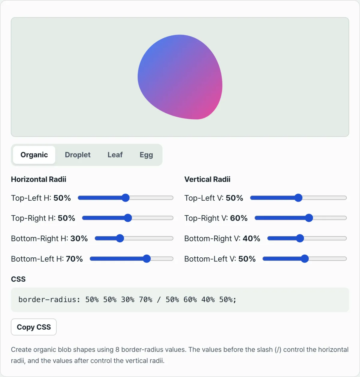
Changing eight percentage values by hand, one at a time, until you get the shape you want is a chore. Try it in our (free) tool. In the CSS Blob Shape Generator, you pick one of the Organic, Droplet, Leaf, or Egg presets, drag the eight directional handles as sliders to see the result in real time, and grab the finished CSS code with the copy button.
Adjust the eight corner radius handles however you like and instantly generate a CSS stylesheet for your own organic blob shape.
Blob shape values you'll use often
| Shape | border-radius value |
|---|---|
| Organic blob | 50% 50% 30% 70% / 50% 60% 40% 50% |
| Water droplet blob | 30% 70% 70% 30% / 30% 30% 70% 70% |
| Leaf blob | 50% 50% 10% 90% / 90% 10% 50% 50% |
| Egg blob | 50% 50% 50% 50% / 40% 40% 60% 60% |
Hover animation and clip-path tips
When you hover, changing only the border-radius values to different ones gives you a smooth morphing animation thanks to the transition property. The .blob-container:hover section in the example code above works this way.
If you need more complex curves, you can also use clip-path: url(#blob-clip) together with an SVG clipPath element. That lets you draw finer Bezier curves than border-radius allows, but you have to manage the separate SVG markup as well.
Wrap-up
With the border-radius slash (/) syntax, you can create organic curved shapes like water droplets and amoebas in pure CSS, no image files required. The four values before the slash are horizontal radii; the four after it are vertical radii. The more differently you combine them, the stronger the asymmetric curve. Rather than tuning the values by hand, building the shape with sliders and copying the code gets you to the look you want faster.
Adjust the eight corner radius handles however you like and instantly generate a CSS stylesheet for your own organic blob shape.
Under the hood: the geometry of eight coordinates and elliptical arcs
Let's look at the math behind how CSS border-radius produces these complex, natural-looking curves, digging into the browser engine's rendering spec.
CSS W3C Backgrounds & Borders Level 3 Specification
The syntax defined in the standard spec separates X-axis and Y-axis radii around a slash (/).
border-radius: [horizontal 1-4] / [vertical 1-4];Here the eight radii act as coordinate geometry that determines the radii of the ellipses sitting at the four corners. Top-Left: (rx1, ry1), Top-Right: (rx2, ry2) Bottom-Right: (rx3, ry3), Bottom-Left: (rx4, ry4)
The most important mathematical principle is asymmetric curvature. If at any corner rx + ry ≠ 100%, the browser renders that corner as an elliptical arc rather than a circle. This asymmetry between the X and Y axes is what produces fluid curves that are sharp on one side and rounded on the other, like a water droplet.
How CSS morphing animation works
Smooth hover transitions between blob shapes are possible because of structural identity. However different they look, all border-radius blobs fundamentally share the same mathematical topology: eight numeric parameters. When a CSS transition occurs from the eight values of state A (Ai) to the eight values of state B (Bi), the browser's rendering engine doesn't recompute points and lines — it simply linearly interpolates the eight scalar values and hands them to the GPU. That's why the shape doesn't tear and frames don't drop, and you get a smooth 60fps transition.
How this differs technically from SVG <clipPath> and Canvas
SVG Bezier curves and the bezierCurveTo() method of the Canvas 2D API offer nearly unlimited mathematical freedom, but when masking DOM elements or external assets, coordinate scaling gets complicated, and event listeners (mouse pointer detection) often fall outside the box model. border-radius, by contrast, belongs entirely to the browser's native box model, so overflow: hidden behaves predictably and responsive scaling happens naturally with % units.
Comparing Organic Shape Techniques (Matrix)
This table compares rendering techniques so you can pick the one that fits your project's requirements.
| Criteria | CSS 8-Value border-radius | SVG <path> & <clipPath> | CSS clip-path: polygon() | WebGL / Canvas 2D |
|---|---|---|---|---|
| File size / markup | Ultra-light (one line of CSS) | Heavy (needs separate tags/files) | Light (just a list of coordinates) | Heavy (needs JS logic) |
| 60fps morphing animation | Best (native GPU acceleration) | Fair (needs a JS interpolation library) | Poor (breaks when point counts differ) | Good (shader programming is complex) |
| Asymmetric curvature control | Good (eight-direction elliptical arc control) | Best (supports every Bézier curve) | Poor (approximates with a set of straight lines) | Best (no mathematical limits) |
| Performance overhead | Almost none (browser-optimized) | Can add DOM rendering load | Fair (repaint cost) | High (setup and render loop) |
| Fluid responsive scaling | Best (percentage units apply automatically) | Good (configure viewBox scaling) | Fair (calc/ratio math is tricky) | Poor (must implement ResizeObserver yourself) |
For web UI image masking or decorative banner elements, CSS border-radius wins on both cost and performance by a wide margin.
5 border-radius Mistakes That Ruin CSS Blobs
These are the geometric masking bugs that come up most often in real projects, plus how to prevent them.
- Missing the slash (/) separator: This is the most common mistake. If you list values without a slash, the browser reads them as one radius per corner, and you end up with plain, symmetric rounded corners. To get asymmetric elliptical arcs, you must separate the horizontal and vertical values with a slash.
- Using px units and breaking responsiveness: If you set units in px instead of %, the blob's curvature ratio won't hold when the container resizes — it gets squashed. Always use % to keep the organic shape.
- Child elements escaping because overflow: hidden is missing: Even with a perfect blob curve on the parent container, without overflow: hidden the inner image (img) or color box ignores the curved boundary, pokes out as a rectangle, and wrecks your UI.
- Animating repaint-triggering properties at the same time: Transitioning layout-changing properties like width and height alongside a border-radius animation forces a synchronous layout, which kills your 60fps budget and makes everything stutter. Use transform: scale() for size changes.
- Hardcoding only four values and losing control: Writing something like border-radius: 50% 20% 40% 60%; with four values and no slash makes the vertical radius equal the horizontal one, so you can't get true organic asymmetry. You have to control all eight values.
5-Step Workflow for a Living, Breathing Organic Blob UI Component
A standard production process for getting a polished blob mask in place fast.
- Step 1 (Define the container shape): Set the element that will render the blob to a square (1:1) or a slightly rectangular ratio. Very long rectangles can distort the curves badly.
- Step 2 (Pick an organic baseline preset): Choose the closest base preset for your use case — Droplet, Leaf, Pebble, or Amoeba.
- Step 3 (Fine-tune with the eight-direction percentage sliders): Use the blob generator to adjust the eight direction handles until you get the asymmetric tension you want.
- Step 4 (Set up image masking and object fit): Apply overflow: hidden to the parent and set width: 100%; height: 100%; object-fit: cover; on the inner child image so it fills the frame with no distortion.
- Step 5 (Add a morphing transition that brings it to life): Add a @keyframes animation or a :hover pseudo-class so the eight values cross-fade slowly when the state changes, giving the shape a sense of life.
7 Blob Styling Tips
Front-end styling know-how that takes your design up a level.
- Manage the container's aspect ratio: To keep a perfectly balanced droplet shape, lock the parent container's ratio with aspect-ratio: 1 / 1 so it holds up as the viewport changes.
- Four-keyframe infinite floating animation: Go beyond a simple hover. With something like @keyframes morph { 0% {...} 33% {...} 66% {...} 100% {...} }, you cycle through four different blob states on an 8–12 second infinite loop, which gives you a premium background element that looks like it's drifting in deep water.
- Soft drop shadow in the dominant color: Instead of a hard black shadow, pull the main color from the blob's gradient and lay down a subtle shadow (box-shadow: 0 20px 40px rgba(99, 102, 241, 0.3)) to add depth.
- Combine with subtle rotation: Pair the border-radius morph with transform: rotate(0deg) to rotate(360deg) at a very slow linear speed (say, 20 seconds). The added curvature complexity makes the shape read as far more irregular than it is.
- Transparency stacking (glassmorphism) layering: Overlap two blobs of the same size, but set the back one to opacity: 0.5 and filter: blur(8px) and offset it slightly. You get a fantastic 3D sense of volume.
- A bold diagonal gradient fill: Use a saturated diagonal color transition like linear-gradient(135deg, #6366f1, #a855f7) to visually emphasize the round volume.
- Lean on an 8-radii generator: Calculating eight percentage combinations in your head is a waste of time. Use a web-based CSS blob generator with live visualization and copy-paste the code instantly.
Decision Tree: Which Curve Technique Should You Use?
A logic flow for deciding between 8-value border-radius, SVG path masks, and clip-path based on your project requirements.
- Question 1: Do you need sharp corners or concave shapes?
- Yes ➔ Use clip-path: polygon() or SVG <path> (border-radius only supports convex elliptical curves).
- No (rounded and convex is enough) ➔ Go to the next question.
- Question 2: Is a 60fps animation that smoothly changes shape on mouse-over a must?
- Yes ➔ Go with CSS 8-value border-radius (transition rendering is the most stable).
- No (a fixed shape is fine) ➔ Go to the next question.
- Question 3: Do you need to reproduce a very complex geometric curve from Figma with sub-pixel accuracy?
- Yes ➔ Use an SVG <clipPath> mask export.
- No (an organic, natural feel is enough) ➔ Go with CSS 8-value border-radius (the lightest option and easiest to maintain).
Terminology Cheatsheet for Blob Masking Pros
- Blob: An organic, asymmetrical curved shape that ripples softly and refuses to be formalized, like a drop of water or an amoeba.
- border-radius: The core CSS property that rounds off an element's corners, and the engine that draws ellipses through eight directional values.
- Slash (/) separator: The syntax symbol in the border-radius declaration that separates the X-axis (horizontal) curvature values from the Y-axis (vertical) curvature values, telling the browser to render an asymmetrical ellipse.
- Elliptical arc: A curve that follows the perimeter of an ellipse with different horizontal and vertical radii, rather than the arc of a circle.
- Morphing animation: A visual effect in which one shape transmutes smoothly and seamlessly into another.
- Asymmetric curvature: A state in which the top, bottom, left, and right do not bend at the same ratio, forming a natural-looking, slightly squashed curve.
- overflow: hidden: A CSS property that clips the rendered area of child elements (such as images) that extend past the parent container's curved boundary, hiding them from view.
- Eight directional control points: A total of eight independent values, one for the X-axis and one for the Y-axis at each of the four corners: top-left, top-right, bottom-right, and bottom-left.
Frequently Asked Questions
Here are clear answers to the three technical questions about CSS blob masking that working developers get tripped up on most.
Q1. Why do I need the slash (/) to make an organic asymmetrical curve?
A1. If you skip the slash and write only four values (for example, 30% 70% 50% 40%), the browser reads that as an instruction to round the corners into circles with equal horizontal and vertical radii. So each corner becomes part of a circle. If you use the slash to split the values into two groups (for example, 30% 70% / 50% 40%), the X-axis radius and the Y-axis radius differ, and the browser draws a geometrically distorted elliptical arc. Only when those elliptical paths meet do you get the organic, asymmetrical, water-droplet-like shape.
Q2. How can I get an endlessly rippling blob morphing effect with CSS alone, no JavaScript (JS)?
A2. You can do it perfectly with CSS @keyframes rules. First, define three or four state frames (0%, 33%, 66%, 100%) in which the eight border-radius values are mixed differently. Make sure the 0% and 100% values match exactly so the loop doesn't jump. Then apply something like animation: morphing 10s ease-in-out infinite; to the element. The browser's graphics engine uses hardware acceleration to smoothly interpolate the eight values between frames at 60fps, producing the feel of an endlessly moving organism.
Q3. I made a nice blob, but the photo in the img tag inside it sticks out in a square. Why?
A3. The border-radius property only rounds off the border and background of that DOM element. It does not physically cut the child elements inside it (images, text, and so on) into that shape. Child elements still try to keep their original rectangular box model, so they visually bleed beyond the rounded corners. You have to add overflow: hidden; to the parent container to clip the rendering of pixels outside the parent's curved boundary. Only then does the image sit snugly inside the blob shape.
This article was adapted from our Korean original. Read the Korean original