
YouTube Banner Safe Area: See How It Crops on Every Screen
Contents
You designed a nice YouTube channel art (banner) image and uploaded it, but when you check it, the logo that looked fine on desktop is gone on mobile, and on TV there's nothing but wide empty space above and below the image. Nothing went wrong with your upload. YouTube takes that one banner image and crops a different slice of it for each screen size. Once you understand how that works, you can decide where to put your logo and text before you upload, so they stay safe on every screen.
Summary ① You upload a single 2560x1440px image as your YouTube channel banner, but TV, desktop, tablet, and mobile each crop it to a different size ② The only part that shows on every screen is the center 1546x423px area, so your logo and text must sit inside it ③ You can verify that safe area by calculating the coordinates yourself, or by laying guidelines over the image and seeing it
Why one banner image looks different on every screen
When you upload channel art, YouTube asks for a single 2560x1440px image (16:9). But the only place the whole image is shown as-is is the TV app.
In a desktop browser, the header at the top of the channel is a long, short strip, so only the middle of the banner shows, cropped to 2560px wide by 423px tall. Tablet crops to a narrower 1855x423px, and mobile crops to the narrowest slice of all: 1546x423px.
So if you place your logo or wording in the top or bottom margins, or out at the left and right edges, it looks fine on TV but gets cut off entirely on desktop or mobile.
How to check: calculate the safe area yourself
You can work out where the safe area sits without any tool. The mobile safe area (1546x423px) is about 29.4% of the full canvas (2560x1440px) in height (423 ÷ 1440) and about 60.4% in width (1546 ÷ 2560), centered both vertically and horizontally.
In pixels, that means starting about 508px from the top and running 423px down, with roughly 507px of margin on each side, so your logo and text go inside a 1546px-wide band in the middle. Draw guides at those coordinates in your image editor and you can check it with math alone.
The catch is that drawing guides from calculated coordinates means redrawing them every time you edit the banner, which gets tedious, and it's hard to really feel how much overlap there is until you see it on top of your actual photo.
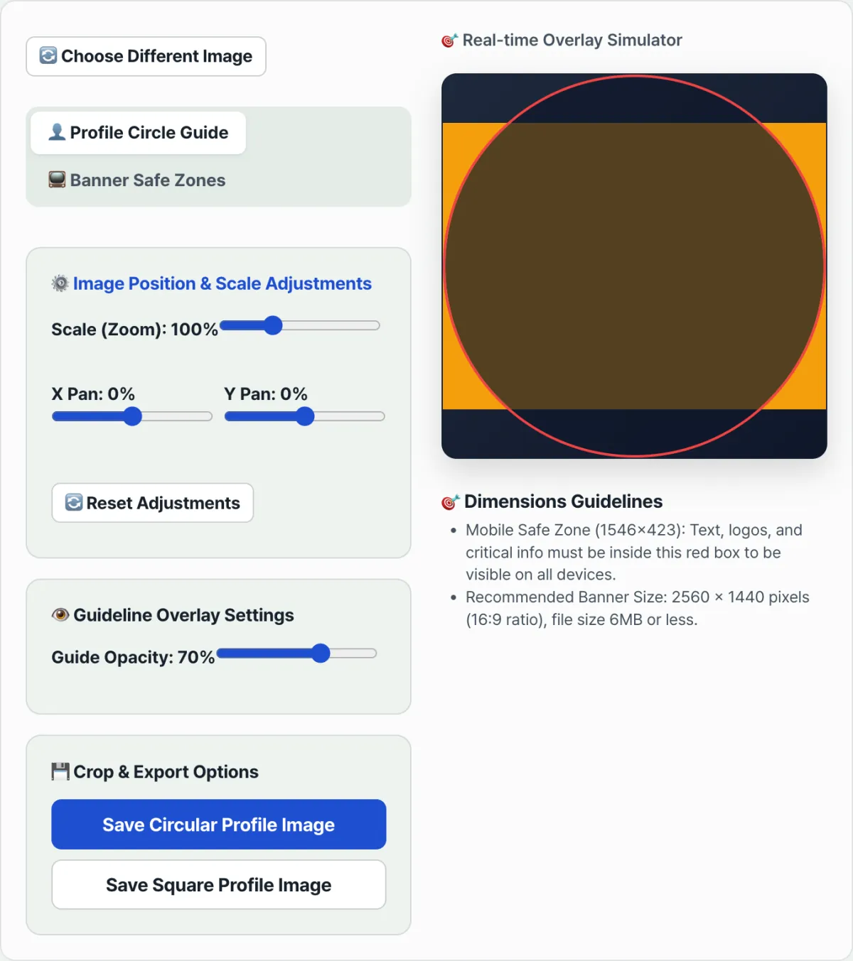
Check it with our tool. Upload your banner image and the safe-area guidelines for TV, desktop, tablet, and mobile are laid over the image automatically, so you can see what gets cropped without calculating coordinates.
Free · No sign-up · Preview safe areas right in your browser
Common trouble spots
| Situation | Why it gets cropped |
|---|---|
| Logo placed at the left or right edge of the banner | Tablet (1855px) and mobile (1546px) are narrower, so the outer edges get cut off completely |
| Wording placed at the top or bottom of the banner | Desktop, tablet, and mobile only show the center 423px-tall strip, so top and bottom elements never appear at all |
| Banner made at an aspect ratio other than 16:9 | On upload it gets refitted to 2560x1440, which shifts the crop in ways you didn't intend |
| Only checking on desktop, never on TV | TV shows the whole banner, so your margins can look empty or your key elements can look small |
As the table shows, the problem almost always comes down to one question: did you put something important outside the center safe area? Place your logo and text inside the safe area from the start and the whole worry disappears.
Recap
You upload one image as your YouTube channel banner, but TV, desktop, tablet, and mobile each crop it to a different size. The only part that shows on every screen is the center 1546x423px area, so keep your logo and text inside it.
You can check by calculating coordinates and drawing guides, but laying guidelines over your actual image makes it far faster to judge where the crops land.
Free · No sign-up · Preview safe areas right in your browser
Frequently asked questions
What image size is recommended for a YouTube banner?
2560x1440px (16:9), with a file size of 6MB or less. Upload at that size and the image stays sharp on TV screens too.
Does a profile picture get cropped differently on each screen, like a banner?
A profile picture works differently from a banner. The image you upload is cropped to a square and then masked into a circle, so you always see the same circular area no matter the screen size. That said, anything at the edges that falls outside the circle gets cut off the same way on every screen.
How do I check whether the banner I already uploaded is getting cropped?
Load your original design file back up and lay the safe-area guidelines over it. If your logo or wording sits outside the red box in the middle, nudge the position or scale with the sliders, export it again, and swap it in.
This article was adapted from our Korean original. Read the Korean original