
Modular Scale Typography: Pick a Ratio, Get 9 Steps
Contents
If you've ever picked font sizes by feel — 32px for the title, 20px for the subtitle, 14px for body text — you've probably also watched the hierarchy between those sizes fall apart the moment the screen size shifts a little.
When you set sizes by multiplying by one fixed ratio (geometric) instead of adding a fixed amount (arithmetic), the relative ratio between neighboring sizes stays the same at every step. This approach is called a modular scale.
Summary ① Modular scale formula:
size = base size × ratio^step. Pick just a base size and a ratio, and every other step in the scale falls out automatically. ② If you grow sizes arithmetically (+4px each time), the relative gap is too big between small sizes and too small between large ones. A geometric scale (modular scale) keeps the relative ratio identical at every step. ③ Choose a base size and a ratio, and all 9 steps are calculated instantly — along with CSS variable code and Tailwind config code you can paste as-is.
Why font sizes picked by feel keep looking off
It's common to start at 14px for body text and add +4px at each step: 18px, 22px, 26px, 30px. That's an arithmetic progression. Here 14px→18px is a 28.6% jump, but 26px→30px is only a 15.4% jump.
It's the same +4px, yet small text jumps a lot in relative terms while large text barely moves. That's the structural problem: as sizes grow, the absolute difference (in px) stays the same while the relative difference (%) keeps shrinking.
The result is an imbalance where headline steps are hard to tell apart, while small steps like captions and body text spread too far. The more steps you add, the worse the drift gets.
Calculating type steps yourself with a formula
You don't need a tool — a calculator and the formula are enough to build a modular scale by hand.
Step 1: Pick a base size
Usually you start with 16px, the default root font size in web browsers, as the base. Keeping the base at 16px preserves the 1rem = 16px relationship, which keeps the math simple.
Step 2: Pick a single ratio
The ratio is the multiplier applied at each step. Commonly used ratio values come with conventional names borrowed from musical intervals.
- 1.067 (Minor Second), 1.125 (Major Second) — small ratios, so the steps sit close together.
- 1.2 (Minor Third), 1.25 (Major Third), 1.333 (Perfect Fourth) — the middle range often used for body text and UI.
- 1.5 (Perfect Fifth), 1.618 (Golden Ratio), 2.0 (Double) — large ratios, so the gap between steps opens up wide.
The smaller the ratio, the tighter the steps, which is good for expressing fine-grained hierarchy. The larger the ratio, the stronger the contrast between steps, so a handful of steps is enough to make size differences obvious. Which ratio is right depends on how many size steps you need on screen at once, so there's no single correct answer.
Step 3: Apply the formula
With a base of 16px and a ratio of 1.25 (Major Third), the size at each step works out like this. Step 0 always equals the base size, because any ratio to the power of 0 is 1.
- Step 0:
16 × 1.25⁰ = 16px(1rem) - Step 1:
16 × 1.25¹ = 20px(1.25rem) - Step 2:
16 × 1.25² = 25px(1.5625rem) - Step 3:
16 × 1.25³ = 31.25px(1.953rem) - Step -1:
16 × 1.25⁻¹ = 12.8px(0.8rem)
Check these by hand and you'll see step 0→1 is a 25% increase and step 2→3 is exactly a 25% increase too — the relative ratio is the same in every range. That's the key difference from the arithmetic approach.
Working out all 9 steps from -2 to +6 by hand, raising the ratio to each power, is a chore. Try it in our tool instead.
Free · no signup · just pick a base size and ratio to generate 9-step CSS and Tailwind code
Here's how to use the tool:
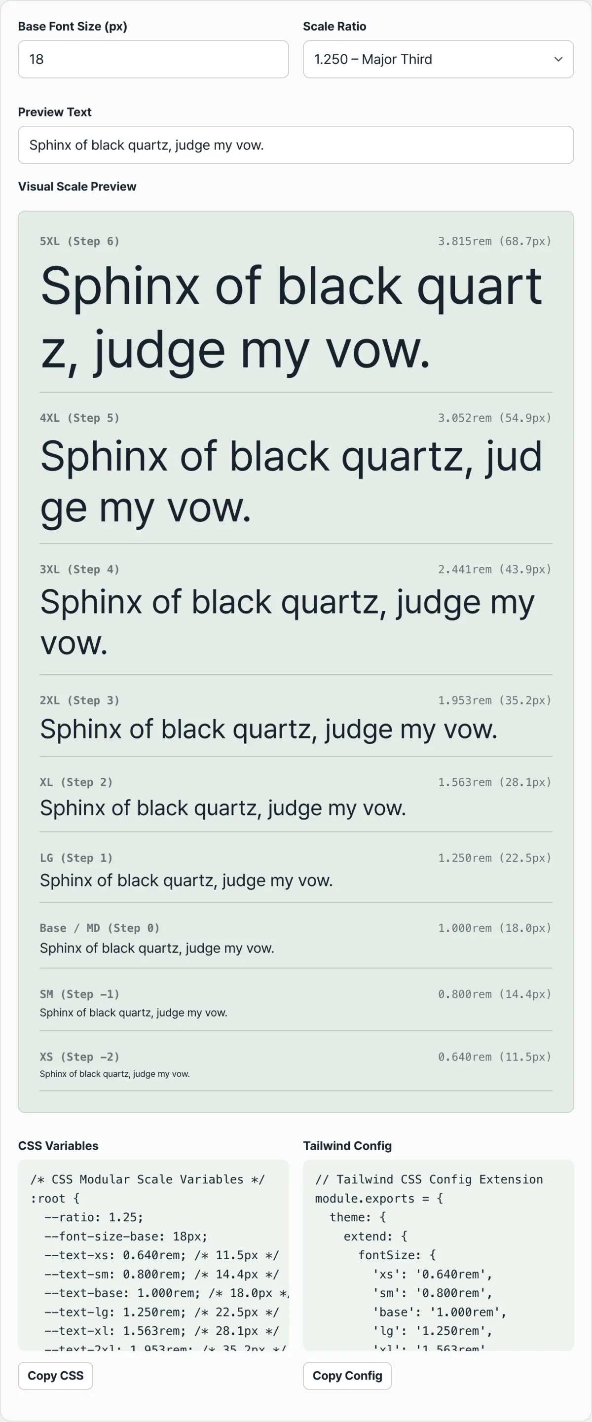
- Enter your base size in the Base font size (px) field (the default is 16).
- Pick one of the 9 ratios from the Ratio dropdown.
- Type whatever sentence you like into Preview text, and the scale preview below renders that same text at all 9 sizes from step -2 to +6 in real time.
- The CSS Variables and Tailwind Config boxes on the right and bottom show the rem value for each step as code, ready to paste with the copy button.
Common sticking points
| Situation | Cause | What to check |
|---|---|---|
| The preview text size looks different from the calculated px label | rem values render relative to the browser's root (<html>) font-size, while the tool's px labels are calculated by multiplying the base size you entered | When you apply the CSS variables in a real project, set the html element's font-size to the same base size you entered in the tool so the rem math matches what actually renders |
| You can't decide which ratio to pick | Larger ratios mean bigger gaps between steps; smaller ratios mean tighter steps | If you need many size steps on screen at once, start comparing with smaller ratios; if you need few, start with larger ones |
| Pasting the Tailwind config as-is conflicts with your existing setup | The generated key names are xs/sm/base/lg/xl/2xl/3xl/4xl/5xl, the same as Tailwind's default fontSize keys | Merging into theme.extend.fontSize overwrites the existing defaults, so decide in your project config whether to replace the block entirely or add it under separate keys |
The bottom line
Instead of hand-picking font sizes one by one, pick one base size and one ratio, and the geometric formula (the ratio raised to each step) derives every size in the scale while keeping the relative ratio consistent. You can do the math by hand if you know the exponent formula, but checking all 9 steps from -2 to +6 and transcribing them into CSS and Tailwind code is far faster with a tool.
Free · no signup · just pick a base size and ratio to generate 9-step CSS and Tailwind code
Frequently asked questions
Can I just use px instead of rem?
The CSS variables the tool generates use rem units, with the reference px values noted alongside as comments. With rem, if a user has enlarged text through their browser's accessibility settings, the whole scale scales up proportionally with it — lock everything to px and that response disappears. Which way you go depends on your project's accessibility policy.
Where do the ratio names (Major Third, Golden Ratio, and so on) come from?
The names shown in the tool are conventional labels borrowed from musical interval names. The values actually used in the math are the numbers themselves, like 1.25 or 1.618. The names are just a way to tell the ratios apart — they don't affect the calculation at all.
What are steps -1 and -2 used for?
Since step 0 is the base size, negative steps mean sizes smaller than the base. When you need text one or two steps below body size — captions, footnotes, secondary labels — you can grab the -1 (SM) or -2 (XS) value directly.
This article was adapted from our Korean original. Read the Korean original