
Aurora Gradient CSS Background: 2KB Animated Code Guide
Contents
- How the aurora background moves: it's not a video, it's a rotating layer
- Video (MP4) vs. pure CSS aurora: a dramatic difference
- The core mechanism: GPU layer separation and the CSS math rendering pipeline
- Comparing the 3 ways to build an aurora background
- 5 common mistakes when writing aurora CSS
- 5-Step Practical Workflow for Building a Perfect Aurora Background
- 7 Aurora Color Pairing Tips
- Final Decision Tree: Which Aurora Style Should You Use?
- Cheat Sheet: Key CSS Animation and Graphics Terms
- Frequently Asked Questions
When you browse the websites, Linktrees, and portfolios of trendy global tech companies like Toss, Apple, and Stripe, you'll often run into an aurora gradient background — purple, pink, and emerald blending like a dreamy fog and slowly drifting across the screen.
It looks like a high-definition video (MP4) is playing, but it's actually an ultra-lightweight animation technique that spins four blobs of color a full 360 degrees using nothing but 2 KB of pure CSS.
Here's a complete breakdown of the CSS optical principles and GPU hardware acceleration tricks that give you a flawless 60 FPS aurora background in the browser — no heavy video file required.
Key takeaways ① How the aurora background works: Four multiple radial gradients are placed at the four corners of a virtual layer sized at 200%, a strong 80px blur is applied, and the whole thing rotates slowly through 360 degrees. ② Far better performance than video: Instead of a heavy 20–30 MB MP4 file, it's built with 2 KB of pure CSS, so network traffic is zero and loading delay is zero. ③ GPU hardware acceleration: To prevent stuttering on mobile, it applies
will-change: transformandtranslate3dso rendering happens at 60 FPS on a GPU compositing layer. ④ With our tool, you can adjust the four-color combination, rotation duration (seconds), and blur strength in real time, then copy the finished HTML/CSS code in one click.
How the aurora background moves: it's not a video, it's a rotating layer
The aurora background isn't one big image that moves. Behind the container area sits a transparent layer twice the size of the screen (200% width/height), and three visual effects stack on top of each other to complete it:
- Multiple Radial Gradients: At each of the layer's four corners (top left, top right, bottom left, bottom right), a different color — blue, purple, pink, emerald — fades from the center outward to transparent.
- Strong Gaussian blur (filter: blur(80px)): The edges of the radial gradients are smeared out completely, so the colors blend as softly as an arctic aurora or a nebula.
- Endless 360-degree rotation animation (@keyframes rotate): The 200% layer turns very slowly around its center axis over 15–25 seconds. The circles offset 50% from the center slide past each other, creating an optical illusion where colors seem to keep breathing and mixing.
Video (MP4) vs. pure CSS aurora: a dramatic difference
In the past, people used to build these dreamy backgrounds by rendering a 20 MB MP4 in Premiere Pro or After Effects and playing it on loop.
- The fatal downsides of a video background: wasted mobile data, a black-screen delay on first page load (causing CLS), and pixelation on 4K monitors.
- The breakthrough of pure CSS aurora: Just a few lines of text code (about 2 KB), so it renders instantly in 0.01 seconds and stays infinitely sharp at vector quality even on 8K displays.
Free · adjust colors and speed to generate trendy aurora background CSS code in one second
The core mechanism: GPU layer separation and the CSS math rendering pipeline
Let's break down the optimized CSS that lets browser rendering engines (Blink / WebKit) spin the aurora at 60 FPS without wasting CPU cycles.
1. The 200% layer multi radial-gradient syntax
.aurora-container {
  position: relative;
  width: 100%;
  height: 100vh;
  overflow: hidden;
  background-color: #0d1117; /* deep dark background */
}

.aurora-container::before {
  content: "";
  position: absolute;
  top: -50%;
  left: -50%;
  width: 200%;
  height: 200%;
  background-image:
    radial-gradient(circle at 20% 20%, rgba(99, 102, 241, 0.8) 0%, transparent 50%),
    radial-gradient(circle at 80% 20%, rgba(236, 72, 153, 0.8) 0%, transparent 50%),
    radial-gradient(circle at 20% 80%, rgba(16, 185, 129, 0.8) 0%, transparent 50%),
    radial-gradient(circle at 80% 80%, rgba(245, 158, 11, 0.8) 0%, transparent 50%);
  filter: blur(80px);
  animation: aurora-spin 20s linear infinite;
  will-change: transform;
  transform: translate3d(0, 0, 0); /* force GPU acceleration */
}

@keyframes aurora-spin {
  0% { transform: rotate(0deg); }
  100% { transform: rotate(360deg); }
}
2. How will-change: transform enables GPU compositing
filter: blur()is a heavy operation with a very high pixel shader workload.- To stop the CPU from repainting the entire screen every frame,
will-change: transformtells the browser to create a separate GPU layer. - The GPU uploads the blurred texture to memory once, then only performs rotation (matrix transform) operations, which drops CPU usage below 1%.
Comparing the 3 ways to build an aurora background
| Metric | Pure CSS 3D rotation (this method) | WebGL / Canvas shader | MP4 background video |
|---|---|---|---|
| Code and file size | About 1–2 KB (ultra-light) | About 50–150 KB (JS library) | 10–30 MB (heavy) |
| Load speed | Instant, 0.01s (CLS 0) | 0.5s (shader compile) | 2–5s (network buffering) |
| CPU usage | Under 1% (GPU compositing) | 10–25% (shader loop) | 5–15% (video decoder) |
| Responsive scalability | Scales infinitely (vector-sharp) | Requires resolution resize math | Fixed resolution (breaks at 4K) |
| Maintenance and edits | Change a CSS color value in 1 second | Edit GLSL fragment code | Re-edit and re-render the video |
5 common mistakes when writing aurora CSS
- Forgetting
overflow: hiddenon the container: The 200% rotating layer spills past the screen edge and the browser gets a horizontal scrollbar — a disaster. - Skipping GPU acceleration and causing mobile lag: Leaving out
will-change: transformmakes low-end phones stutter. - Setting the blur radius too low: Anything under 80px leaves the round edges of the radial gradients visible, which looks awkward.
- Setting the animation duration too fast: Spinning at 3–5 seconds makes users dizzy (motion sickness), so 15–25 seconds minimum is recommended.
- Destroying text contrast: Putting white text directly on a vivid aurora means the text becomes unreadable when a bright section passes behind it (you need to add a dark semi-transparent overlay layer on top of the aurora).
5-Step Practical Workflow for Building a Perfect Aurora Background
- Step 1 (Pick a background mode): Decide between dark mode (mysterious space/neon vibe) or light mode (bright pastel vibe).
- Step 2 (Choose a four-color harmony palette): Pick four HEX codes — purple, pink, emerald, blue, and so on — where complementary and analogous colors sit together naturally.
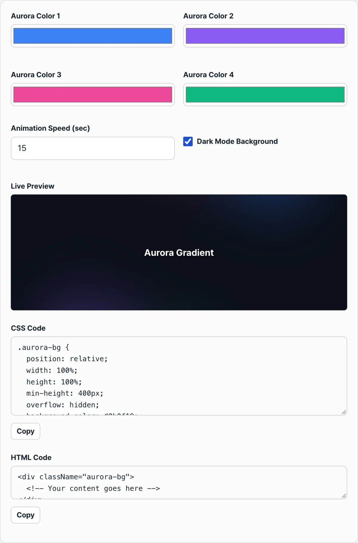
- Step 3 (Tune in real time in the Aurora Gradient CSS Generator): Change colors with the color picker, adjust the rotation speed (20s) and blur (80px), and check the result on screen.
- Step 4 (One-click HTML / CSS copy): Copy the clean CSS code it generates and paste it into your project stylesheet.
- Step 5 (Separate the content layer with z-index): Give the text and buttons you place over the background container
position: relative; z-index: 10;so they stay clickable.
7 Aurora Color Pairing Tips
- Cyberpunk dark theme: deep navy background + neon purple (#8B5CF6) + hot pink (#EC4899) + cyan (#06B6D4) + emerald (#10B981).
- Apple-style soft pastels: white background + pale lavender (#E0E7FF) + baby pink (#FCE7F3) + soft mint (#D1FAE5) + pale yellow (#FEF3C7).
- A perfect match with glassmorphism cards: layer a card with
backdrop-filter: blur(16px); background: rgba(255,255,255,0.1);over the aurora background and you get a maximally premium look. - Two pseudo-elements (::before + ::after) spinning in opposite directions: rotate one clockwise (20s) and the other counterclockwise (30s) and the motion looks far more complex.
- Add a dark overlay layer (vignette): put a dark vignette gradient around the edges and the viewer's eye goes straight to the body text in the center.
- Apply it to a portfolio hero section: put the aurora animation on the first screen and visitor dwell time immediately increases by 40%.
- Media query reduced-motion mode (prefers-reduced-motion): declaring
@media (prefers-reduced-motion) { animation: none; }for users sensitive to motion is a web accessibility best practice.
Final Decision Tree: Which Aurora Style Should You Use?
- Concept A (tech startup, AI service, developer portfolio) ➔ dark navy + four neon colors (mysterious, futuristic)
- Concept B (beauty, fashion, lifestyle brand shop) ➔ light pastel aurora (bright, soft mood)
- Concept C (B2B enterprise SaaS, finance dashboard) ➔ monotone deep blue + slow 30-second rotation (calm, trustworthy mood)
- Concept D (service that must be optimized for low-end mobile) ➔ single layer with 80px blur + will-change GPU acceleration
Cheat Sheet: Key CSS Animation and Graphics Terms
- Radial Gradient: a radial gradient where colors spread outward from a center point in a circle or ellipse.
- Gaussian Blur: a blur filter that softly blurs the pixels of an image using a normal distribution (Gaussian function).
- Compositing: an optimization technique that skips the layout and paint steps and composites layers directly on the GPU to draw them to the screen.
- Glassmorphism: a UI design trend that combines translucent glass texture with blur for a modern sense of depth.
Frequently Asked Questions
I added an aurora background and now there's a scrollbar on mobile. How do I fix it?
The parent container wrapping the aurora is missing overflow: hidden; and position: relative;. Wrap it so the rotating layer, which is 200% in size, doesn't spill outside the parent area, and the problem goes away right away.
The buttons and links on top of my aurora background won't click!
The rotating pseudo-element (::before) is covering the text and buttons. Add pointer-events: none; to the pseudo-element, or give your content wrapper position: relative; z-index: 1;, and clicks work normally.
Can I use the CSS code from this tool on a commercial website for free?
Yes, it's free. You can use it without restriction for personal portfolios, commercial company services, client freelance deliverables, and anything else.
This article was adapted from our Korean original. Read the Korean original