
CSS perspective 3D card: how transform order changes the result
Contents
To spin a card or a box in 3D with CSS alone, you first need to know how six values — perspective, rotateX, rotateY, rotateZ, translateZ, and scale — combine, in what order, and what each one actually changes.
These six values aren't something you eyeball. They follow fixed rules, so once you know the rules, you can predict the result exactly.
I put this together so front-end developers and UI developers building hover cards or 3D cube effects can change one value at a time and check the rules for themselves.
Summary ①
perspectivebelongs on the parent, not on the element you're rotating — that's what creates the depth distortion. ② Transform functions are calculated left to right, so the same values in a different order give a different result. ③translateZlooks bigger or smaller depending on the perspective value, whilescalemultiplies the on-screen size regardless of perspective.
Why your CSS 3D card keeps looking flat
You paste in a CSS 3D card example you found online, and instead of rotating in 3D, the card just looks like a rectangle squashed at an angle. You clearly set rotateY(30deg), but all you get is a tilted flat plane with no sense of depth.
The cause is almost always one of two things. Either you never declared perspective at all, or you put perspective on the element you're rotating.
perspective defines the virtual distance between the viewer and the z=0 plane. But it applies to the children of the element that has the property, not to the element itself. So putting it on the element you want to rotate does nothing.
The other cause is the order of the transform functions. rotateY(30deg) translateZ(50px) and translateZ(50px) rotateY(30deg) use the same numbers but produce different results. That's because CSS applies the functions in a transform list from left to right.
The order in which perspective, rotate, translateZ, and scale combine
Follow these steps in order and you can build the same result in plain CSS, no tool needed.
- Declare perspective on the parent element. Put
perspective: 600px;on the container that wraps the card you want to rotate. This value is the virtual distance from the viewer to the z=0 plane. It has to go on the parent that holds the card, not on the card itself, or the card won't show any depth distortion when it turns. - The size of the perspective value sets how strong the distortion is. A smaller value (say 200–400px) puts the viewer right up against the card, so the front and back faces differ a lot in size when it rotates and the distortion is strong. A larger value (say 1500–2000px) moves the viewer back, so the distortion eases off and the rotation looks closer to a flat one.
- rotateX, rotateY, and rotateZ spin around different axes.
rotateXturns around the horizontal axis, so the top and bottom of the card tilt forward and back.rotateYturns around the vertical axis, so the left and right sides tilt forward and back.rotateZturns around the axis pointing straight at you, which looks the same as a 2D rotation. - translateZ pulls the card toward the viewer or pushes it away. A positive value brings the card closer to the viewer (toward the front of the screen), and a negative value moves it farther away (behind the screen). Once perspective is in play, this movement alone makes the card look bigger or smaller, because of perspective projection: closer looks bigger, farther looks smaller.
- scale multiplies the on-screen size only, independent of perspective.
translateZchanges how big the card looks by moving it through distance.scalemultiplies the element's rendered size by the factor you give it, with no z-axis movement at all.translateZ(100px)andscale(1.5)can both make a card look bigger, but they differ in whether they respond to perspective distortion. - String the final transform together in order. Write it like
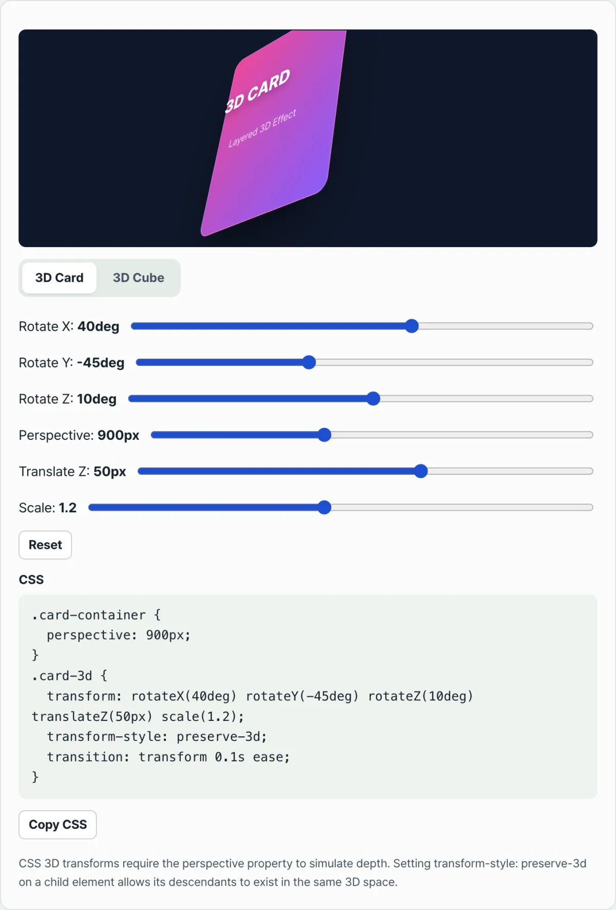
transform: rotateX(25deg) rotateY(-30deg) rotateZ(0deg) translateZ(0px) scale(1);. Each function is calculated left to right, and that determines the final shape. Addtransform-style: preserve-3d;andtransition: transform 0.1s ease;on top, and you get a card that animates smoothly when the values change.
You can also verify these rules by hand — change one of the six values, save, refresh the browser, and repeat. The catch is that you have to edit, save, and reload every single time, so comparing several combinations by eye takes a while.
Check it with our free tool.
As you move the sliders, the CSS updates in real time. All calculations run in your browser, so nothing is sent to a server.
The parts people get tripped up on
The values themselves aren't hard, but these four spots are where the result usually doesn't match expectations.
| Mistake | What you see | Why it happens |
|---|---|---|
| Putting perspective on the element you're rotating | It rotates, but it looks flat with no depth distortion | perspective applies to the children of the element that has it, so it does nothing on the element itself |
| Leaving perspective out entirely | rotateX/rotateY just looks like a tilted flat plane | Without perspective projection, rotation doesn't change the relative size of the front and back faces |
| Changing the order of the transform functions | The same numbers give a different shape than the example | Transform functions apply left to right, so the order is the calculation order |
| Forgetting preserve-3d on nested 3D elements like a cube | The faces don't look 3D and collapse into each other | The default flat value flattens the child's 3D transform onto the parent's plane |
transform-style: preserve-3d is needed for the same reason. At the default flat value, the 3D transforms on child elements get flattened onto the plane the parent sits on before rendering.
To combine several faces into something that looks like a cube, set preserve-3d on the element that wraps those faces, so the children's 3D positions aren't flattened and stay as they are.
Wrap-up
- perspective goes on the parent, not on the element you're rotating, and smaller values mean stronger depth distortion.
- rotateX, rotateY, and rotateZ spin around different axes, and transform functions are calculated left to right.
- translateZ makes the card look bigger or smaller in response to perspective, while scale multiplies only the on-screen size regardless of perspective.
- Nested 3D elements (like a cube) need
transform-style: preserve-3dto stay 3D instead of being flattened. - Drag the sliders and you can watch each of these rules show up live in the CSS text.
As you move the sliders, the CSS updates in real time. All calculations run in your browser, so nothing is sent to a server.
Frequently Asked Questions
What perspective value should I use?
There's no single right answer. For a given rotation angle, the only fixed relationship is that a smaller perspective (200–400px) exaggerates the distortion and a larger one (1000px and up) makes it subtler. How much distortion you want depends on the situation, so try comparing a few values with the sliders and pick the one you like.
Does the order of rotateX and rotateY change the result?
Yes, it does. Transform functions are evaluated from left to right, so rotateX(25deg) rotateY(-30deg) and rotateY(-30deg) rotateX(25deg) produce different results. Because the two rotations spin around different axes, swapping the order changes the final orientation.
Changing only translateZ makes the card look bigger: how is that different from scale?
translateZ physically moves the card toward the viewer, and how much bigger it looks depends on the perspective value. scale doesn't move anything; it just multiplies the rendered size by a factor, so it always grows or shrinks at the same ratio regardless of the perspective value.
What's the difference between the 3D Card tab and the 3D Cube tab?
The 3D Card tab applies perspective plus rotation, translation, and scale values to a single gradient card, showing how one flat plane tilts into three dimensions. The 3D Cube tab places six faces — front, back, left, right, top, and bottom — using translateZ(50px) with rotateY/rotateX to build a cube, and the same slider values are applied to all six faces so they rotate together.
This article was adapted from our Korean original. Read the Korean original