
CSS Text Truncation: Single-Line Ellipsis and Multi-Line Clamp
Contents
When you build a web page or mobile app UI, card titles and list previews often spill out of the space you gave them. Trimming the overflow and appending an ellipsis (...) so the layout holds together is a must-have front-end technique that makes or breaks how polished a UI feels.
Summary ① Single-line truncation:
white-space: nowrap,overflow: hidden, andtext-overflow: ellipsismust all be used together. Any one missing and it won't work. ② Multi-line truncation: combinedisplay: -webkit-box,-webkit-line-clamp: N,-webkit-box-orient: vertical, andoverflow: hidden. ③ Broken Flexbox parent: when truncation fails inside a flex container and the text pushes right through the parent, declaringmin-width: 0on the flex item fixes it immediately.
Single-Line Text Truncation: The 3 Required Properties
To limit text to exactly one line and turn the overflow into an ellipsis, you need to declare these three properties on the same element.
.single-line-truncate {
  white-space: nowrap;
  overflow: hidden;
  text-overflow: ellipsis;
}
Each property does its own job, and if even one is missing, no ellipsis appears.
white-space: nowrap: Forces the text to stay on one line instead of wrapping, even when it's wider than the parent.overflow: hidden: Hides the text that spills outside the box width.text-overflow: ellipsis: Renders the three-dot (...) glyph in place of the text thatoverflow: hiddencut off.
One thing to watch: inline tags like <span> and <a> (display: inline) have no concept of width, so you must also set display: block or display: inline-block.
Multi-Line Truncation (2+ Lines): WebKit Line Clamp
When you want to show only two or three lines of a card summary or news preview and hide the rest behind an ellipsis, use the -webkit-line-clamp property.
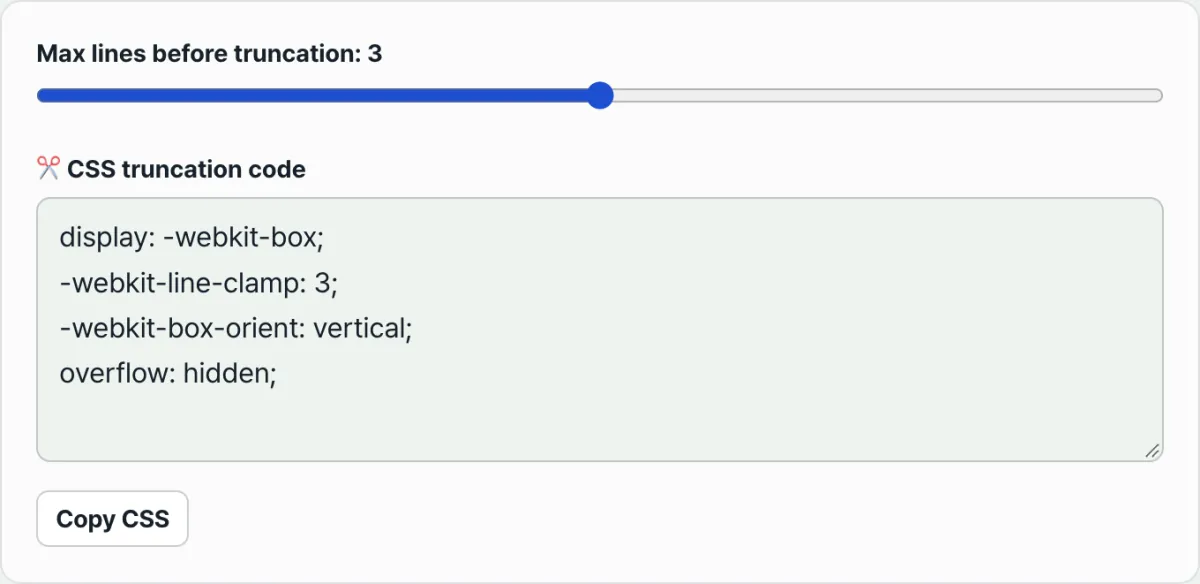
.multi-line-truncate {
  display: -webkit-box;
  -webkit-line-clamp: 3; /* desired max line count */
  -webkit-box-orient: vertical;
  overflow: hidden;
}
People used to count characters with JavaScript or hack together pseudo-element (::after) tricks to fake multi-line truncation. Today every modern browser (Chrome, Safari, Edge, Firefox) officially supports the WebKit vendor prefix, so four lines of CSS handle it cleanly.
display: -webkit-box: Groups the text into a multi-line box model, creating the special box context needed to count lines.-webkit-line-clamp: 3: Limits the visible text to a maximum of 3 lines.-webkit-box-orient: vertical: Locks the content flow inside the box to the vertical direction.overflow: hidden: Hides whatever text goes past the line count you set.
The 3 Bugs You'll Hit in Real Projects, and How to Fix Them
Here are the three most common reasons truncation code produces no ... or blows up your layout in real front-end work — and how to fix each one.
1. Text Pushes Through the Parent Inside a Flexbox / Grid Container
When the parent is display: flex and you apply truncation to the child text, the text won't shrink. Instead, it keeps stretching the parent box wider and wider.
- Cause: Per the CSS Flexbox spec, a flex item's
min-widthdefaults toauto(the content's minimum intrinsic width), not0. - Fix: Explicitly declare
min-width: 0;on the flex item with the truncation (or on its direct flex child), and truncation works normally within the parent's width.
2. It Doesn't Work on Inline Tags (<span>, <a>)
Slap single-line truncation CSS on a <span> and nothing happens. Inline elements aren't constrained by the parent's width — they just grow to fit the text.
- Fix: Add
display: inline-block;ordisplay: block;to that element, and addmax-width: 100%;if needed.
3. The Bottom of the Last Line Gets Cut Off
Set a fixed height (height: 60px) and apply -webkit-line-clamp, and the line height (line-height) won't line up with those pixels. The bottom of the third line can get sliced off like a knife cut.
- Fix: Remove the fixed
heightand let the natural multiple of-webkit-line-clampandline-heightdetermine the height, or give it breathing room withmax-height.
To choose your line count and instantly generate and copy single-line or 2–5 line clamp CSS, give the CSS Line Clamp & Text Truncate Generator a try.
Free · instantly copy one-line and 2–5 line line-clamp CSS
Single-Line vs Multi-Line Truncation CSS Comparison
| Item | Single-line truncation | Multi-line truncation |
|---|---|---|
| Core display | display: block or inline-block | display: -webkit-box |
| Line-break control | white-space: nowrap | -webkit-box-orient: vertical |
| Line limit | Fixed at 1 line | -webkit-line-clamp: N |
| Overflow hiding | overflow: hidden | overflow: hidden |
| Ellipsis property | text-overflow: ellipsis | Built into -webkit-line-clamp |
| Browser support | Nearly all browsers, including IE6 | Modern browsers |
Wrapping Up
Single-line truncation comes down to three properties working together: white-space: nowrap, overflow: hidden, and text-overflow: ellipsis.
For two or more lines, use the four-property WebKit set led by -webkit-line-clamp. And whenever text spills out inside a Flexbox or Grid layout, the first thing to check during real-world debugging is whether the flex item has min-width: 0 declared.
Free · instantly copy one-line and 2–5 line line-clamp CSS
Frequently Asked Questions
Why do I still need the -webkit- prefix in 2026?
The W3C's official CSS Overflow Module Level 3 spec does define a standard line-clamp property. But for backward compatibility with the existing web ecosystem, browser vendors (Chromium, WebKit, Gecko) unanimously adopted the -webkit-line-clamp syntax as a standard alias and support it permanently.
In Flexbox, which tag do I put min-width: 0 on?
If the element with the truncation class is a direct child of the flex container (a flex item), put min-width: 0 on that element itself. If there's a wrapper <div> inside the flex child and a <p> tag inside that, you need to put min-width: 0 on the outermost wrapper that acts as the flex item so the parent's flex width constraint carries down correctly.
Why is CSS truncation better than cutting text by character count with JavaScript?
If you cut by character count with JavaScript — say, 20 Korean characters or 30 English characters — you can't adapt to proportional fonts (the width difference between "W" and "I") or to responsive screen widths across devices. CSS truncation, on the other hand, has the browser's rendering engine calculate the remaining space in pixels in real time, so it places the ellipsis in the best possible spot on every device.
What do I do when truncation breaks inside a table (<table>) cell?
By default, a <td> tag widens to fit its content. Set table-layout: fixed; on the table to lock the column widths, then place a <div> or <span> inside the cell and apply truncation to that. It works without breaking the table.
The CSS properties and rendering engine behavior covered in this guide are summarized from the W3C CSS Text & Overflow official specifications. Details of the rendered output may vary in legacy browsers or specialized webview environments.
This article was adapted from our Korean original. Read the Korean original