
@font-face CSS: woff2, woff, ttf src order and syntax
Contents
To use a downloaded web font file on your site, you need to write an @font-face rule. Two things trip people up: what order to list woff2, woff, and ttf inside src, and why font-family needs quotes. That order and syntax aren't arbitrary conventions — they come straight from how browsers read CSS. Here's how it works, starting from the code structure.
Summary ① Browsers read the src list from top to bottom and stop at the first format they support, which is why the order is fixed at woff2 → woff → truetype. ② Wrapping the font-family name in quotes is the safe choice, so you avoid spaces and reserved-word conflicts. ③ font-display: swap shows text in a fallback font first, then swaps in your font once it loads.
Once you've downloaded the three web font files, this is where you get stuck
When you use a site or download tool that converts a font file for the web, you usually get three files: .woff2, .woff, and .ttf. Browsers don't all support the same formats, so instead of picking one, you link all three in your CSS.
The trouble starts there. Every example you find in search results lists src in a different order, and some put ttf at the top. If you get the order wrong, the browser doesn't throw an error — it just loads the font quietly, so you can't see at a glance what went wrong.
The same goes for whether font-family needs quotes, and whether it's okay to write a font-weight that doesn't match the actual file. Most of the time you're left staring at an ambiguous screen where it "kind of looks applied, but also kind of looks like the original font."
How to write @font-face code yourself without a tool
An @font-face rule declares a font name, then attaches the file list (src) and the weight and style info to that name. The basic form looks like this.
@font-face {
  font-family: "Pretendard";
  src: url("/fonts/pretendard.woff2") format("woff2"),
       url("/fonts/pretendard.woff") format("woff"),
       url("/fonts/pretendard.ttf") format("truetype");
  font-weight: 400;
  font-style: normal;
  font-display: swap;
}
Let's go through why the order and syntax have to look like this.
Why the src order is fixed at woff2 → woff → truetype
The src property can hold multiple url() and format() pairs separated by commas. The browser reads that list from top to bottom, and when it finds the first format it supports, it downloads only that file and ignores the rest.
So the order you list them in is the priority order. WOFF2 has the highest compression and the smallest file size, WOFF is older but more widely supported, and TTF (TrueType) is the oldest fallback format. Put woff2 at the top and browsers that support it get the lightest file. Only browsers that don't support it move to the next line for woff, and if that fails too, they get ttf.
Flip the order and put ttf at the top, and most browsers support ttf, so the list stops on the first line. As a result, even the newest browsers that support woff2 end up downloading the heavier ttf file. From the browser's side, nothing is broken — it followed the order you gave it — so you won't even see a warning in the console.
Why font-family uses quotes
You can write a font-family value in CSS two ways. Either as an identifier without quotes, or as a string wrapped in quotes.
As an identifier, a name with spaces risks being split into multiple words during parsing. A name that starts with a number, or one that collides with a CSS reserved word like sans-serif or inherit, can cause a parsing error. Wrap it in quotes and the whole name is passed through exactly as one string, with none of those problems.
So it's a good habit to use quotes even when the font name has no spaces. That's why the example above wraps "Pretendard" in quotes.
What font-display: swap actually does in rendering
font-display controls how the browser shows text during the brief window before the web font file finishes downloading. With the swap value, the browser doesn't wait for the font — it draws the text right away in a fallback font.
Then, when the web font file finishes loading, it replaces the already-drawn text with that font. If you leave font-display unset, the browser's default behavior can create a waiting period where text is invisible until the font loads. swap effectively removes that waiting period so text is always visible first.
One caveat: if the fallback font and the real font have different character widths, you may see line breaks or layout shift slightly the moment the swap happens. Use swap when you'd rather have text appear immediately than appear late.
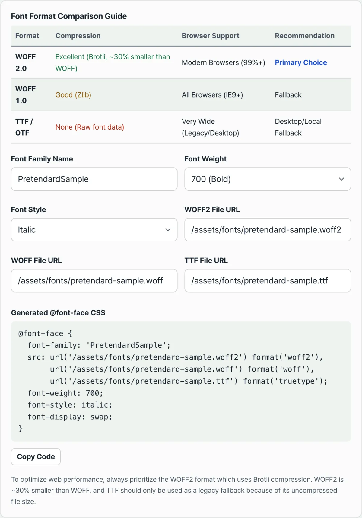
Even once you understand the structure — src order, quotes, font-display — lining up the font name and the three file paths by hand every time is tedious. You can check the whole process right in our free tool, the @font-face CSS Generator.
Enter a font name and file paths, and a correctly ordered @font-face rule appears as you type. Everything runs in your browser, with no data sent to a server.
Three common mistakes that keep a font from showing up
Sometimes the code runs without a syntax error and looks fine, but the font still doesn't apply. Most of the time it's one of these three.
| Mistake | What happens |
|---|---|
| Listing src in reverse order (ttf at the top) | Even the newest browsers stop at the first line and download the heavier ttf |
| format() name doesn't match the actual file extension | The browser trusts the hint to judge the format, so it skips that line or fails to read the file |
| font-weight or font-style doesn't match the actual file | When text asks for the declared weight or style, this font doesn't match, so a fallback font or synthetic bold is used instead |
The format() name is a hint the browser checks before it opens the file. If you write format("woff") for a file that's actually .woff2, the browser treats that line as an unsupported format, skips it, and moves to the next line. The file itself is fine — the label in the code is what's wrong, so it never loads.
The same applies to font-weight. The browser doesn't open the file to check its actual weight; it trusts the number written in the CSS. If you upload a Bold file but declare font-weight: 400, text asking for font-weight: 700 won't be linked to this font. A fallback font or bold that the browser synthesizes on its own gets used instead.
Summary
- The src order isn't a convention — it's fixed at woff2 → woff → truetype because of how browsers stop at the first format they support.
- Wrapping font-family in quotes is the safe choice to prevent space and reserved-word conflicts.
- font-display: swap shows a fallback font first, then swaps instead of waiting for the font to load.
- The format() value must exactly match the actual file extension, and font-weight and font-style must exactly match the actual file's weight and style, or the font won't connect properly.
- Follow these four rules and you can write accurate @font-face code yourself, without any extra tools.
Enter a font name and file paths, and a correctly ordered @font-face rule appears as you type. Everything runs in your browser, with no data sent to a server.
Frequently Asked Questions
Can I just include a single woff2 file?
Yes, if you're only targeting modern browsers. But if you need to support older browsers too, it's safer to include woff as a fallback. Only add ttf if you need to support really old environments.
Do I use the actual file name in the string inside format()?
No. format() takes a value defined by the CSS spec (woff2, woff, truetype, opentype, and so on). That value just has to match the actual format of the file. For a .ttf file you use format("truetype"), and for a .otf file you use format("opentype").
How do I declare multiple font files with different weights?
Declare a separate @font-face rule for each file, all using the same font-family name but different weights. Set font-weight: 400 for the Regular file and font-weight: 700 for the Bold file, and the browser will pick the rule that matches the font-weight value actually in use.
Does font-display have values other than swap?
There are five: auto, block, swap, fallback, and optional. block waits briefly for the font before drawing text, while swap draws text right away in a fallback font and then swaps it. If you want text to appear as fast as possible, use swap. If you want to minimize the sudden change after the font loads, consider block.
This article was adapted from our Korean original. Read the Korean original