
Meme Caption Fonts: Why White Text With a Black Outline
Contents
The memes you see online were made by different people using different programs, yet the caption text looks oddly similar. That's not because some "official meme font" standard exists somewhere. It's because everyone follows the same combination of style choices out of habit. This post breaks down what that style is actually made of, and where people get stuck when they try to recreate it themselves.
Summary ① Meme caption styling isn't a standard. It's a convention: bold text, white fill, black outline, center alignment. ② White fill and a black outline go together so the letters don't get lost no matter what color the photo background is. ③ "Uppercase" doesn't apply to Korean, because Korean has no uppercase and lowercase letters.
Why meme caption fonts all look the same
There's no international standard or official typeface spec for meme captions. Nearly every generator follows the same few ingredients — a bold typeface, white fill, a black outline, center alignment — which just makes it look like a set font exists.
This combination caught on because every photo has a different background. White text alone disappears on a bright background, and black text alone disappears on a dark one. Add a black outline to a white fill and the letterforms hold up regardless of background color.
The values you need to match if you build it yourself
To recreate this style by hand in Paint or Photoshop, you first need a bold font. Impact is the classic choice, but it isn't installed on every device, so when it's missing you should fall back to a font with similar weight, like Arial Black or Malgun Gothic, for a natural look.
Set the fill to white (#FFFFFF) and the outline to black (#000000), then set the outline width to about 9% of the font size for a balanced look. Center the text horizontally, and leave a little padding at the top and bottom so it doesn't get clipped.
When a line goes past about 94% of the image width, it needs to wrap to the next line automatically. If a single long word with no spaces exceeds that width, there's no space to break at, so you have to force a break by character to keep it from getting cut off.
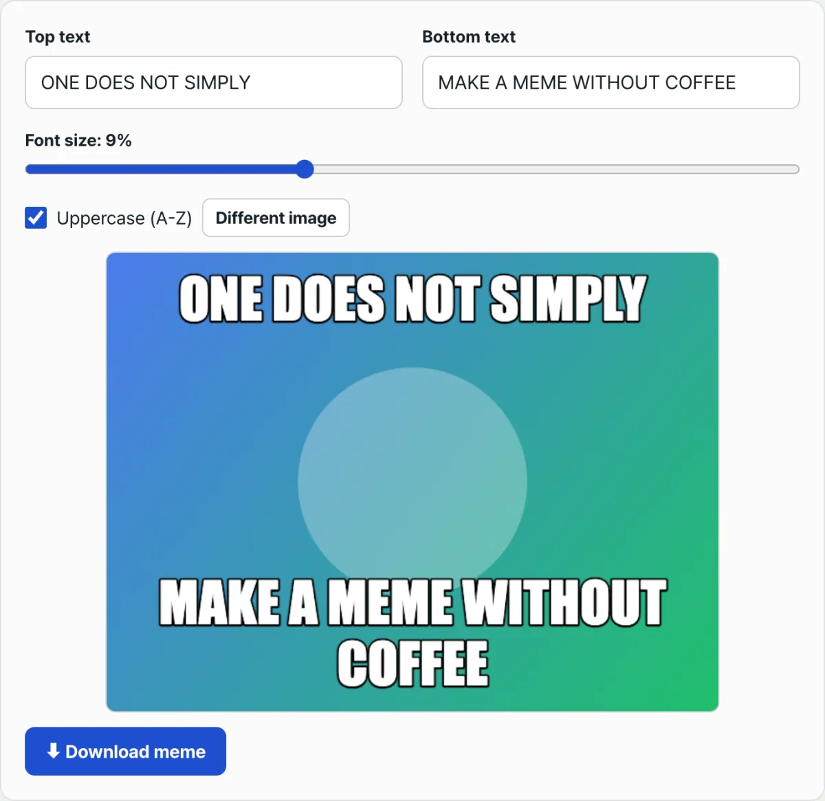
Check it with our tool. Instead of hand-tuning font weight, fill color, outline width, and wrap thresholds every time, just type your text into a tool that already has those values built in and you get the same style right away.
Free · No sign-up · Images are processed only in your browser
Common snags
| Situation | What to check |
|---|---|
| I turn on "Uppercase" for Korean text and nothing changes | Korean has no uppercase or lowercase, so there's nothing to convert. This option only applies to the letters A–Z |
| My source is a JPG, but the saved file is a PNG | The caption is composited on a canvas that's fixed to always export as PNG, so the output is a PNG no matter what the source format was |
| Does my uploaded photo stay on the server? | No. Compositing happens entirely in your browser and nothing is sent to a server |
| I want to break the line myself in the middle of my text | It's a single-line input, so you can't add a line break with Enter. Line breaks are handled automatically based on the horizontal width |
Wrap-up
Meme captions look alike not because of a standard font, but because people habitually follow the same recipe: bold text, white fill, black outline, center alignment. White fill plus a black outline is there to keep the text readable against any background color.
The "Uppercase" option has no effect on Korean, and the output always saves as a PNG regardless of the source format. Instead of dialing in that combination by hand every time, just type your text into a tool that already has those values built in.
Free · No sign-up · Images are processed only in your browser
Frequently asked questions
Is there an official name for the meme font?
There's no standard name. What caught on as a convention is a thick sans-serif typeface (Impact being the classic example) paired with a white fill and a black outline. On devices without Impact, it falls back to a font with similar weight, such as Arial Black or Malgun Gothic.
Why does the uppercase option do nothing when I make a meme in Korean?
The uppercase option converts the letters A–Z to capitals, so there's simply nothing for it to act on in Korean syllables. Korean has no uppercase and lowercase to begin with.
Do I need to change the text color depending on the photo background?
With a white fill and a black outline, the letterforms hold up whether the background is light or dark, so you don't need to swap colors per background. That combination is designed to stay readable on any background.
What format is the saved meme file always in?
Whatever the source photo was — JPG, PNG, or WEBP — the result always saves as a PNG file, because the image and caption are composited on a canvas and then exported as PNG.
This article was adapted from our Korean original. Read the Korean original