
Photo to Sketch Sliders: Why Each Mode Works in Reverse
Contents
When you use a tool that turns photos into pencil sketches or line drawings, you'll run into this: you raise the slider number, and depending on the mode, you get the opposite result.
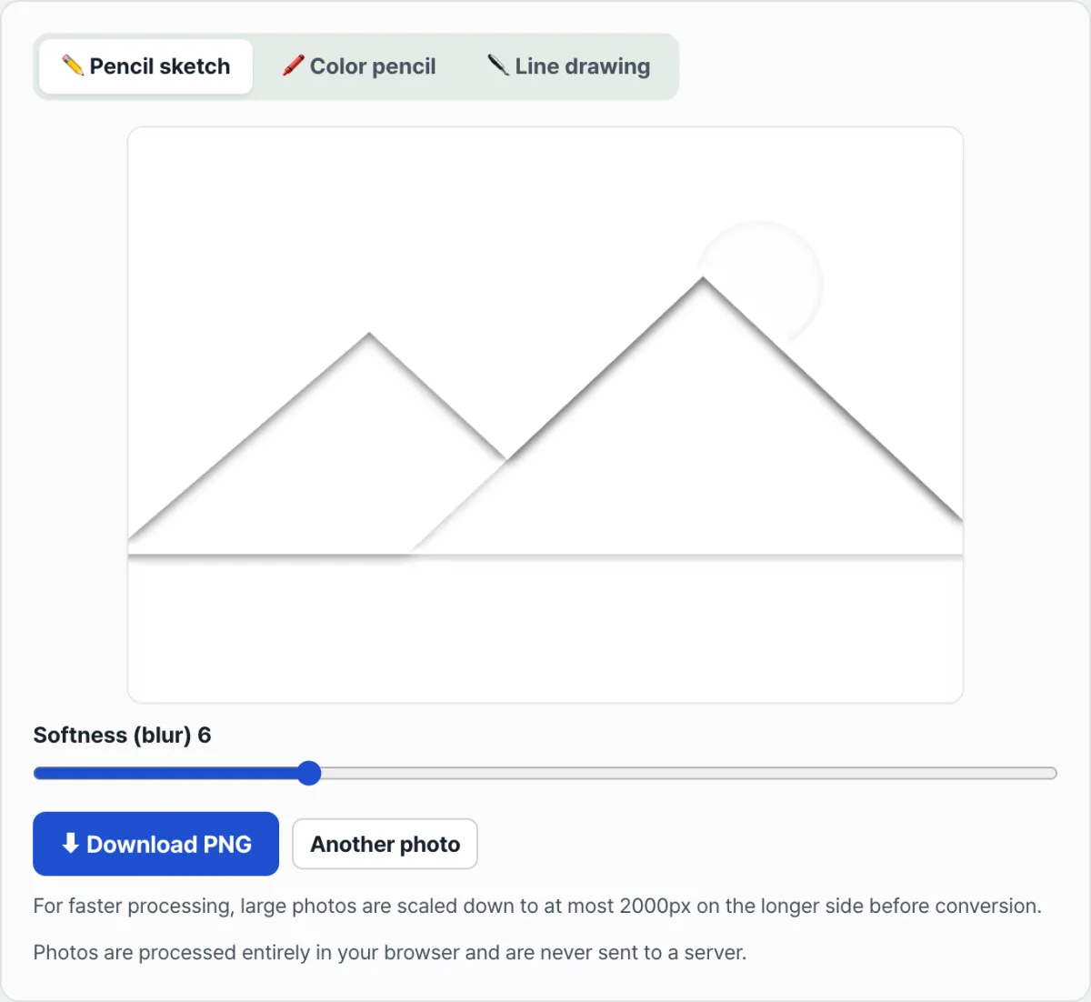
In pencil sketch mode, the higher the number, the softer and blurrier the drawing gets. In line drawing mode, the higher the same number, the denser and darker the lines get.
This isn't a bug. The two modes use completely different image processing methods. This post explains how each one works and how to read the slider.
Summary ① Pencil and colored pencil modes use "invert → blur → color dodge," and the slider controls the blur radius (how much it spreads). ② Line drawing mode uses edge detection to find brightness boundaries, and the slider controls the sensitivity. ③ So the same number makes pencil mode softer, and line mode denser and darker.
Why the slider is confusing: and why it matters
Turn a photo into a pencil sketch and raise the slider to around 12, and fine lines get smeared into blurry brush marks. Turn the same photo into a line drawing and raise the sensitivity to 12, and every tiny bit of shading in the background gets picked up as a black line and looks messy.
In both cases you did the same thing — raised the number — but the results go in opposite directions, so it's easy to feel like one of them is broken. In reality, the UI just shares a slider of the same shape; the math running underneath is completely different.
How it works: the two modes actually calculate different things
Pencil and colored pencil: invert → blur → color dodge
The photo is converted to grayscale, then the brightness is inverted, and that inverted image is blurred by an amount set by the slider. Then the original grayscale and this blurred image are combined using "color dodge," which blows out the bright areas to white and leaves only the edges as lines.
This is the same "invert and overlay" technique people use when sketching with a pencil by hand, translated directly into math. Here, the slider number means the radius of that blur, in pixels.
With a small radius, only nearby pixels are compared, so thin lines stay tight and detailed. With a large radius, pixels farther apart get lumped together in the comparison, so lines come out thick and blurry. That's why the label is "Softness (Spread)" — the bigger the number, the literally softer and blurrier the result.
Line drawing: edge detection that finds brightness boundaries
Line drawing does something entirely different. For each pixel, it calculates the amount of brightness change (the gradient) across the surrounding 3×3 area, paints the spots with large change — the boundaries — in black, and leaves the rest white. This kind of brightness-gradient calculation is what image processing usually calls "edge detection."
Here, the "Line Sensitivity" slider is a multiplier applied to that gradient. Raise the multiplier, and even weak light-dark differences that wouldn't normally count as edges get pushed over into black lines. So the higher the number, the more lines you get and the darker they are, which can make the image look denser and messier.
So the same slider controls "blur radius" in pencil mode and "sensitivity multiplier" in line mode. It's normal for the direction to feel reversed.
Reading the slider: how to adjust it for the result you want
In pencil and colored pencil modes, if you want fine, crisp lines, keep the slider low (1–5). If you want a soft, spread-out sketch, keep it high (10 or more).
In line drawing, if you want only clean outlines, keep the sensitivity low. If you want to pick up the fine texture in the background, raise it. If the photo itself has low contrast (shot on a cloudy day, backlit, and so on), you'll need to raise the sensitivity a bit more to bring out the boundaries.
Try it with our tool. Change the values one at a time and watch the result update in real time — you'll get the feel for it much faster.
Free · No sign-up · Your photos are never sent to a server
Common snags
| Symptom | Cause | Check and adjust |
|---|---|---|
| Pencil mode looks flat and blurry | The original photo has low contrast (cloudy day, backlit) | Try lowering the slider, or use a photo with stronger contrast |
| Line mode picks up background noise as lines | Higher sensitivity turns even weak light-dark differences into lines | Lower the sensitivity to keep only strong edges |
| A large photo comes out smaller than the original | If the long side exceeds 2000px, it's automatically scaled down before processing | To keep the original resolution, use a photo with a long side of 2000px or less |
| Saved files are always PNG | The download format is fixed to PNG | If you need another format such as JPG, convert it separately after saving |
The short version
Pencil and colored pencil modes use a color dodge technique: blur the inverted image and combine it with the original. So the slider means blur radius, and the bigger the number, the softer and blurrier the result.
Line drawing mode uses edge detection, which calculates brightness gradients. The slider is the sensitivity applied to that gradient, and the bigger the number, the more lines you get and the darker they are.
Just remember that the slider looks the same but the math underneath changes with the mode, and you won't get confused about which way to adjust it to get what you want.
Free · No sign-up · Your photos are never sent to a server
Frequently asked questions
Are my photos sent to a server?
No. The sketch conversion is calculated pixel by pixel inside your browser, and neither the original nor the result ever leaves your device. No photo is uploaded to or stored on a server.
What exactly is the difference between pencil sketch, colored pencil, and line drawing?
Pencil sketch and colored pencil use the same "invert → blur → color dodge" calculation. Colored pencil just keeps a light trace of the original colors so it looks like a sketch with color. Line drawing uses a different edge detection calculation, so instead of a grayscale sketch you get line art with only the outlines.
Adjusting the slider doesn't seem to change much.
If the original photo has low contrast, the slider may not make an obvious difference in either mode. Both calculations are based on brightness differences (contrast), so the effect of the slider shows up much more clearly on a photo with strong contrast.
Can I save as JPG instead of PNG?
Right now the download format is fixed to PNG only. If you need another format such as JPG, download the PNG and convert it with a separate image conversion tool.
This article was adapted from our Korean original. Read the Korean original