
CSS Grid Layout Guide: fr Units, Template Areas & Responsive Grids
Contents
CSS Grid Layout is the standard technique widely used to build two-dimensional (row and column) layout skeletons in modern web design. Working out column and row ratios and gaps by hand, then refreshing the browser over and over to check the result, takes a long time and invites mistakes. This article covers the main CSS Grid properties, how to design grid templates, and how to make them responsive, plus how to get the code without calculating anything yourself.
Summary ① The fr unit divides the grid container's leftover space proportionally. ② grid-template-areas lets you place areas by name instead of by cell coordinates. ③ Combining auto-fit with minmax() gives you a responsive grid without media queries.
Why You Need CSS Grid
Unlike float-based layouts or Flexbox, which handles one-dimensional placement, CSS Grid can place column and row ratios and gaps together as a single grid track system. The more two-dimensional the layout — a dashboard or news portal where the header, sidebar, main content, and footer all interlock — the more Grid simplifies the coordinate math. That said, if you want to design column width ratios or area names by hand, you have to work through the calculations and syntax below yourself.
Designing Grid Track Ratios and Area Names by Hand
fr (fractional unit), the core unit of CSS Grid, is a relative unit that distributes the remaining usable space inside a grid container proportionally. The calculation works like this:
Column width = total available width × (that column's fr value ÷ sum of all fr values)
For example, with three columns of 1fr 2fr 1fr, the total fr sum is 4, so the second column takes 2 ÷ 4 = 50% of the total width.
Structure of the Main Property Declarations
grid-template-columns: repeat(3, 1fr);: Automatically splits the container width into 3 columns of equal ratio.grid-template-rows: auto 1fr auto;: Lays out a 3-row track where the header and footer take the content size (auto) and the center main area takes all the remaining space (1fr).gap: 20px 16px;: Sets the row gap (20px) and column gap (16px) separately to build the spacing layout.
Designing with Grid Template Areas
For complex dashboards or news portal layouts, giving areas a name in text instead of calculating cell coordinates makes the layout easier to follow.
.dashboard-grid {
  display: grid;
  grid-template-columns: 240px 1fr;
  grid-template-rows: 60px 1fr 40px;
  grid-template-areas:
    "header  header"
    "sidebar main"
    "footer  footer";
  gap: 16px;
}

.main-content {
  grid-area: main;
}
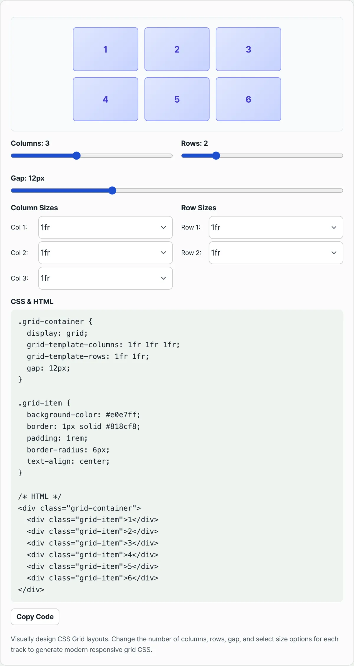
Rather than calculating fr ratios and grid-template-areas strings by hand and getting the typos right, you can adjust the number of columns and rows and the spacing with sliders and see the result in a live preview — check it with our tool.
Adjust the number of columns and rows and the gap spacing, then copy the optimized responsive CSS Grid stylesheet code instantly.
Essential Practical Tips for Responsive Web Grids
- Combining
auto-fitandminmax(): To build a responsive grid where the number of cards grows and shrinks with the screen width without writing media queries one by one, usegrid-template-columns: repeat(auto-fit, minmax(280px, 1fr));. - Using Flexbox Alongside It: Build the overall two-dimensional skeleton (page layout, dashboard view) with CSS Grid, and use Flexbox for the one-dimensional horizontal and vertical alignment of icons and text inside cards. That combination is easier to maintain.
Core Properties at a Glance
| Property | Description | Example |
|---|---|---|
| grid-template-columns/rows | Sets the track size of columns and rows | repeat(3, 1fr), auto 1fr auto |
| gap | Sets the row/column gap | gap: 20px 16px; |
| grid-template-areas | Assigns area names in text | "header header" |
| auto-fit + minmax() | The number of cards adjusts automatically to the screen width | repeat(auto-fit, minmax(280px, 1fr)) |
Wrapping Up
CSS Grid is the standard layout technique: it divides column and row ratios with the fr unit, places areas by name with grid-template-areas, and handles responsive behavior with the auto-fit and minmax() combination. Instead of calculating values by hand and checking them in the browser every time, you can adjust sliders, review the result in a live preview, and copy the finished CSS/HTML code as is.
Adjust the number of columns and rows and the gap spacing, then copy the optimized responsive CSS Grid stylesheet code instantly.
Frequently Asked Questions
Can I use the generated code as is in a real project?
Yes. It's standard CSS Grid code built around the grid-container and grid-item classes, so you can paste it in and just adjust the class names or the number of items however you like.
How do I set column and row sizes in the tool?
Use the sliders to set the number of columns and rows to anywhere from 1 to 6 each, then adjust the spacing from 0 to 40px with the Gap slider. For each track you can pick 1fr, 2fr, a fixed px value, or auto, and the column tracks also offer an extra minmax(100px, 1fr) option.
Can I make more than 7 columns or rows?
The sliders currently support up to 6. If you need more tracks, just extend the grid-template-columns/rows values in the CSS you copied.
What does using minmax(100px, 1fr) for grid-template-columns do?
It guarantees a minimum width of 100px for that column while letting the remaining space grow flexibly at a 1fr ratio, which keeps content from getting too narrow in a responsive layout.
This article was adapted from our Korean original. Read the Korean original