
Blog Thumbnail 1:1 Crop: Why Text Gets Cut and How to Fix It
Contents
- Why Do the Sides of a Landscape Photo Get Cut Off?: How Center Crop Works
- The Crop Loss Formula You Can Do by Hand
- Under the Hood: CSS object-fit: cover and Safe Zone Geometry
- Thumbnail Display Ratios and Recommended Resolutions by Platform
- 5 Common Thumbnail Mistakes
- The 5-Step Workflow for a Master Thumbnail That Never Gets Cut
- 7 Thumbnail Design Tips
- Final Decision Tree: Which Thumbnail Ratio Should You Make?
- Thumbnail & Image Crop Key Terms Cheat Sheet
- Frequently Asked Questions
You spent time making a high-quality 16:9 widescreen hero image, uploaded it to your blog, and then it happened: in Naver's mobile unified search results or the Neighbor new-post feed, the sides of your title text get chopped off and "JavaScript" shows up as "Script."
This isn't an upload mistake. Naver Blog, the Tistory mobile home, and the Instagram grid all force hero image cards into a 1:1 square (center crop) when they render them.
Here's a complete breakdown of how cropping works on each platform, the math showing exactly why 43.75% of the left and right of a 16:9 photo gets cut away, and how to build a thumbnail with a central Safe Zone so your text survives no matter what the platform crops.
Key takeaways ① Naver/Tistory force a 1:1 crop: Mobile search results and feed cards use
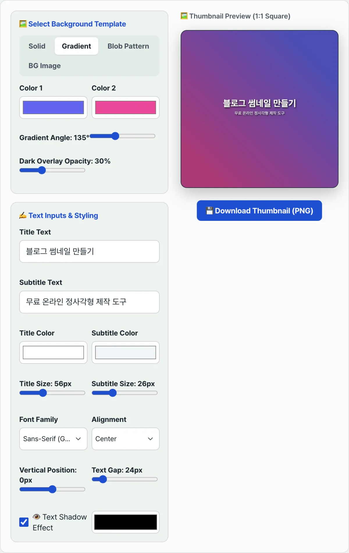
object-fit: coverto slice off both sides and display a 1:1 square. ② 16:9 loses 43.75%: Crop a 1600×900px photo to 1:1 and 350px on each side (700px total, about 44% of the width) is permanently gone off-screen. ③ Central Safe Zone: Keep your key text and objects within the middle 50% of the canvas and no social network or portal will cut them off. ④ Our thumbnail generator starts from a 1:1 square canvas and builds an optimized gradient background with center-aligned typography in one second.
Why Do the Sides of a Landscape Photo Get Cut Off?: How Center Crop Works
Portals and mobile apps use a center crop algorithm to keep card UI heights and widths uniform:
- The image is scaled to fit its short edge (900px tall).
- The excess on the long edge (1600px wide) — 700px — is trimmed evenly from the left (350px) and the right (350px).
As a result, text or faces you placed at the left and right edges of a landscape photo disappear completely on a mobile search screen.
The Crop Loss Formula You Can Do by Hand
Lost horizontal pixels = W − H Horizontal crop ratio (%) = W − H/W × 100%
- 16:9 ratio (1600 × 900px): 1600 − 900/1600 × 100 = 43.75% cropped (21.87% cut from each side)
- 3:2 ratio (1200 × 800px): 1200 − 800/1200 × 100 = 33.33% cropped (16.66% cut from each side)
- 4:3 ratio (1200 × 900px): 1200 − 900/1200 × 100 = 25.00% cropped
Free · Just type a title and get a 1:1 square thumbnail that won't get cut off, generated in one second.
Under the Hood: CSS object-fit: cover and Safe Zone Geometry
Let's look at the geometric pipeline a web rendering engine uses to crop an image.
1. The CSS object-fit: cover rendering rule
.thumbnail-card img {
  width: 100%;
  height: 100%;
  aspect-ratio: 1 / 1;
  object-fit: cover;
  object-position: center center; /* center-center crop */
}
2. The Cross-Platform Golden Safe Zone
- When you overlap 1:1 squares (Naver/Instagram) with 1.91:1 rectangles (KakaoTalk/Facebook OG):
- The safe intersection that always stays visible is a central square equal to 52% of the total width and 52% of the total height.
- Put your headline and key symbols inside that central safe zone and not a single character gets cut, no matter which platform in the world it's shared on.
Thumbnail Display Ratios and Recommended Resolutions by Platform
| Platform / Placement | Display ratio | Recommended resolution | Crop method | Text placement tip |
|---|---|---|---|---|
| Naver Blog mobile search | 1:1 square | 1000 × 1000 px | Center-based side trim | Perfect centering required |
| Tistory mobile home feed | 1:1 square | 1000 × 1000 px | Center-based side trim | Keep within the middle 50% |
| KakaoTalk link share (OG) | 1.91:1 wide | 1200 × 630 px | Top/bottom padding crop | Full width is usable |
| YouTube thumbnail | 16:9 wide | 1280 × 720 px | No crop (watch the timestamp bottom right) | Leave the bottom-right 20% empty |
| Instagram feed grid | 1:1 square | 1080 × 1080 px | Fixed 1:1 center square | Use a 1:1-only layout |
5 Common Thumbnail Mistakes
- Putting text at the ends of a 16:9 image: More than 40% of your letters get cut off in the Naver/Tistory mobile feed.
- Ignoring the contrast of the background photo: White text on a busy photo becomes unreadable on a small phone screen.
- Setting the font size too small: It looks fine on a PC but turns into a smudge at smartphone size (around an 80x80px thumbnail).
- Letting the YouTube timestamp cover the bottom right of a 16:9 image: The duration box (for example, "12:34") hides your key caption — a total disaster.
- Cramming in four or more lines of text: A thumbnail has one second to grab attention, so you need to compress your key words into two or three lines.
The 5-Step Workflow for a Master Thumbnail That Never Gets Cut
- Step 1 (set up a 1:1 canvas): In Photoshop or Canva, open a 1000 × 1000px square workspace from the start.
- Step 2 (add an eye-catching gradient background): Lay down a vivid gradient — deep dark blue, purple, sunset — that invites the click.
- Step 3 (type two lines of key copy in the central safe zone): Use our tool's center typography engine to write a highly readable headline.
- Step 4 (style the font for high contrast): Apply white (#FFFFFF) or fluorescent yellow (#FACC15) text with a soft drop shadow.
- Step 5 (download as WebP/JPG and set the hero image): Download your finished 1:1 thumbnail and register it as the very first image (the hero image) in your post.
7 Thumbnail Design Tips
- Keep it to 8–12 characters max: A short phrase of three or four words, like "Python Basics," reads better on a thumbnail.
- Include a number: Specific numbers like "5 Ways," "Fix in 1 Second," or "2026 Update" build trust.
- Dark background + bright text: A deep navy (#0F172A) background with bold white type is the top combination for mobile readability.
- Leave generous margins on all four sides: Pulling text toward the center makes it more likely to survive when a platform trims the edges. Before you upload, actually crop it to the real ratio and check.
- Run the 80px mobile preview test: Shrink your thumbnail to a postage-stamp size (80x80px) and make sure the text is still readable.
- Build brand identity with the same template: Keeping colors and fonts consistent lets people spot your blog at a glance in a list of search results.
- Bookmark our generator: Skip Photoshop — just type your headline and export a perfect 1:1 thumbnail in 10 seconds.
Final Decision Tree: Which Thumbnail Ratio Should You Make?
- Case A (Naver Blog, Tistory post, Instagram) ➔ 1000 × 1000 px 1:1 square (completely safe)
- Case B (YouTube video thumbnail) ➔ 1280 × 720 px 16:9 wide (leave room in the bottom right)
- Case C (newsletter, Facebook, website OG meta tag) ➔ 1200 × 630 px 1.91:1 wide
- Case D (one source, many uses across every platform) ➔ 1:1 square canvas + central 50% safe zone, all in one
Thumbnail & Image Crop Key Terms Cheat Sheet
- Center Crop: when an image's aspect ratio doesn't match, you trim the edges evenly from the center.
- Safe Zone: the guaranteed area where your content is always visible and never cut off, no matter what aspect ratio it gets cropped to.
- Open Graph (OG tags): a web standard meta tag that sets the preview image and title shown when you share a link on social media such as KakaoTalk or Slack.
- CTR (Click-Through Rate): the percentage of people who actually click a thumbnail they see in search results or a feed.
Frequently Asked Questions
I really want to use a 16:9 photo as my featured image. How do I keep it from getting cut off?
Even with a 16:9 landscape photo, keep your key text and any people inside the middle 50% of the frame and leave the left and right 25% as plain background. That way nothing gets cut off when it's cropped to 1:1.
How big should the font be in a thumbnail image?
On a 1000x1000px canvas, use a bold sans-serif font (Pretendard, Escoredream, and so on) at a minimum of 60–80px (48–60pt in Photoshop). That's what reads most clearly in mobile feeds.
Can I use thumbnails made with this tool for free on a commercial blog or YouTube channel?
Yes. It's free, and you can use them on your blog, Tistory, YouTube channel, and anywhere else you like.
This article was adapted from our Korean original. Read the Korean original