
Photo Brightness and Contrast Clipping: Why Detail Disappears
Contents
- You raised the brightness and the photo turned to mush: why that's a problem
- Why clipping happens: what brightness, contrast, and saturation actually calculate
- How to check for clipping without a tool
- Where people get stuck
- Recap
- Under the hood: per-channel formulas for brightness, contrast, and saturation
- Dynamic range and editing headroom by bit depth
- 5 common mistakes when editing brightness and contrast
- The 5-Step Workflow for Perfect Edits With No Clipping
- 7 Tips for Editing Brightness and Contrast
- Final Decision Tree: Which Editing Tool Should You Use?
- Cheat Sheet: Key Photo Editing and Image Processing Terms
- Frequently Asked Questions
When you push the brightness or contrast slider way up in a photo editor, a dull sky gets brighter — and then at some point it turns into a flat sheet of white paper while the shadows crush into solid black with no detail.
You moved the slider just a little further, yet part of the photo looks like it vanished entirely. That effect has a name, and once you understand the math behind it you can estimate in advance how far you can push the slider.
Summary ① Brightness and contrast filters are simple arithmetic: they multiply pixel color values by a ratio, or push them apart around a midpoint. ② When the result falls outside the 0–255 range, the value is forcibly cut off at the edge of the range (0 or 255) — this is called clipping. ③ Once a pixel is clipped, moving the slider back to the original value does not restore it.
You raised the brightness and the photo turned to mush: why that's a problem
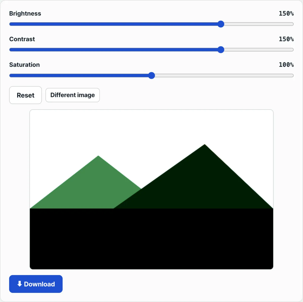
Crank up the brightness on a photo that looked drab on an overcast day, and the parts that were already bright — sky, skin — are the first to collapse into a single white blob. The texture of clouds and the subtle tonal differences in a face disappear, leaving nothing but pure white.
Raise the contrast instead and now the shadows are the problem. Dark backgrounds and fabric folds get crushed to solid black with no detail, and it's common for both the bright and dark areas to break down at the same time.
Neither case means the program is broken. Brightness and contrast filters are simply designed to calculate this way.
Why clipping happens: what brightness, contrast, and saturation actually calculate
The brightness filter used in browsers multiplies every color value in the image by the ratio you set. 100% means the original (1×), and 150% means every pixel value is multiplied by 1.5.
The contrast filter works a little differently. It takes mid-level brightness (gray) as the pivot and pushes each pixel away from that pivot by the ratio you set.
So above 100%, bright pixels get pushed brighter and dark pixels get pushed darker at the same time. The saturation filter follows a similar principle: it blends between a grayscale version that keeps only the luminance and the original color, by the ratio you set.
All three calculations share one thing. A pixel's color value is ultimately a number between 0 and 255, so when a multiply or spread pushes the result outside that range, the value is forcibly cut off at the edge of the range (0 or 255). In image processing this is called "clipping."
How to check for clipping without a tool
There is a way to check for clipping without any tool. Editing programs like Photoshop and Lightroom, plus a good number of recent smartphone gallery apps, show a "histogram" graph.
If that graph has a sharp spike pressed up against the right edge (255) or the left edge (0), it means many pixels were cut off at that value — so the detail is already gone.
Check it with our free tool. If you don't have an editing program with a histogram, or installing one is a hassle, it's faster to just move the slider and watch the preview update live with your own eyes.
Free · no sign-up · adjust brightness, contrast, and saturation right in your browser
Where people get stuck
| Symptom | Cause |
|---|---|
| Bright areas like sky and skin look like a flat white blob | Brightness or contrast raised too far, so pixel values are cut off at 255 (highlight clipping) |
| Shadow areas are crushed to pure black | Contrast raised too far, so dark pixel values are cut off at 0 (shadow clipping) |
| Colors become unnaturally intense | Saturation raised close to 200%, so values are calculated far more intense than the original color |
| Detail doesn't come back even after returning the slider to 100% | Pixel information already cut off to 0 or 255 was lost during the calculation, so it can't be restored |
Recap
- Brightness, contrast, and saturation sliders work by simple arithmetic: multiplying pixel values, or spreading them apart around a midpoint.
- If the result falls outside the 0–255 range, the value is forcibly cut off at the edge of that range — this is called clipping.
- Clipped pixels cannot be restored by moving the slider back, so it's safer to keep a separate copy of the original file.
- In a program with a histogram, check for sharp peaks at both ends of the graph; if you don't have one, look at the preview with your own eyes to spot clipping.
Free · no sign-up · adjust brightness, contrast, and saturation right in your browser
Under the hood: per-channel formulas for brightness, contrast, and saturation
1. Brightness
Multiply every pixel's RGB channel values by the same factor: Output = min(255, max(0, Input × factor))
- factor = 1.0 is the original, 1.5 is 50% brighter, 0.5 is 50% darker.
- Applying factor 1.5 to a pixel with Input 200 gives 300, which is clamped to 255, so highlight detail is lost.
2. Contrast
Spread or narrow pixel values around a pivot at mid-level brightness (128): Output = min(255, max(0, factor × (Input − 128) + 128))
- With factor > 1, bright pixels get brighter and dark pixels get darker at the same time.
- Highlight clipping (saturation at 255) and shadow clipping (saturation at 0) happen on both ends at once.
3. Saturation
Interpolate between each pixel's pure color component and its grayscale (Luminance) value by the factor: OutputR = Luma + factor × (InputR − Luma)
- Luma (weighted average of brightness) = 0.2126R + 0.7152G + 0.0722B (BT.709 basis)
- Push saturation too far and the strongest color channel (Red, for example) clips to 255 first, so the boundaries between neighboring colors bleed unnaturally.
Dynamic range and editing headroom by bit depth
| Item | 8-bit JPG | 12-bit RAW | 16-bit TIFF/PSD |
|---|---|---|---|
| Brightness levels per channel | 256 levels (0–255) | 4,096 levels | 65,536 levels |
| Dynamic range | About 8 EV (narrow) | About 12–14 EV | About 16 EV (very wide) |
| Clipping sensitivity | Very high (clips even with small slider moves) | Low (plenty of editing headroom) | Very low (even extreme corrections are tolerated) |
| Banding after editing | Gradient stripes appear | Rarely | Effectively none |
| File size (FHD basis) | About 1–5 MB | About 15–30 MB | About 30–50 MB |
| Recommended use | Final upload to social media | Keeping the original at capture time | Master file for print |
5 common mistakes when editing brightness and contrast
- Editing the JPG original directly: 8-bit JPG has extremely narrow editing headroom, so clipping happens with the smallest slider move. Make a RAW or PSD copy and work on that.
- Stacking brightness adjustments 2–3 times: Apply brightness +20% three times and the final factor is 1.23 = 1.728, so quantization error compounds exponentially.
- Ignoring the histogram: A vertical peak at either end of the histogram means clipping has already happened. Don't glance at the preview, decide it "looks fine," and move on.
- Not keeping the RAW original: A RAW file holds the sensor's raw 12–14-bit data, giving you far more room to recover than a clipped JPG.
- Oversaturating the red channel: When you raise saturation on food or flower photos, the Red channel saturates to 255 first, creating unnatural colors that look like the red has bled.
The 5-Step Workflow for Perfect Edits With No Clipping
- Step 1 (Shoot in RAW): Set your camera to RAW mode to get an original file with a wide 12–14 bit dynamic range.
- Step 2 (Open in 16-bit mode): Open it in Photoshop or Lightroom in 16 bit/channel mode to maximize your editing headroom.
- Step 3 (Use adjustment layers): Skip Brightness/Contrast and use Curves or Levels adjustment layers so your edits stay non-destructive.
- Step 4 (Watch the histogram live): Keep the histogram panel open while you edit and check that peaks aren't piling up at either end (0 and 255).
- Step 5 (Final export): When you're done, keep the PSD/TIFF master and export only the 8-bit JPG you need for social media.
7 Tips for Editing Brightness and Contrast
- ETTR (Expose To The Right): Slightly raise your exposure when shooting so the histogram leans right (toward the bright end). When you pull it back down in post, you'll get less noise and more detail.
- Use Curves instead of the brightness slider: An S-curve lets you control highlights and shadows separately, so you avoid clipping just one end.
- Adjust Highlights and Shadows separately: In Lightroom, Highlights -50 / Shadows +50 artificially widens the dynamic range and cuts your clipping risk a lot.
- Split Toning: Give the highlights just below clipping a warm tint and the result looks more natural than a pure-white blowout.
- Lightroom clipping warning shortcut J: Highlight clipping shows up instantly as a red overlay and shadow clipping as blue.
- Monitor calibration: If your monitor is set too bright, your images look brighter than they are, so you raise brightness less than you should — and then they print dark. That's the paradox.
- Bookmark our tool: Watch the clipping point as you make small brightness, contrast, and saturation adjustments, and learn your safe editing limits in real time.
Final Decision Tree: Which Editing Tool Should You Use?
- The photo is too dark overall ➔ Brightness +10–30%, or pull up the bottom of the curve
- The photo looks flat and lacks contrast ➔ Contrast +10–20%, or apply an S-curve
- The sky is white and the shadows are too dark ➔ Don't touch contrast — lower Highlights and raise Shadows
- The colors look dull ➔ Saturation +15–25% (Vibrance is the better first choice)
- You want to emphasize one specific color ➔ Adjust that single channel in the HSL panel (don't raise overall saturation)
Cheat Sheet: Key Photo Editing and Image Processing Terms
- Clipping: When pixel values go outside the 0–255 range and get cut off, destroying detail.
- Dynamic Range: The range of brightness between the darkest and brightest areas an image can represent (measured in EV).
- Histogram: A graph showing how brightness is distributed in an image, from 0 (black) to 255 (white).
- Quantization: The process of dividing continuous analog brightness values into a finite number of digital steps (8-bit = 256 steps).
- ETTR (Expose To The Right): A shooting technique where you brighten the exposure right up to the edge of clipping to maximize your post-processing headroom.
- Adjustment Layer: A non-destructive editing method that applies an effect on a separate layer instead of changing the original pixels.
Frequently Asked Questions
If I set brightness back to 100%, does the clipped part come back?
No. Once a pixel value gets cut to 0 or 255, the original information is gone in the calculation, so dragging the slider back to 100% won't restore the detail you had before clipping. The only safeguard is saving a copy of the original file before you edit.
If I shoot in RAW, can I recover clipped areas afterward?
RAW files hold a wide 12–14 bit dynamic range, so highlight areas that already blew out to 255 in an 8-bit JPG often still have real data behind them. Pull Lightroom's Highlights slider down to -100 and you can watch cloud detail come back from pure white. That said, areas where the sensor itself saturated can't be recovered even in RAW.
Why is 100% brightness and 100% contrast the default?
In filter math, 100% means "multiply the original value by 1," which is effectively no change at all. The further you move from 100 — toward 0% or 200% — the more the result differs from the original.
Does dropping saturation to 0% make a black-and-white photo?
Yes. Saturation at 0% strips all color information and leaves only brightness, producing a grayscale image. Going the other way, closer to 200%, exaggerates and deepens the original colors.
This article was adapted from our Korean original. Read the Korean original