
CSS Vertical Alignment: 5 Methods Compared (Flexbox, Grid)
Contents
- Why vertical alignment comes in so many flavors
- Building all 5 vertical alignment methods yourself
- The 5 methods at a glance
- Wrapping up
- The Core Technical Mechanics: How Does the Browser Render Vertical Alignment?
- Detailed Comparison Matrix of 5 Vertical Alignment Methods
- 5 Critical Vertical Alignment Mistakes Developers Make
- A 5-Step Workflow for Flawless Vertical Alignment
- 7 CSS Alignment Tips
- Final Decision Tree for Vertical Alignment Techniques
- Key CSS Layout Alignment Terms (Terminology Cheatsheet)
- Frequently Asked Questions
Vertically centering text or icons inside a box on a web page is a basic task you'll run into constantly in front-end development. You have several options — Flexbox, Grid, absolute positioning, line-height — but each one has its own conditions and limits, so people often get stuck not knowing which to pick for the situation. This article covers the principles and CSS code for the 5 vertical alignment methods used in real projects, and shows you how to check which method fits which situation.
Summary ① Flexbox and Grid are the modern standard: one or two lines of CSS handle vertical alignment. ② Absolute + transform, line-height, and table-cell are fallback approaches that only work under specific conditions. ③ With the tool below, you can switch between all 4 methods — Flexbox, Grid, Line Height, and Absolute — and compare the results and the code side by side.
Why vertical alignment comes in so many flavors
In the past, CSS had no dedicated property for vertical alignment, so developers had to work around it — borrowing vertical-align: middle from table-cell, or combining position: absolute with transform: translateY(-50%). When CSS3 introduced Flexbox and Grid, you could set vertical alignment directly with properties like align-items: center and place-content: center. But there are still cases where the old ways make sense, such as centering a single line of text or supporting older browsers, so all 5 methods are still in use today.
Building all 5 vertical alignment methods yourself
Here's how to apply each method in code.
- Flexbox (
align-items: center): Setdisplay: flexandalign-items: centeron the parent. When the main axis is horizontal (row), this property handles alignment along the cross axis, which is vertical. - CSS Grid (
place-content: center): Setdisplay: gridandplace-content: centeron the parent, and you handle both horizontal and vertical alignment in one go. - Absolute + Transform: Set
position: relativeon the parent, andposition: absolute; top: 50%; left: 50%; transform: translate(-50%, -50%)on the child. This centers the child even when you don't know its height. Work it out as a formula and the vertical center coordinate is (parent height − child height) ÷ 2. - Line-height: For single-line text only, set the
line-heightvalue equal to the container'sheightand it lines up in the vertical center. - Table-cell: Set
display: table-cellandvertical-align: middle. Use this in legacy projects that need older browser support.
/* 1. Flexbox */
.flex-center {
  display: flex;
  justify-content: center; /* horizontal center */
  align-items: center;     /* vertical center */
  height: 200px;
}

/* 2. CSS Grid */
.grid-center {
  display: grid;
  place-content: center;   /* centers both horizontally and vertically */
  height: 200px;
}

/* 3. Absolute + Transform */
.absolute-center-parent {
  position: relative;
  height: 200px;
}
.absolute-center-child {
  position: absolute;
  top: 50%;
  left: 50%;
  transform: translate(-50%, -50%);
}

/* 4. Line-height, for text only */
.text-single-line {
  height: 50px;
  line-height: 50px; /* set it to match the height value */
}

/* 5. Table-cell (legacy technique for older browser support) */
.table-cell-parent {
  display: table;
  height: 200px;
}
.table-cell-child {
  display: table-cell;
  vertical-align: middle; /* vertical center */
  text-align: center;     /* horizontal center */
}
Mistakes people make in real projects
- Missing the conditions for
vertical-align: Thevertical-align: middleproperty only applies to inline, inline-block, and table-cell elements. Set it directly on a normal block element like adivorarticleand nothing happens, so use Flexbox or Grid instead. - Leaving the properties alone when switching to
flex-direction: column: Changeflex-directionto column and the main axis becomes vertical, which means the property in charge of vertical alignment shifts fromalign-itemstojustify-content. If you flip the axis, flip the alignment property too.
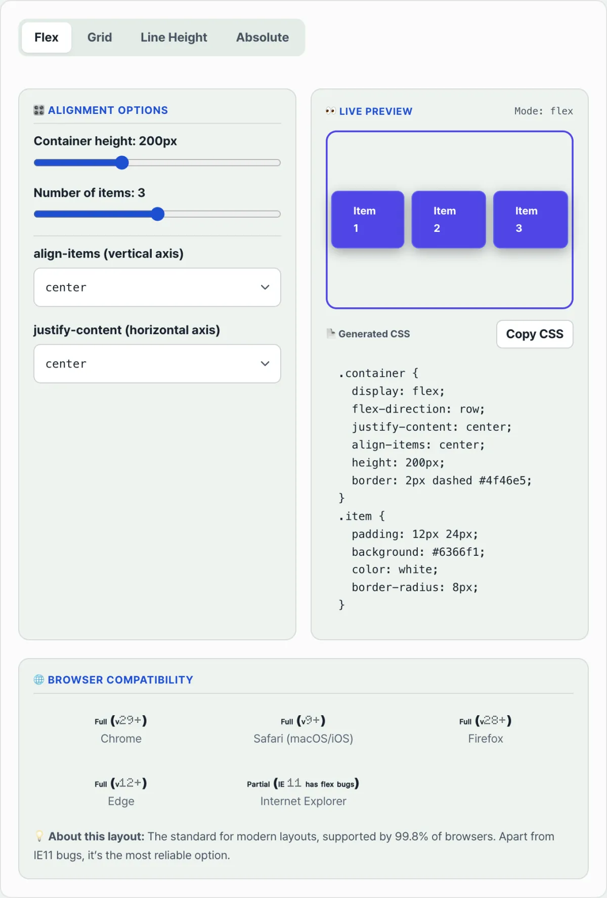
Rather than checking each method's result in code one by one, you can click through all 4 — Flexbox, Grid, Line Height, and Absolute — for a live preview plus compatibility info. Check it with our tool.
Compare the four vertical alignment techniques — Flexbox, Grid, Line Height, and Absolute — side by side, then copy the CSS you need right away.
The 5 methods at a glance
| Method | Key CSS | Best for |
|---|---|---|
| Flexbox | display: flex; align-items: center; | One-dimensional layouts, modern browsers |
| Grid | display: grid; place-content: center; | Aligning both axes at once, minimal code |
| Absolute + Transform | position: absolute; top: 50%; transform: translate(-50%, -50%); | When you don't know the child's height |
| Line-height | Set line-height equal to height | Single-line text only |
| Table-cell | display: table-cell; vertical-align: middle; | When you need older browser support |
Wrapping up
The right vertical alignment method depends on the situation. For layouts targeting modern browsers, Flexbox or Grid gets it done in a line or two. When you don't know the child's height, absolute + transform is handy. For a single line of text, use line-height, and if you need older browser support, use table-cell. If the differences still blur together, the fastest way to sort them out is to compare them directly in the tool.
Compare the four vertical alignment techniques — Flexbox, Grid, Line Height, and Absolute — side by side, then copy the CSS you need right away.
The Core Technical Mechanics: How Does the Browser Render Vertical Alignment?
In CSS, vertical alignment isn't just about moving something to where it looks right. It's the result of strict calculations driven by CSS Box Model Centering Geometry. To design layouts that don't break, you need to understand how each alignment method works under the hood.
1. The Math Behind Flexbox Cross-Axis Alignment
When you declare align-items: center in Flexbox, the browser's rendering engine automatically distributes the leftover space. When the main axis is row, it calculates the top and bottom margins (auto margins) on the cross axis — the vertical direction — as equal values like this:
Here, Hcontainer is the total height of the parent container, and Hchild is the height of the child element. The Flex layout algorithm handles this formula at runtime, so you get perfect centering every time — even when the child's height changes.
2. The Formula for the Absolute + Transform Technique
This method works in two steps: shift the reference point, then shift back by half the element's own size.
- Step 1 (top: 50%): Push the child's top edge down to exactly half the parent's height (50%). At this point, the element's center isn't in the middle — its top edge is.
- Step 2 (transform: translateY(-50%)): Pull the child back up along the Y axis by half its own height (Hchild). The result: the child's exact center lines up perfectly with the parent's center.
3. What place-content: center Actually Is
In CSS Grid, place-content: center isn't a single simple property. It's a shorthand property that aligns both the vertical and horizontal axes at once. Internally, it's the same as declaring align-content: center; (cross-axis/vertical alignment) and justify-content: center; (inline-axis/horizontal alignment) together. Grid is a two-dimensional layout system, so centering code compresses into far fewer lines than the one-dimensional Flexbox.
4. Why vertical-align: middle Fails on Block Elements
In the browser's rendering process, the vertical-align property is specified to work only inside an Inline Formatting Context.
- It aligns inline boxes and table cells up or down relative to their baseline.
- Block-level elements like
<div>and<section>, on the other hand, create their own Block Formatting Context, so the very concept of a text baseline doesn't apply. That's whyvertical-alignvalues are ignored on block elements.
5. The Axis Swap Rule for Flex Direction
The most confusing part of Flexbox is how the main axis and cross axis shift.
- flex-direction: row (default): Main axis is horizontal, cross axis is vertical. ➔ align-items: center handles vertical alignment.
- flex-direction: column: Main axis is vertical, cross axis is horizontal. ➔ justify-content: center handles vertical alignment.
Detailed Comparison Matrix of 5 Vertical Alignment Methods
This table compares the limits and browser support of the five alignment techniques you'll use most in real projects.
| Comparison Item | Flexbox (align-items) | Grid (place-content) | Absolute + Transform | Line-height Method | Table-cell Method |
|---|---|---|---|---|---|
| Multi-line text support | ✅ Perfect support | ✅ Perfect support | ✅ Perfect support | ❌ Not supported (breaks) | ✅ Perfect support |
| Unknown child height | ✅ Supported (auto-calculated) | ✅ Supported (auto-calculated) | ✅ Supported (reverse-calculated via transform) | ❌ Impossible | ✅ Supported |
| Modern browser and mobile compatibility | 💯 Best | 💯 Best | 💯 Best | ⚠️ Limited | ⚠️ Legacy only (not recommended) |
| Code simplicity | ⭐⭐⭐ (needs 2–3 lines) | ⭐⭐⭐⭐⭐ (shortest) | ⭐⭐ (top, left, transform, etc.) | ⭐⭐⭐ (same as height) | ⭐ (complex structure) |
| Responsive scaling | ✅ Excellent | ✅ Excellent | ⚠️ Parent height required | ❌ Only works with fixed sizes | ❌ Fixed table layout |
5 Critical Vertical Alignment Mistakes Developers Make
Here are the five most common reasons vertical alignment falls apart during development.
- Overusing vertical-align: middle on block elements: You apply the property to a
<div>block that isn't in an inline context, then leave behind a trail of patches wondering why it doesn't work. - Forgetting an explicit height on the parent when using Absolute: Even if you set the parent as the reference point with
position: relative, a parent height of 0 meanstop: 50%can't be calculated — and the element shoots out above the top of the viewport. - Switching to flex-direction: column and leaving the alignment properties alone: When you switch to column for mobile at a media query breakpoint, you don't notice the alignment axis changed, so you leave align-items as is and the alignment breaks.
- Trying to center vertically with margin: auto without display: flex: In a normal block context,
margin: autoonly centers horizontally (left and right). You needdisplay: flexfor the margins to be distributed evenly on all sides — top, bottom, left, and right. - Forgetting min-height: 100vh on a hero banner: When you want to center a full-screen welcome banner, if you don't explicitly set the parent wrapper's height to the viewport height, the container shrinks to fit the content and the centering effect never shows up visually.
A 5-Step Workflow for Flawless Vertical Alignment
A five-step validation process that lets you finish vertical alignment without panicking, no matter what UI layout you're given.
- Step 1: Confirm the parent container has height: First, check that the parent element has enough visible height (
heightormin-height). Without space, alignment means nothing. - Step 2: Consider Flexbox first: In more than 90% of everyday one-dimensional content layouts, use
display: flex; align-items: center; justify-content: center;as the default answer. - Step 3: Use Grid for two-axis alignment: If the component has a grid structure or needs an item centered on both the X and Y axes, use the shortest code:
display: grid; place-content: center;. - Step 4: Use Absolute + Transform for modals and overlay popups: If the UI floats above the screen or a specific parent container, it must be taken out of the document flow, so use a combination of
position: absoluteandtransform. - Step 5: Stress-test text wrapping and variable heights: Push the content inside to extremes—add much more or much less—and check that the alignment baseline doesn't collapse when the element's height changes.
7 CSS Alignment Tips
- The shortest perfect centering in the world:
display: grid; place-items: center;(Just two lines of code center a child both horizontally and vertically inside its parent.) - The margin: auto trick inside a Flex container: Inside a parent with
display: flex, give a specific childmargin: auto;. The child absorbs all the remaining space, which makes perfect centering or pushing it into a corner possible. - min-height: 100dvh that accounts for the mobile Safari bottom bar: To keep content from being hidden by mobile browser dynamic UI (the top address bar and bottom toolbar), use the dynamic viewport unit
dvh(Dynamic Viewport Height)instead of the existing vh, and create a banner that fills the screen safely. - If only one child needs to stand out, use align-self: center: Even if the parent's default alignment is align-items: flex-start, you can give a single child
align-self: centerso it ignores the group rule and centers itself vertically. - Perfect square card alignment (aspect-ratio + place-content): When building thumbnail cards, combine
aspect-ratio: 1/1anddisplay: grid; place-content: center;to get perfect, non-distorted centering inside a square. - Alignment caveats in multilingual vertical writing modes (writing-mode): In vertical writing layouts that use
writing-mode: vertical-rl, such as Japanese or Mongolian, align-items and justify-content work along the logical block and inline axes, not physical top, bottom, left, and right. So think of the axes in terms of logical direction. - Use a live interactive simulator: If you're unsure which property to use among the different methods, open the link to our free tool, CSS Vertical Alignment Visual Guide & Compatibility Report, above. Switch between the four methods and compare the browser's live rendering.
Final Decision Tree for Vertical Alignment Techniques
If you're not sure which code to write in a given situation, follow the tree below.
- Question 1: Does the item you're aligning need to float above the document flow (overlay)?
- YES ➔ Use Absolute + Transform (modals, tooltips, badges)
- NO ➔ Continue below
- Question 2: Is the layout one-dimensional (linear) or two-dimensional (grid)?
- Two-dimensional, or you want a single child perfectly centered ➔ CSS Grid (
place-content: center) - One-dimensional, and you need detailed control over item placement and spacing ➔ Continue below
- Two-dimensional, or you want a single child perfectly centered ➔ CSS Grid (
- Question 3: Is the text guaranteed to stay on a single line?
- YES ➔ Line-height trick (button labels, single-line text menus)
- NO (the text may wrap) ➔ Flexbox (
align-items: center)
- Special case: Do you need to support extremely old browsers such as IE9?
- YES ➔ Table-cell (
vertical-align: middle)
- YES ➔ Table-cell (
Key CSS Layout Alignment Terms (Terminology Cheatsheet)
- Vertical Alignment: Centering an element or text within the top-to-bottom space of a parent container.
- Main Axis & Cross Axis: In Flexbox, the main direction in which items are laid out is the main axis, and the axis perpendicular to it is the cross axis. The physical direction changes dynamically based on row or column.
- Inline Formatting Context (IFC): The rules for how inline-level boxes are laid out within a line. This is the only area where vertical-align works.
- place-content: In CSS Grid, a simple shorthand that sets align-content and justify-content at once.
- transform: translate(-50%, -50%): In absolute positioning, an essential calculation technique that calibrates the element so its center—not its top-left (0,0) reference point—sits exactly where you want it.
- dvh (Dynamic Viewport Height): A modern CSS unit that dynamically detects the expansion and collapse of mobile browser toolbars and always returns the accurate visible viewport height.
Frequently Asked Questions
Q1. Why doesn't vertical-align: middle work at all on normal block elements like a <div>?
vertical-align is an inline-formatting-only property that adjusts vertical position based on a text's baseline, relative to font size or line box. Block formatting contexts (BFC) such as <div> or <section> don't have a rendering concept of text line boxes, and they follow box model rules that occupy 100% of the parent's remaining width. So even when they encounter vertical-align, an inline alignment command, they can't interpret it and simply ignore it.
Q2. When you switch to flex-direction: column, why do you control vertical alignment with justify-content instead of align-items?
Flexbox properties aren't designed around physical top/bottom/left/right. They're designed around the logical axis that data flows along.
- In the default row, data flows horizontally, so the main axis is horizontal and the cross axis is vertical. Here,
align-itemsalways handles the cross axis. - If you change the direction to column, data flows vertically, so the main axis becomes vertical and the cross axis becomes horizontal — a 90-degree swap. Since the vertical direction is now the main axis, the
justify-contentproperty, which handles main axis alignment, is what controls vertical alignment.
Q3. When you don't know the parent container's height (variable height), which vertical alignment method is perfect?
In a dynamic layout environment where the parent's height changes based on the content inside it, Flexbox or Grid is the safest and most reliable choice. Set display: flex; align-items: center; and the browser will figure out the parent box's final computed height at the moment of rendering, then equally calculate and distribute the top and bottom space. The line-height technique and methods that require an explicit height declaration cause immediate layout collapse in variable-height environments, so avoid them.
This article was adapted from our Korean original. Read the Korean original