
px to rem Calculator: Check the Formula by Hand
Contents
This post is for anyone who needs to convert px values in CSS to rem, em, %, or pt and keeps getting tripped up by the formulas. px→rem conversion looks simple on the surface, but because rem, em, %, and pt are each calculated against a different base value, people often misread the result. This post walks through what formula each unit actually uses, and how to interpret the numbers you get, step by step.
Summary ① rem and em are value × base font size, % is value ÷ 100 × base font size, and pt is px × 72 ÷ 96 (= px × 0.75). ② rem is always based on the font size of the top-level (html) element, while em is based on the parent element's font size, so the same number can render differently on screen. ③ The browser's default root font is 16px, but if a user changes the text size in their browser settings, the actual px result of values set in rem, em, or % changes with it.
Why this calculation is so confusing
Here's the situation where px→rem conversion actually trips people up. A design file lists font sizes in px, like 24px or 32px, but the project's CSS coding convention says to use rem for font sizes.
At that point the question seems simple — "how many rem is 24px?" — but the answer depends on what the project's root (html) font size is set to. The browser default is 16px, but some projects lower the html font-size to 62.5% (that is, 10px) in a CSS reset to make the math easier.
If you do the math in your head assuming "16px base" without checking the base font size, the result will be off whenever the project's actual base is different. That's why the question should always be "how many rem at what base font size?" rather than just "how many rem is this value?"
How to calculate it yourself without a tool
Every conversion goes through px. First you turn the input value into px, then you convert that px value into the unit you want. Two steps.
Step 1 — Turn the input value into px.
- px: use it as is.
- rem, em: value × base font size (px)
- %: value ÷ 100 × base font size (px)
- pt: value × 96 ÷ 72 (= value × 1.3333…)
Step 2 — Convert the px value into the unit you want.
- rem, em: px ÷ base font size
- %: px ÷ base font size × 100
- pt: px × 72 ÷ 96 (= px × 0.75)
The numbers 96 and 72 in the pt calculation come from the resolution basis of web screens (1 inch = 96px) and the print point basis (1 inch = 72pt). Line the two bases up at 1 inch and you get a fixed ratio of 1px = 0.75pt.
For example, here's what 24px converts to when the base font size is 16px.
- rem = 24 ÷ 16 = 1.5rem
- em = 24 ÷ 16 = 1.5em
- % = 24 ÷ 16 × 100 = 150%
- pt = 24 × 0.75 = 18pt
If the base font size changes to 20px, the same 24px becomes 1.2 for rem and em and 120% for %. pt, on the other hand, stays fixed at 18pt regardless of the base font size. That's because the relationship between px and pt is nothing but the fixed ratio 96:72, and no base value enters the calculation.
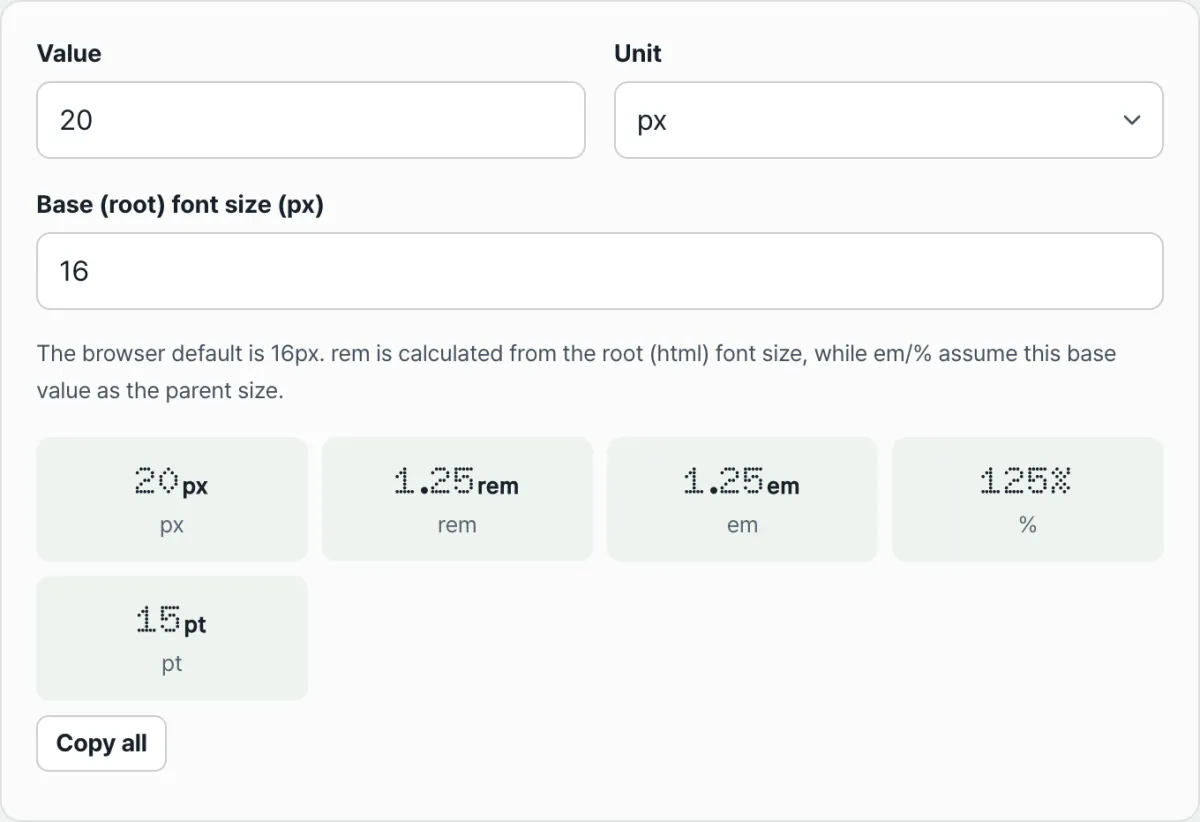
Check it with our tool.
Enter a value and a root font size, and you get results in all five units — px, rem, em, %, and pt — right away.
Easy-to-miss points
The math itself is simple, but there are places where people often slip up when interpreting the results.
Why rem and em use different bases
rem is based on the top level; em is based on the parent. rem looks only at the font size of the html element. Wherever it appears in the document, the same rem value always computes to the same px.
em, by contrast, is calculated against the font size of the element's parent. So even if you write "1.5em" in both cases, a different parent font size means a different actual rendered px value.
This tool takes a single base font size as input and uses it for both rem and em. That's why rem and em always come out the same inside the tool. If em renders as a different value on the real page, the calculation isn't wrong — it's because that element's parent font size differs from the base value you entered here.
Values that change with browser text size settings
The 16px base font is the browser default, not a fixed value. Most browsers keep the root font size at 16px unless the user sets it otherwise. But that value can be changed by the user in browser settings (larger or smaller text, accessibility settings).
If a user has raised the root font size to 18px, an element with "1.5rem" in the CSS renders at 27px, not 24px.
Values fixed in px stay the same regardless of this setting, but values set in rem, em, or % can produce different actual px results depending on the user's settings.
| Unit | Calculation basis | Is the value fixed within the document? |
|---|---|---|
| px | None (fixed value) | Always fixed |
| rem | Font size of the root (html) element | Fixed regardless of position |
| em | Font size of the parent element | Varies with nesting position |
| % | The base value you specify (usually the parent) | Varies with position |
| pt | Fixed ratio to px (96:72) | Always fixed |
Recap
- For rem and em, multiply the value by the base font size; for %, divide the value by 100 and multiply by the base font size. That gives you px, which you then convert into the unit you want.
- pt and px convert at the fixed ratio 96:72 (1px = 0.75pt), independent of the base font size.
- rem is always based on the root (html) element, so the value is fixed, while em is based on the parent element, so the same number can produce a different actual px depending on position.
- The browser's default root font is 16px, but if the user changes it, the actual rendering of values set in rem, em, and % changes with it.
- The results assume that the base font size you entered is the parent/root, so if the real page's inheritance structure differs, treat them as reference only.
Enter a value and a root font size, and you get results in all five units — px, rem, em, %, and pt — right away.
Frequently Asked Questions
Why do rem and em come out the same?
Because this tool takes a single base font size and calculates both rem and em against that value. In real CSS, rem is based on the root element and em on the parent element, so the two can differ. Enter the element's actual parent (or root) font size as the tool's base font size and the result will match reality.
How does pt convert to px?
The web standard defines 1 inch as both 96px and 72pt, which gives a fixed ratio of 1px = 0.75pt. To convert px to pt, calculate px × 72 ÷ 96; to convert pt to px, calculate pt × 96 ÷ 72. This ratio is always the same, regardless of the base font size.
Can the result look different from the actual screen?
Yes, it can. em and % are actually calculated based on the parent font size of the element in question, but this tool assumes the base value you entered is the parent. When you apply it to a real page, the result can differ if the element's parent font size isn't the value you entered in the tool.
Do browser text size settings affect the result?
The rem, em, %, and pt figures the tool shows are ratio calculations based on the base font size you entered, so they stay as they are. But if a user changes their text size setting in an actual browser, the root font size itself changes, so the same rem, em, or % value can render as a different px result from user to user.
This article was adapted from our Korean original. Read the Korean original