
CSS Accordion Menu: Build One With No JavaScript
Contents
- Why you might need a JavaScript-free accordion
- How the checkbox/radio hack works (and how to build it yourself in code)
- Checkbox vs. radio, and common mistakes
- Summary
- How CSS Accordions Actually Work Under the Hood
- Accordion Techniques Matrix
- 5 Fatal CSS Accordion Mistakes Frontend Developers Make
- The 5-Step Workflow for Building a Production-Level CSS Accordion Component
- 7 Pure CSS Accordion Engineering Tips from a Senior Developer
- Technology Decision Tree: Which Implementation Fits Your Project Best?
- Essential Frontend Terms Cheat Sheet
- Frequently Asked Questions
You can build an accordion menu with pure CSS, no JavaScript needed. A hidden checkbox (or radio) input, a label that catches the click, and the :checked sibling selector are all it takes to make it open and close on every click.
This article covers the code-level details for anyone who needs a collapsible menu where scripts are blocked, or who wants to understand why this code behaves the way it does.
Summary ① A hidden input[type=checkbox|radio] paired with label[for=] stores the open state through click handling. ② The
:checkedsibling selector changes the header background color and the content's max-height, making it look like it opens and closes. ③ With checkboxes, each item opens independently. With radio buttons, all items must share the same name so only one can open at a time.
Why you might need a JavaScript-free accordion
There are real situations where you need a collapsible menu, FAQ, or details panel but can't use JavaScript. On blog platforms like Tistory or WordPress, the HTML editor often strips <script> tags or refuses to run them.
Company message boards and CMSs also commonly block script injection for security reasons.
In these cases, you need HTML and CSS alone to create a "click to change state" behavior, instead of JS code that listens for click events.
A pure CSS accordion is the way to solve this, and as a bonus, the page stays lighter with no extra library or script to load.
How the checkbox/radio hack works (and how to build it yourself in code)
This technique comes down to reading the input's checked state with a CSS selector instead of JavaScript. Here's how it works, step by step.
Step 1: Pair a hidden input with a label
The element that actually receives the click is the label, not the invisible input. When the label's for attribute matches the input's id, the browser automatically checks or unchecks that input when you click the label.
This is standard HTML behavior, not something special to accordions.
<input type="checkbox" id="acc-item-0" class="accordion-input" />
<label for="acc-item-0" class="accordion-header">제목</label>
<div class="accordion-content">
  <div class="accordion-inner"><p>내용</p></div>
</div>
Step 2: Remove the input from view but keep it functional
Using display: none can also kill click and focus behavior in some browsers, so the usual approach is to hide the input with position and opacity only, like this.
.accordion-input {
  position: absolute;
  opacity: 0;
  z-index: -1;
}
The input is still in the DOM and its checked state still changes, but it doesn't show on screen. Only the label renders, as the visible header.
Step 3: Read the state with the :checked sibling selector
This is where CSS takes over from JavaScript. When the input is checked, you can change the styles of the sibling elements that follow it.
.accordion-input:checked + .accordion-header {
  background: #e5e7eb;
}
.accordion-input:checked ~ .accordion-content {
  max-height: 500px;
}
+ selects only the next sibling (the header), while ~ selects any matching sibling that comes after it (including the content).
The input must come before the header and content for these selectors to work.
Step 4: Use max-height and transition to create the open/close feel
CSS transitions can't animate height: auto directly, so the closed state uses max-height: 0 and the open state uses a fixed value comfortably larger than the actual content (for example, 500px), with a transition between them.
.accordion-content {
  max-height: 0;
  overflow: hidden;
  transition: max-height 0.3s ease;
}
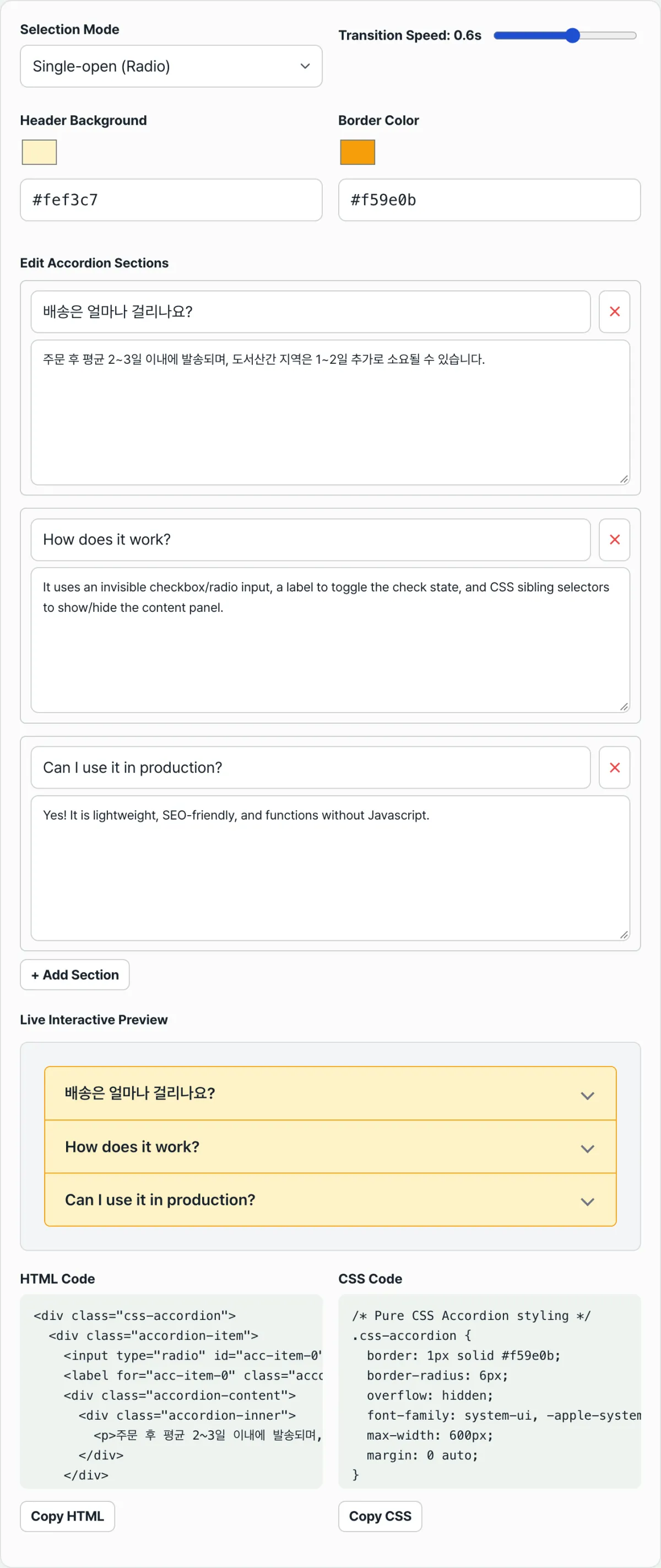
See it in action with our free tool, CSS Accordion Menu Generator.
Change the multi/single open mode, colors, and speed, and the preview and HTML/CSS code update in real time. Copy it right in your browser, no signup or install.
Checkbox vs. radio, and common mistakes
Checkbox mode and radio mode differ by one character in the input's type, but the results are different. At the code level, there are three things to check that create this difference.
| Checkbox mode | Radio mode | |
|---|---|---|
| How many items can be open at once | Multiple (multi-open) | At most one (single-open) |
| name attribute | Optional; doesn't affect behavior | Every item must share the same value |
| Clicking an open item again | Closes it (unchecks) | Doesn't close it (you must click another item) |
All three differences come from how browsers already treat checkboxes and radios differently. The accordion code doesn't add any separate branching logic.
A radio input is inherently designed so that only one selection is allowed within a group that shares the same name. The accordion simply borrows that behavior.
The three mistakes to watch for when reading the actual code are:
- Radio mode with a different name on each item. If the names don't match, the browser treats the inputs as separate groups and multiple items can open at once. If you want single-open behavior, first make sure every input's name is exactly the same string.
- Setting max-height smaller than the actual content. As noted above, this technique can't use
height: auto, so it relies on a fixed max-height. If an item with an image or long text is taller than the max-height you set (for example, 500px), the overflow is simply cut off with no scrollbar. - The label's for doesn't match the input's id. When you add or remove items or edit the code by hand, the id numbers can shift. Then clicking a label may point to a different input or no input at all, so clicks seem to do nothing. If clicking the header doesn't respond, check the for/id pairs first.
Summary
- An accordion opens and closes not through JavaScript, but through the hidden input's checked state and CSS
:checkedsibling selectors. - The label's
forand the input'sidmust match exactly for clicks to reach the input. - The only difference in the code is that checkboxes open independently, while radio buttons share a name for single-open behavior.
- max-height must be generous enough for the actual content. If it's too small, the content gets clipped.
- To see results as you change values, a tool that shows the preview and code together is faster than editing values by hand one at a time.
Change the multi/single open mode, colors, and speed, and the preview and HTML/CSS code update in real time. Copy it right in your browser, no signup or install.
How CSS Accordions Actually Work Under the Hood
Let's take apart the elegant mechanics that let the browser's built-in HTML parser and CSS rendering engine control the state of DOM elements, with no JavaScript event listeners involved.
The Sibling Selector State Machine
The basic skeleton of an accordion UI has to follow a strict order. Only when the sequence <input> ➔ <label> ➔ <div class="content"> is guaranteed can CSS sibling selectors propagate state changes to adjacent elements.
<input type="checkbox" id="item1" class="sr-only" />
<label for="item1" class="header">Title</label>
<div class="content"><div class="inner">Body</div></div>
- Adjacent sibling combinator (+): Targets the single sibling element that comes immediately after a given element. Used as input:checked + label, for example, it's the key to instant visual feedback — inverting the header's background color the moment the user checks an item, or rotating an arrow icon inside the label 180 degrees.
- General sibling combinator (~): Targets every matching sibling element that appears after a given element. Set up as input:checked ~ .content, it finds the body container placed after the label and expands the previously collapsed layout. This is the actual trigger engine of the accordion.
The Mechanics of Height Animation and Transitions
For a long time, the web standard CSS rendering engine did not support animating the height property directly from 0 to auto (auto-sized to the content). Let's look at how the technique evolved to work around and overcome that.
The classic approach (the max-height hack) The most widely known old-school technique. You set max-height: 0 in the closed state, then assign an absurdly large fixed value in the open state (say, max-height: 500px) to drive the transition.
- Downside: If the content is taller than 500px, the overflow gets mercilessly chopped off. Conversely, if the actual content is very short — 50px, say — nothing visibly changes on screen while the closing animation travels from 500px down to 50px, which inevitably produces a serious "timing mismatch" and a lag in responsiveness.
The modern standard (CSS Grid 0fr ➔ 1fr transition) The most celebrated elegant, flawless solution in the frontend world right now. It achieves perfect auto-height interpolation animation with zero JavaScript.
.content {
  display: grid;
  grid-template-rows: 0fr;
  transition: grid-template-rows 0.3s ease-out;
}
.content > .inner { overflow: hidden; }
input:checked ~ .content {
  grid-template-rows: 1fr;
}
This structure cleverly exploits the way the browser's grid rendering engine computes fr units, painting a clean, perfect animation frame from 0 all the way to the real text height (1fr).
The native HTML way (<details> and <summary>) These are semantic elements built right into the HTML5 spec. They weren't widely used in the past because smooth animation was hard to add, but recent rendering updates to modern browser engines like Chrome now officially support smooth height transitions with no extra hacks — by combining the ::details-content pseudo-element with the interpolate-size: allow-keywords CSS property.
Accordion Techniques Matrix
A comprehensive matrix for comparing frontend tech stacks at a glance — their traits, strengths, and weaknesses — so you know which technique to pick for which project.
| Criterion | Pure CSS (Checkbox Hack) | Modern CSS Grid (0fr/1fr) | Native HTML5 (<details>) | JavaScript (React/Vue/Vanilla) |
|---|---|---|---|---|
| JavaScript requirement | None at all (Zero JS) | None at all (Zero JS) | None at all (Zero JS) | Framework runtime and state management required |
| Dynamic height animation | Timing delay (max-height) | Very smooth and accurate | Progressive support, varies by browser | Heavily dependent on library quality |
| Accessibility (ARIA/screen reader) | Developer must set it up manually | Developer must set it up manually | Best-in-class accessibility guaranteed by the browser | Wildly inconsistent depending on developer skill |
| Cross-browser support | Supports legacy environments including IE9 | Modern browsers only (no IE) | All browsers (animation only in modern ones) | Requires polyfills and Babel compilation |
| CSP compliance | Compliant (no restrictions) | Compliant (no restrictions) | Compliant (no restrictions) | Restricted depending on rules around inline scripts |
5 Fatal CSS Accordion Mistakes Frontend Developers Make
This technique looks simple, but these are the typical layout and accessibility disasters that happen when you copy and paste without fully understanding the principles. Know them and avoid them.
- Using display: none or visibility: hidden on the input If you reach for display: none just to hide it from view, the element is completely removed from the render tree. As a result, the browser engine ignores it for keyboard Tab focus, and users who can't use a mouse are permanently locked out of the accordion menu — an accessibility disaster.
- Sprinkling absurdly large max-height: 5000px everywhere If you slap on a ridiculously big number because you're afraid of clipping text, you get a transition-timing collapse of a UX: it snaps open abnormally fast and then sits frozen for several seconds on the way closed.
- Forgetting overflow: hidden on the inner container (.inner) In the grid approach, the height is shrinking toward 0fr while the text content inside still wants to keep its original size. Without overflow: hidden to contain it, the text spills out of the container and bleeds into other UI elements, wrecking the layout.
- Forgetting to unify the name attribute in radio mode You want a single-open accordion — "only one panel open at a time" — so you add input type="radio", but if you don't tie each input's name attribute to the same group string, the browser treats them as separate items and several end up open at once. A logical flaw.
- Violating the DOM tree markup order Ignore the top-to-bottom directionality that CSS sibling combinators depend on — swap the positions of the input and label, or wrap the input in an unnecessary div wrapper — and the + and ~ selector chain breaks. The result is the dreaded "dead" accordion: you click and nothing happens on screen.
The 5-Step Workflow for Building a Production-Level CSS Accordion Component
This is the standard development process for building a solid, flawless component that fully covers web accessibility, maintainability, and design details in real-world work.
- Step 1: Build the semantic HTML skeleton and bind the for attribute precisely First, map the input's unique id to the label's for attribute 1:1 with an exact string identifier. This binding has to be solid so that the check event fires correctly on mouse or touch clicks.
- Step 2: Visually hide it with accessibility in mind (apply the .sr-only class) Instead of display: none, apply a general-purpose class that keeps screen reader and keyboard focus events alive while making the element visually invisible. Use the combination clip: rect(0,0,0,0); position: absolute; width: 1px; height: 1px; overflow: hidden;
- Step 3: Structure the modern CSS Grid 0fr wrapper Set display: grid and grid-template-rows: 0fr on the top-level wrapper of the body (.content) that will be animated, then give the child element (.inner) min-height: 0; and overflow: hidden to get it ready for the transition.
- Step 4: Define the :checked state transition grid animation Match the input:checked ~ .content selector to the content that follows the input, and assign grid-template-rows: 1fr. At the same time, add a smooth transition so it renders naturally from 0 to auto height.
- Step 5: Refine the keyboard focus outline and state indicator For keyboard users as well as mouse users, explicitly define the input:focus-visible + label selector to provide a clear outline when moving with the Tab key, which keeps you compliant with web standards.
7 Pure CSS Accordion Engineering Tips from a Senior Developer
These are 7 fine-detail tuning tricks learned through a lot of troubleshooting.
- Give up the temptation of max-height and upgrade to CSS Grid 0fr ➔ 1fr Even when the length of the inner content text varies, this advanced approach hands the height calculation to the browser engine and guarantees a pixel-perfect dynamic animation.
- For a single-open requirement, use the native behavior of a radio button group If you use input type="radio" with the same name attribute, the browser's native radio button logic automatically deselects the previous choice and keeps a single accordion item open.
- Hide the input with clip-path or clip to preserve the accessibility tree Even a hidden input element should stay firmly in the screen reader and keyboard tree, so nudge it off screen or clip it to keep the DOM node alive.
- Restore tab focus accessibility for the label with the :focus-visible selector Since the browser's default focus ring becomes invisible, you have to manually bring back the label's outline or background color with the input:focus-visible + label selector.
- Leave the toggle chevron rotation animation to the + adjacent sibling combinator With just two lines, input:checked + label .icon { transform: rotate(180deg); transition: 0.3s; }, you get a natural rotation UI detail like gears meshing when the menu opens and closes.
- Keep an eye on how the native details tag evolves Recent Chrome browsers and others now experimentally and fully support smooth height transitions on the details-content element through the global interpolate-size: allow-keywords property.
- Use a generator tool to cut down on repetitive typing and human error Matching every HTML input id with its label for attribute by hand is a recipe for tangles. Pull perfectly mapped skeleton code instantly from the 'CSS Accordion Menu Generator' in this post and put it straight into your work.
Technology Decision Tree: Which Implementation Fits Your Project Best?
Pick the right approach for your project's requirements in one second.
- [Constraint 1] Is this a closed environment where JS scripts are strictly forbidden (government network separation, CSP headers, etc.)? ➔ Go with pure CSS checkbox hack (max-height). (Reliable cross-browser behavior and security compliance)
- [Constraint 2] Do you need to rule out JS but still have perfect height animation with no timing delay? ➔ Go with the modern CSS Grid 0fr/1fr technique.
- [Constraint 3] Are screen reader accessibility for visually impaired users and semantic HTML structure the top priority? ➔ Use the native HTML details/summary tags.
- [Constraint 4] Does data get injected asynchronously from the backend so items are added dynamically? ➔ Build a framework-based accordion with state management, such as React/Vue/Svelte.
Essential Frontend Terms Cheat Sheet
A quick field summary of the key terms you need to fully understand the docs.
- Accordion Menu: A space-saving UI design pattern where clicking the top header expands the detail area below, and clicking again collapses it.
- Checkbox Hack: A trick that controls dynamic state without JavaScript by using an HTML form element's attribute (its checked state) as a CSS trigger.
- Sibling combinators (+ / ~): CSS selectors that target relationships between elements sharing the same parent in the DOM tree to change state in a chain.
- :checked pseudo-class: A state-detection pseudo-class that lets you override specific styles only when a radio or checkbox form control is selected.
- max-height transition technique: A classic technique that works around the fact that height: auto can't be transitioned by setting an arbitrary maximum height value to create the expansion effect.
- CSS Grid 0fr/1fr animation: A modern web standard solution that animates the open space to fit the actual text content size using the track fraction unit (fr).
- details / summary tags: The recommended semantic HTML5 elements that give you a collapsible UI through the browser's own engine, with no scripting or CSS hacks.
- Accessibility (sr-only class): An essential frontend practice of planting invisible text or setting focus movement so screen reader users and keyboard users can use the service just the same.
Frequently Asked Questions
The questions that come up most in real-world work, beyond the theory, with clear answers.
Q1. Why does the classic max-height transition approach create that annoying "ghost lag" when the menu closes?
This method runs the transition from 0 in the closed state to 500px in the open state. Even if the actual content text is only 100px tall, the browser spreads the same transition duration across the full 500px target.
When it opens, the height cap lifts and the 100px of content shows up right away, so it feels natural. When it closes, the browser spends a long stretch going from 500px down to 100px with nothing changing on screen, so pressing the button feels like it's dead, with a delay of several seconds.
Q2. How does the newer CSS Grid approach: 0fr to 1fr: completely solve the problem of not being able to animate height: auto?
In older rendering specs, when you set an element's height to auto, the engine couldn't pin down the pixels, so interpolation wasn't possible.
But as CSS Grid engines got more advanced, sizes could be controlled and calculated in fractional units (fr). 0fr means a height of 0, and 1fr means the ratio of "available space" the actual content needs (the old auto concept). Once modern browsers could interpolate the intermediate frames between these ratio units, smooth height expansion finally became possible.
Q3. What should I do so screen reader users can use a pure CSS accordion without trouble?
First, never use display: none to hide things visually — keep the element in the render tree. Then put the heading level clearly inside the <label> tag, and explicitly add role="button" to the hidden <input> tag so it's announced as a toggle button.
Giving the expanding content container section and region landmark roles also helps screen readers follow the flow of the content. Pure CSS can't change aria-expanded dynamically, so if full web accessibility is a hard requirement, use the native HTML5 <details> tag — that's what I recommend first.
This article was adapted from our Korean original. Read the Korean original