
CSS aspect ratio calculator: 16:9, 4:3 and padding-top hack
Contents
- Why You Need to Lock the Aspect Ratio
- How to Lock an Aspect Ratio with CSS
- padding-top Values for Common Ratios
- Under the Hood: The Math of Intrinsic Aspect Ratio
- Aspect Ratio Implementation Methods: Comparison Matrix
- 5 Aspect Ratio Layout Mistakes You Must Avoid
- 5-Step Workflow for Building a Zero-CLS Responsive Media Container
- 7 Aspect Ratio Design Tips
- Aspect Ratio Decision Tree
- Key Terminology Cheat Sheet
- Frequently Asked Questions
Want a YouTube embed (16:9), an Instagram card banner (1:1, 4:5), or a shop product gallery thumbnail (4:3) to hold its ratio without stretching on any screen size? Then you need to handle CSS aspect ratio correctly. If you also want to support older browsers, you need the classic padding-top percentage calculation, and dividing the numbers by hand for every ratio gets tedious. This post covers how to convert an aspect ratio into a percentage and how to use the modern aspect-ratio property.
Summary ① To lock in an aspect ratio, modern browsers use the aspect-ratio property and older browsers use the padding-top percentage hack. ② The padding-top value is (height ÷ width) × 100, so 16:9 comes out to about 56.25% and 4:3 comes out to 75%. ③ Using object-fit: cover together with a fixed ratio reduces image distortion and layout shift (CLS).
Why You Need to Lock the Aspect Ratio
If an image or iframe has no width and height that match a ratio, its vertical size grows or shrinks along with the screen width. The result: a YouTube video looks squashed, or a card banner image looks stretched top to bottom.
In the past, older browsers solved this with a hack like padding-top: 56.25%, known as the Padding-Top Hack. Modern CSS3 lets you declare the same result more briefly with aspect-ratio: 16 / 9. But if you need to support both browser environments, you still need to know both approaches.
How to Lock an Aspect Ratio with CSS
The padding-top Percentage Formula
For a rectangle with width W and height H, the padding-top percentage is (H ÷ W) × 100. Plugging in the common ratios gives you this:
- Standard video 16 : 9 → (9 ÷ 16) × 100 = 56.25%
- Classic monitor 4 : 3 → (3 ÷ 4) × 100 = 75%
- Square 1 : 1 → (1 ÷ 1) × 100 = 100%
- Vertical short-form 9 : 16 → (16 ÷ 9) × 100 ≈ 177.78%
Modern aspect-ratio and padding-top Hack Code
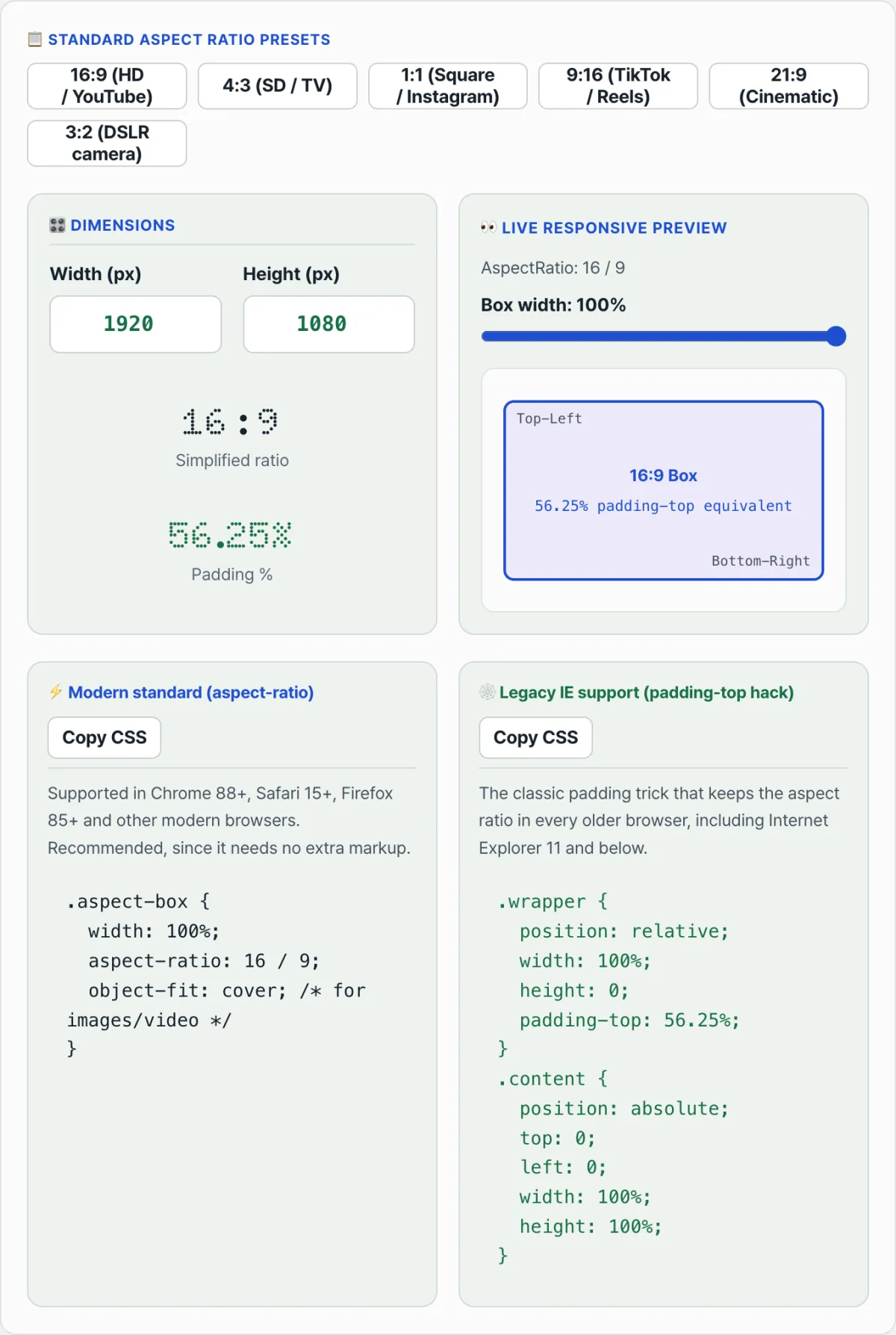
Here's code that covers both modern CSS aspect-ratio and the padding-top technique for cross-browser support.
<!-- 1. Modern aspect-ratio 16:9 video box -->
<div class="modern-aspect-box">
  <iframe src="https://www.youtube.com/embed/sample" title="YouTube video"></iframe>
</div>

<!-- 2. Cross-browser classic padding-top hack for a 16:9 box -->
<div class="legacy-aspect-wrapper">
  <div class="legacy-aspect-content">
    <img src="banner.webp" alt="Responsive banner" />
  </div>
</div>
/* 1. Using the modern CSS3 aspect-ratio property */
.modern-aspect-box {
width: 100%;
aspect-ratio: 16 / 9;
border-radius: 12px;
overflow: hidden;
}
.modern-aspect-box iframe {
width: 100%;
height: 100%;
border: 0;
}
/* 2. Classic padding-top hack for older browsers */
.legacy-aspect-wrapper {
position: relative;
width: 100%;
padding-top: 56.25%; /* (9 / 16) * 100% for 16:9 video */
height: 0;
overflow: hidden;
}
.legacy-aspect-content {
position: absolute;
top: 0;
left: 0;
width: 100%;
height: 100%;
}
.legacy-aspect-content img {
width: 100%;
height: 100%;
object-fit: cover;
}The padding-top hack is easy to get wrong when you do the math by hand, and the aspect-ratio property isn't supported in Internet Explorer (IE) 11 and below. Also, per spec, object-fit applies only to replaced elements like img and video, so it has no effect on iframe. When you use an iframe, as with a YouTube embed, just set width and height to 100% as in the code above. Instead of reaching for a calculator to divide numbers or looking up browser support every time, enter your target aspect ratio and width and check both code options at once in our free tool, the CSS Aspect Ratio Calculator & Responsive Padding Hack Converter.
Enter the width and height pixel ratio you want, and get modern aspect-ratio CSS plus the legacy padding hack percentage right away.
padding-top Values for Common Ratios
| Ratio | padding-top (%) | Example use | | ---
Under the Hood: The Math of Intrinsic Aspect Ratio
To keep an image or video's ratio in step with a flexible width, you need to understand how the browser renders and the physics of the intrinsic ratio.
1. Modern CSS3: the aspect-ratio Property
In modern browsers you can define a ratio simply with the aspect-ratio: <width> / <height>; property (for example, aspect-ratio: 16 / 9;). With this one line, you hand the height calculation entirely to the browser engine.
2. The Legacy Percentage Padding Math
The core formula behind the long-used Padding-Top Hack looks like this:
Why does this formula work? Per the CSS Box Model spec, a percentage padding value on a block container is always calculated against the width of the parent container, not the element's height! That's what lets you make a vertical padding value scale with the horizontal width.
3. Common Media Aspect Ratios and Their Conversions
- 16:9 (Widescreen Video) = (9/16) × 100 = 56.25%
- 4:3 (Classic Display) = (3/4) × 100 = 75.00%
- 1:1 (Square Avatar) = (1/1) × 100 = 100.00%
- 9:16 (Shorts/Reels/TikTok) = (16/9) × 100 ≈ 177.7778%
- 21:9 (Ultrawide Cinema) = (9/21) × 100 ≈ 42.8571%
- 3:2 (DSLR Photography) = (2/3) × 100 ≈ 66.6667%
4. How It Prevents Cumulative Layout Shift (CLS)
A browser doesn't know the size of an external image or iframe (YouTube, Vimeo, and so on) until the resource finishes downloading. If you declare the aspect ratio up front, the browser can reserve empty layout space in the viewport ahead of time. That completely removes the jump that happens when the image finishes loading (layout shifting) and optimizes your Core Web Vitals score.
Aspect Ratio Implementation Methods: Comparison Matrix
Here's a comparison of the four main techniques so you can pick the best fit for your situation.
| Comparison | Modern CSS aspect-ratio | Traditional padding-top hack | HTML width/height attributes | ViewBox SVG Placeholder |
|---|---|---|---|---|
| Browser support | Modern browsers (no IE) | All browsers | All browsers | Mostly modern browsers |
| HTML markup | Very clean (single tag) | Complex (needs a double-wrapper structure) | Very clean | A bit complex |
| Dynamic resizing | Fully supported | Fully supported | Depends on browser heuristics | Fully supported |
| CLS prevention | Best (space reserved up front) | Best (padding reserves the space) | Good (modern browsers only) | Best |
| Implementation complexity | Low (one line of CSS) | High (formula math and split CSS) | Very low | Medium (inline SVG) |
5 Aspect Ratio Layout Mistakes You Must Avoid
- Applying padding-top directly to the
<img>tag: Adding padding to the image element itself breaks rendering. You have to apply the padding to an outer wrapper <div> that holds an inner element with absolute positioning. - Forgetting
object-fit: cover: When an image's natural ratio differs from the aspect ratio container, leaving outobject-fit: coverstretches or distorts the image badly. - Thinking a percentage height (%) works like percentage padding: In CSS,
height: 50%is based on the parent's "height," butpadding-top: 50%is based on the parent's "width." Mixing these up is a common way to break a layout. - Leaving YouTube/Vimeo embeds unresponsive: If you just give an iframe
width="100%"and a fixed height, the video looks abnormally narrow on mobile. Always use an iframe wrapper. - Hardcoding fixed pixel (px) heights in a responsive layout: Fixing media height at something like
height: 300pxin a fluid grid wrecks the ratio as soon as the screen width changes.
5-Step Workflow for Building a Zero-CLS Responsive Media Container
- Determine Target Ratio: Settle on the target aspect ratio for the media. (For example, 16:9 for video, 1:1 for product cards.)
- Apply aspect-ratio: Apply the modern
aspect-ratio: 16 / 9;property to the container (the parent card) to set up the base layout. - Legacy Fallback: For older browsers, use an
@supports not (aspect-ratio: 1/1)media query to declarepadding-top: 56.25%and the double-wrapper rules. - Fit Inner Media: On the actual image or video (iframe) inside, set
width: 100%; height: 100%; object-fit: cover;(for images) so it fills the box. - Audit in Lighthouse: Open the Lighthouse tab in Chrome DevTools, run the performance audit, and confirm the Cumulative Layout Shift score is 0.00.
7 Aspect Ratio Design Tips
- Combine position properties: When you use
aspect-ratiowithobject-fit: cover, addobject-position: centerso the main subject stays centered even when the image gets cropped. - Make the most of HTML attributes: Always add physical
width="1600" height="900"attributes to your<img>tags. Modern browser engines read those two attributes, infer the 16:9 ratio, and reserve rendering space. - Use the auto keyword: Declaring
aspect-ratio: auto 16 / 9keeps a 16:9 space reserved before the image fully loads, then switches to the image's intrinsic dimensions once they're known — which keeps the layout flexible. - Optimize vertical video carousels: In mobile carousel UIs where people swipe through TikTok or short-form content, apply 9:16 (
aspect-ratio: 9 / 16) so the video fills the full vertical area of the screen. - Prevent desktop blowout: If you don't cap the aspect ratio wrapper with something like
max-width: 800px;, the video grows endlessly on large widescreen monitors and pushes all your text out of the way. - Use the calculator on this page: Rather than working out awkward fractional padding percentages by hand for legacy browsers (like 42.8571%), use the CSS Aspect Ratio Calculator & Responsive Padding Hack Converter in this post to get error-free code.
- Make performance monitoring a habit: After applying aspect ratios, double-check layout stability on both mobile and desktop through a Core Web Vitals report or PageSpeed Insights.
Aspect Ratio Decision Tree
Pick your approach fast based on your project environment and target browsers.
- Modern webviews inside mobile apps / internal networks on current browsers ➔ [Use modern CSS
aspect-ratioalone]: The code is concise and the easiest to maintain. - Full support for old browsers (IE and the like) required, such as government or financial sites ➔ [
padding-tophack]: It's a hassle, but it works in old browsers. - Image galleries with user uploads at all sorts of unknown ratios ➔ [
aspect-ratio: 1/1+object-fit: cover]: Standardizes every image into a tidy grid. - A blog built from image widgets or simple thumbnails (targeting modern browsers) ➔ [Declare HTML
width/heightattributes]: Let the browser's built-in heuristics prevent CLS without writing any CSS.
Key Terminology Cheat Sheet
- Aspect Ratio: The proportional relationship between the width and height of a screen or image. (For example, 16:9, 4:3.)
- Padding-Top Hack: A legacy technique that forces a ratio by exploiting the fact that vertical padding (%) is calculated from the parent element's width.
- Cumulative Layout Shift (CLS): A negative user-experience metric where media elements claim space late in rendering and shove surrounding content around.
- Intrinsic Ratio: The physical width-to-height ratio that a media asset (image, video, etc.) natively has.
- object-fit: cover: A CSS property that fills an element's width and height while preserving the original ratio, cropping whatever overflows.
- 16:9 (56.25%): The standard ratio for YouTube video and modern widescreen displays, plus its corresponding percentage.
- 4:3 (75%): A classic display ratio common on traditional CRT monitors and iPad screens.
- @supports query: A feature query module that lets you branch your CSS depending on whether a browser supports a given CSS feature (like aspect-ratio).
Frequently Asked Questions
Q1. Why are percentage-based paddings calculated from width instead of height?
A1. When the CSS specification was written, document layout was designed around text flowing from top to bottom. If padding were calculated from height, an element growing in size could trigger padding to be recalculated again, creating an infinite loop (circular reference). To prevent rendering engines from calculating endlessly, percentage padding and margins were established to always be calculated from the stable width of the parent element.
Q2. How does the aspect-ratio property help achieve a 0.00 CLS score in Lighthouse?
A2. Without aspect-ratio, the browser treats an image as 0px tall until it finishes downloading. The moment the image loads, it suddenly expands to 300px and pushes the content below it down (increasing CLS). Declare this property instead, and the browser already knows during the layout calculation stage (before paint) that "this area needs vertical space equal to some fraction of its width," so it reserves an empty box in advance. The layout therefore doesn't shift before and after the resource loads, which is how you get a perfect 0.00 score.
Q3. What if the ratio I set on the container (say 16:9) doesn't match the image's original ratio (say 4:3)?
A3. The object-fit property is how you handle that mismatch gracefully. Give the container a 16:9 ratio and set object-fit: cover on the image tag, and the 4:3 image scales up to fill the 16:9 area, with the overflow top and bottom cleanly cropped. If you don't want the image cropped, use object-fit: contain to show the whole original image with empty space (letterboxing) around it.
This article was adapted from our Korean original. Read the Korean original