
SVG to React Component: What the Converter Actually Changes
Contents
If you paste SVG code copied from a design tool or an icon site straight into a React or Next.js component, the icon may show up on screen while the console fills with warnings about attributes like stroke-width and class. The code isn't wrong — JSX just reads attribute names by different rules (camelCase) than HTML and XML do. This post lays out those differences in a rule table and explains, using only verifiable facts, what a converter actually changes.
Summary ① JSX reads attribute names in camelCase, so you have to change
class→classNameandstroke-width→strokeWidthfor the warnings to go away. ② The converter puts{...props}at the end of the opening<svg>tag, so the caller can passclassName,fill,width, andheightto control styling. ③ Every non-alphanumeric character is stripped from the component name, so you need to enter an English PascalCase name likeHeartIcon, not "하트 아이콘" (heart icon).
It Pastes In and the Icon Shows Up, but the Console Fills with Warnings
Picture copying an icon from Figma or downloading an SVG from an icon site and pasting it as-is inside the return of a .tsx file. The icon looks fine on screen. The problem is the browser dev tools console.
In development mode, React throws warnings that look roughly like this.
Warning: Invalid DOM property `stroke-width`. Did you mean `strokeWidth`?
Warning: Invalid DOM property `class`. Did you mean `className`?
In other words, React tells you "this attribute name isn't the name used in JSX" and suggests the correct camelCase name along with it. CSS classes in particular are supposed to be set as className in JSX, not class, so if you leave class="icon-heart" as-is, you may get a warning and the styles may not apply the way you intended.
You can fix these warnings by hand, one at a time. But when a single icon has multiple path elements and dozens of attributes, hunting down which ones need camelCase every time gets tedious. The rules themselves are simple, so let's start by laying them out.
How to Convert It Yourself Without a Tool
You can do all of this conversion by hand. Here's the order.
Step 1 — Wrap it in a component. Wrap the SVG markup so a function component returns (returns) it. The function name must start with a capital letter. JSX treats tags that start with a lowercase letter as HTML elements and tags that start with a capital letter as components.
Step 2 — Change hyphenated attributes to camelCase. Change the left side of the table below to the right side. The names on the right are exactly what React suggests in the console with "Did you mean …?".
| Original SVG attribute | JSX (React) attribute |
|---|---|
| class | className |
| stroke-width | strokeWidth |
| stroke-linecap | strokeLinecap |
| stroke-linejoin | strokeLinejoin |
| stroke-miterlimit | strokeMiterlimit |
| stroke-dasharray | strokeDasharray |
| stroke-dashoffset | strokeDashoffset |
| stroke-opacity | strokeOpacity |
| fill-rule | fillRule |
| fill-opacity | fillOpacity |
| clip-rule | clipRule |
| stop-color | stopColor |
| stop-opacity | stopOpacity |
| font-family | fontFamily |
| font-size | fontSize |
| font-weight | fontWeight |
| xmlns:xlink | xmlnsXlink |
| xlink:href | xlinkHref |
Step 3 — Delete the <?xml … ?> declaration and comments. The XML declaration at the very top of an SVG file and <!-- … --> comments can't be used as-is in JSX syntax. JSX comments take the form {/* … */}, so leaving an HTML comment in place causes a syntax error. Deleting it outright is the safer move.
Step 4 — Change inline style strings into objects. A string like style="color:red" has to be an object in React (style={{ color: "red" }}). This isn't just a name change — the form itself has to change.
Step 5 — Add {...props} if you need it. Putting {...props} at the end of the opening <svg> tag lets you pass values like className, fill, width, and height when you use the component, so you can control styling from the outside.
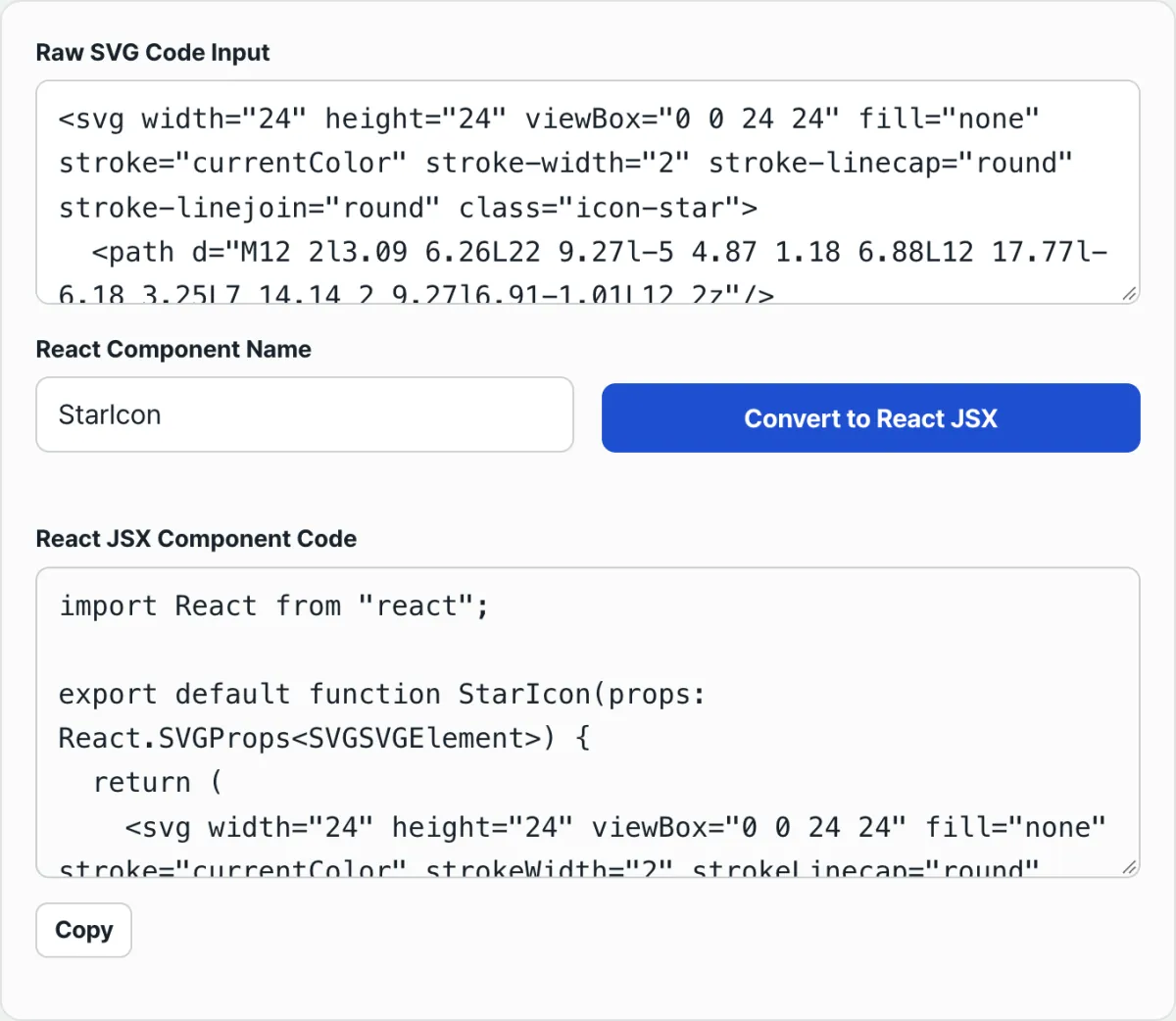
The core rules come down to the one table in step 2. The catch is that the more complex the icon — the more path elements it has — the easier it is to miss something by hand, and every time that happens you're back to reading console warnings. Paste your SVG into the converter below and you can check the whole process at once.
Paste your SVG in the browser and get a TypeScript React component, no sign-up. Your input is never sent to a server; it's processed right on the page.
Common Points of Confusion
Pasting it in without converting. This is the most common case. As we saw above, attributes like stroke-width and class trigger console warnings, and they disappear once you switch to camelCase. This converter changes all 18 attributes in the table above at once.
Component name rules. The converter deletes every non-alphanumeric character from the name (spaces, hyphens, underscores, and Korean characters are all removed). And it does not capitalize the first letter for you. So you need to enter an English PascalCase name that starts with a capital letter yourself.
| Name you enter | Name actually generated |
|---|---|
| HeartIcon | HeartIcon |
| heart-icon | hearticon |
| my_icon 2 | myicon2 |
| "하트 아이콘" (heart icon) | IconComponent |
If you enter only Korean characters and spaces, like "하트 아이콘" (heart icon), nothing is left over, so it falls back to IconComponent. If you start with a lowercase letter like heart-icon, you get hearticon with just the hyphen removed — and a name that starts with a lowercase letter is treated by JSX as an HTML tag rather than a component, which causes problems when rendering. That's why you should start with a capital letter, like HeartIcon.
Where {...props} goes. The converter puts {...props} at the very end of the opening <svg> tag. So the original attributes come first, and {...props} comes after. In JSX, when the same name appears twice, the later value wins. So if you pass <HeartIcon fill="red" />, the value you pass overrides the original fill value. If you don't pass anything, the original attributes stay as the defaults.
One more thing. If you pass a className, it doesn't merge with the className converted from the original class — it replaces it entirely. If you want to keep the original classes while adding more, you have to include the original classes in the className you pass.
Inline style strings. This converter only goes as far as the attribute names in the table above. Strings like style="…" stay as they are. React requires an object rather than a string for style, so if your SVG contains inline styles, you'll need to convert that part into an object yourself.
Summary
- JSX reads attribute names in camelCase. If you don't change
classtoclassNameandstroke-widthtostrokeWidth, you'll get console warnings. - The rules fit in a single table. The converter camelCases all 18 of those hyphenated and XML attributes in one pass.
{...props}gets added to the end of the opening<svg>tag, so you can passclassName,fill,width, andheightfrom the call site to control styling. Anything you pass overrides the original.- The component name keeps only letters and digits, and you have to add the leading capital letter yourself. If you use only Korean characters or spaces, it falls back to
IconComponent. - The
<?xml?>declaration and comments can't be used in JSX and are removed. Inlinestylestrings have to be converted to objects separately.
Paste your SVG in the browser and get a TypeScript React component, no sign-up. Your input is never sent to a server; it's processed right on the page.
Frequently Asked Questions
Why do I get warnings when I just paste SVG into React?
Because JSX reads attribute names in camelCase (for example, strokeWidth) rather than the hyphenated style used in HTML and XML. When React's development mode runs into an attribute like stroke-width, it suggests the correct name in the form "Did you mean strokeWidth?" Change the name to camelCase and the warning goes away.
Can I use Korean characters or spaces in a component name?
If you do, those characters are all deleted. The converter keeps only letters and digits in the name, so if you enter only Korean characters and spaces, like '하트 아이콘', nothing is left and it falls back to IconComponent. It's safer to use an English PascalCase name that starts with a capital letter, like HeartIcon.
How do I change the color or size of a converted component?
The converted component has {...props} on its opening <svg> tag, so you just pass values when you use it. For example, <HeartIcon fill="red" width={48} className="my-icon" /> overrides the original attributes with the values you pass. That's because {...props} sits at the end of the tag, so your values come after the originals.
Is it okay if the SVG I paste has comments or an XML declaration?
That's fine. The converter automatically strips the <?xml … ?> declaration and <!-- … --> comments. Neither can be left as-is in JSX syntax (comments have to be in the {/* … */} form), so leaving them in causes errors — that's why they're removed during conversion.
This article was adapted from our Korean original. Read the Korean original